
max
Lalit Yadav
Senior Web Developer for SaaS, Ecommerce & Agencies
- $100k+
- Earned
- 22x
- Hired
- 5.00
- Rating
- 103
- Followers
Hitting $100k as a freelancer feels unreal.
Not because of the number, but because of everything behind it — the late nights, uncertain months, lost clients, underpriced projects, and moments where quitting felt easier.
There was a time when getting the first $100 felt like a milestone. Then $1k felt impossible. Then slowly, project by project, things started compounding.
No shortcuts. Just consistency, learning, and showing up even when things weren’t working.
Freelancing isn’t easy. It tests your patience, your confidence, and sometimes your identity. But it also gives you something no job ever did — ownership.
Ownership of your growth. Your mistakes. Your wins.
Grateful for every client who trusted me, every failure that pushed me, and every lesson along the way.
This is just the beginning.
65
52
1.3K
Handoff AI – AI Powered Construction Estimation Platform
0
12
Naked Beauty MD – Shopify E-commerce Case Study
Project Overview
Naked Beauty MD is a Shopify-based beauty and skincare e-commerce platform focused on delivering a premium online shopping experience for skincare products and treatments.
The goal of the project was to create a modern, conversion-focused Shopify store that reflects the brand’s luxury aesthetic while maintaining strong performance, mobile responsiveness, and easy product management.
Objectives
• Build a clean and premium Shopify storefront
• Improve user experience and product discoverability
• Create responsive layouts optimized for all devices
• Optimize the website for speed and conversions
• Simplify content and product management for the client
• Ensure scalable structure for future growth
Solution Delivered
The website was developed using Shopify with a focus on performance, scalability, and conversion optimization.
Key implementations included:
Custom Shopify Development
Developed and customized Shopify theme sections to create a clean and luxury-focused storefront experience aligned with the brand identity.
Responsive User Experience
Built a fully responsive interface optimized for desktop, tablet, and mobile users to ensure smooth browsing and checkout experiences across all devices.
Product & Collection Structure
Organized products and collections with a user-friendly structure that improves navigation and product discoverability.
Conversion-Focused Design
Implemented optimized layouts, product presentation sections, and clear call-to-actions to improve engagement and purchasing flow.
Performance Optimization
Optimized images, layouts, and frontend structure to improve loading speed and overall website performance.
Scalable Shopify Architecture
Structured the Shopify setup to support future expansion including new products, collections, and marketing campaigns.
Technologies Used
• Shopify
• Shopify Liquid
• HTML5
• CSS3
• JavaScript
Results
• Premium and modern e-commerce experience
• Improved mobile responsiveness across devices
• Faster and smoother shopping experience
• Simplified store management for the client
• Scalable structure for ongoing business growth
My Role
As the developer on this project, I was responsible for:
• Shopify theme customization
• Frontend development
• Responsive UI implementation
• Store structure optimization
• Performance improvements
• Shopify section and layout development
4
3
199
$3K+ earned
Cinematic WordPress Website Redesign for Spreadfilms
1
24
E-commerce Website Development
1
29
Indunor React-Based Website
0
18
Mbaruku Ventures – Corporate Website Design & Development
1
5
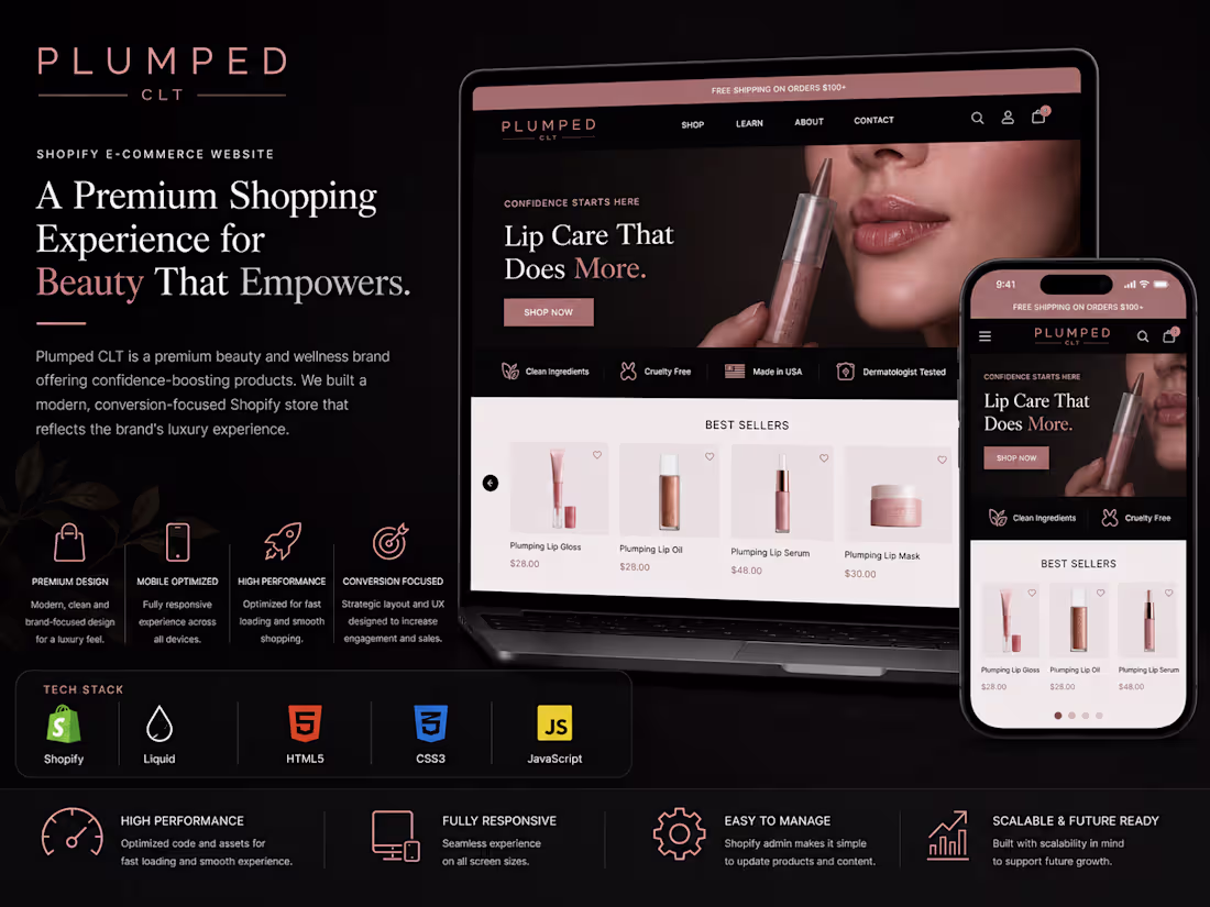
Luxury Shopify Development for Plumped CLT
0
6
Evrideo – SaaS Video Distribution Platform Website (Webflow)
2
5
Relevance AI – AI SaaS Website Design & Development (Framer)
0
2
EnterDreamlab – Interactive Digital Experience with Webflow
For EnterDreamlab, I developed an engaging, interactive website using Webflow to showcase their creative digital studio's portfolio and services. The focus was on delivering a visually striking experience with smooth animations and transitions, reflecting the agency’s cutting-edge work. I utilized Webflow’s CMS to manage dynamic content and ensured responsive design to provide an optimal experience across all devices. The project involved creating custom interactions using Webflow’s native tools and JavaScript for enhanced user engagement.
Key Objectives
Create a Visually Engaging Design
The primary objective was to craft a highly interactive, visually striking digital experience that aligns with Enter Dreamlab's innovative branding. The design aimed to showcase their creative work with minimal yet captivating aesthetics. This involved using Webflow’s rich visual tools to build fluid layouts, dynamic elements, and full-page transitions that reflected the studio’s creativity.
Responsive Web Design
Ensuring the website was fully responsive across all devices was a key priority. The design had to adapt seamlessly to different screen sizes, from desktop to mobile. By leveraging Webflow’s flexible grid system and media queries, I built an adaptive layout that maintained the site’s integrity on tablets, phones, and desktops.
Custom Interactions & Animations
A significant objective was to implement custom animations and interactive elements that would captivate users. This was achieved using Webflow’s built-in interactions and animations tools. Key interactions included hover effects, scroll animations, and transitions that engaged visitors as they navigated through the site, ensuring an immersive and memorable experience.
Webflow CMS Integration
To streamline content management, I integrated Webflow's CMS, enabling the team at Enter Dreamlab to update portfolio pieces, blog posts, and other dynamic content easily. This setup allowed for content flexibility and scalability, with no need for additional backend coding. The CMS was structured to handle their evolving content efficiently.
Performance Optimization
Another crucial objective was to optimize the site’s performance, ensuring fast load times and a smooth browsing experience. This included optimizing images, reducing the use of unnecessary scripts, and making sure the custom animations didn’t hinder page speed.
Seamless User Experience (UX)
The goal was to design an intuitive user experience that led visitors effortlessly through the website. This included well-thought-out navigation, clear call-to-actions, and easy access to key content. My objective was to ensure visitors could explore the studio’s services and portfolio with ease, creating a frictionless and enjoyable journey.
SEO Optimization
The website needed to be search engine friendly. I focused on implementing SEO best practices, including optimized meta tags, heading structures, alt text for images, and clean code to enhance the site's visibility on search engines.
Branding Consistency
Ensuring that the website reflected Enter Dreamlab’s unique brand identity was a key objective. Every element, from typography to color schemes, was chosen to align with their visual branding guidelines, ensuring that the website felt authentic and cohesive with their offline and online presence.
Expected Outcomes:
In this Webflow project I created a visually engaging, interactive website that boosted brand presence and user engagement. With custom animations, responsive design, and Webflow CMS integration, the site showcased their portfolio and improved mobile performance. SEO optimizations increased visibility, leading to higher organic traffic, while providing a scalable, easy-to-manage platform for future growth and content updates.
0
248
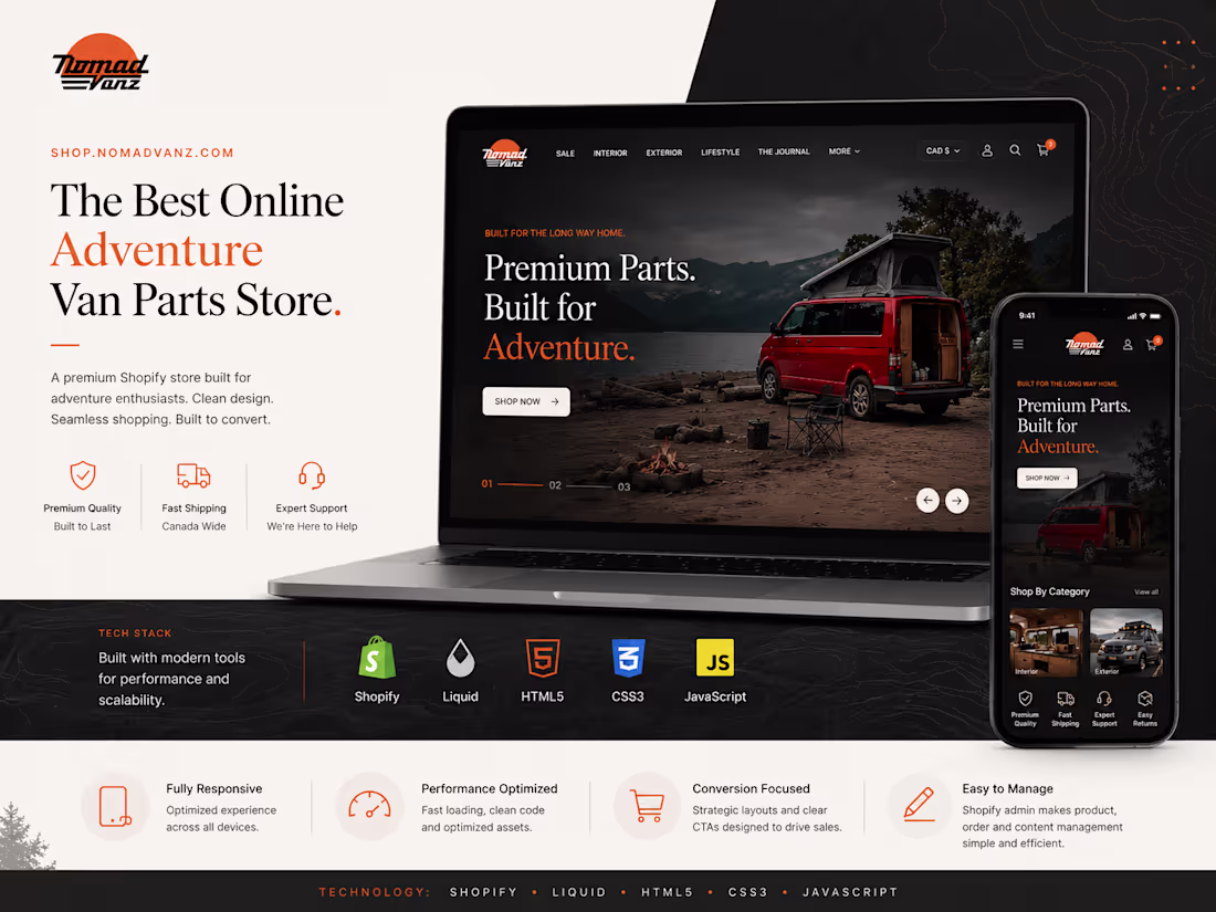
Shopify E-commerce Store Development for NomadVanz
2
5
For ByDefaultStudio, I developed a modern, visually refined website using Webflow to reflect the studio’s creative identity and minimalist design approach. The goal was to build a clean, high-impact digital presence that highlights their work, services, and brand philosophy. I translated design concepts into responsive layouts, ensuring consistency across devices while maintaining strong visual hierarchy and typography.
Key Objectives:
Create a Clean & Minimal Visual Identity:
Develop a modern, design-forward website that reflects the studio’s minimalist aesthetic, focusing on typography, spacing, and visual hierarchy to create a premium look and feel.
Showcase Portfolio Effectively:
Structure the website to highlight projects in a clear and engaging way, allowing users to easily explore work and understand the studio’s creative capabilities.
Responsive Web Design:
Ensure the website delivers a seamless experience across all devices (desktop, tablet, mobile) using Webflow’s responsive layout system.
Smooth Interactions & Animations:
Implement subtle animations and transitions to enhance user engagement while maintaining performance and not overwhelming the design.
Scalable Webflow Structure:
Build reusable components and a flexible layout system so the client can easily update and expand content without technical dependency.
Webflow CMS Integration:
Set up CMS collections for projects and content, enabling easy management and regular updates by the internal team.
Performance Optimization:
Optimize images, structure, and interactions to ensure fast loading speed and smooth browsing experience.
SEO Best Practices:
Implement proper heading structure, meta tags, and clean code to improve search engine visibility and organic reach.
User Experience (UX) Focus:
Design intuitive navigation and clear user flow to guide visitors toward key sections like portfolio, services, and contact.
Brand Consistency:
Maintain consistency in colors, typography, and layout to align with the studio’s brand identity across all pages.
Expected Outcomes:
The ByDefaultStudio Webflow project resulted in a clean, modern website that strengthened the brand’s digital presence and improved overall user engagement. The responsive design and smooth interactions ensured a seamless experience across all devices, while CMS integration made content management simple and scalable. Performance and SEO optimizations contributed to faster load times and better visibility, helping attract and retain more visitors.
1
227
The Ÿnsect website is a visually captivating and content-rich platform built on WordPress, designed to showcase the company’s pioneering work in sustainable insect-based products. The site reflects Ÿnsect’s commitment to innovation and environmental responsibility, delivering an intuitive and informative user experience.
The Ÿnsect WordPress website successfully communicates the brand’s mission and innovations through a user-friendly, visually appealing, and high-performing platform. The site serves as a key digital asset for engaging stakeholders and promoting sustainable solutions globally.
Link to Project : Ÿnsect Website (https://www.ynsect.com/)
1
455
UpKid – Childcare Staffing Platform Website (Webflow)
0
1
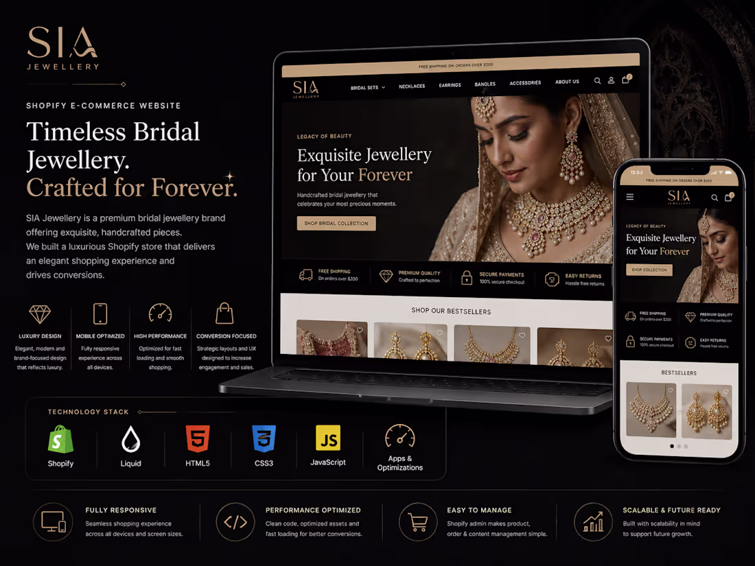
I had the opportunity to design and develop the Shopify-based e-commerce store for Sia Jewellery, a brand celebrated for its exquisite and timeless jewelry collections. The goal was to create a visually stunning, user-friendly online store that enhances the shopping experience and reflects the elegance of Sia’s designs.
Key Features Implemented:
• Custom Design
• Responsive Design
• Enhanced Product Pages
• Advanced Filters and Search
• Wishlist Feature
• Secure Payment Gateway
• SEO Optimization
• Social Media Integration
1
454
🎬
From Wireframe to Wow. Every design tells a story.
For SpreadFilms, a creative film agency, the homepage needed to make a strong first impression, bold visuals, clean motion, & a layout that feels cinematic from the first scroll.
This video walks through my Figma creation process for the homepage from rough layout to high-fidelity prototype 👇
Inside the video:
🎯 Reviewing the old homepage & identifying UX issues
🎨 Setting up the Figma workspace & style guide
🧩 Creating the new grid, structure, & visual hierarchy
💻 Designing hero, feature, & showcase sections
⚡ Adding interactions and prototype flow
🎞 Before vs After — the transformation
The goal was to craft an immersive homepage that instantly communicates SpreadFilms’ cinematic brand identity.
Every frame was designed with balance and purpose.
2
759
Wordpress Expert For Dental Website
0
5
UI Design Service: Crafting Engaging & Intuitive User Interface
0
15
1
0
29
Fitfile.com WordPress Website Development
0
16
Stunning Woo Store for Modern Bridal Wear
0
26
Dospace Webflow Website Development
0
15
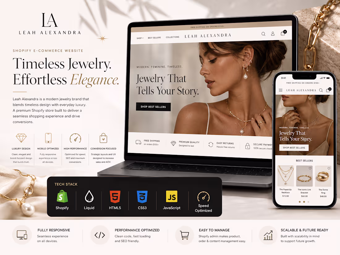
Leahalexandra Shopify Website
1
13
Premium Car Wash & Detailing Website for MagicWash
2
29
Influur Webflow-Based Website
0
18