Kshama Sinha
UX/UI Designer helping businesses build clear, user-centered
Ready for work
Kshama is ready for their next project!
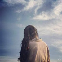
Latest work: A dive into experimental editorial layouts.
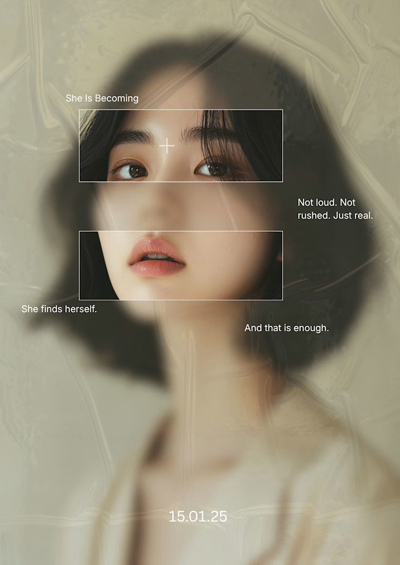
I’m currently exploring how to push the boundaries of traditional portraiture using liquid distortion effects and modern serif typography. The result? A design that doesn't just sit on the page—it makes a statement.
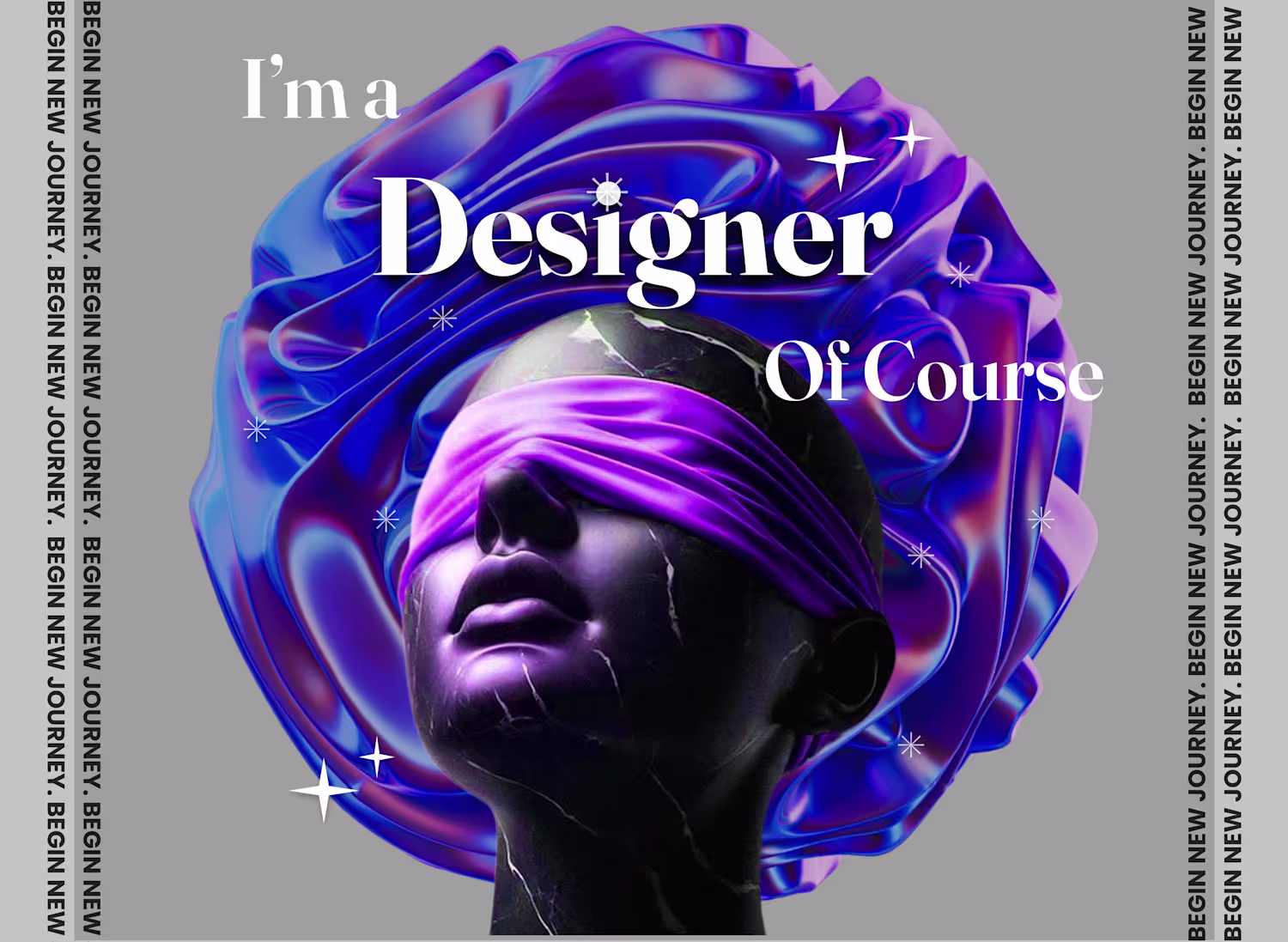
Visual Hierarchy in Abstract Layouts 🙌
Even in abstract design, the eye needs a path. For this piece, I experimented with asymmetrical text placement and "framing within a frame" to guide the viewer's journey across the canvas.: 💻
The use of muted tones and high-grain textures...
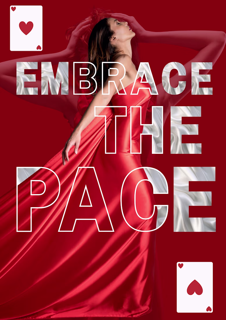
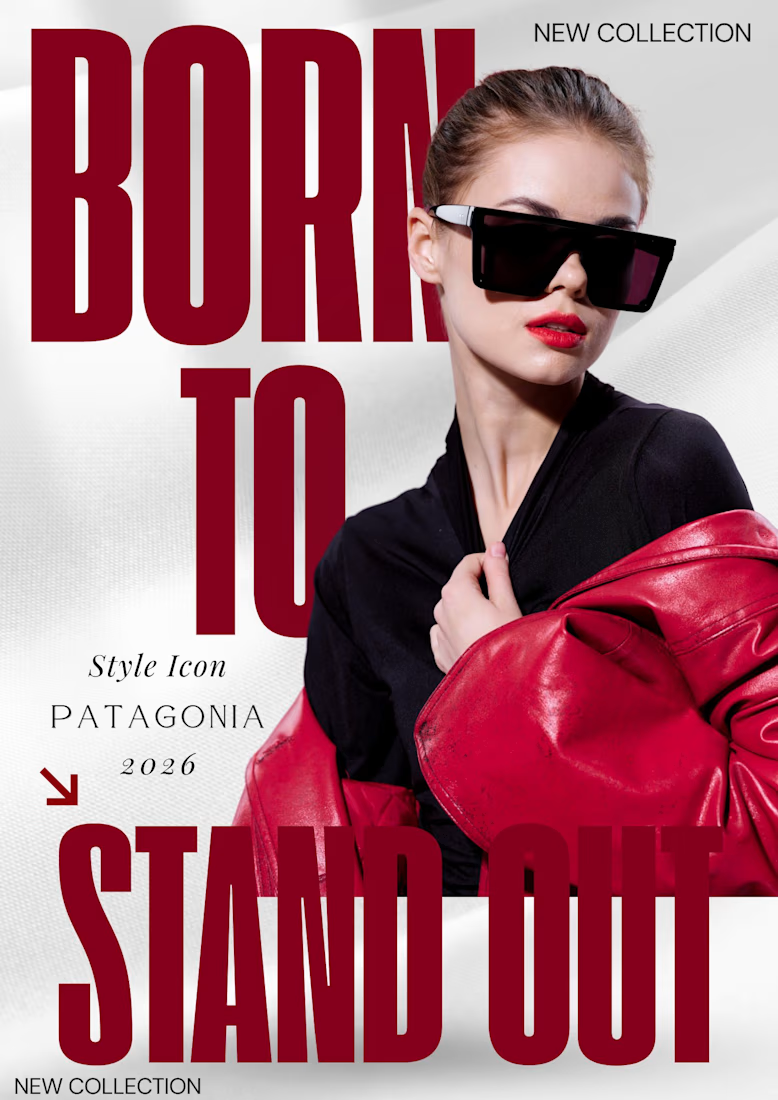
Bold Typography & Visual Hierarchy: The Patagonia 2026 Concept
Using oversized typography and editorial layering, I’ve crafted a poster meant to dominate both physical walls and digital feeds.
I'm a big fan of bold, chunky fonts and that deep crimson color—it definitely lives up...
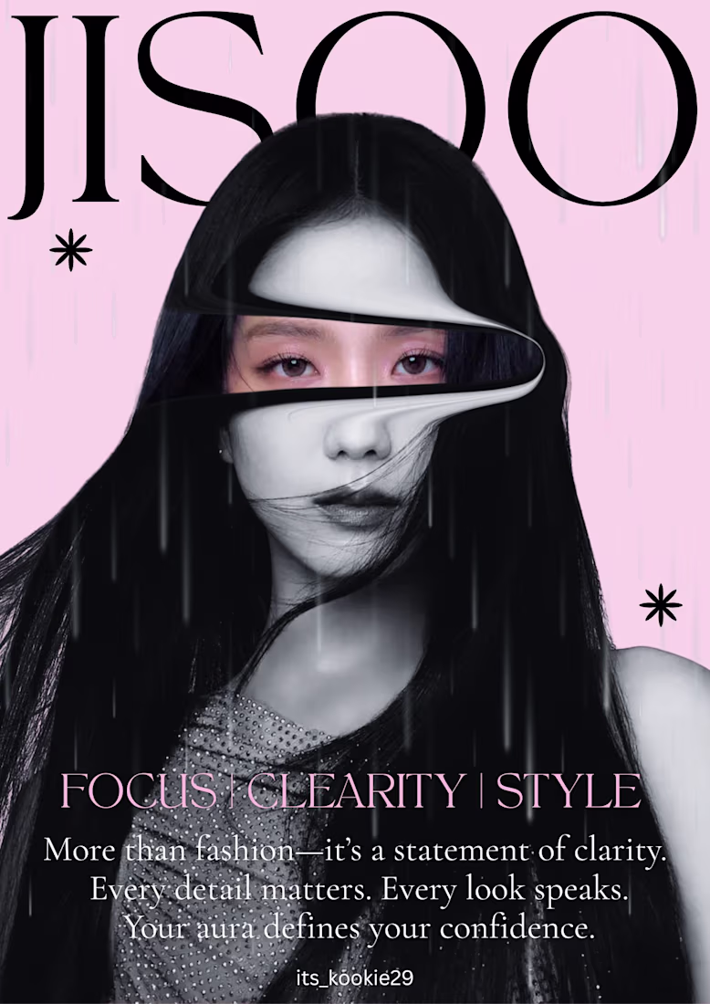
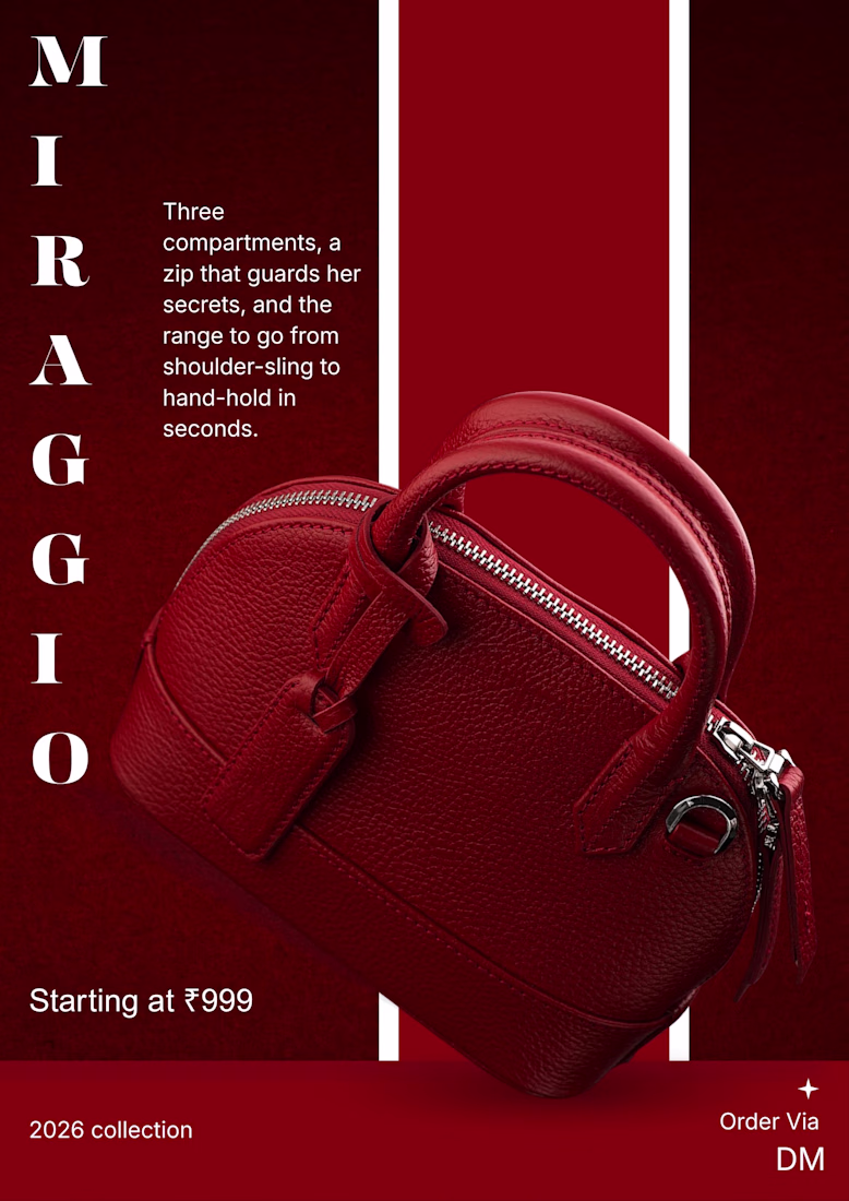
Product Showcase: Miraggio 2026 Collection
A deep dive into monochromatic branding.
Playing with vertical layouts and bold serif typography for a high-end fashion brand concept. The 2026 Collection poster focuses on texture, contrast, and clean CTA placement.
What do you think of the monochromatic look? Let's talk in the comments!
Design that moves as fast as your ambition.
Embrace the pace. #GraphicDesign #Branding #CreativeWork