The network for creativity
Join 1.25M professional creatives like you
Connect with clients, get discovered, and run your business 100% commission-free
Creatives on Contra have earned over $150M and we are just getting started
Back to feedPost
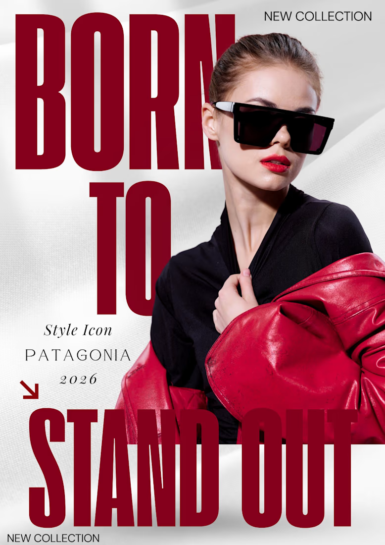
Bold Typography & Visual Hierarchy: The Patagonia 2026 Concept
Using oversized typography and editorial layering, I’ve crafted a poster meant to dominate both physical walls and digital feeds.
I'm a big fan of bold, chunky fonts and that deep crimson color—it definitely lives up to the "Stand Out" headline.
What do you think? Does the red pop enough for you? Let me know in the comments! 👇
The network for creativity
Join 1.25M professional creatives like you
Connect with clients, get discovered, and run your business 100% commission-free
Creatives on Contra have earned over $150M and we are just getting started
Related posts
We're excited to share our latest launch: the new brand and website for Kin & Co.
Founded by Toronto-based editorial and commercial photographer Samuel Engelking, Kin & Co. is a boutique portrait studio for families who've always been intentional about how they live, and how they're seen.
We met Samuel in person and connected right away over a shared belief: family photography had gone stale, and design-conscious families deserved something with real editorial intention behind it. We partnered with him to build a brand and website that could carry that vision.
From the custom serif logotype to the tactile, print-first identity system, every detail was built to let Samuel's photography lead.
No clichés. Just intention, taste, and images made for the wall.
This is so nicee
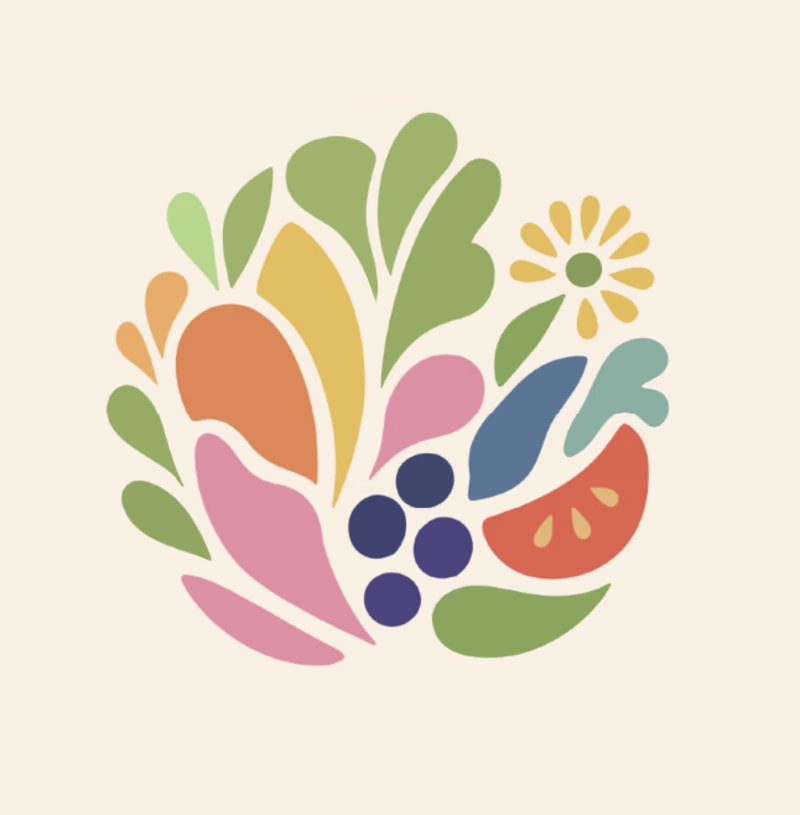
Which Logo is your favorite for a Registered Dietitian called Nourish Colorfully?
22 voted
39%
35 voted
61%
57 votes
Closed
Ummmm, option A gives the feeling actually
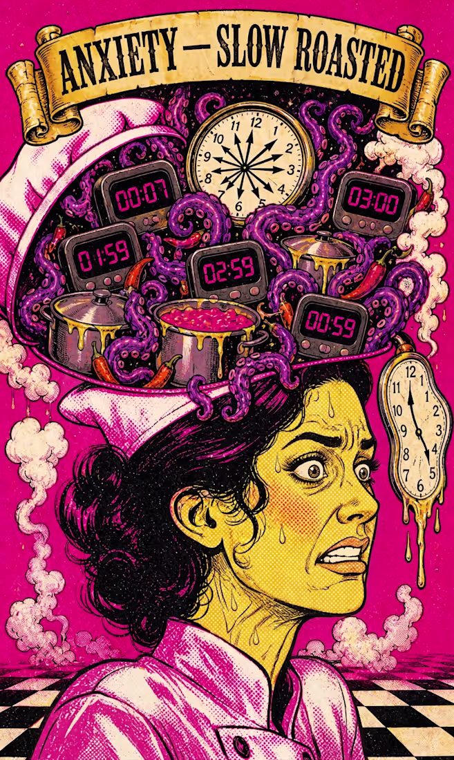
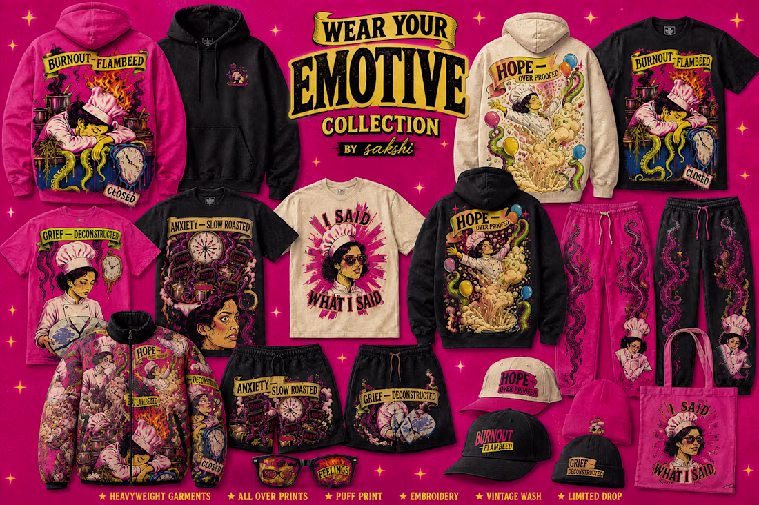
Wear Your Feelings — a pop-surrealist streetwear ecosystem 🧠🔥
Standard AI gave me generic clip art.
My Human by Design moment: overriding it, mapping every detail to real psychology — handwritten letters for Grief, exploding dough for Hope, a vinyl record for Nostalgia, a "CLOSED" sign for Burnout, grenade chilis for Rage.
Started as a cookbook concept. Became a full brand — apparel, sunglasses, hot sauce packaging, campaign reels — one Envato pipeline, start to finish.
@Envato gave it a canvas. Human taste gave it a soul.
Check out the raw walkthrough video below for the exact workflow breakdown. 🎬👇
walkthrough:
Trending
Claude
Claude has entered the design space. How are you using Claude Design?
Contra University
Learn from expert creatives how to earn more using next-gen AI tools.
creativeaiflow
Creative AI workflows are evolving. What tools do you use, and what are their strengths and weaknesses?
freelancerlife
Freelancer life is wins, pivots, and everything in between. What’s yours right now?
