
pro
Kris Anfalova
Premium UI/UX & Web Design for Fintech, SaaS & Web3 | Framer
- $5k+
- Earned
- 1x
- Hired
- 5.00
- Rating
- 108
- Followers
11k followers, beautiful pastries, and 4.5 hours wasted in DMs daily. Here is how I fixed a local bakery's operations in 3 hours. 🥐✨
For the #GiveItAGlow challenge, I wanted to find a business where design could solve a real operational bottleneck. I chose "Holidays treat" — a visually stunning local bakery in Thailand.
The Problem:
Visually, their brand is flawless. Digitally, it was a nightmare. Every single custom cake order, tart reservation, and FAQ was handled manually through Instagram DMs. The owner was losing over 4.5 hours a day just typing out the same allergen information and stock updates.
The Process (How it was built):
Using Base44, I went from a blank canvas to a fully functioning digital ecosystem in exactly 3 hours. Here is the exact breakdown of the build:
Phase 1: The Figma Benchmark & Asset Generation
Every high-end product starts with strict visual discipline. Before touching the builder, I opened Figma to define the rules of "quiet luxury" for this brand. I established a rigorous grid, editorial typography, and terracotta accents. I used Midjourney to generate high-end asset concepts to set the perfect mood. I didn't design every screen—I designed one flawless Root Index to serve as my absolute source of truth.
Phase 2: Architectural Foundation
Inside Base44, I prioritized architecture over aesthetics. My initial prompts focused purely on database generation and routing. Within minutes, the AI spun up the core infrastructure: a Products database, an Orders table, and dynamic routing for the entire B2C catalog.
Phase 3: The Design Translation
This is where I am usually skeptical of builders, but Base44 delivered. I fed my Figma benchmark into the Base44 agent and instructed it to overwrite the global design system. It adopted my strict visual parameters and replicated them across the entire app with 100% accuracy. When we hit minor component bugs, like routing issues in the Global Header, I used precise system directives to re-bind the events without touching the code.
Phase 4: Automation Depth & State Management
A beautiful site means nothing if the business operations are still manual.
The Backend:
I built a B2B Kitchen Dashboard with a live Kanban board tied directly to the front-end checkout.
The CMS:
I converted static footer galleries into dynamic databases so the owners can update their digital storefront seamlessly.
The Superagent:
I integrated a 24/7 AI Superagent and wired it directly to the live inventory database. It now handles all FAQs, consults on bespoke cakes, and routes users to checkout. To ensure a seamless UX, I prompted the system to utilize a Global Session State, ensuring cart persistence across all page navigations.
The Verdict on Base44:
As a UI/UX Designer who is fiercely protective of visual layouts, my stack has strictly been Figma and Framer. But building this project completely shifted my perspective. Base44 is the first platform I’ve used that handles deep backend logic and AI automations without sacrificing an inch of front-end aesthetic control. It is officially part of my permanent freelance toolkit.
The Handoff:
I handed the fully live ecosystem over to the bakery—no setup fees, no friction. Just real utility.
Watch the full Before/After transformation and my process breakdown
Demo: https:// (https://holiday-treat-studio.base44.app)holiday-treat-studio.base44.app (http://holiday-treat-studio.base44.app)
Figma (all step): https://www.figma.com/design/8uKK1dv5q5jX5O3pSFkSxQ/Challenge-base44?node-id=0-1&t=BXoMyOdu87ld3IyX-1
Before in comment. Base44 you BEST!!! Realy.
3
6
381
Just a quick work-in-progress update! 💻
Sharing an early sketch of the animation and illustration concept for a B2B developer cloud browser I'm working on. The dark mode architecture is coming together nicely, but there is still plenty of tweaking to do.
I'll be showing the complete, polished project very soon—stay tuned for the full reveal! 🔥
5
8
294
PUFFHS: Artisanal Pastry Landing Page Concept
Welcome to PUFFHS, a conceptual landing page designed for a premium artisanal bakery specializing in gourmet cream puffs. This project reimagines how we browse and buy high-end digital food products.
Most food e-commerce platforms and delivery apps rely on static, uninspiring grid layouts that fail to capture the true tactile appeal of the product. The challenge was to break away from standard UI patterns and create a digital shopping experience that is as mouth-watering and engaging as the pastries themselves, all while keeping complex dietary information accessible
To solve this, I experimented with a highly interactive, motion-driven approach. The core UX innovation is the "Reveal the Puff" mechanic. Instead of forcing users to read long paragraphs about the ingredients, I designed a seamless micro-interaction that allows them to virtually "slice" the dessert with a single click, instantly revealing the rich filling and texture.
20
60
2.5K
Here’s my take on what the website for a Product Hunt 'Product of the Day' should look like today.
Honestly, the actual PH feed has felt a bit sad lately—it seems like 99% of the winning products are just AI tools generated by Claude. I wanted to design something that actually stands out and brings quality aesthetics back to the top spots. 🫠
What do you think of this concept?
3
9
596
Always down for a fresh UI experiment! 🎨✨
Just finished up this new concept: FAME.X — a platform designed for investing in digital talent and creators.
For the visual direction, I wanted something bold, energetic, and slightly futuristic. To pull that off, I went heavy on high-contrast, grainy gradients mixed with massive, striking typography and sleek glassmorphism cards. It gives the whole platform that trendy, high-value feel. 🔥
I’m an absolute sucker for testing out new design tools, and when they are built by awesome people, it’s an ultimate ccccombo. 💥
To get these incredibly juicy gradients, I used a brand-new tool created by Leo. I’ve been playing around with it, and it’s honestly just pure joy to use. Plus, it’s completely free.
If you want to level up your gradient game, you absolutely have to try it out: https://www.gradientool.com/
29
86
2.7K
Modern UI/UX meets Moroccan authenticity.
Here is a new landing page concept for a luxury riad in Marrakech. The goal was to blend local culture with clean, responsive design—focusing on elegant layouts, immersive imagery, and a seamless booking flow.
Perfect for boutique hotels, resorts, and travel platforms looking for a premium digital presence. What do you think of this aesthetic? 👇
7
11
835
Tesla Mobile App — Premium EV Charging
A high-end, dark-themed mobile application concept designed for Tesla owners to manage charging sessions, monitor vehicle health, and navigate to the nearest Supercharger with precision. This UI focuses on real-time data visualization and a seamless "glanceable" experience.
Managing an EV often involves juggling complex data—kilowatt speeds, fluctuating costs, and battery degradation—which can feel overwhelming for the average user. Most automotive apps suffer from cluttered dashboards that make it difficult to find critical information while on the go.
By utilizing a high-contrast dark mode and minimalist typography, we prioritized visual hierarchy. The charging screen uses massive 74% progress indicators for immediate recognition. We implemented custom-designed gauges for "Charge Remaining" and "Est. Range" to mimic professional telemetry, while the map interface simplifies route planning with a clean, low-poly aesthetic to reduce cognitive load during navigation.
Real-time Charging Analytics: Live tracking of time-to-full, charge speed (kW), and accumulated cost.
Predictive Range Gaging: A refined dashboard showing battery health and estimated distance.
Smart Supercharger Map: Dark-themed maps featuring stall availability (4/8) and distance tracking.
Premium Interactive HUD: Custom-designed icons and buttons with haptic-ready visual feedback.
Sophisticated Dark UI: Optimized for OLED displays to save battery and provide a luxury aesthetic.
This project showcases the intersection of automotive UI and luxury branding. By focusing on user-centric navigationand clean data visualization, we’ve created a smart mobility solution that feels as premium as the car itself. This Tesla app redesign highlights the future of EV dashboard design and mobile app development for high-performance vehicles.
6
759
Breathe Nature Landing Page Design
4
17
Hevn - Global NeoBank Landing Page
2
14
Premium Brand Identity for Lemma
2
13
Atlas Global HR Platform UI Design
1
25
MÉL THE SEAL — Remote Work Solutions for Tired Creative People
Meet Mel: a sleepy harbor seal built from lavender raff, client revisions, lofi beats, low battery mode, and tiny wins.
What started as a small painting of a seal with cosmic eyes became a full mascot-led brand world. I developed Mel’s personality, origin story, visual identity, comic series, emotional language, packaging, merch, stickers, social content, and a card game for freelancers surviving the workday.
The goal was to create more than a cute mascot. Mel needed to feel like the same character everywhere: in a comic panel, on a coffee cup, inside a sticker pack, on a hoodie, and in a tiny animated moment of client-revision panic.
Built with Recraft Studio:
Character exploration, reference-image workflows, V4.1 Vector identity studies, packaging and merchandise applications, social assets, storyboards, and image-to-video experiments.
Always tired. Often late. Still shows up.
Full Case Study: https://www.recraft.ai/project/2a11d3ab-1851-4c5e-b259-3e3a54b46633
My loom is in the comments.
13
25
1.2K
SaaS UI Illustration Course Landing Page
In an era dominated by generic AI generation, the true competitive edge for UI/UX designers lies in bespoke craftsmanship. This landing page design showcases an intensive masterclass dedicated to creating high-end, structured vector illustrations and 3D-style assets specifically for the modern SaaS ecosystem.
The Challenge
Most designers struggle to bridge the gap between flat UI and immersive storytelling. The goal was to design a high-conversion landing page that reflects the "I See the World Differently" philosophy—moving away from automated prompts toward intentional, grid-based visual logic that enhances the user experience.
The Solution
The interface utilizes a sophisticated dark mode aesthetic combined with a modular bento-gridlayout to organize complex course modules. By implementing glassmorphism and strategic neon accents, the design directs the user's eye toward the curriculum while maintaining a premium, tech-forward atmosphere. Every element was built natively in Figma to demonstrate the power of professional design tools over prompt-based shortcuts.
4
10
1.1K
Bloom is a conceptual premium plant care application designed to transform daily botanical maintenance from a stressful chore into a calming, mindful experience. This project showcases a sleek mobile interface and a landing page concept that highlights the app's core value propositions through minimalist, high-end design.
Plant owners frequently struggle to keep track of varying watering schedules, humidity needs, and care routines, often resulting in what we call "plant parent guilt." Existing solutions in the market tend to be cluttered, overly technical, and visually overwhelming, adding to the stress rather than alleviating it.
I approached Bloom with a focus on high-end minimalism and intuitive tracking. The goal was to strip away the noise and create an interface that feels like a "living gallery."
The resulting design establishes a premium brand feel that stands out in the crowded utility app market. By prioritizing a clean, stress-free user experience, Bloom proves that functional apps can also be visually stunning and emotionally resonant.
6
8
801
Moola Landing Page, Branding and app design
1
8
Crafting a High-Conversion Wellness Landing Page
I recently completed the design for Moola, a premium mindfulness application. The goal was to create a web presence that balances aesthetic storytelling with high-performance SaaS marketing principles.
Focused on "Sensory Design," I used soft gradients and glass-like textures to reflect the app's core mission: mental clarity. By replacing traditional lists with a structured bento grid, I improved the information architecture, making it easier for potential users to digest the app’s benefits.
Available for new design inquiries. Let’s build something meaningful together.
1
7
770
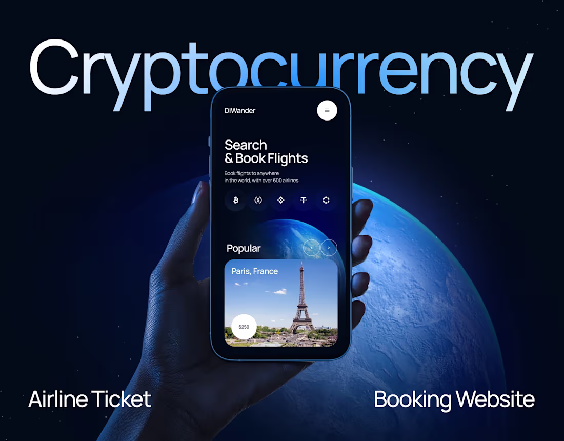
Designing for Web3 shouldn't mean sacrificing premium aesthetics. 💳✨
I recently explored a new concept for a limitless crypto banking platform. The goal was to move away from intimidating, jargon-heavy interfaces and create an experience that feels as secure and exclusive as traditional luxury banking.
Here is how I built it:
Visuals: Deep Dark UI paired with sleek metallic 3D elements to establish instant trust.
Structure: A modular Bento Grid to make complex features—like staking and non-custodial security—easy to digest.
Motion Workflow:I used Jitter. It allowed me to rapidly build and iterate on smooth UI animations that look incredibly polished.
See the details, and let me know what you think of this aesthetic for fintech! 👇
2
6
705
The Smart Shoulder Drone for Motorcycle Passengers
After over 100,000 kilometers traveling as a passenger on a heavy Harley-Davidson, I desperately wanted a way to capture the journey without sacrificing safety or the sheer joy of the ride. Holding a phone or a heavy camera at highway speeds is dangerous and exhausting.
It’s a compact, magnetic shoulder-mounted drone controlled by a smart leather glove with an embedded micro-OLED screen.
My Melius Workflow:
I utilized the Melius agent not just to prompt, but to architect a complete production studio on the canvas.
Stage 1: Hardware Lock (The Source of Truth). I briefed the agent to generate studio-quality master shots of the drone and the smart glove. I then instructed the agent to hard-wire these specific nodes as global visual references (Image-to-Image/ControlNet) for the rest of the canvas to prevent the model from hallucinating new designs.
Stage 2: Storyboarding. The agent built a storyboard branch, placing the locked product designs into realistic environments (highway, golden hour) using precise text nodes to establish the narrative.
Stage 3 & 4: Commercial & UGC Video Pipelines. I tasked the agent to build complex Image-to-Video branches. For the promo video, the agent generated sequential keyframes (First, Mid, Last) showing UI interactions and mechanical sliding, which were then routed into video nodes. For the UGC branch, the agent completely shifted the aesthetic to raw, vertical smartphone footage while maintaining the exact hardware design.
Stage 5: Assembly. Text nodes were used as a director's script on the canvas to dictate the exact sound design and features (USPs) being highlighted before final video generation.
Feedback:
As a UI/UX designer, the node-based canvas feels incredibly intuitive. Generative AI usually feels like a chaotic slot machine, but Melius turns it into a structured, production-ready pipeline. The ability to converse with the agent, ask it to build branches based on specific logic, and literally see the "wires" connecting a master reference to a final video output gives an unprecedented level of creative control. It allowed me to act as an Art Director rather than just a prompt engineer.
Project flow: https://app.melius.com/projects/b3edd6cc-ec50-49fa-b861-80fbe443ef97/canvas/2aefaa54-3d08-4265-b21b-83233c694be2
X Post: https://x.com/KrisAnfalova/status/2056718110682489214?s=20
Travel more and ride safely!
1
674
Most "cheap" UI looks messy because designers are afraid of empty space.
Negative space isn't "missing content." It's the frame that makes your product look like a luxury brand. 🤌
I applied this exact philosophy to Axiom—a cloud observability platform.
Usually, complex B2B SaaS looks like an airplane cockpit because teams try to cram data into every single pixel. But for Axiom, we gave the heavy tech room to breathe: a massive split-screen layout, confident typography, and zero clutter.
The result? An enterprise tool that doesn't intimidate, but immediately sells premium, senior expertise.
3
2
672
Customer support teams often get buried in repetitive tickets, slow handoffs, and unpredictable workloads — which hurts response time and customer trust.
For Auron, the goal was to show an AI agent as a reliable, scalable co-pilot for support, not a “mystery black box.”
Design solution:
Built a calm, premium SaaS landing page with a deep-space dark theme to signal technology + reliability.
Focused the hero on one clear promise: an AI agent that improves speed and quality of service.
Added a subtle feature orbit to visually explain capabilities at a glance (automation, routing, insights, security).
Kept layout minimal and conversion-oriented: strong hierarchy, soft glow accents, and a single primary CTA path.
The result is a landing concept that feels modern, trustworthy, and easy to scan for founders and product teams looking to upgrade customer service with AI.
1
368
AI Video Generation Canvas Design
0
6
Payius: Fintech SaaS Landing Page Redesign
0
11
Kumo — Interactive Matcha Tea Landing Page UI-UX
Choosing a drink online is often a flat and boring experience — static product cards don’t convey taste, freshness, or emotion. For a premium product like matcha, this makes it harder to stand out and convert.
This animated landing page for Kumo turns product selection into an interactive and sensory experience. Instead of reading long descriptions, users visually explore flavors through motion, ingredients, and composition.
32
110
2.7K
KaultAI Landing Page Design
0
10
Combine modern 3D, smooth motion, and AI-driven workflows to turn a simple product (like a cookie 🍪) into a premium experience. People buy with their eyes first. 👀
What’s your take on immersive web design?
1
2
551
1
0
14
SaaS Landing Page UI/UX: AI Customer Support & Automation
To break away from typical, sterile corporate SaaS designs, we implemented an airy, nature-inspired visual direction. By combining organic 3D elements (skies, rocks, grass) with clean, floating glassmorphic UI components, the design translates a sense of calm, clarity, and control. The elegant serif typography used for headlines adds a layer of trust and premium quality, while the minimalist bento-box navigation keeps the user journey intuitive.
1
559
The secret to "expensive" UI design isn't more graphics; it's less text.
The best tech landing pages use under small number words in their hero section. They just confirm you're in the right place.
Minimalist UX always wins the conversion game.
3
513
Typical renewable energy landing pages? Cluttered with text and generic solar panels. I prefer the SaaS unicorn approach: establish authority with one massive headline and strip away the navigation noise.
This hero screen has one job — to show you exactly who they are in 3 seconds.
0
514
Recent UI exploration for a futuristic finance ecosystem. The goal? Translating complex financial connectivity into an intuitive, high-end visual experience.
Looking to elevate your brand's digital presence?
1
533
A little creative collab between me and the machines happened today. 🦾
Generated the core atmosphere using Hailuo, Midjourney, and Nano Banana. Then did what I do best: pulled the chaos into Figma, stripped away the noise, set a rigid grid, and animated it in Jitter.
Really happy with how clean and tactile this organic beverage concept turned out. Live on Dribbble now
5
4
592