
Banjoko Timothy
Help Founders Design SaaS & Apps That Fuel Growth & Revenue


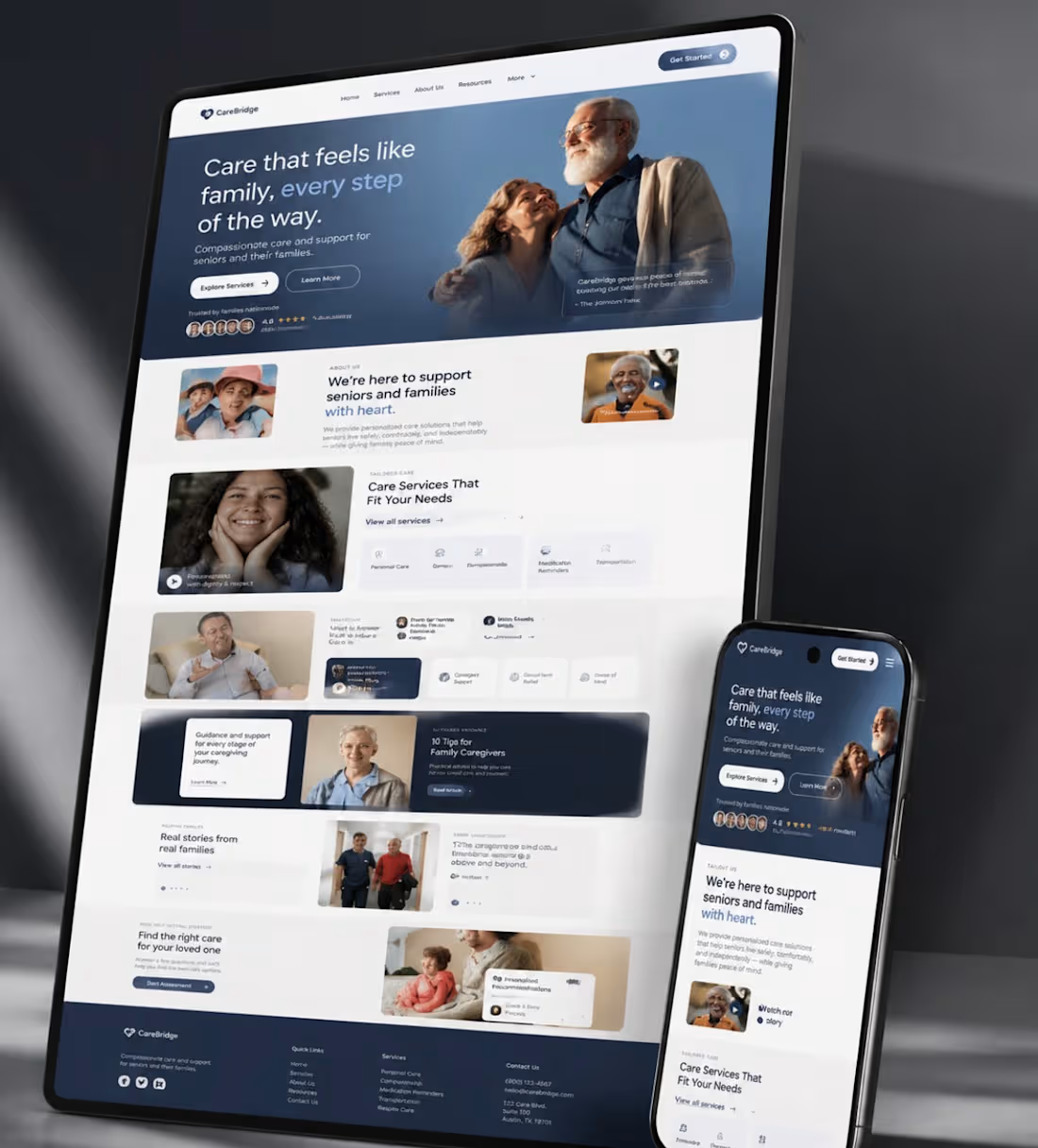
Designed a responsive healthcare platform that helps seniors and their families easily discover, compare, and access professional care services. The experience is built to inspire trust through intuitive navigation, clear information architecture, caregiver resources, testimonials, and seamless calls to action making it simple for families to find the right support when they need it most.
#ProductDesign #UIDesign #UXDesign #HealthcareDesign #WebDesign #ResponsiveDesign #Figma #DesignSystems #UserExperience #LandingPage #Healthcare
0
115
Founders,
Here's a product test.
Open your landing page for 5 seconds.
Close it.
Now ask someone what your product does.
If they hesitate, you don't have a design problem.
You have a clarity problem.
Users don't abandon confusing products because they're impatient.
They abandon them because another product makes understanding effortless.
The best product design doesn't impress users.
It removes the need to think.
0
160
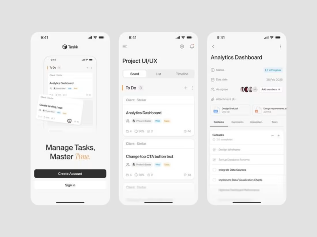
Founders often think they have a growth problem.
Most actually have a clarity problem.
If users don’t immediately understand:
• What your product does
• Why it matters
• Why they should trust you
They leave.
No amount of paid ads, SEO, or AI automation can fix a confusing product experience.
Great products aren’t just built.
They’re understood.
Design isn’t about making things look good.
It’s about reducing friction, communicating value, and helping users make confident decisions faster.
Every unnecessary click, every confusing screen, and every unclear message is a hidden cost to your business.
The best founders obsess over simplicity because simplicity scales.
Build products people don’t have to figure out.
0
161
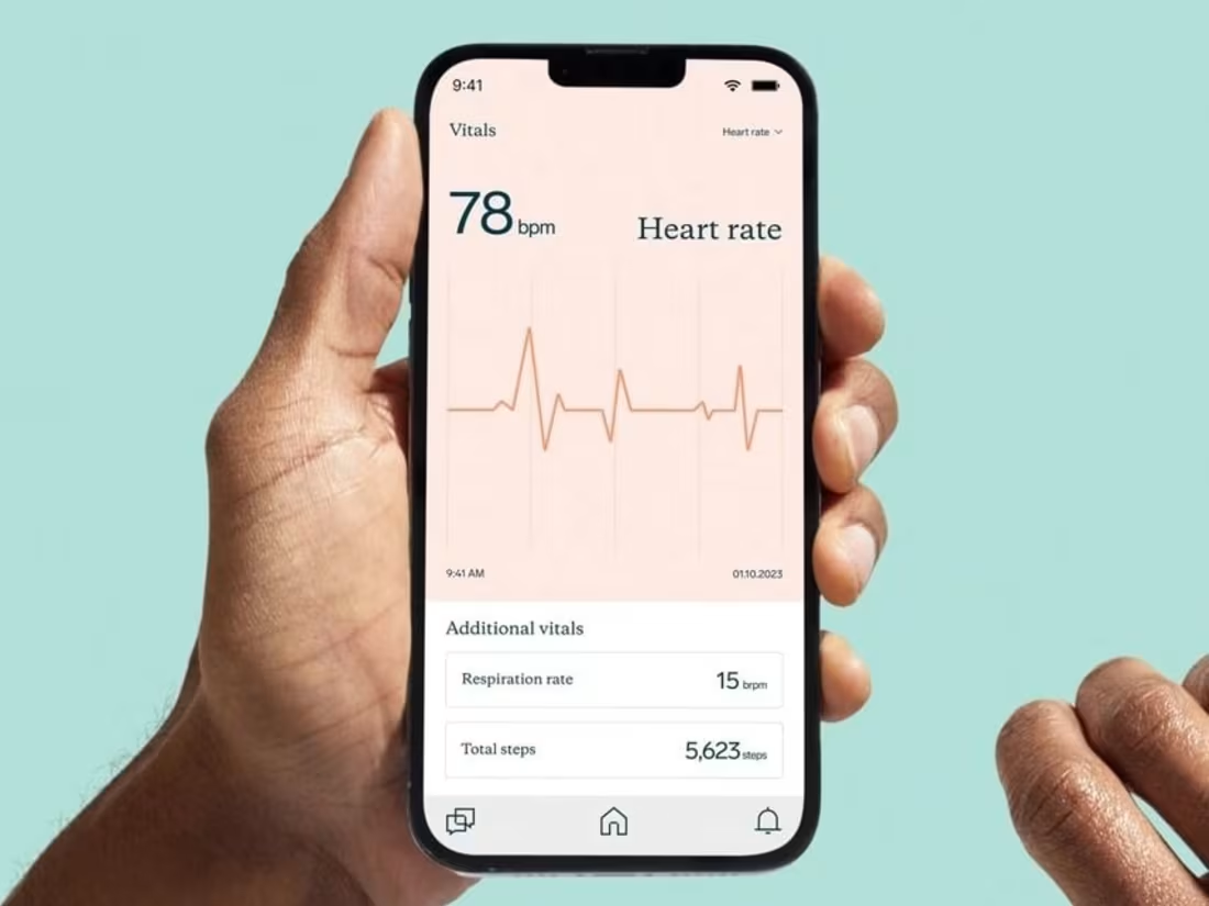
A single pixel can cost you thousands in revenue.
It's about the subtle friction hiding in plain sight.
The navigation that makes users think twice, the button that doesn't feel clickable, the form that overwhelms before they even start.
I've seen startups lose 40% of their conversions because their primary CTA blended into the background.
Others hemorrhage users at checkout because the path felt uncertain.
The brain processes visual information in milliseconds.
If users have to decode your interface, they're already gone.
Every extra click is a chance to lose them.
Every moment of confusion is revenue walking away.
The magic happens in the details:
🎯 Navigation that guides, not confuses
🔥 CTAs that scream "click me" without saying a word
🧠 Layouts that reduce cognitive load, not increase it
4
283