
Kateryna Zahorulko
UX/UI Designer | AI-Integrated Workflows | SaaS & E-comm Pro


Konto — Personal finance planner, web dashboard and mobile app
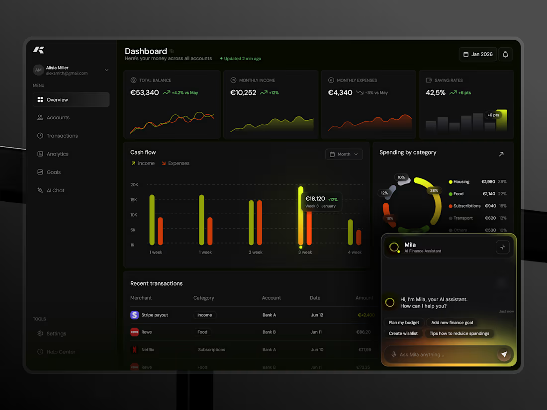
Konto is a personal finance planner concept I designed for both desktop and mobile, sharing one data model and one visual language.
Web dashboard: four KPI cards (balance, income, expenses, saving rate) with mini-charts, a weekly cash-flow chart with income and expenses side by side, spending by category as a segmented ring with a legend, and a recent-transactions table. The AI assistant lives in a docked panel bottom-right.
Mobile: the dashboard leads with total balance and a 30-day trend, then cash flow, saving rate and categories in one scroll. Analytics gets its own tabbed view. A floating action button opens the assistant from anywhere.
The visual system is dark by default with two signal colours: lime for income and growth, orange for spending. Glows are used only on the active data point, so highlights mean something. Numbers use the same layout and spacing on both platforms, so switching devices doesn't require re-learning the app.
5
10
534
Konto — Designing an AI finance assistant that plans 🙌
Budgeting apps are great at showing you what already happened. I wanted to explore what changes when the AI is the planner.
Mila is the assistant inside Konto, a personal finance concept I designed end-to-end. At the close of a month she reviews the result, connects it to your savings goal, and proposes the next month as three options — built around your calendar, a repeat of last month, or a harder-save version that reaches the goal sooner. You pick one, and the budget is set. No spreadsheets, no manual category editing.
Design decisions that mattered here:
- The assistant leads with an outcome ("you were €1,240 under plan, all of it went to your goal") before any chart.
- Choices are shown as radio cards with a one-line consequence each, so the decision is fast and reversible.
- Chat history is organised as finance threads (budget review, tax plan, portfolio), so past conversations become a record you can return to.
The AI is a persistent side panel, not a separate screen — it sits next to the data it talks about.
1
145
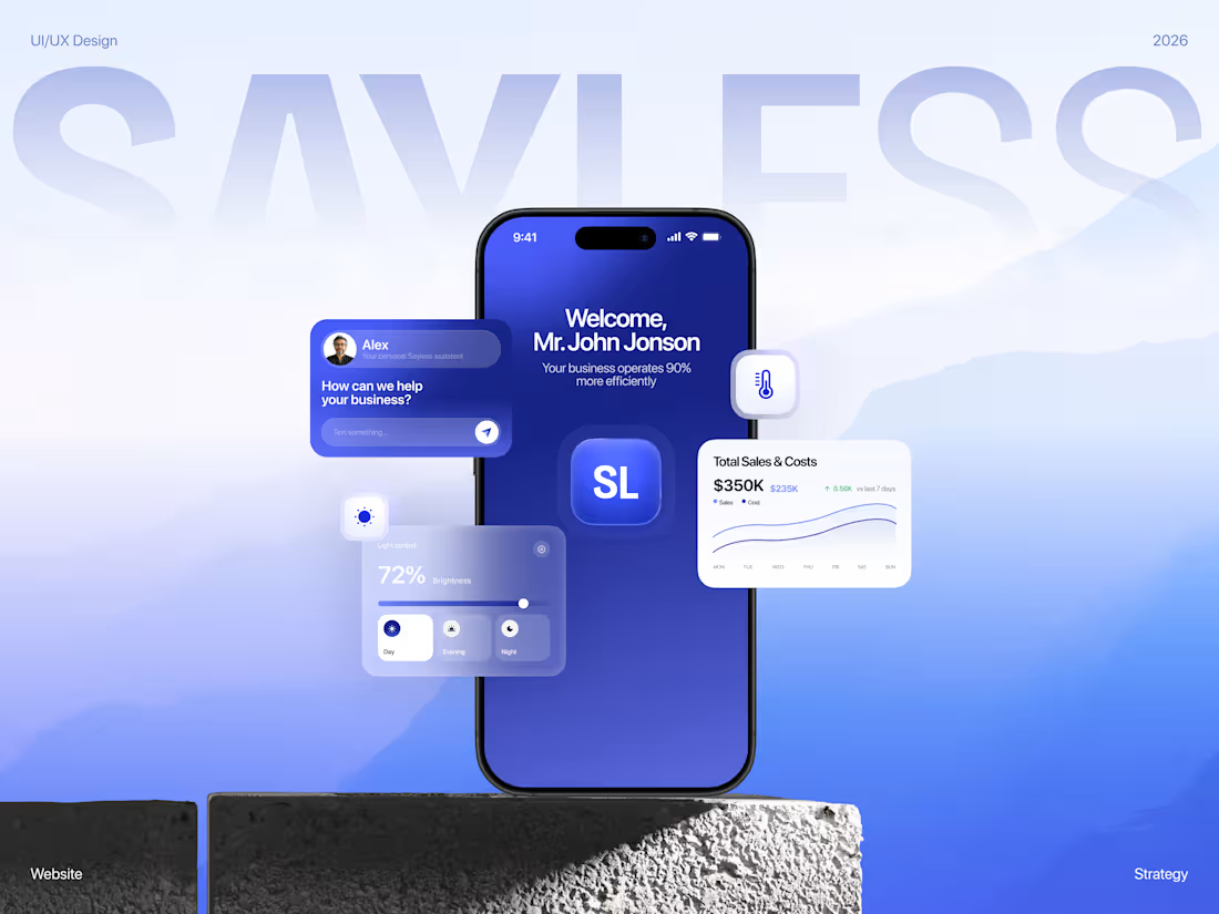
SAYLESS — website for an AI automation company
Full Behance case here (https://www.behance.net/gallery/254233465/SAYLESS-Website-for-an-AI-Automation-Company) 💙
Here's the thing about selling AI automation: nobody actually wants "workflow orchestration." People want fewer hours in the week and a smaller bill at the end of the month.
That's what made this one fun. Everyone in this space promises efficiency, and almost nobody shows what that means in money. So I built the whole site around making the value obvious before you even understand how the product works.
A few bits I'm happy with:
The cost calculator sits right on the page. No "contact us for a quote." You pick your own scope and the estimate moves as you go. Everyone in this category hides pricing, so just… showing it says a lot. Nice side effect — the wrong-fit leads filter themselves out before anyone gets on a call.
Before/after charts do the talking. Your current process next to the automated one. The gap between the two bars is basically the whole pitch, which means the copy gets to relax a bit.
Savings shown per month, not as a percentage. A percentage is trivia. A monthly number is money you're already spending on nothing.
Deep premium blue with warm, editorial photography. Every AI company reaches for the same cold neon gradients, so I went the other way. It ends up feeling like a premium consultancy rather than a dev tool — closer to whoever's actually approving the budget.
Design & UI/UX by me. Happy to walk anyone through the thinking.
49
94
2.9K
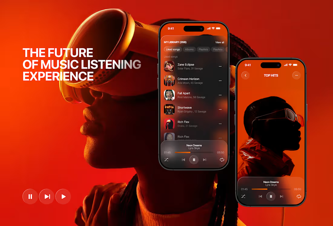
Music streaming platform concept 🎧
Music has always been emotional. The interface around it should be too.
This is a concept for a music streaming platform built around one idea — immersion. Not just in the music, but in the visual experience of discovering and listening to it.
The warm palette of deep reds, burnt oranges, and dark backgrounds wasn't accidental. It creates a mood. It makes you want to stay, scroll, and listen.
What I focused on:
→ A dashboard that surfaces the right content without overwhelming
→ A "now playing" experience that feels cinematic
→ Mobile screens that carry the same visual weight as desktop
→ Typography and hierarchy that guide without interrupting the vibe
This is a concept — but built on real UX logic. Because even imaginary products deserve thoughtful design. 🎧🖤
#MusicApp #UIDesign #ProductDesign #DarkUI #AppDesign #UXDesign #MobileDesign
50
119
2.8K