
Karmaine Tan
Marketing intern and graphic designer
New to Contra
Karmaine is building their profile!
Designed a social content concept for Komohaus’ Yin Reformer Pilates, using minimalist editorial layouts and East Asian ink-inspired visuals to reflect balance, stillness, and mindful movement.
1
53
Made a debut brand video for Aeroes, a shoe brand that I created.
Aero-flux technology, aeration and aerosoles (air cushioning) are incorporated into Aeroes shoes' aerodynamic design, to improve postural structure and body balance, maximising athletic performance and physical flow.
Subcategories: Performance, Lifestyle, Wellness, Futuristic/Experimental
LinkedIn: https://www.linkedin.com/feed/update/urn:li:activity:7444759074119770112/
8
523
The Buddha Box - for when you're feeling lost, so you can get lost in a moment.
Ever had a spare moment but spent more time thinking about what you should do than doing it? The Buddha Box is a simple tool designed to create a sense of calm in those moments of uncertainty.
You can add activities ahead of time, and when you have some time to yourself - the Box randomly selects one - no overthinking, no fretting, no indecisiveness.
The experience is intentionally minimal, with warm tones and gold accents set against a dark interface to evoke a sense of stillness and quiet focus.
Rather than optimising for productivity, the Buddha Box is designed to support presence - because being in the moment is what matters.
You can access it here (customise your own activity lists!): https://omma.build/p/quick-decision-to-do-box-ti5ia5
Linkedin: https://www.linkedin.com/feed/update/urn:li:activity:7444424624026574850/
2
19
1K
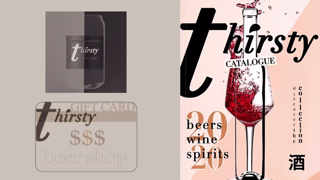
Re-imagined a beer shop. The Thirsty profile: using layout and typography to convey a premium feel. Kept the logo minimal and used neutral colours with muted accents.
0
351
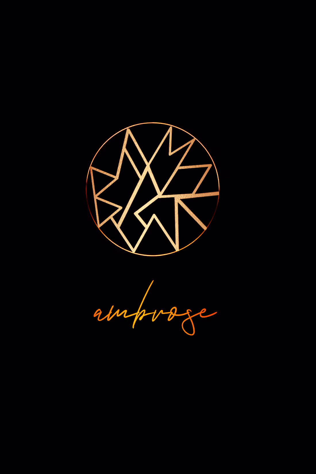
For a concept restaurant & bar Ambrose, inspired by the idea of indulgence as ritual:
Encased within a circular form, the logo draws inspiration from natural fragmentation — like veins in leaves or cracks in gold leaf.
The internal lines echo organic patterns, reinterpreted through a geometric lens. This creates a dialogue between nature and refinement, reinforcing Ambrose’s identity as a place where raw elements are elevated into something precious.
The visual identity draws from the notion of ambrosia — food of the gods — expressed through a palette of black and gold. Organic gold textures evoke richness and abundance, while geometric forms introduce structure and modernity, combining tactile materials, expressive typography, and symbolic elements to create a dining experience that feels both elevated and immersive.
0
566
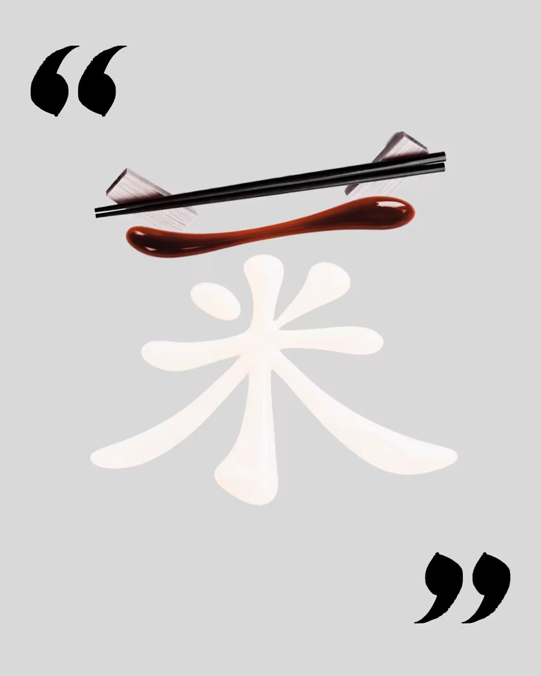
A personal exploration into imagery and stylisation. A deconstruction of the Chinese character “菜” (dish), with its core radical “米” (rice) brought into focus.
This piece explores food as language — isolating the foundational element of a meal and reinterpreting it through sauce-based calligraphy. A bold red stroke references the top radical, while a translucent white sauce forms “米”, symbolising rice as the heart of every dish.
This visual decodes the Chinese character “菜”, isolating “米” — rice — as its foundation. Rendered in sauce, the character becomes both ingredient and meaning, where language dissolves into texture.
By enclosing the composition in quotation marks, the character is lifted out of language and into focus — translated not as text, but as an idea to be deciphered, plated, and reimagined.
1
582
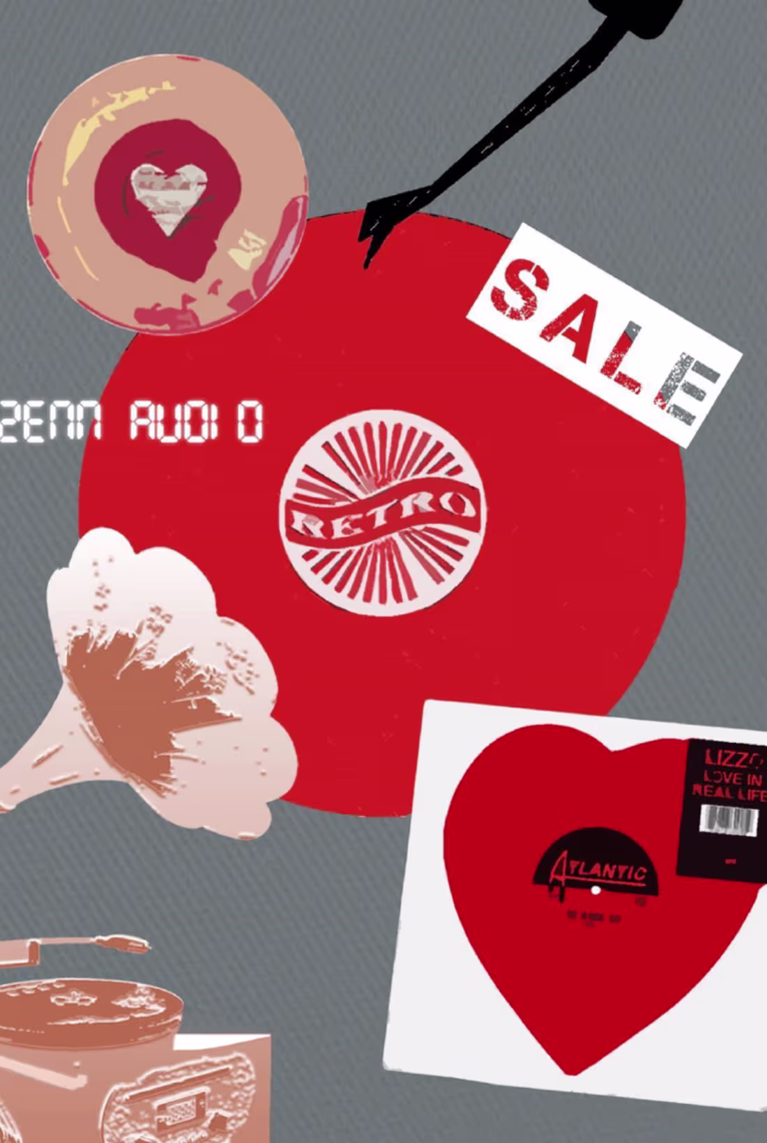
A couplet of social media visuals created for a vinyl and audio electronics store, translating the tactile, nostalgic experience of music into contemporary digital content.
Drawing from the visual language of records—labels, sleeves, textures, and ephemera—the designs explore two contrasting approaches: layered collage compositions that echo the richness of music culture, and more minimal layouts that highlight form, rhythm, and negative space.
Graphic elements such as looping audio cables, retro typography, and record motifs are used to evoke the physicality of sound, while maintaining clarity and impact within a social media context. The result is a flexible visual system that balances nostalgia with modern sensibility, designed to engage both collectors and new listeners.
2
592
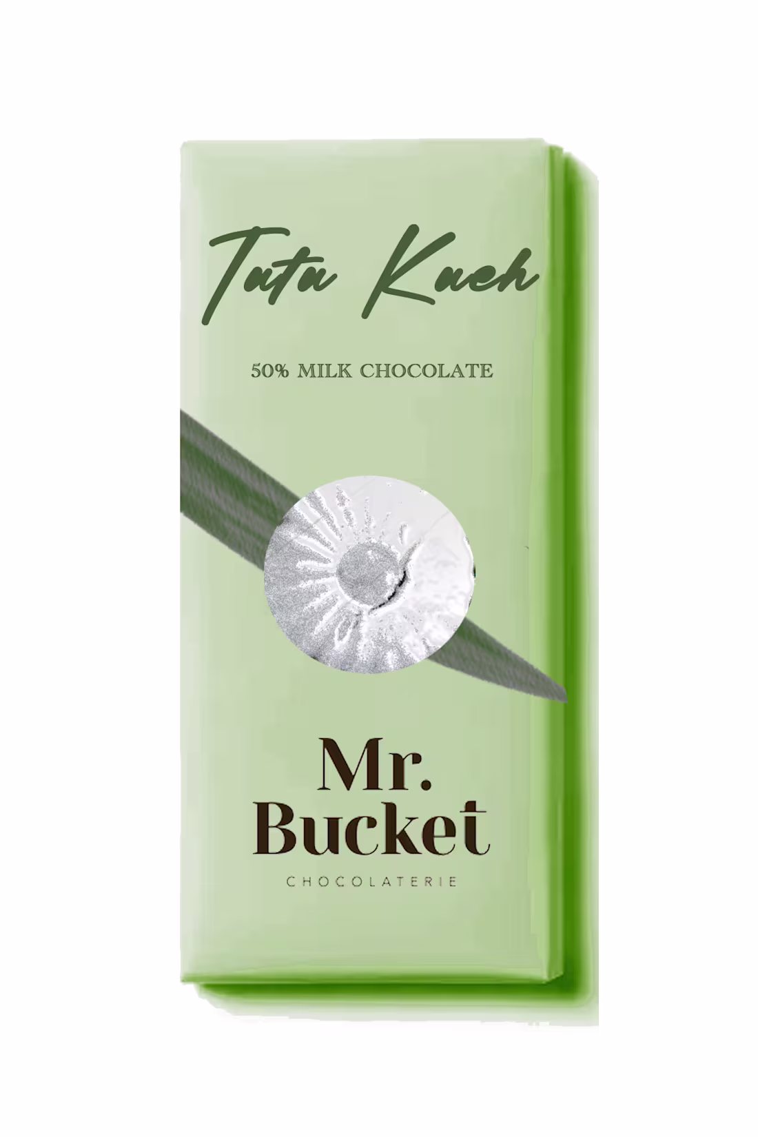
A contemporary reinterpretation of a traditional Southeast Asian dessert, this chocolate bar translates the soft, nostalgic experience of tutu kueh into a refined indulgence. Tutu kueh is small, steamed rice cake, typically shaped like a flower and filled with sweet coconut or ground peanuts.
The packaging draws from the dessert’s iconic moulds—reimagined as a repeating floral system for the inner wrap. A diagonal ribbon motif subtly references the pandan leaf on which tutu kueh is traditionally served, anchoring the design in cultural memory through abstraction. A foil stamp of tutu kueh serves as a seal to the chocolate bar.
By shifting tutu kueh from a momentary street snack into a crafted chocolate format, the design explores how heritage flavours can be preserved, elevated, and reintroduced to a new generation of consumers.
1
646
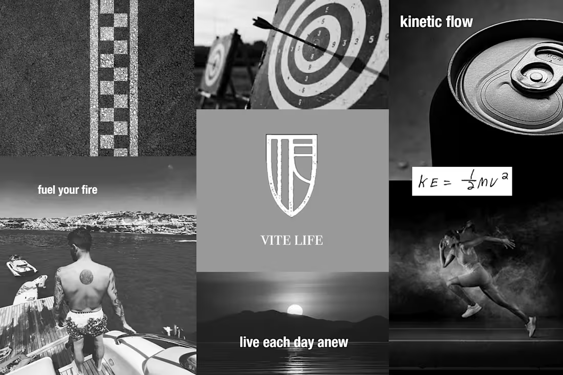
The Vite energy drink provides a natural boost of energy to power through your day. Vite's brand identity is clean, minimalist and functional. The brand world of Vite is a new kind of energy — where precision performance meets natural vitality. Designed for those who move with intent, Vite combines the endurance power of maca root with the clean focus of green tea extract, delivering sustained energy without compromise. Backed by real fruit and essential vitamins, it fuels both motion and clarity — a daily shield for those who live with purpose.
0
444
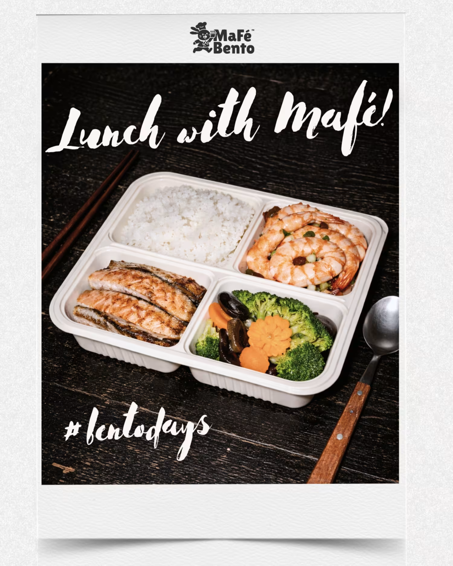
Reel for Mafé Bento:
This project plays on the tension between screen and reality — where food feels so close, it’s almost tangible. By placing smartphone frames as bento set containers, the reel transforms an everyday experience (seeing food online) into something sensory and immediate.
The goal was to create a moment of craving activation — where viewers don’t just see the food, but feel compelled to reach for it. Mafé Bento delivery is so close, it's almost already right there.
A blend of clean visuals, appetising food styling, and minimal copy drives the idea that great food isn’t coming soon — it’s just within reach.
0
586