
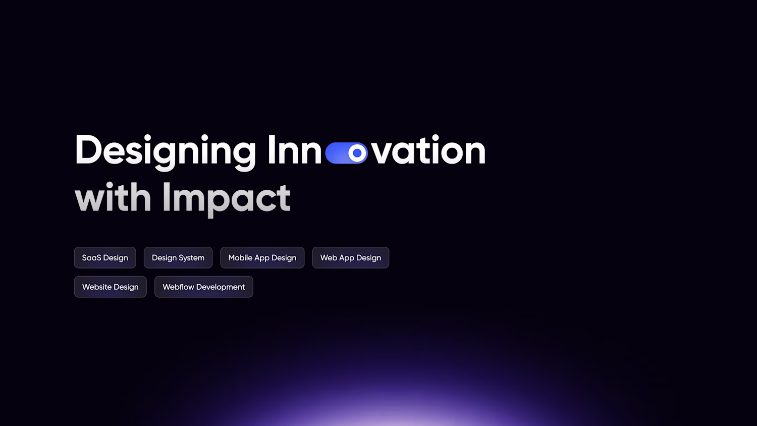
Jubed Ahmed
Passionate Product Designer
Ready for work
Jubed is ready for their next project!
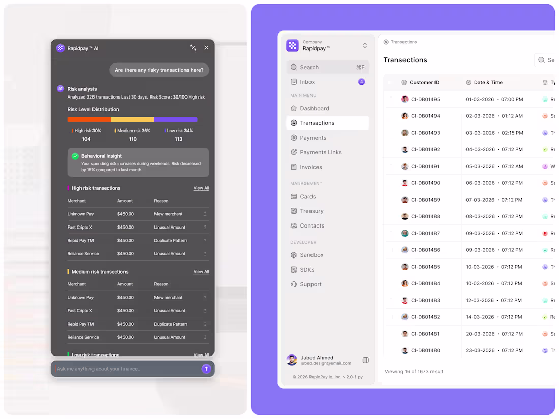
AI Fintech Dashboard Design - Transaction Monitoring & Risk Analysis
A next-generation AI-powered fintech dashboard designed for transaction monitoring, fraud detection, and financial risk analysis.
The experience combines clean data visualization with an intelligent AI assistant that helps users identify suspicious activities, analyze behavioral patterns, and surface real-time financial insights.
✨ Features:
• AI Risk Analysis Assistant
• Transaction Monitoring
• Fraud Detection
• Risk Distribution Charts
• Behavioral Insights
• Smart Alert System
• Modern SaaS Dashboard UI
Designed with a clean visual hierarchy, minimal interface, and scalable design system to make complex financial data easier to understand and navigate.
1
50
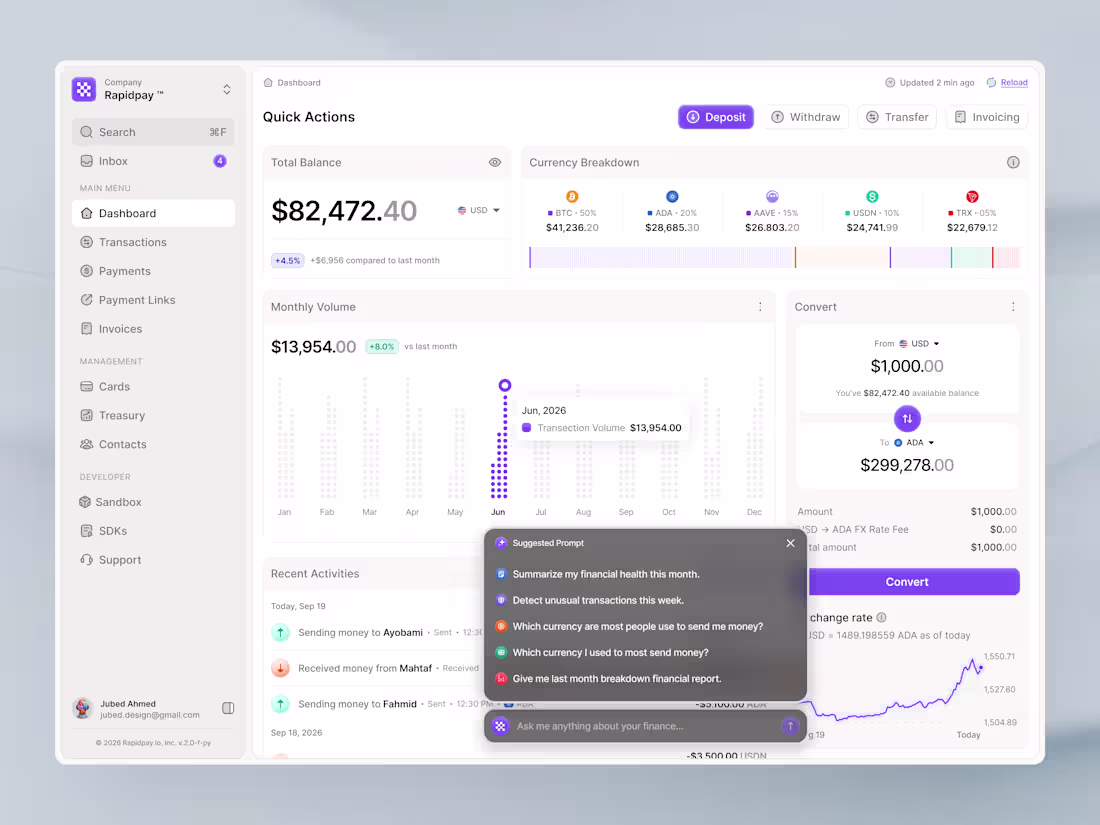
AI-Powered Crypto Finance Dashboard UI (Fintech SaaS) 🚀
Designed a clean and modern crypto finance dashboard focused on usability and real-time financial insights. This interface allows users to manage balances, analyze transaction data, and convert currencies seamlessly.
A key feature is the integrated AI assistant, helping users quickly access insights like financial summaries, unusual activity detection, and spending patterns.
The goal was to create a scalable and intuitive fintech experience suitable for modern SaaS platforms.
Focus: UX clarity, data visualization, AI interaction
1
5
181
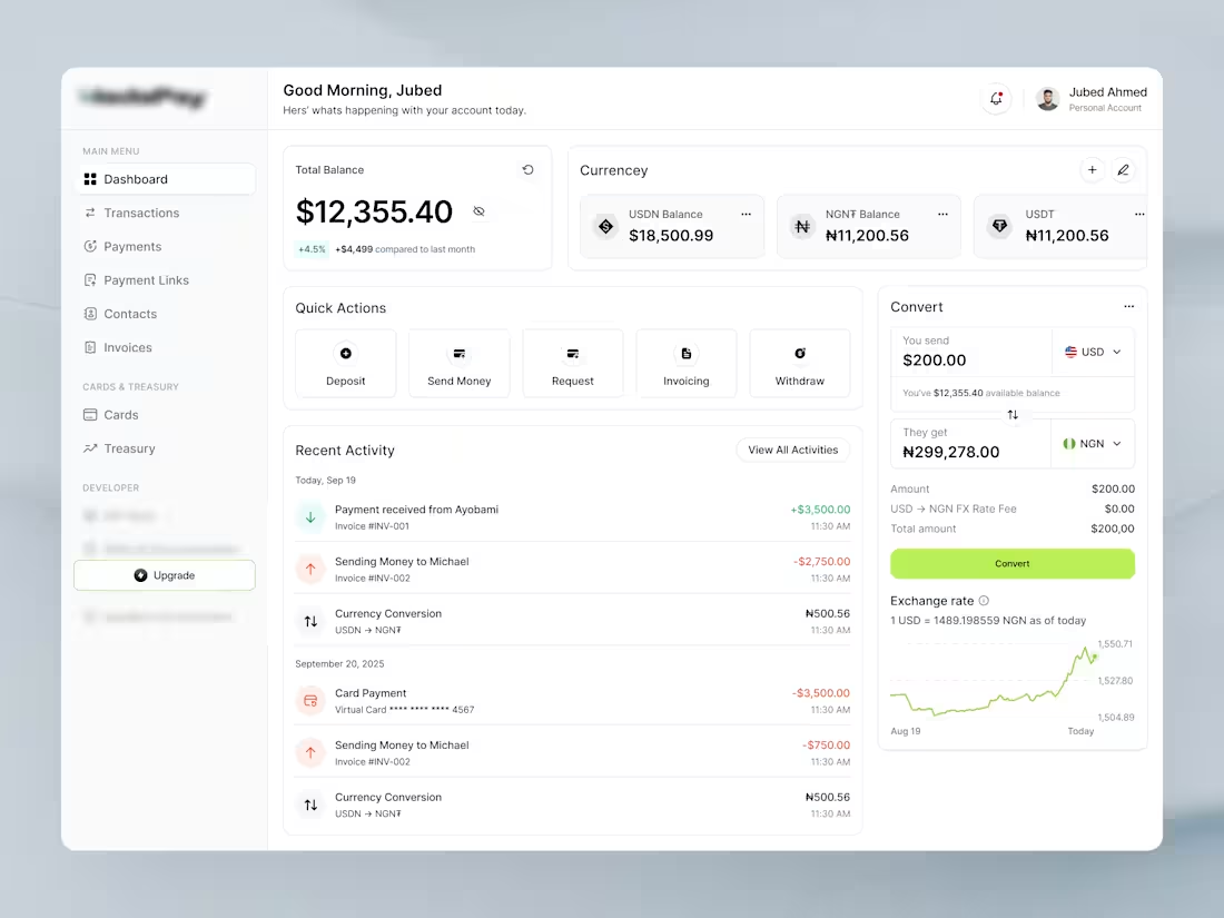
Fintech Wallet Dashboard — Real-Time FX & Transfers
0
109
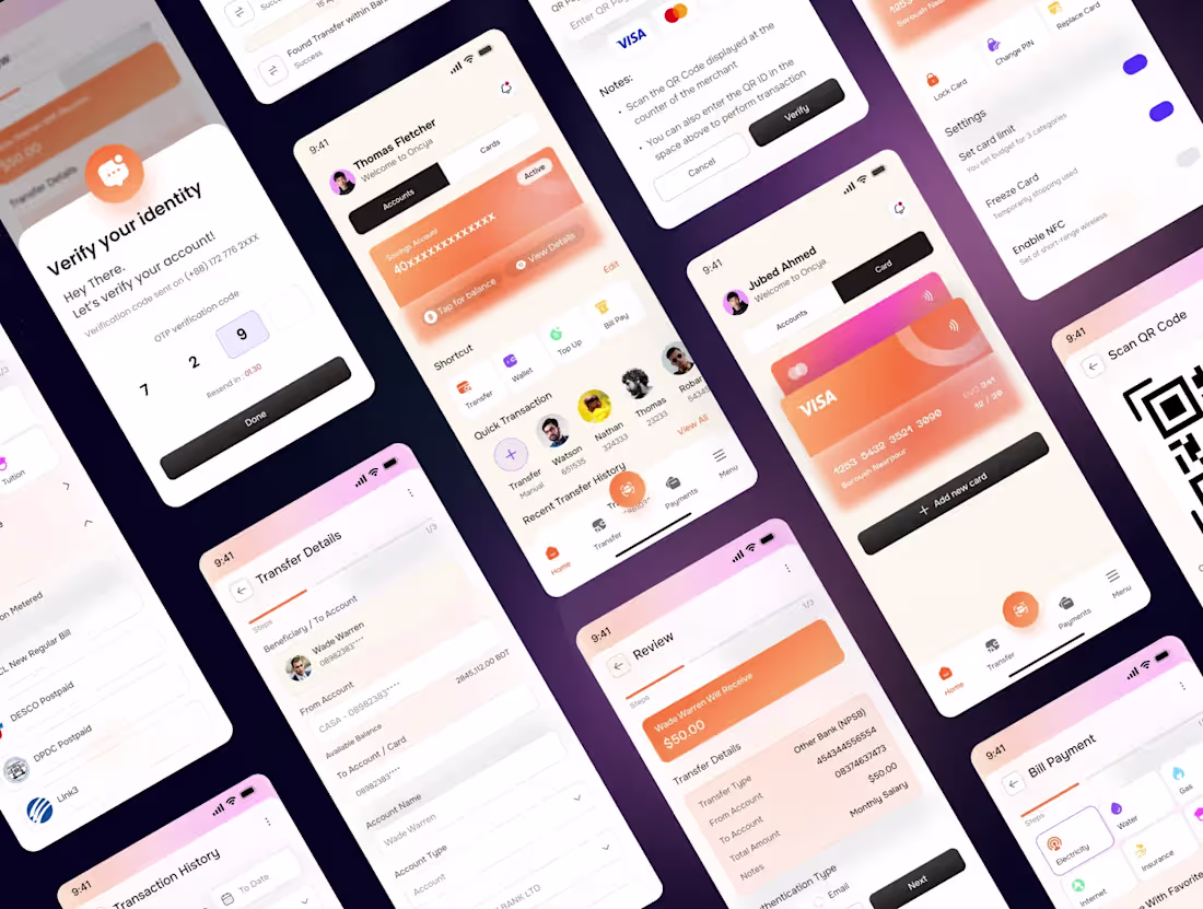
Designing a banking experience that feels simple, not stressful.
→ Clean onboarding & OTP verification
→ Smart dashboard with quick actions
→ Seamless money transfers & bill payments
→ Card control with real-time settings
→ Minimal UI, maximum clarity
Every interaction is designed to reduce friction and build trust.
Because finance apps shouldn’t feel complicated, they should just work.
1
91
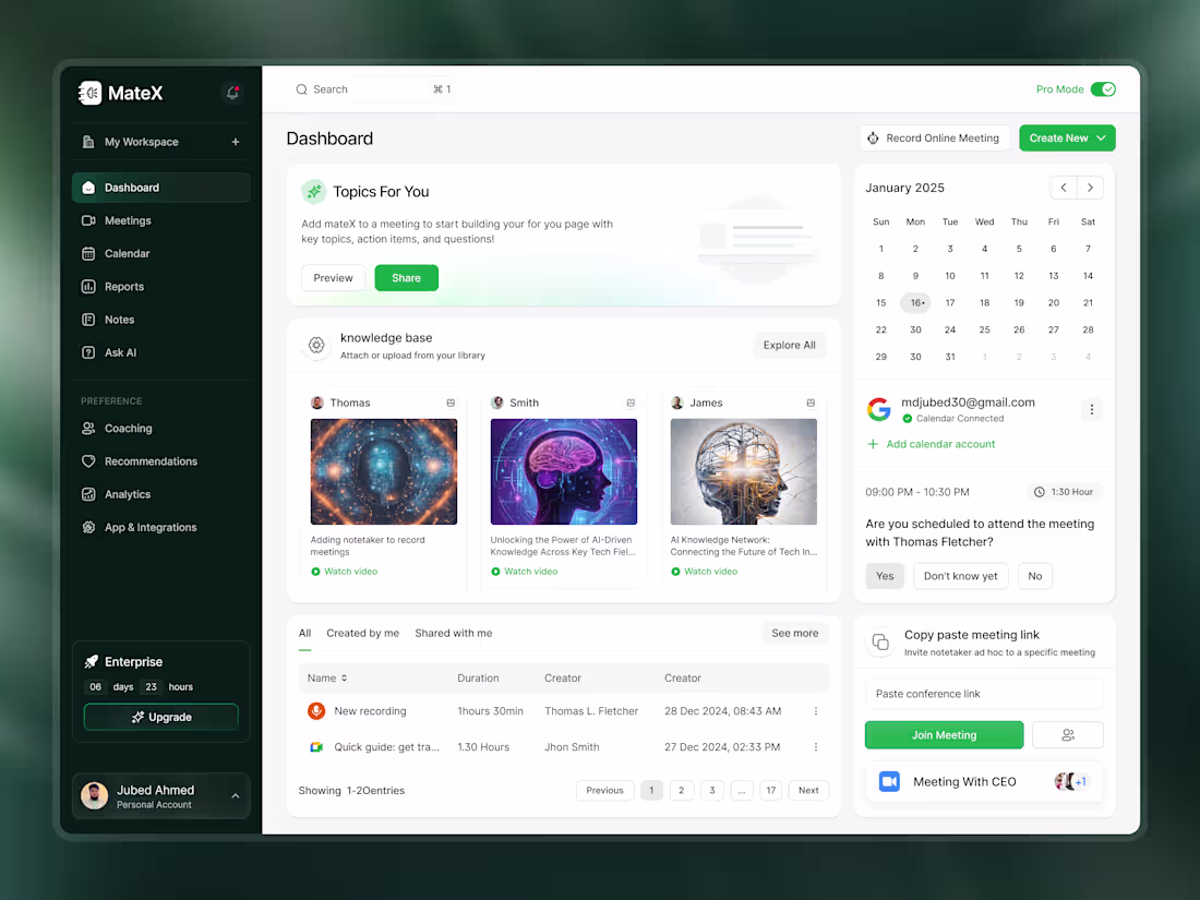
MateX - AI Meeting Assistance Dashboard
0
97
Designing clarity in complexity 💳✨
Today I explored a clean fintech dashboard concept, where data doesn’t just exist, it communicates.
From balance visibility to transaction insights, every element is crafted to reduce cognitive load and guide decisions faster. Subtle gradients, soft shadows, and structured spacing help create a calm financial experience, not an overwhelming one.
The goal?
Make money management feel simple, intuitive, and almost effortless.
Good design isn’t decoration, it’s direction.
#UIUX #FintechDesign #DashboardDesign #ProductDesign #UXDesign #UIDesign #DesignSystem #SaaS #Figma
2
80
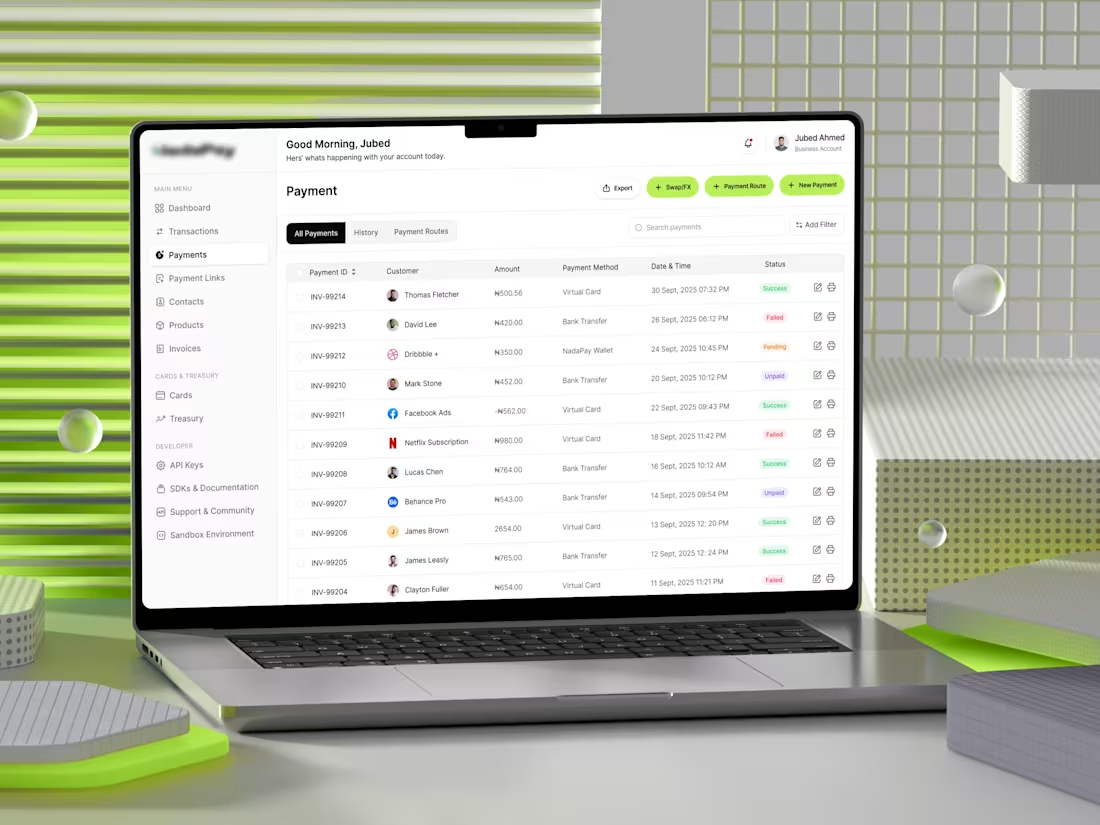
Enterprise Fintech Dashboard - Payments System UI
Most fintech dashboards fail at one thing:
they overwhelm instead of empower.For NadaPay, the goal was simple
make complex payment workflows feel effortless.
This design focuses on clarity at scale.
A structured data table, clear transaction states, and minimal visual noise help users instantly understand what’s happening and what needs attention.
Every detail serves a purpose:
• Smart filtering for faster navigation
• Clear success / pending / failed states
• Actionable controls without clutter
Instead of adding more features, the focus was on reducing friction.
Because in finance, speed and clarity aren’t just nice to have they’re critical.
0
92
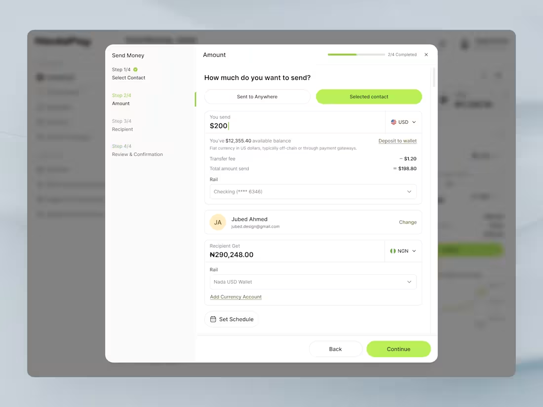
💸 Send Money Flow - Fintech Dashboard UI
Designing financial experiences isn’t just about transactions it’s about clarity, trust, and speed.
This send money flow focuses on:
🧭 Step-by-step guidance to reduce cognitive load
💵 Transparent fee breakdown for user confidence
🌍 Multi-currency handling with real-time clarity
⚡ Frictionless progression from input to confirmation
Every element is crafted to make sending money feel simple, secure, and intuitive exactly what modern fintech users expect.
0
72
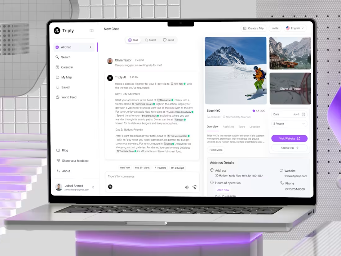
Designing a smarter way to plan trips ✈️
This concept explores an AI-powered travel planner dashboard where users can generate personalized itineraries through chat, discover destinations visually, and manage trips seamlessly all in one place.
The experience blends conversational AI + structured travel data, making trip planning faster, intuitive, and enjoyable. From itinerary generation to destination insights, every interaction is designed to feel effortless and intelligent.
Focused on:
• Clean SaaS layout with modern UI patterns
• AI chat-driven user experience
• Visual exploration with destination cards
• Smooth trip management flow
Built for the future of travel — where planning feels like a conversation.
2
105
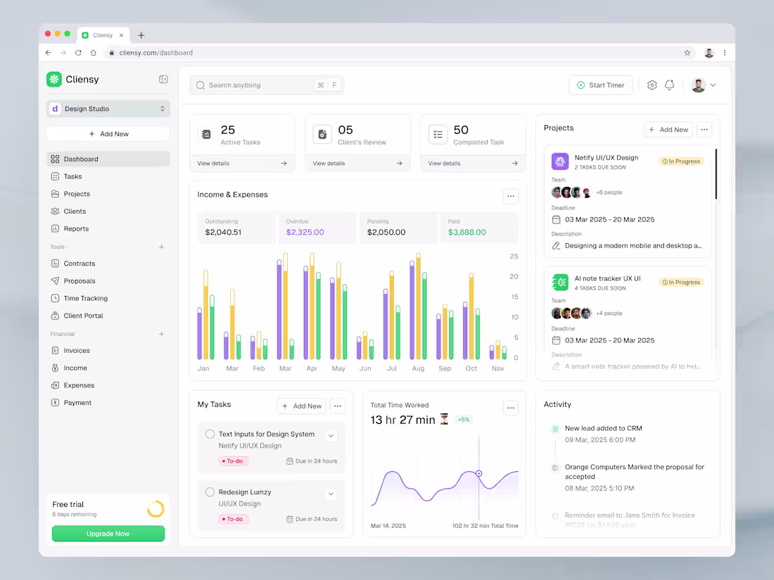
Cliensy – Modern Client & Project Management Dashboard UI
A clean and minimal SaaS dashboard crafted for client management, task tracking, and financial insights.
This UI focuses on clarity, data visualization, and smooth workflow—perfect for agencies, freelancers, and product teams.
Designed with a modern layout, soft color system, and structured components to ensure scalability and great user experience.
0
72
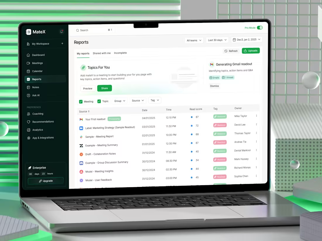
Designing a smarter way to read meetings.
With this MateX Reports Dashboard, the goal was simple: reduce noise and highlight what actually matters after every meeting. Instead of digging through long transcripts, users get structured insights, topics, summaries, read scores, and ownership, all in one place.
Key focus areas:
• Scannable data over dense content
• Clear hierarchy for faster decision-making
• Smart tagging + filtering for workflow efficiency
• Read score to quickly evaluate report quality
AI shouldn’t just generate data, it should organize thinking.
4
2
68
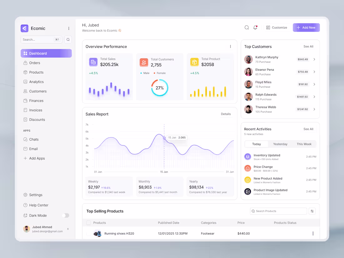
🚀 Designing a High-Impact SaaS Dashboard UI
A great SaaS dashboard isn’t just about visuals it’s about clarity, speed, and decision-making.
When I design dashboards, I focus on simplifying complex data into intuitive, actionable interfaces. Every element from charts to navigation is crafted to reduce cognitive load and enhance user flow.
✨ Key focus areas:
• Clean and scalable layout
• Data-first design approach
• Consistent design system
• Smooth user experience
The goal? Help users understand more, faster with less effort.
Good design doesn’t just look good, it performs.
2
128
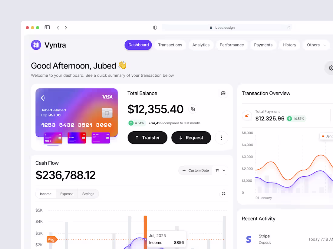
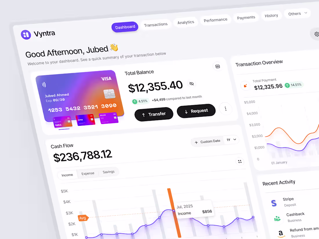
Vyntra - Finance Dashboard UI
0
67
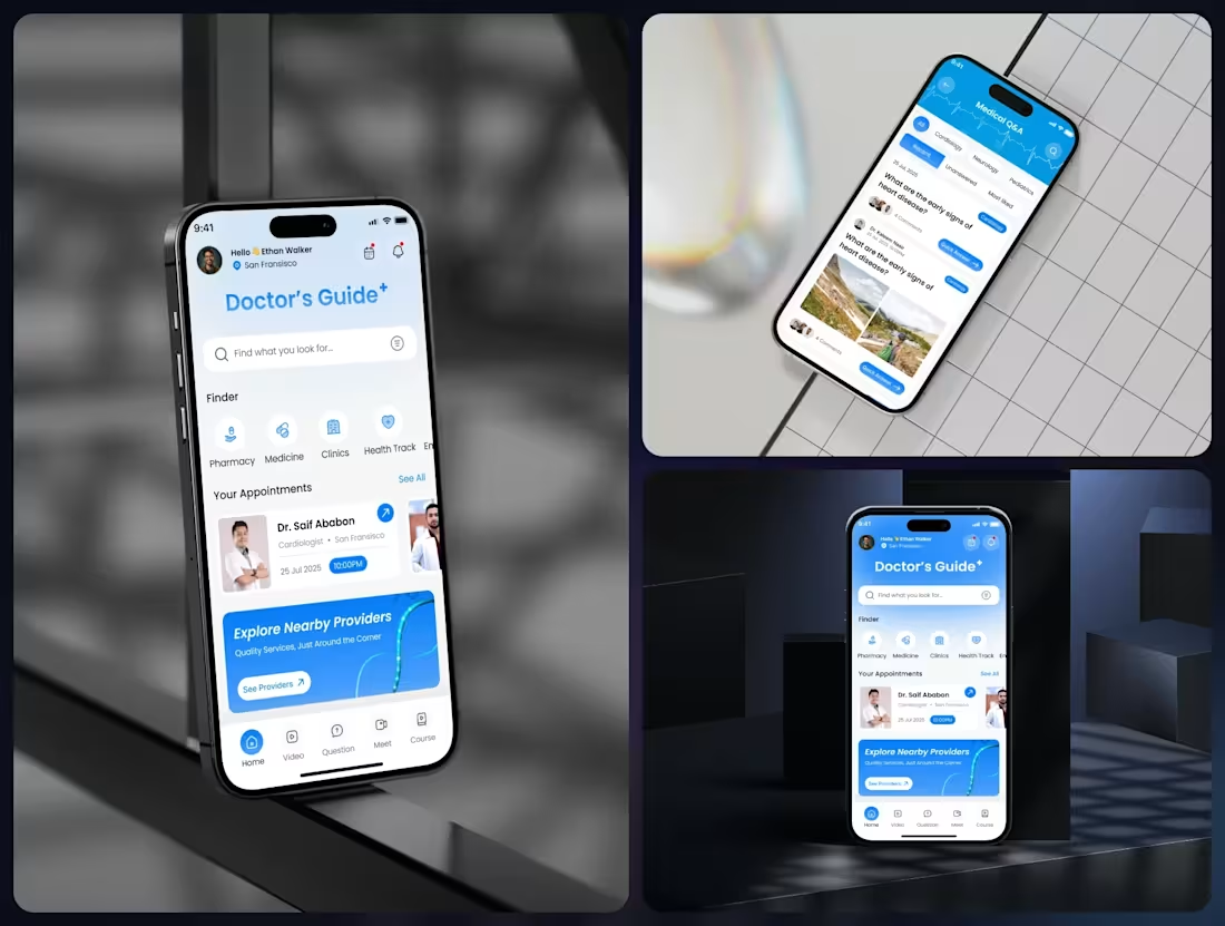
Designing healthcare, but making it feel human.
This concept for Doctor’s Guide+ focuses on clarity, speed, and trust three things every medical experience should deliver without friction.
→ Smart search to find what you need instantly
→ Clean appointment tracking with real-time updates
→ Quick access to pharmacies, clinics, and health tools
→ Friendly UI that reduces stress, not adds to it
The goal isn’t just functionality, it’s confidence.
Because when it comes to health, users shouldn’t have to think twice about where to tap next.
0
27