The network for creativity
Join 1.25M professional creatives like you
Connect with clients, get discovered, and run your business 100% commission-free
Creatives on Contra have earned over $150M and we are just getting started
Back to feedPost

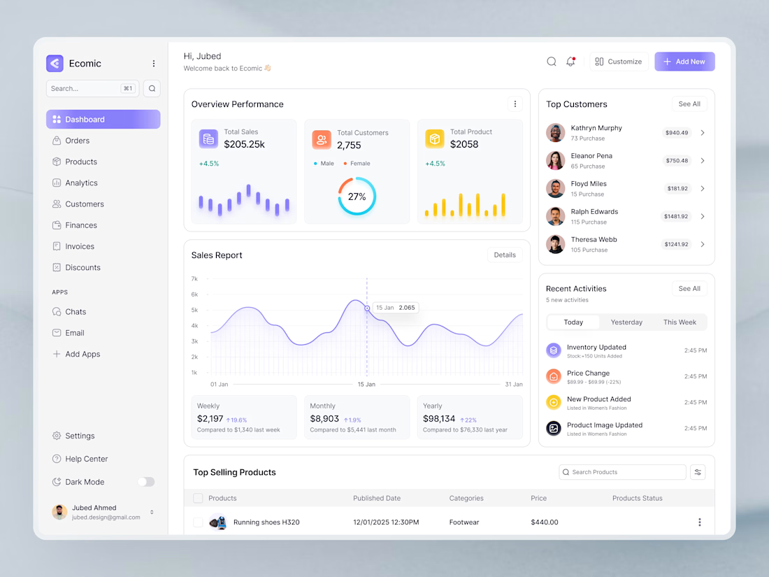
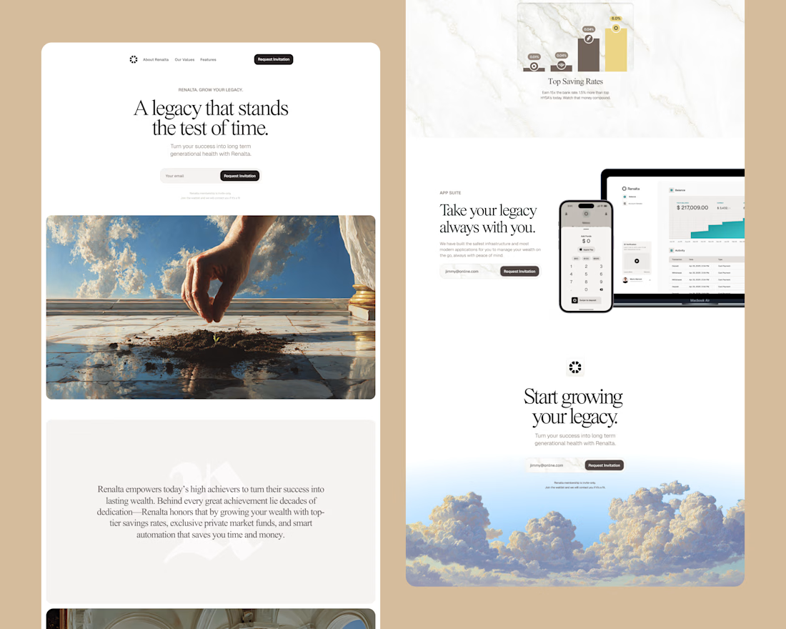
🚀 Designing a High-Impact SaaS Dashboard UI
A great SaaS dashboard isn’t just about visuals it’s about clarity, speed, and decision-making.
When I design dashboards, I focus on simplifying complex data into intuitive, actionable interfaces. Every element from charts to navigation is crafted to reduce cognitive load and enhance user flow.
✨ Key focus areas:
• Clean and scalable layout
• Data-first design approach
• Consistent design system
• Smooth user experience
The goal? Help users understand more, faster with less effort.
Good design doesn’t just look good, it performs.


The network for creativity
Join 1.25M professional creatives like you
Connect with clients, get discovered, and run your business 100% commission-free
Creatives on Contra have earned over $150M and we are just getting started
Related posts


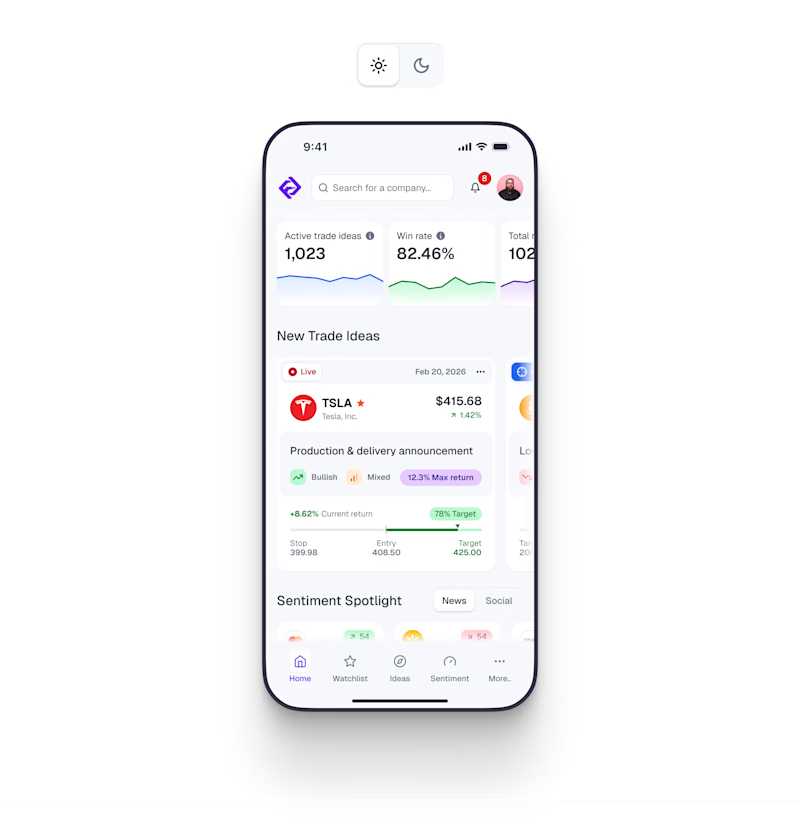
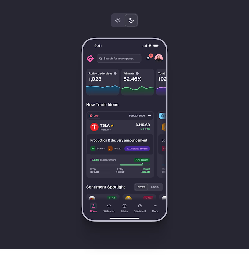
☀️ Light or 🌘 Dark? Pick a side!
Design tokens fine-tuned for both in the updated Edge Hound [.com]
Because in 2026, if your product doesn't support dark mode, what are you even doing? 😅
More updates coming soon. 🤘
86 voted
59%
61 voted
41%
147 votes
Closed

Both for me. Good work


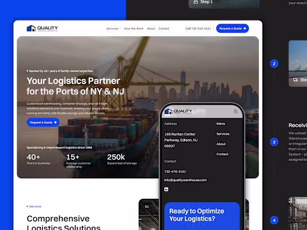
Case Study | Quality Warehouse & Distribution
Quality Warehouse & Distribution is a logistics company operating across the NY/NJ ports, with over 40 years of experience in warehousing, drayage, and rail freight.
We redesigned their brand and website to reflect that level of expertise and scale. The focus was on creating a structured, credible experience that clearly communicates their services and builds trust from the first interaction.
The result is a more modern, reliable digital presence aligned with the reality of their operations.


Amazing Work!

Throwback to the legacy designs! Love how the website looks, and forever sad it was never put online.


This design is evergreen!!


Trending


Notion
Notion isn’t just where you work, it’s starting to work for you. What agents are you building?
portfolioreview
The best portfolios tell a story, not just show a grid. Share yours for feedback.
brandguidelines
Brand guidelines are becoming living systems, not static documents. What are you building for your clients?
aivideo
AI video tools are moving at warp speed. Which ones are you experimenting with?
freelancerlife
Freelancer life is wins, pivots, and everything in between. What’s yours right now?