The network for creativity
Join 1.25M professional creatives like you
Connect with clients, get discovered, and run your business 100% commission-free
Creatives on Contra have earned over $150M and we are just getting started
Back to feedPost
Taste Test


☀️ Light or 🌘 Dark? Pick a side!
Design tokens fine-tuned for both in the updated Edge Hound [.com]
Because in 2026, if your product doesn't support dark mode, what are you even doing? 😅
More updates coming soon. 🤘

86 voted
59%
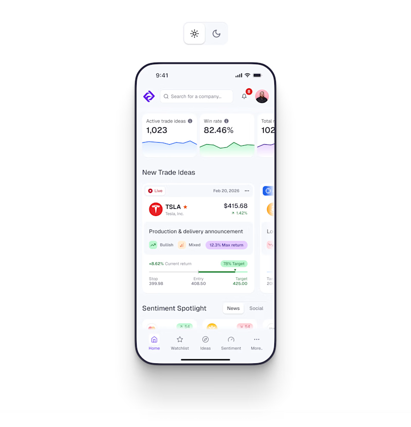
61 voted
41%
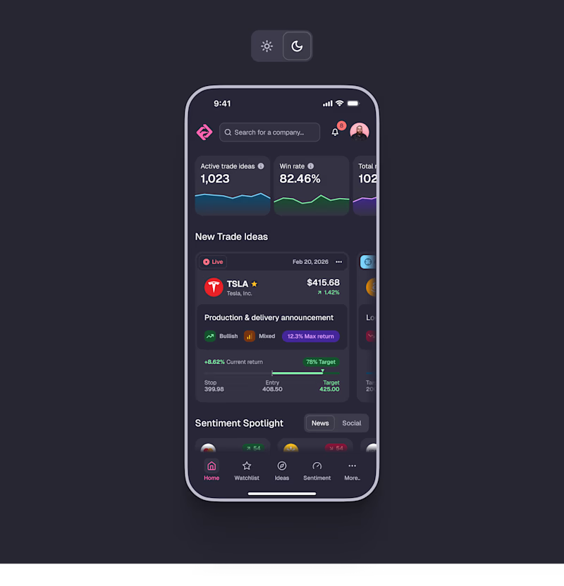
147 votes
Closed

Light Mode


Perfect mode execution!

Dark mode

absolutely light mode. It's looking good

I have to say, I'm always partial to white space, but the dark mode is growing on me. I feel like the screen could pop even more if the screen remaining white and the background went to dark mode.

I love your use of colors. Very clear indication of purpose and values.

Avoid dark blue navy in dark UI patterns its feels like an AI generated

Light 💯


Same here ☀️

Light mode looks cleaner.

Both are good and can be undoubtedly be used interchangeable but the dark is better.

dark mode:💯

Amazing Work

Both for me. Good work
Thank you!

Nice color balance

I like dark mode. Nice design.

Dark mode

Light mode for me!

Light mode ftw

Availability of both makes it available for wider audience. IMHO


Dark is absolutely amazing

Honestly both look good..

Always a fan of dark

Dark Mode!!!
I'm kinda surprised by the results.. usually the dark mode is the winner, but this one is different for some reason.
Thanks everybody for the feedback!

Wow nice work


Good work

I will go with light mode
The network for creativity
Join 1.25M professional creatives like you
Connect with clients, get discovered, and run your business 100% commission-free
Creatives on Contra have earned over $150M and we are just getting started





Related posts

Light or dark, which one wins? ☀️🌙
Same site, two moods. Warm stone and lacquer red, or the same build after dark.
Both are hand-built with a 3D paper crumple, real physics, a stick-figure film drawn in code, and a receipt that gets a bicycle kick. 🔊 Sound on.
Tell me which you'd ship: light or dark? 👇
26 voted
59%
18 voted
41%
44 votes
Closed

I really like how the light version looks, but it has some legibility issues. Since readability is more important for users than visual appeal, I think the dark version is the better option.
BTW, I initially voted for the light version, but after analyzing both options more closely, I changed my mind 😄

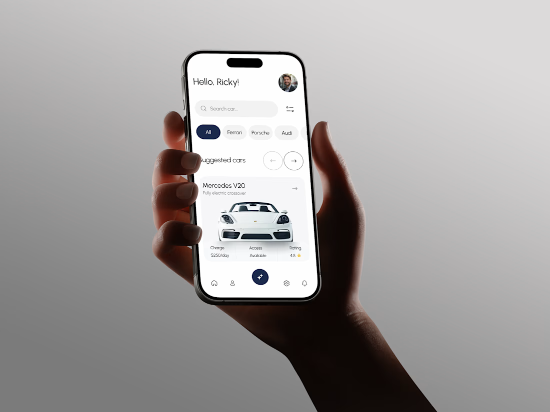
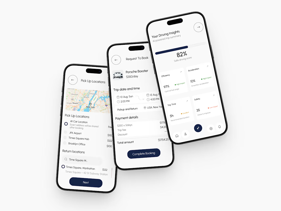
A few things we’ve been working on this month.
Different industries, different problems, but the same goal: making complex products feel simple, clear, and trustworthy.
Fintech → Investment Banking → Geospatial AI
More projects are still in progress.
Full case studies coming soon.






This is the kind of work I enjoy seeing — simple, focused, and actually thought through.


Professional work