
pro
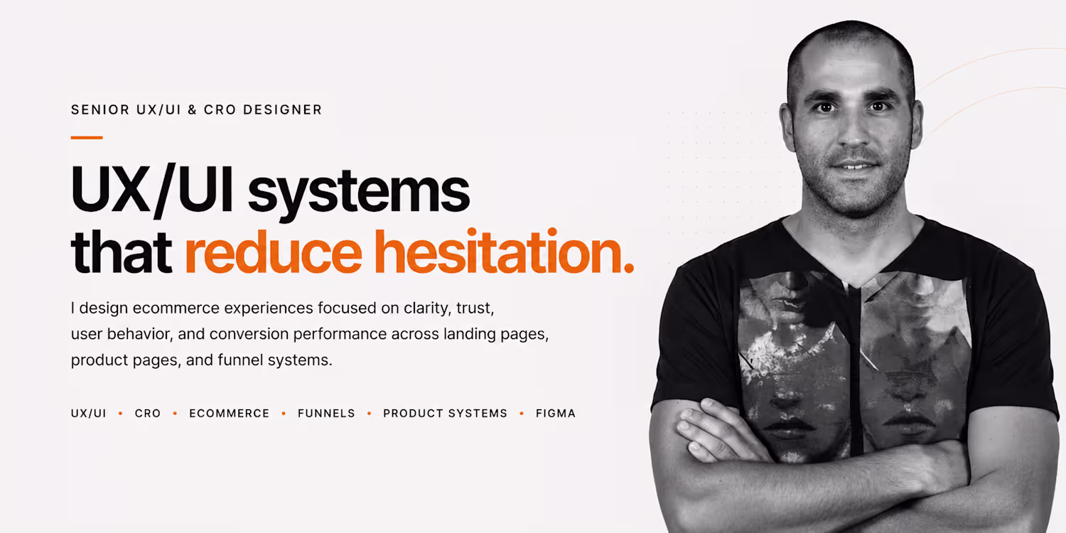
Juan Amisano
Senior UI/UX & CRO Web Designer
New to Contra
Juan is ready for their next project!
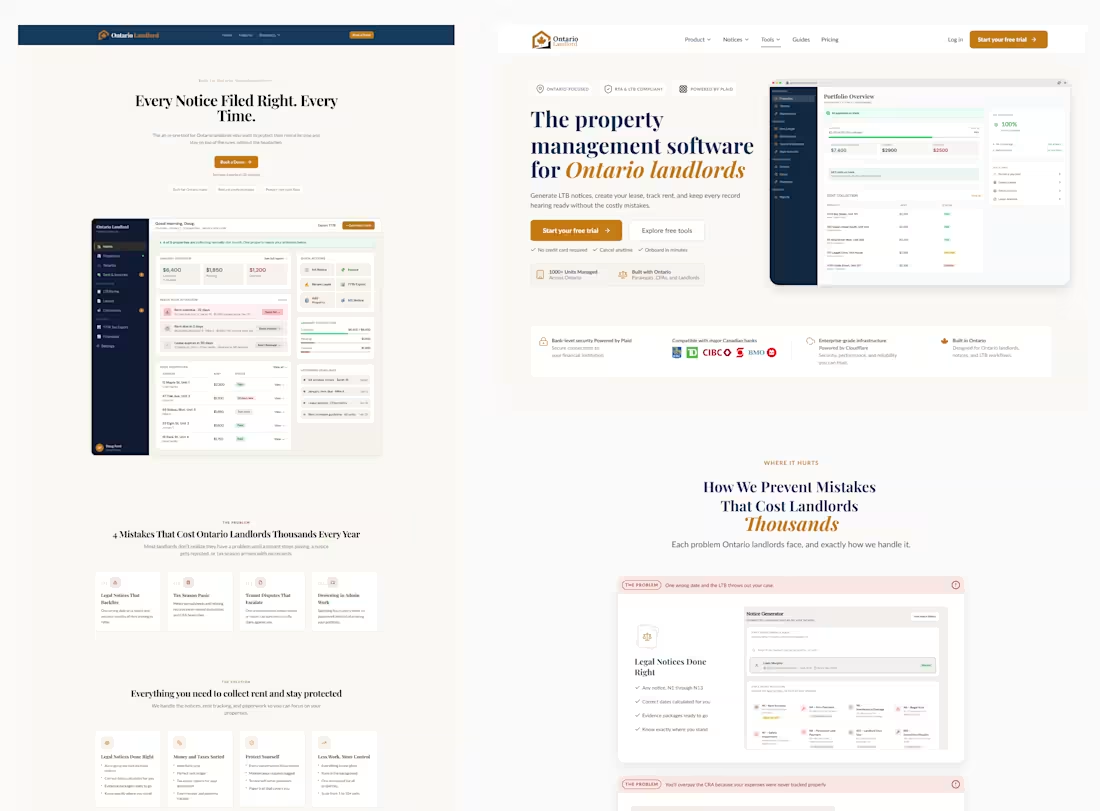
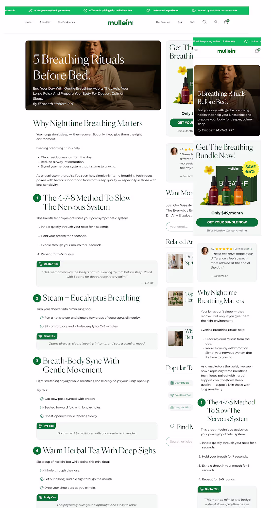
OntarioLandlord | SaaS Homepage UX/UI & Conversion Redesign
This project focused on redesigning the OntarioLandlord homepage to improve both user experience and conversion performance while maintaining the existing brand identity.
Rather than simply refreshing the visual design, the objective was to clarify the value proposition, strengthen trust, improve content hierarchy, and create a clearer path toward product adoption and demo requests.
The redesign transformed a feature-focused homepage into a more strategic experience built around clarity, trust, proof, and action.
Core Design Principles
Clarity over complexity
Trust before persuasion
Value before features
Proof before claims
Guidance over friction
Confidence through transparency
Action through clear decision paths
Key Improvements
Repositioned the value proposition for greater clarity
Improved conversion flow and CTA hierarchy
Redesigned information architecture and content structure
Enhanced trust, credibility, and product proof sections
Created stronger problem-solution storytelling
Improved visual hierarchy and readability
Mobile-first UX considerations
Developer-friendly implementation approach
Tools
Figma, UX/UI Design, CRO, Information Architecture, Wireframing, SaaS Design, Conversion Optimization
Role
Lead UX/UI & CRO Designer
Deliverables
Homepage Strategy, Wireframes, High-Fidelity UI Design, Conversion-Focused Content Structure, Responsive Layout System, and Developer Handoff Documentation.
2
74
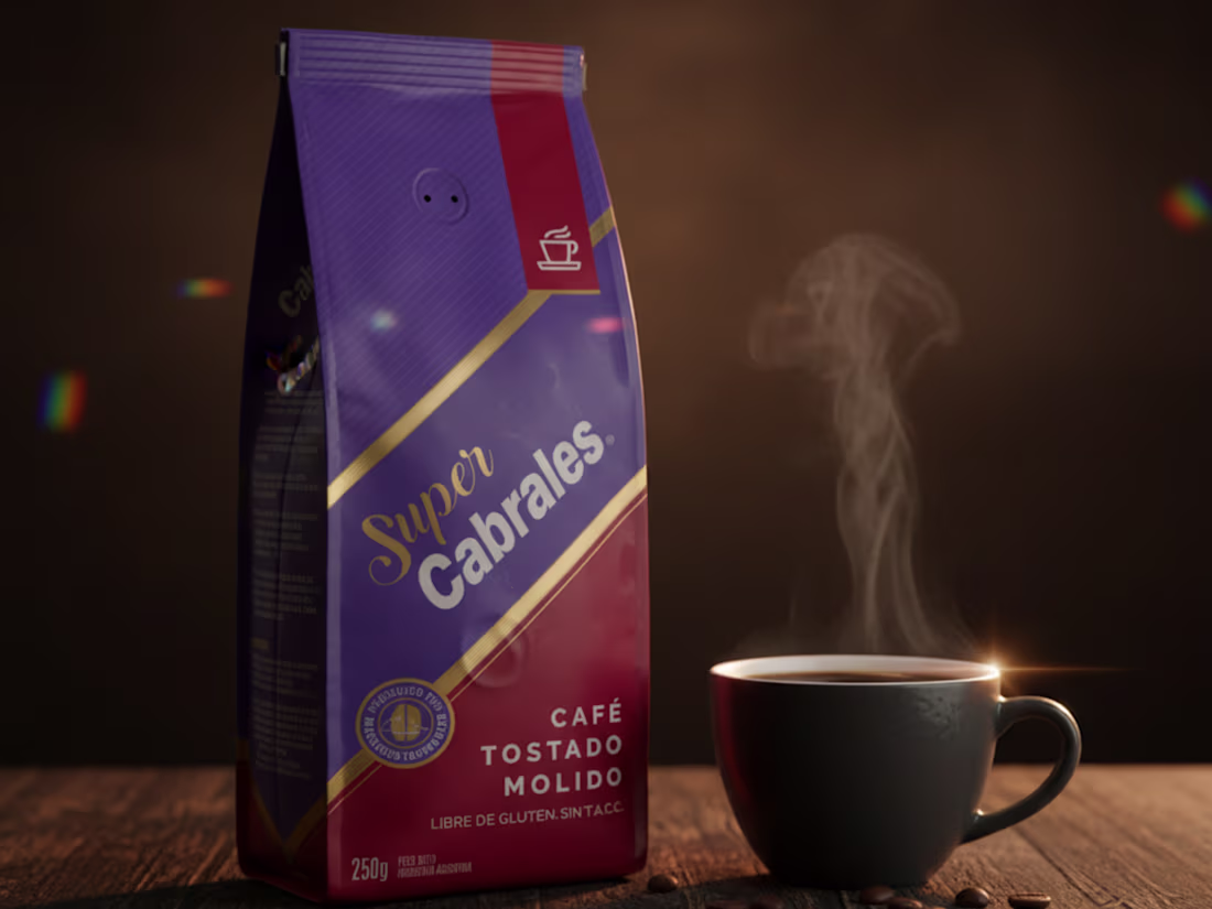
from classic clean studio shot → into a warmer lifestyle-driven coffee moment.
same product.
completely different emotional perception.
the goal wasn’t just to make the packaging look better.
it was to make the product feel more premium, atmospheric, and connected to a real experience.
interesting how lighting, mood, environment, and storytelling can completely transform ecommerce visuals.
8
12
537
Recently, I’ve been experimenting with a more guided approach to ecommerce, where the shopping experience feels cohesive rather than fragmented across isolated screens.
This concept combines UI clarity with user behavior throughout the full journey, from product introduction to checkout and even the post-purchase upsell.
The goal wasn’t just to create a clean interface.
It was also about reducing cognitive load, maintaining emotional momentum, and making each step feel intentional throughout the funnel.
Some ideas explored during this process:
Consistent layout structure to maintain spatial continuity
Strong product presence to reinforce confidence
Minimal cart interaction to avoid premature complexity
Progressive transitions instead of abrupt page jumps
Post-purchase upsells integrated into the same visual language
Reduced checkout noise to keep focus on completion I’m still refining parts of the experience, especially around cart behavior and progression feedback, but that’s also what makes these explorations interesting. UI and UX should support behavior, not just aesthetics.
0
82
This Menorescue project was focused on rebuilding the entire funnel experience into one unified conversion system.
From the TSL to ecommerce, upsells and product flow, the goal was to reduce friction, improve clarity and create stronger purchase momentum across every step of the journey.
Main focus:
• Mobile-first UX
• Conversion hierarchy
• Funnel consistency
• CTA optimization
• Trust & product clarity
• Direct-response structure
The video below is a quick scroll-through of the full case study and funnel system.
Full project:
https://amisano-design.com/work/menorescue
0
113
What improved most in this homepage redesign?
Trying to simplify the experience, improve product clarity, create stronger visual hierarchy, and make the entire journey feel more premium and conversion-focused.
Main focus:
• cleaner structure
• better spacing & hierarchy
• mobile-first UX
• improved product presentation
• stronger CTA visibility
• more premium visual direction
• reduced cognitive overload
• clearer trust & value communication
Curious which direction feels stronger to you visually and from a UX perspective.
2
134
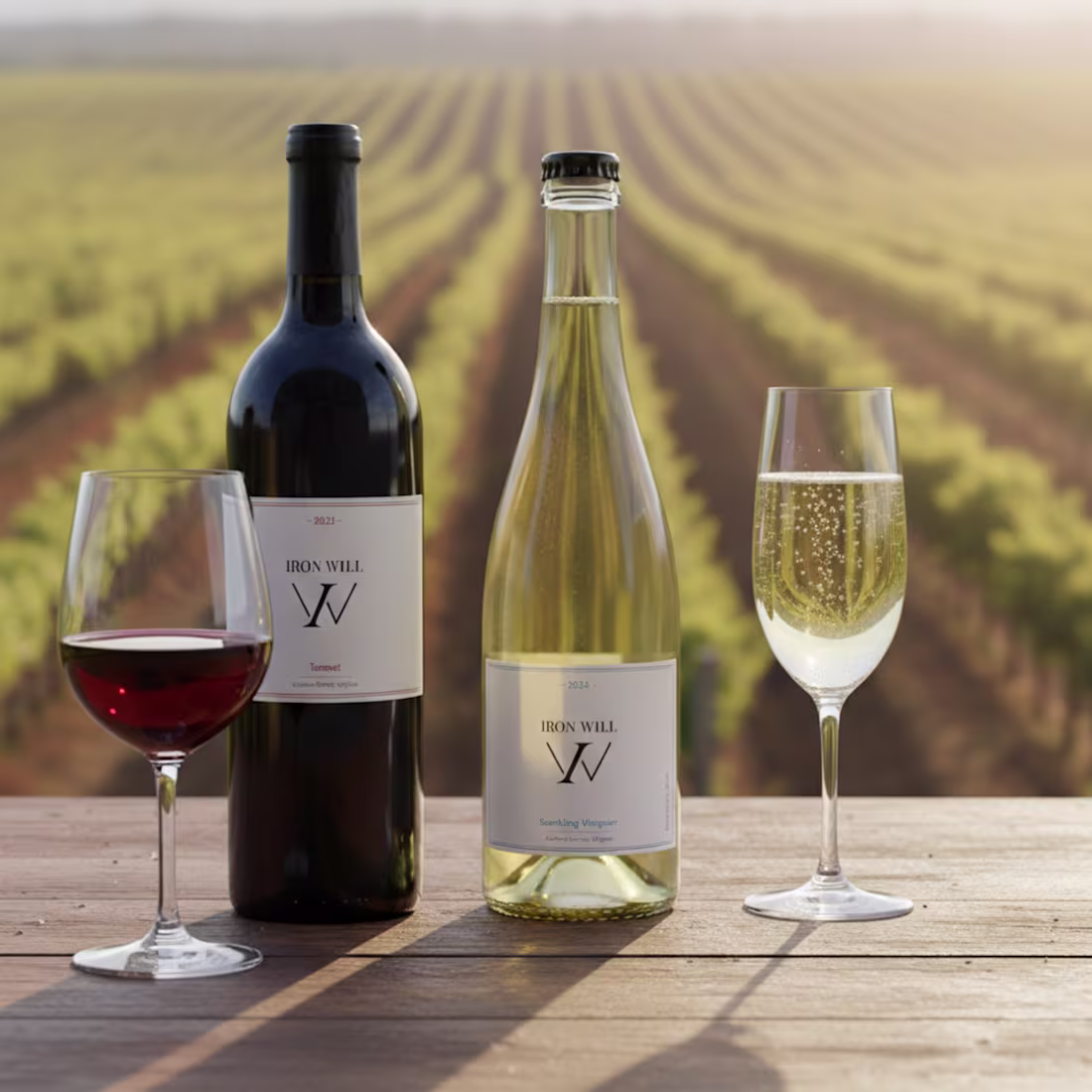
AI-directed product photography.
Custom visual engine for ecommerce, branding, lighting, environments, and product realism.
Not just prompting.
Art direction, UI/UX systems, environment logic, lighting behavior, product preservation, and industry-specific rendering rules working together in real time.
Services include:
• AI product photography
• Ecommerce campaign visuals
• PDP and branding imagery
• Product realism systems
• Creative direction
• Visual consistency systems
• Luxury product renders
• Wine, supplement, and coffee visual pipelines
Every scene is controlled through modular visual layers:
• product structure
• environment behavior
• camera systems
• lighting architecture
• physical interaction
• composition logic
• artwork preservation
• realism constraints
From a single product image → scalable campaign-ready visuals with controlled consistency.
0
109
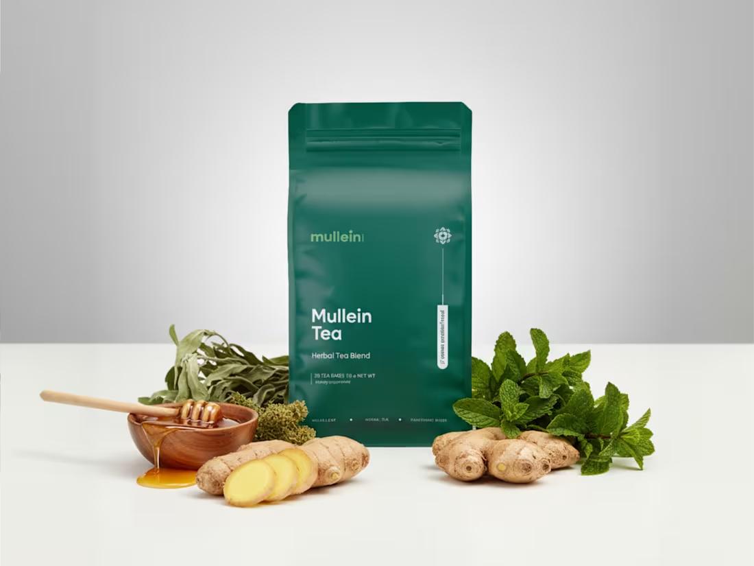
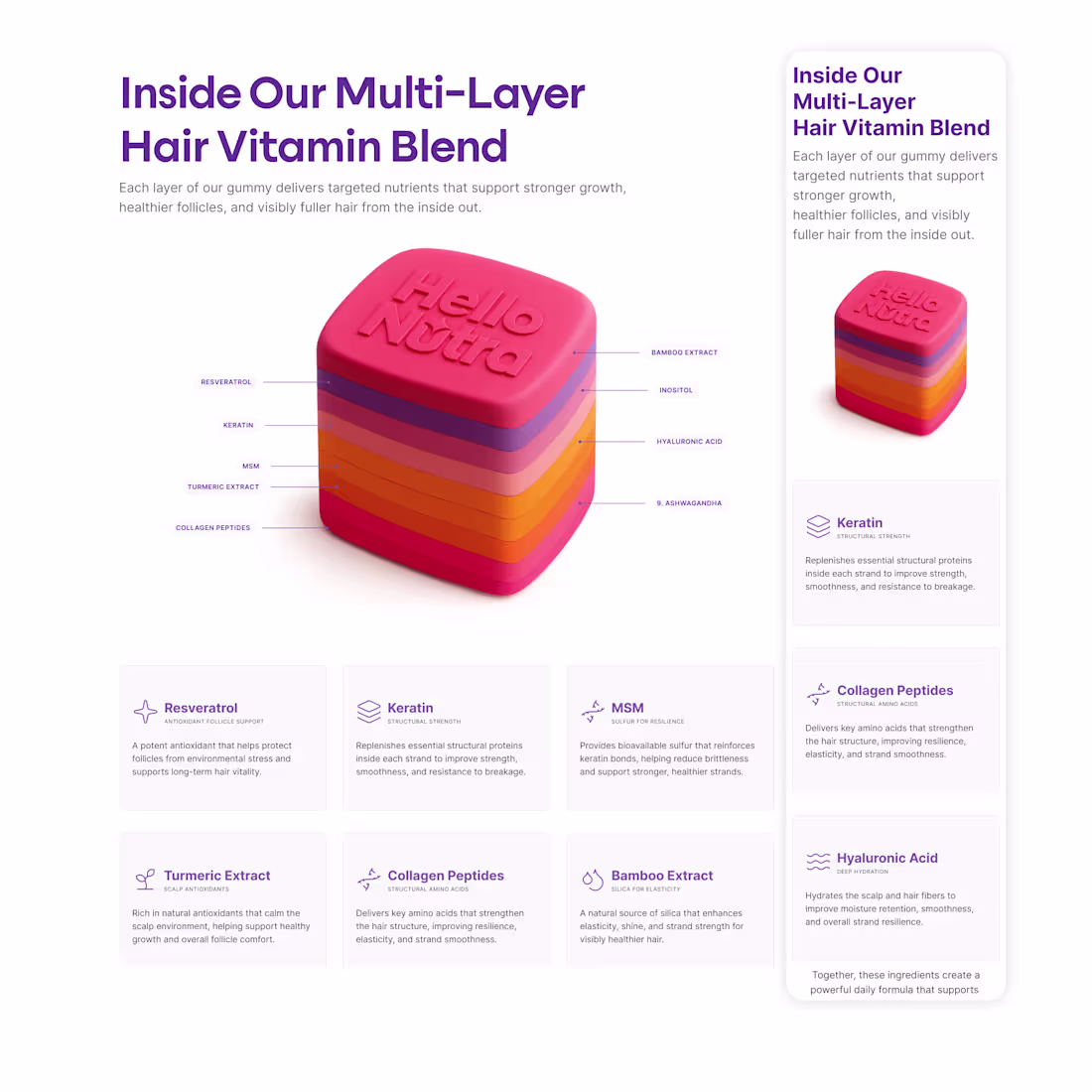
Designed a premium herbal tea packaging system concept for Mullein focused on creating a cleaner, more modern wellness identity while maintaining strong product differentiation across the lineup.
The goal was to balance shelf clarity, minimalism, and emotional positioning through typography, color systems, and simplified visual hierarchy.
Lineup concepts:
• DE•TOX
• IN•HALE
• EX•HALE
• SOOTHE
Created in Figma as part of a broader ecommerce and wellness brand exploration focused on premium DTC positioning, packaging systems, and conversion-oriented brand experiences.
Case Study:
https://amisano-design.com/work/mullein-ecommerce
1
3
168
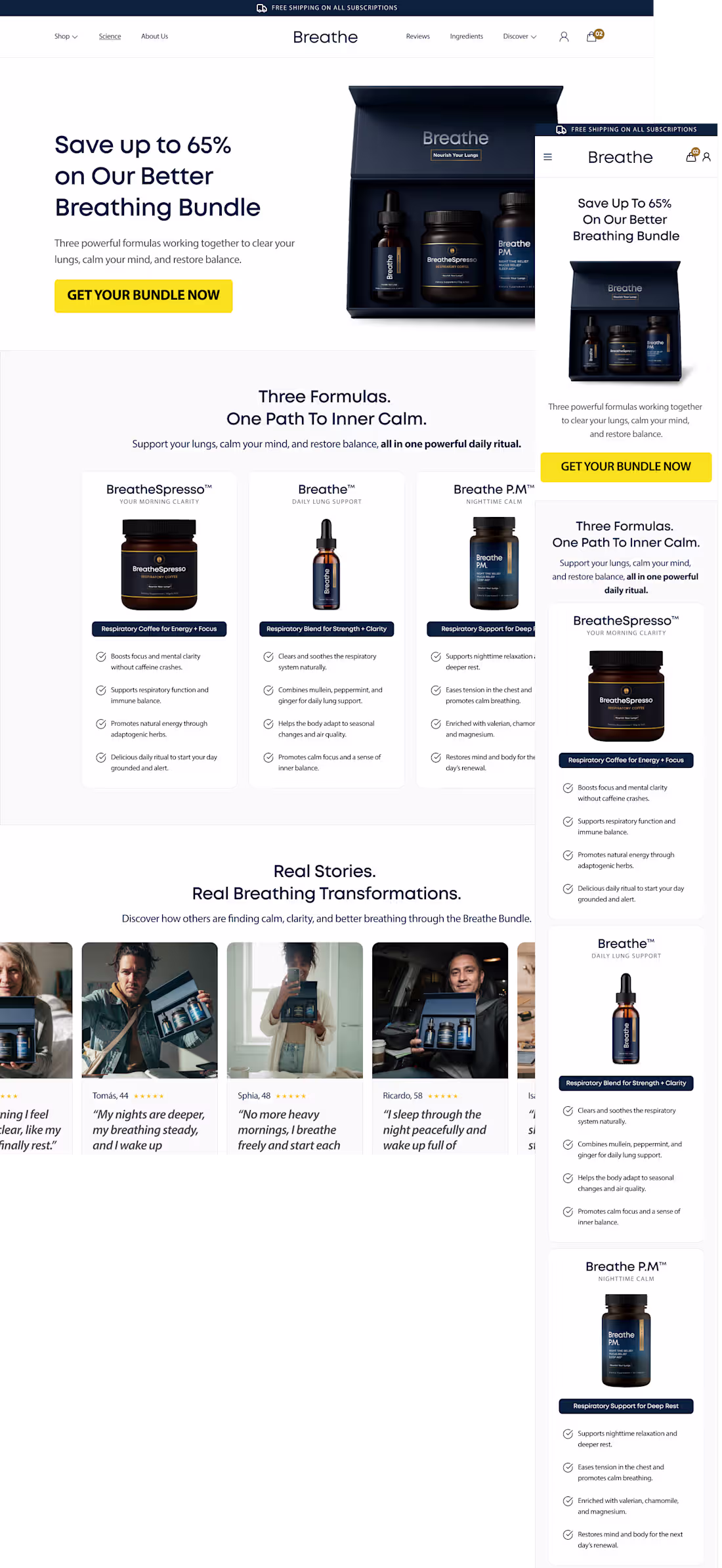
Designed a premium, conversion-focused Shopify ecommerce experience for a wellness supplement brand, with a strong focus on storytelling, mobile-first UX, subscription optimization, and customer trust.
The project combined ecommerce UX, CRO strategy, and modern visual design to create a more engaging and emotionally driven customer journey across product pages and landing pages.
Key areas included:
• Ecommerce UX strategy
• Shopify-focused design
• Mobile-first layouts
• CRO and conversion hierarchy
• Subscription-focused user flow
• Product storytelling
• Trust-building sections
• Long-form product page structure
• Funnel consistency and offer clarity
• Interactive prototyping and component systems
The goal was to create a premium ecommerce experience that improved clarity, reduced hesitation, and supported stronger conversion performance for paid traffic and returning customers.
0
84
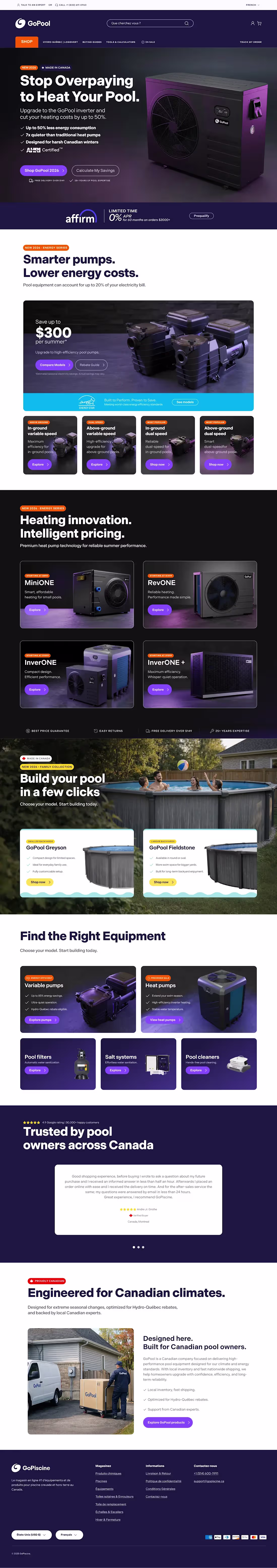
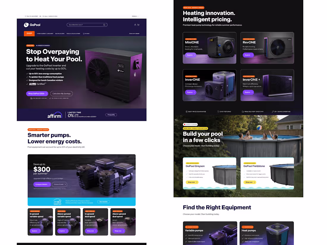
Designed a premium, conversion-focused ecommerce and lead generation experience for a fiberglass pool brand, with a strong emphasis on product clarity, customer trust, and high-ticket purchase behavior.
The project focused on improving the overall user journey by simplifying pool model exploration, increasing trust through visual presentation and hierarchy, and creating a more premium and modern digital experience aligned with luxury outdoor living brands.
Key areas included:
• Ecommerce and lead generation UX
• High-ticket conversion strategy
• Mobile-first responsive design
• CRO-focused layouts
• Product comparison and model exploration
• Trust-building sections
• Premium visual direction
• Funnel and inquiry optimization
• Design system and UI consistency
The redesign helped create a clearer and more conversion-oriented customer experience focused on reducing hesitation and improving engagement for high-value purchases.
0
88
Designed a high-converting Shopify ecommerce experience for a supplement and wellness brand focused on improving product clarity, mobile usability, subscription conversion, and overall customer trust.
The project included a complete ecommerce UX approach combining CRO principles, product storytelling, and premium visual design to create a more engaging and conversion-focused customer journey.
Key areas included:
• Ecommerce UX strategy
• Mobile-first Shopify design
• CRO-focused layouts
• Product storytelling
• Subscription optimization
• Product page hierarchy
• Funnel consistency
• Trust and credibility sections
• Design system and visual consistency
The goal was to create a premium supplement ecommerce experience that reduced hesitation, improved user flow, and supported higher conversion performance across landing pages and product pages.
1
2
135
Designed a long-form, conversion-focused Shopify product page for a supplement brand, with a strong emphasis on mobile usability, visual hierarchy, product education, and customer trust.
The project focused on improving the overall shopping experience by reducing friction, simplifying complex supplement information, and guiding users naturally through the purchase journey.
Key areas included:
• Product page UX strategy
• Long-form ecommerce design
• CRO-focused hierarchy
• Mobile-first layouts
• Ingredient and benefit visualization
• Trust-building sections
• Subscription and offer clarity
• Conversion-driven CTA structure
The final design was built to support paid traffic, improve engagement, and create a more premium and trustworthy ecommerce experience.
1
1
133