The network for creativity
Join 1.25M professional creatives like you
Connect with clients, get discovered, and run your business 100% commission-free
Creatives on Contra have earned over $150M and we are just getting started
Back to feedPost

OntarioLandlord | SaaS Homepage UX/UI & Conversion Redesign
This project focused on redesigning the OntarioLandlord homepage to improve both user experience and conversion performance while maintaining the existing brand identity.
Rather than simply refreshing the visual design, the objective was to clarify the value proposition, strengthen trust, improve content hierarchy, and create a clearer path toward product adoption and demo requests.
The redesign transformed a feature-focused homepage into a more strategic experience built around clarity, trust, proof, and action.
Core Design Principles
Clarity over complexity
Trust before persuasion
Value before features
Proof before claims
Guidance over friction
Confidence through transparency
Action through clear decision paths
Key Improvements
Repositioned the value proposition for greater clarity
Improved conversion flow and CTA hierarchy
Redesigned information architecture and content structure
Enhanced trust, credibility, and product proof sections
Created stronger problem-solution storytelling
Improved visual hierarchy and readability
Mobile-first UX considerations
Developer-friendly implementation approach
Tools
Figma, UX/UI Design, CRO, Information Architecture, Wireframing, SaaS Design, Conversion Optimization
Role
Lead UX/UI & CRO Designer
Deliverables
Homepage Strategy, Wireframes, High-Fidelity UI Design, Conversion-Focused Content Structure, Responsive Layout System, and Developer Handoff Documentation.


The network for creativity
Join 1.25M professional creatives like you
Connect with clients, get discovered, and run your business 100% commission-free
Creatives on Contra have earned over $150M and we are just getting started
Related posts

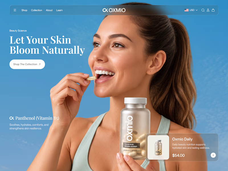
Your design has 3 seconds to earn attention. Which skincare brand wins?
A leads with confidence, energy, and aspiration. B builds trust through nature, freshness, and simplicity.
Great design doesn’t just look good. It makes people feel the brand before they read a word.
A or B? Which would make you stop scrolling?


30 voted
52%
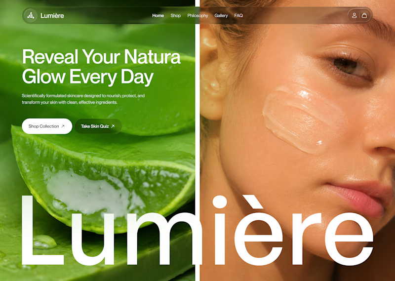
28 voted
48%
58 votes
Closed


B without questions

Built this free SaaS portfolio template in Framer a few months ago, and it’s been amazing to see the momentum it’s gaining! 🚀
It’s now ranked #18 in Framer’s Marketing category, bringing in more visibility, views, and commissions.
I’ve shared the full case study here, covering the project and how it came together.
Take a look if you’re curious! 🙌


This is amazing Fawaz! 🚀 Ranked #18 in Framer's Marketing category is huge! Love how you turned a free SaaS template into visibility + commissions. That's smart product thinking. Can't wait to read the full case study, congrats on the momentum!

Same layout. Same copy. Completely different feel.
Swapping just the color palette and gradient glow changed the whole personality of this Wezzi hero section.
Which one fits a SaaS brand better? 👇

10 voted
50%
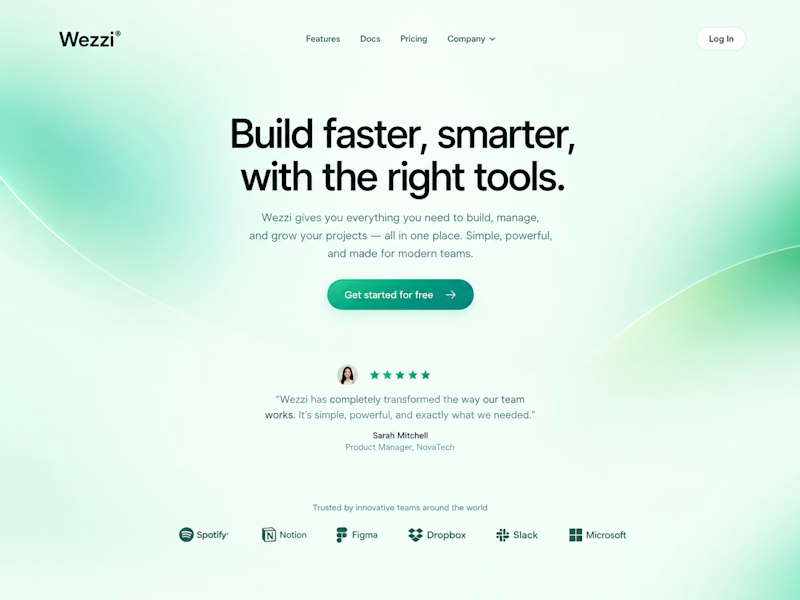
10 voted
50%
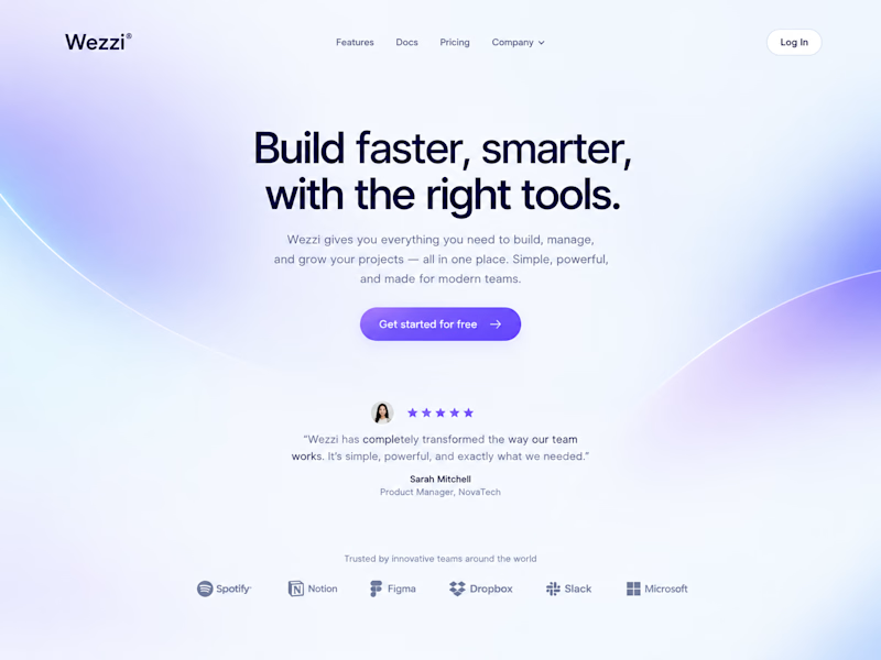
20 votes
Closed
Such a great demonstration Amina! It's amazing how just changing the color palette and gradient glow completely shifts the personality — same layout, same copy but totally different vibe. This Dreamy Haze version feels so soft, modern and perfect for a SaaS brand, very...


