
Jonathan Swanson
Brand Identity & Logo Designer for Bold Brands
- $1k+
- Earned
- 3x
- Hired
- 5.00
- Rating
- 117
- Followers
Quinto Games Brand Identity Redesign
0
1
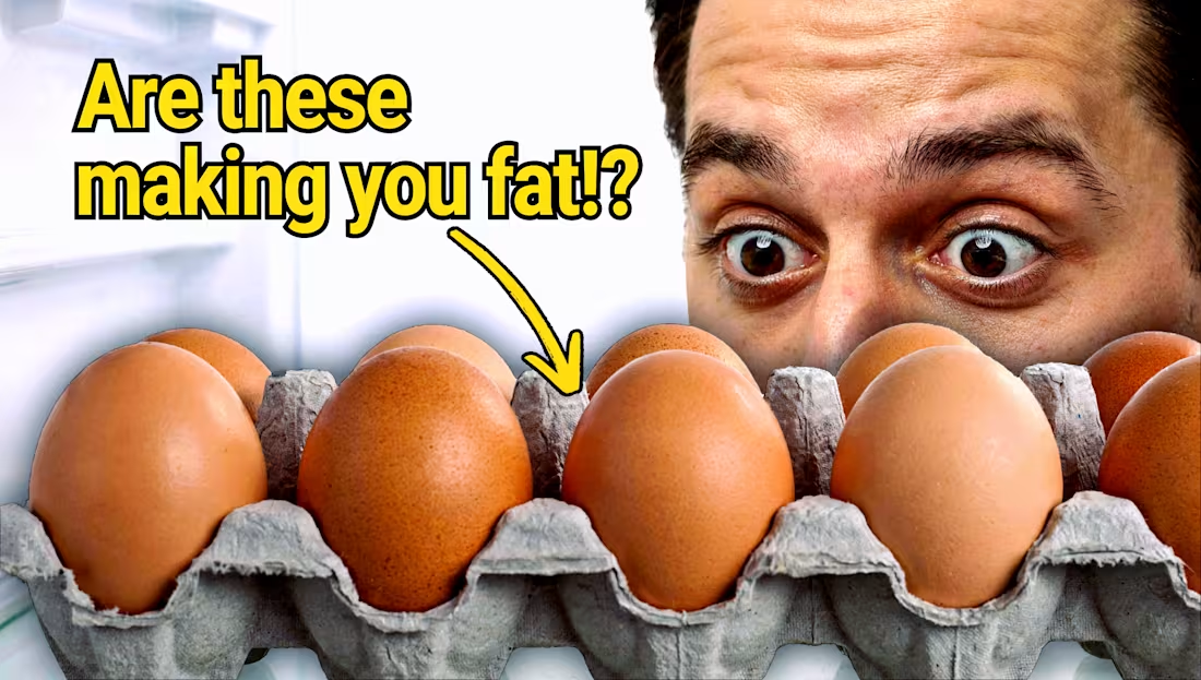
Intriguing YouTube Thumbnail Design for Breakfast Myth Video
0
5
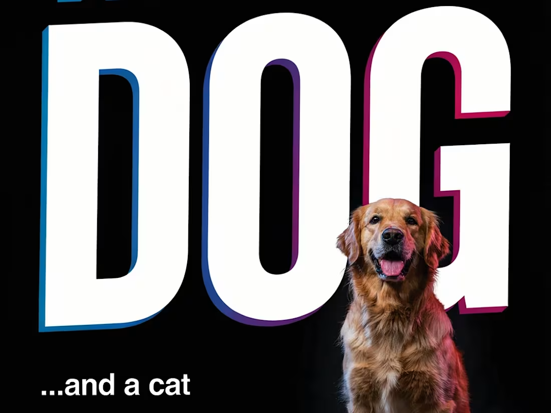
"This is a DOG" — AI-Directed Comedy Poster
0
1
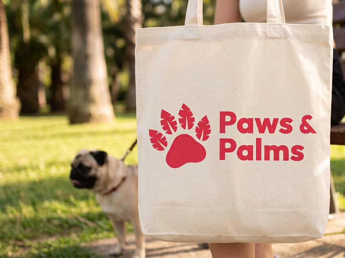
Branding Paws & Palms
How does visual identity influence trust in a service-based industry?
For Paws & Palms, the branding was designed to bridge the gap between luxury hospitality and compassionate pet care.
The Logo and Brand Strategy:
Visual Symbolism: The logo merges a classic paw print with stylized tropical leaves, immediately establishing the "vacation" theme.
Color Palette: A base of warm sunset tones and soft neutrals evokes a sense of reliability and comfort, moving away from clinical or generic primary colors.
Typography: A combination of modern sans-serif fonts ensures the brand feels contemporary while maintaining approachable friendliness.
Brand Mission: Every design choice supports the shift in perception from simple pet-sitting to a premium hospitality experience for pets.
The goal was to create a visual identity that feels as high-end as a luxury resort, ensuring clients feel their pets are in the best possible hands.
1
163
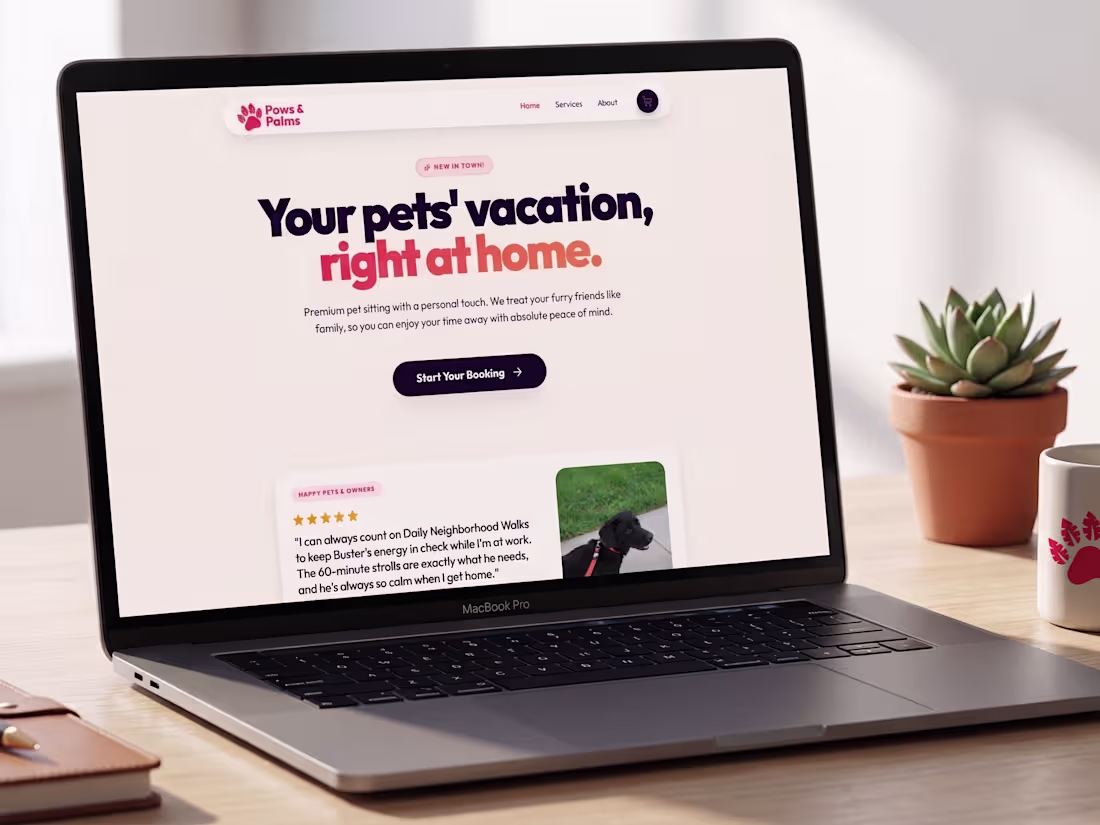
How do you design a pet-sitting platform that feels like a luxury vacation?
For Paws & Palms, the design focus was on creating a premium, living interface that goes beyond basic utility.
Key Design Pillars:
Premium Branding: Reimagining pet-sitting as "The Vacation Service" to shift the user focus toward high-end care.
Interactive UI: High-density, real-time booking flows that adapt to complex multi-pet families.
Living Interface: Physics-based micro-animations and transitions that make the site feel responsive and alive.
Mobile-First: Optimized touch targets and a thumb-friendly navigation bar for effortless mobile use.
Built with React, Vite, and Framer Motion to ensure the performance is as smooth as the design.
Design should feel as premium as the service itself.
2
4
190
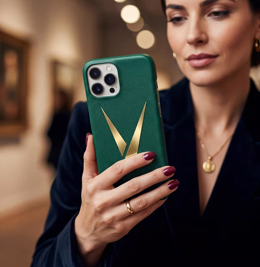
Here’s a luxury apparel brand logo for Divinity, meticulously designed to embody the profound concept of time in all its elegance and ephemerality. I incorporated a stylized V to symbolize the converging hands of a clock, evoking the relentless passage of moments and reflecting the fleeting nature of life that urges us to cherish every instant. The brand itself is dedicated to transcending mere fashion, aiming to bring unparalleled comfort and joy through thoughtfully crafted products that promote happiness, well-being, and a deeper sense of fulfillment in the wearer's daily journey.
1
145
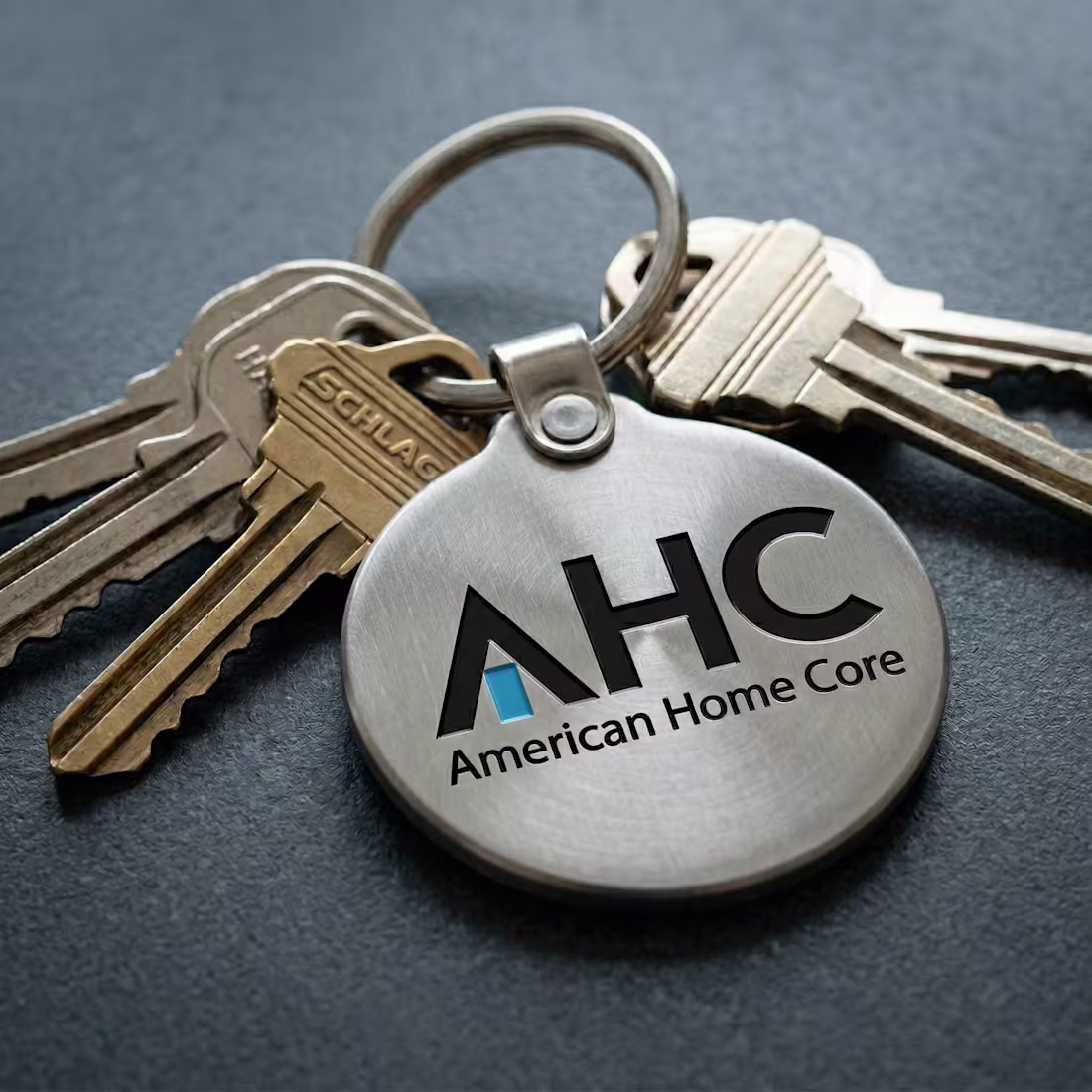
American Home Core. In the real estate sector, a brand must be more than just a logo, it must act as a trusted guide during a major life transition.
The heart of this design is the "door of opportunity," represented by the blue rectangle integrated into the "A." This motif serves as the brand’s heartbeat, symbolizing the entry to your next chapter. We’ve strategically applied this signature blue across all touchpoints, acting as a visual cue to highlight key points of value throughout the home-buying process.
The result is a clean, authoritative system designed to build instant trust. It scales perfectly, from professional stationery and keychains to high-visibility signage and vehicle graphics.
If your organization is ready to align its visual presence with the scale of its mission, let’s talk.
1
159
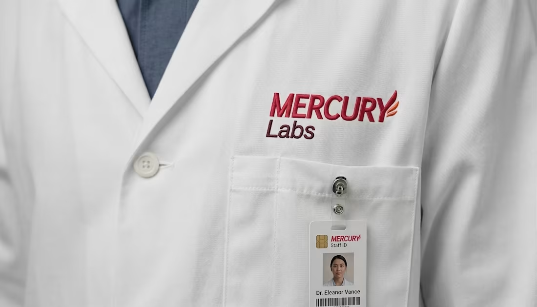
I’m proud to reveal the brand evolution for Mercury Labs. In medical research, an identity must balance scientific precision with forward momentum.
My approach was to transition their legacy identity into a clean, authoritative wordmark. I integrated a subtle winged sandal motif into the "Y", a nod to the company’s namesake and their drive to accelerate breakthroughs.
This system prioritizes scalability, ensuring the mark commands attention on architectural signage while remaining crisp on a lab coat or digital UI. I traded clutter for a stable, professional design that reflects the scale of the work being done inside.
It was a pleasure partnering with the Mercury Labs team on this transition. If your organization is ready to align its visual presence with the ambition of its mission, let’s talk.
1
140
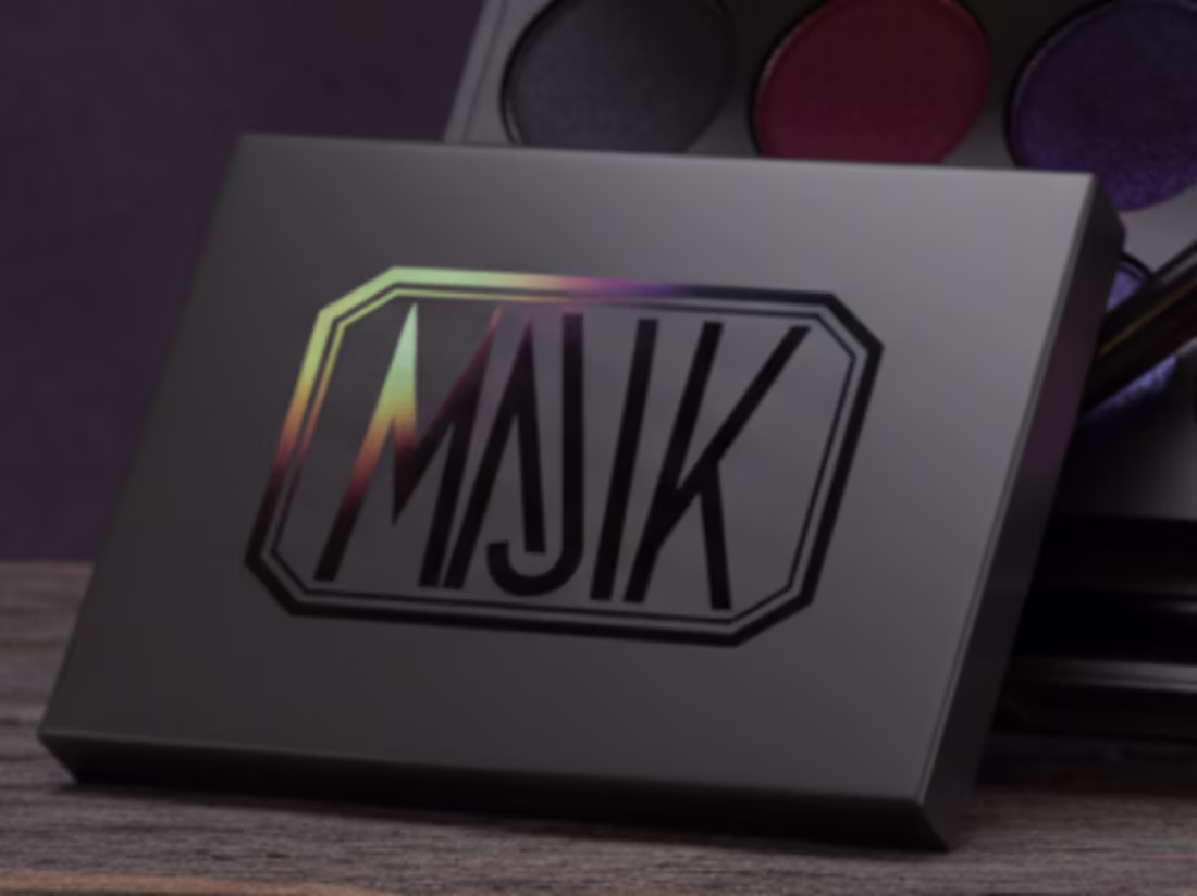
MAJIK is luxury makeup for the Gothic, shadowed, and arcane. It channels inner darkness with obsidian blacks, bruised purples, and blood-rich reds that seep into skin. Not for daylight; this is pigment for rituals and midnight.
The packaging I designed is meant to feel like something otherworldly, an ancient tome. The exterior is matte black, soft and absorbing. At the center sits my original MAJIK logo mark, glossed into the surface and sealed with a thin iridescent film. The mark itself is reflective, but the film bends the light, flashing a range of color, providing a MAJIK look, depending on how it catches the light.
1
14
349
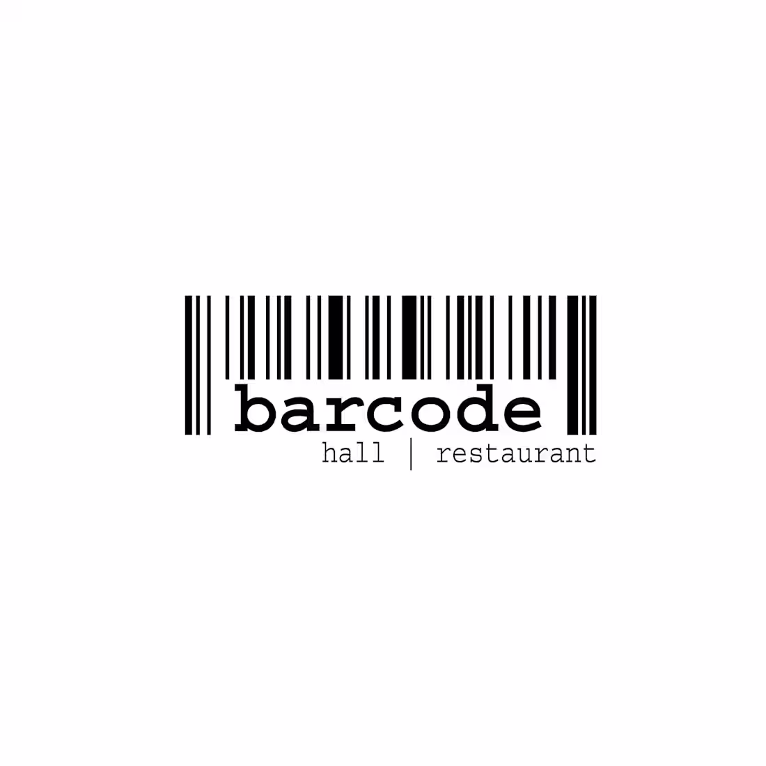
Barcode is a bar and restaurant that features a convenient Grab, Scan, and Pay system. The logo represents the scanning process and its technological approach while also functioning as an actual barcode for added enjoyment. The brand is simple, featuring a black-on-white design and a welcoming font.
1
1
338
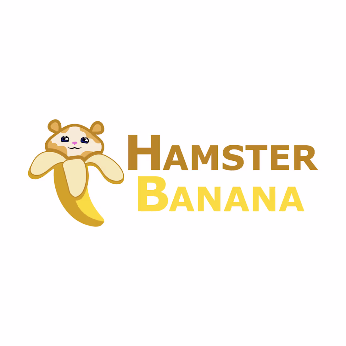
Here’s a fun, adorable character I created for a YouTube channel brand I started some time ago. The channel had a relaxed vibe, featuring general reviews of gadgets, food, and toys, a chill spot to hang out. It was named Hamster Banana, inspired by a hamster who loved bananas and co-hosted the show.
1
15
323
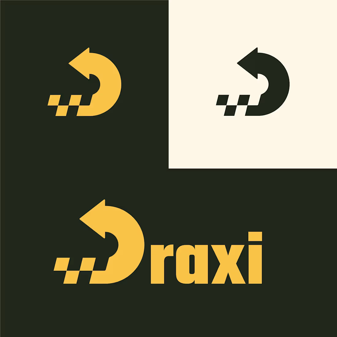
Discover Draxi, the innovative ride share service that bridges the gap between traditional taxis and modern rideshare platforms, giving you the best of both worlds. Imagine hailing a taxi on the street: simply scan the code, input your details, and handle payment seamlessly through the app. Or skip the wait and order a taxi straight from your phone. With Draxi, taxi services join a unified platform where drivers operate as integrated partners, not independent contractors like on other apps. By blending "direct" and "taxi," Draxi delivers your ride right to your doorstep, faster and more reliably than ever. Revolutionize your commute today!
12
302
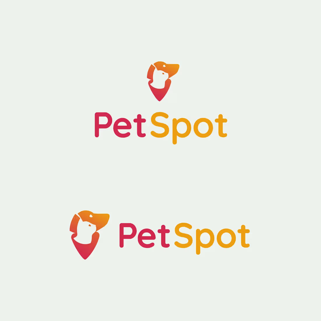
Here's another fun project I worked on: a fictional stray pet assist service where people can take photos and mark locations of found pets, or if they're inclined to take the stray in, they can post that they've found a pet. There are approximately 10 million pets that go missing in the US each year, and this app seeks to help reunite those pets with their owners faster.
The logo itself is a waypoint marker like those we often see on map systems but combining the shapes of common household pets: a dog and a cat. With warm yellow and red coloring, giving a sense of urgency and alert.
25
351
VersaCut Logo Design
0
20
The Riddler: Typographic Logo Design
1
22
StockTalk: Fintech Social Platform Logo
1
18
Ana.so: Mascot & Brand Identity
1
20
LeafLit: Full Rebrand & Naming
1
18