VersaCut Logo Design
Jonathan Swanson
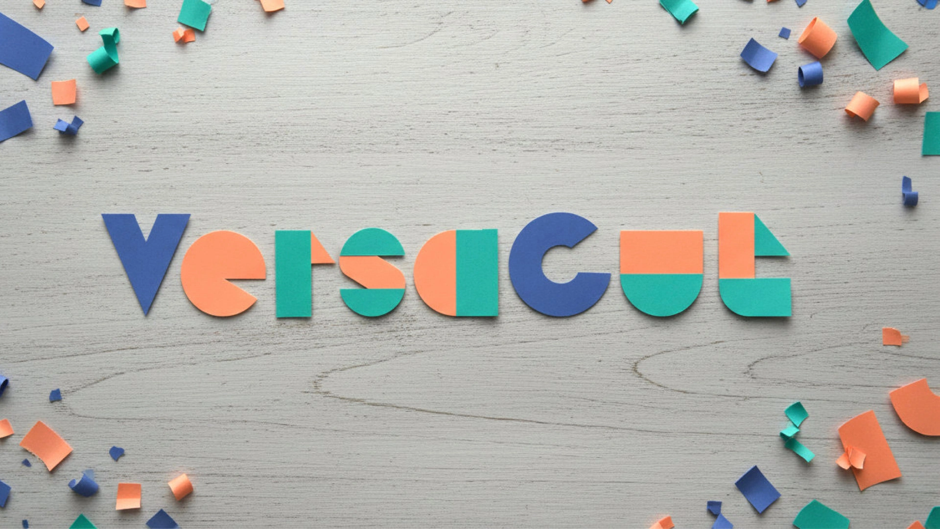
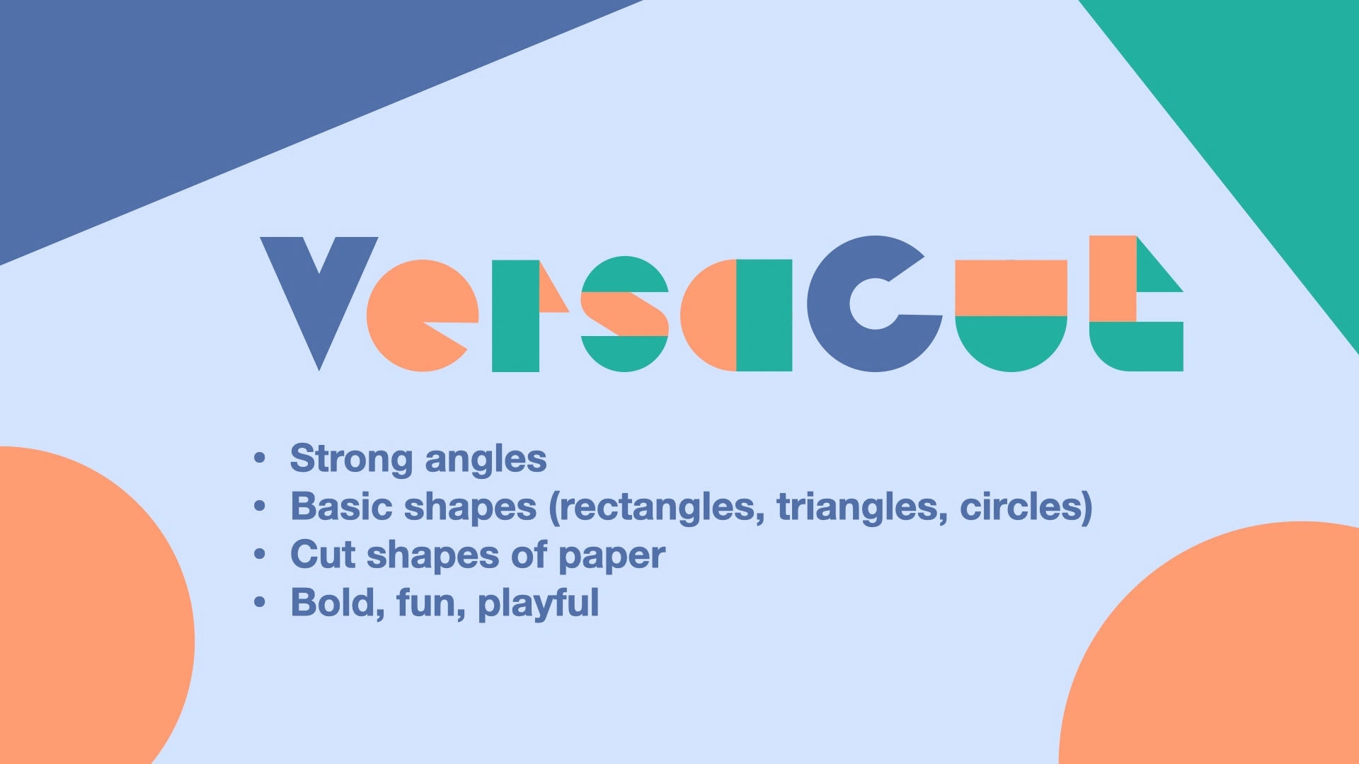
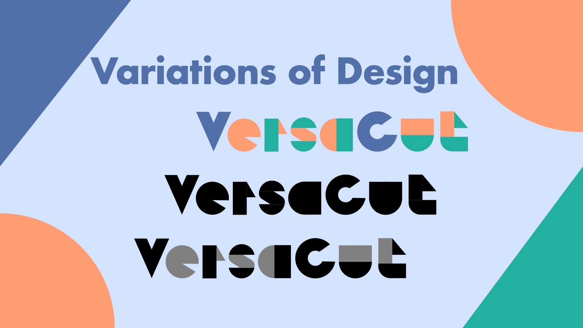
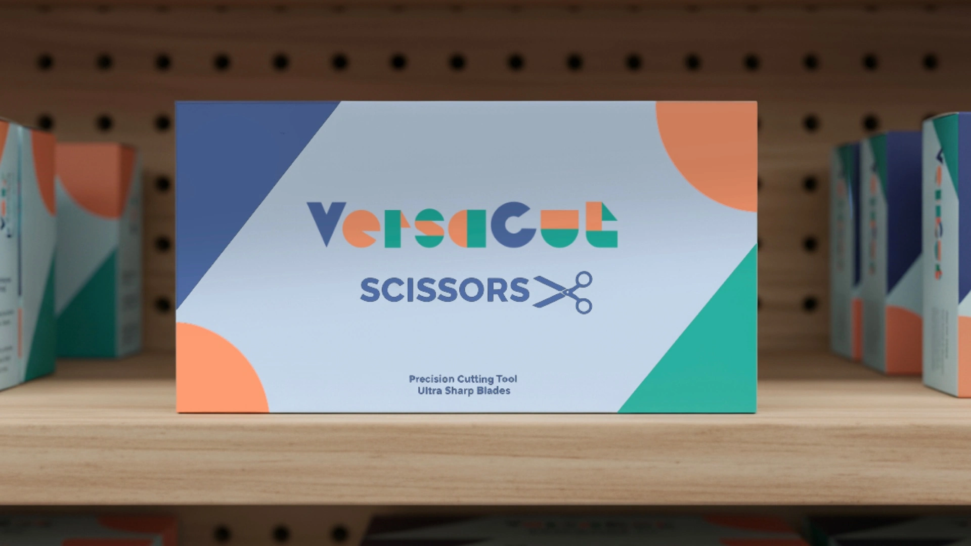
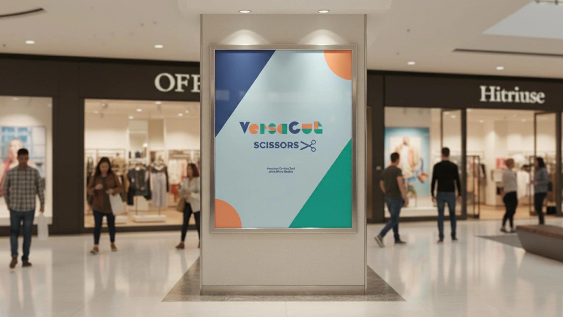
The VersaCut logo embodies the essence of precision and reliability through its clever use of deconstructed paper elements, where each letter is meticulously crafted from basic geometric shapes, circles, squares, and triangles, precisely cut and reassembled like the flawless snips of its signature scissors. This design choice not only mirrors the brand's commitment to clean, dependable cuts but also highlights the tool's versatility in handling diverse materials with ease. Surrounding the wordmark are scattered paper scraps in soft, playful hues, evoking the joyful remnants of a creative crafting session, while the central composition remains sharp and structured, ensuring the logo conveys trustworthiness without sacrificing whimsy.
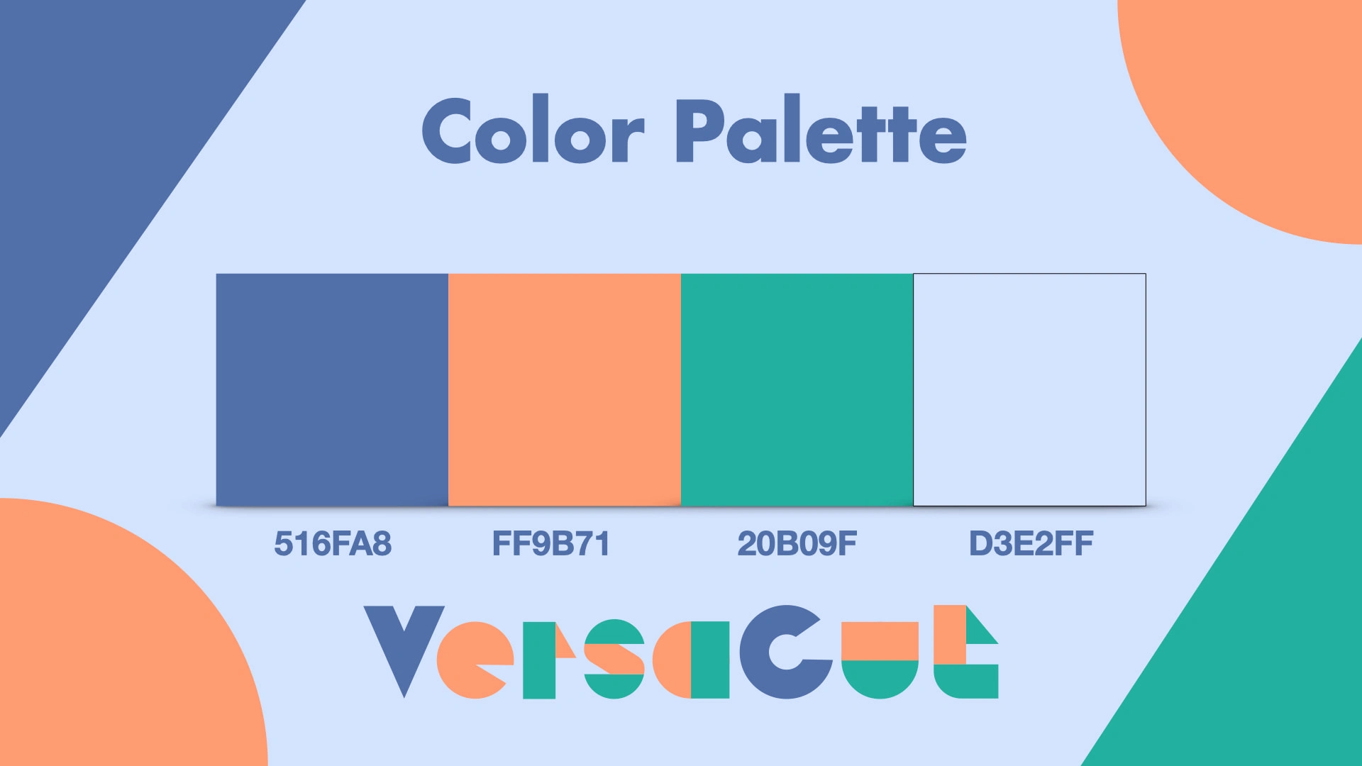
Drawing from the nostalgic texture of pastel construction paper, VersaCut's color palette, featuring gentle blues, soft oranges, mint greens, and muted corals, infuses the design with a sense of approachable fun and boundless creativity, inviting users to unleash their imagination on any project. These hues were thoughtfully selected to balance vibrancy with subtlety, fostering a brand identity that feels both innovative and comforting, much like the reliable grip of a VersaCut scissor in hand. By transforming simple cutouts into a cohesive emblem, the logo not only celebrates the artistry of cutting but also positions VersaCut as the go-to tool for makers who demand precision wrapped in playful possibility.

Like this project
Posted Sep 22, 2025
VersaCut's logo: Precision-cut paper letters in pastel blues, oranges & greens evoke reliable snips, creative fun & construction paper nostalgia.