
John Bresciani
Senior Designer focused on insight-driven solutions.
Ready for work
John is ready for their next project!

Editorial design project showcasing the portfolio of French-based interior architect Olga Yanchuk.
Full case study here: https://www.behance.net/gallery/239538495/Olga-Yanchuk-Interior-Design-Editorial-2025
0
110
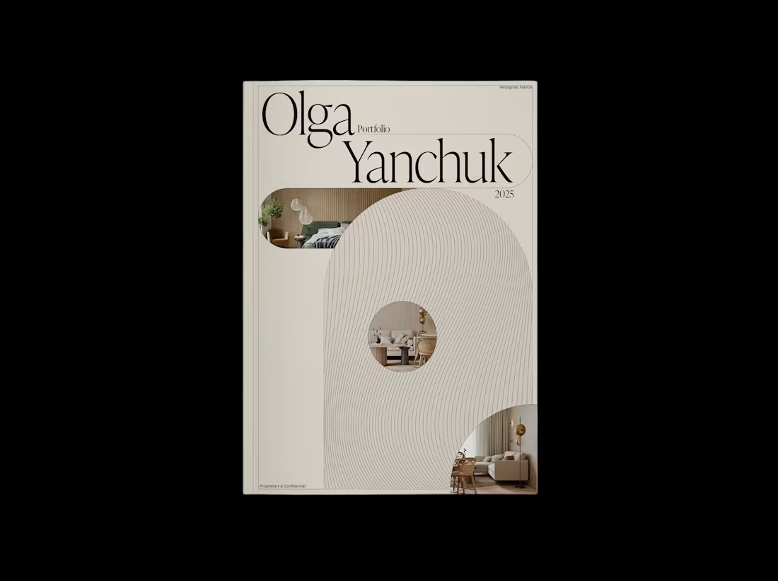
A sophisticated editorial design project showcasing the portfolio of French-based interior architect Olga Yanchuk.
This 42-page publication celebrates a refined collection of residential projects completed between 2018-2025, spanning locations from Moscow to Perpignan.
The design employs custom-crafted grid systems that respond organically to each project's unique visual narrative.
Full case study coming soon...
7
22
317
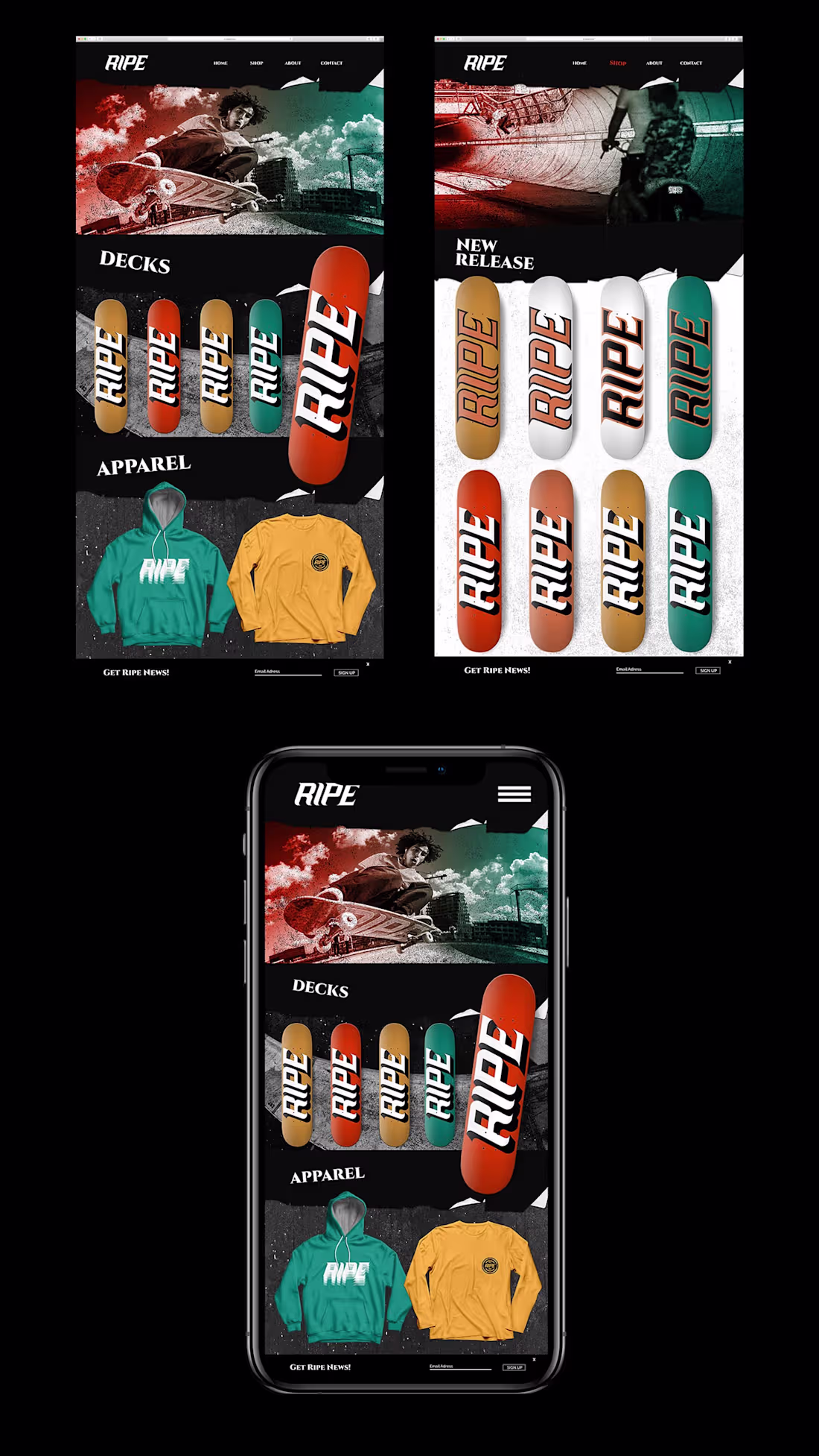
Ripe Skateboards Brand Identity (Barcelona, Amsterdam)
About
Locking horns with poser-operated corporations that trespass on core skate culture, Ripe set out to discern themselves from US operated brands and revolutionize what competitive skate culture means, without Identity sacrificing authenticity.
Challenges
How might we sever Ripe from the present-day jock evolution in skateboarding, retrieve the essence that made European skating exclusive and design a brand identity that communicates what tight knit, Spanish skate teams represent?
Idea
With an already united brotherly culture in its DNA, we chose to blend Ripe’s cherished personality traits by creating a brand based off intense skating, a rebellious familia and a visual homage to Barcelona’s historically Gothic architectural tone with sharp edges throughout.
1
27
285
Typographic animation
Created in: Calvary
Typeface: PP Machina by Pangram Pangram
Creating dynamic movement in static layouts gives designs an energetic feel that I love.
1
7
150
Didot clock animation.
A clock created entirely from the Didot typeface. This is an old piece I’ve always wanted to animate.
The intertwined similarities of this typeface and renaissance craftsmanship was the inspiration behind this piece.
Zoom in an appreciate all the letterforms if you dare! haha
Type: Didot Bold & Regular
Software: Cavalry Animation App
2
97
My works from the past few years showcased on Instagram (https://www.instagram.com/typokicks/?hl=en).
Mainly my editorial designs, some teaching, prominent designer interviews and animation.
2
5
151
Dynamic Poster Design Process.
A little snippet of how I lay type, shapes and images out on a page.
4
5
133
Home page for Bresciani Design.
Readymag is an incredible platform that allows me to layout my work the way I want it too.
The best part is being able to let my imagination run free with type, grid and dynamic ways of grabbing attention.
2
136
Wave by Antônio Carlos Jobim | Animated Swiss poster design
Animation: Midjourney
Typeface by Pangram Pangram
Layout in Adobe Illustrator
0
164
Dynamic Layouts
A few layouts I created last year using custom grids, flexible proportion changes, contrast and hierarchy.
4
156
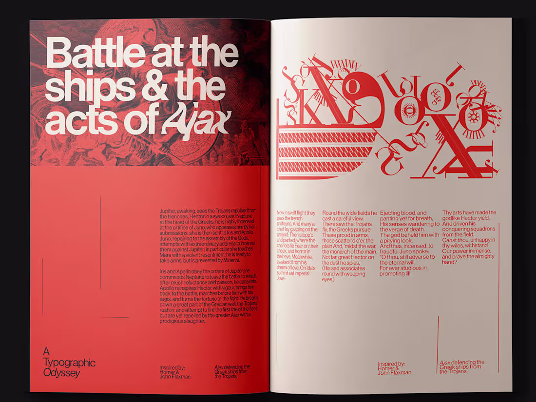
A Typographic Odyssey (2020)
This study was an adventure inspired by the works of Homer, John Flaxman and the Didot typeface.
It was a dedication to the things that inspire me—story, typography, design and art.
The Iliad by Homer presented an incredible opportunity to explore layouts and visual storytelling using type.
I chose to illustrate 5 scenes from the book using letters entirely from the Didot typeface.
This was a wild ride to create and I’m happy I went on it.
79
183
788
A Typographic Odyssey
3
18
Albatross Care Visual Identity
4
35
Whole Beings® Collective
0
12