max
Jelmer Hoekstra
We help agencies stop leaving web revenue on the table.
- $1k+
- Earned
- 1x
- Hired
- 5.00
- Rating
- 53
- Followers
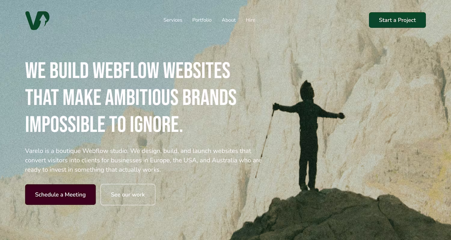
Some of our latests projects, which one is your favorite?
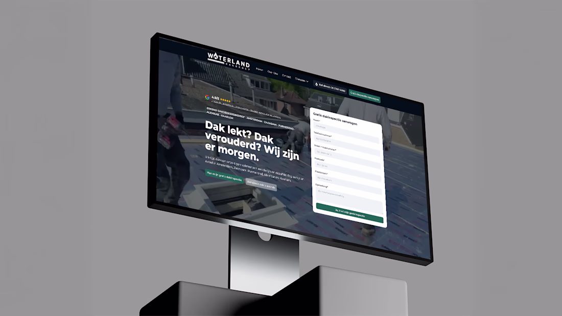
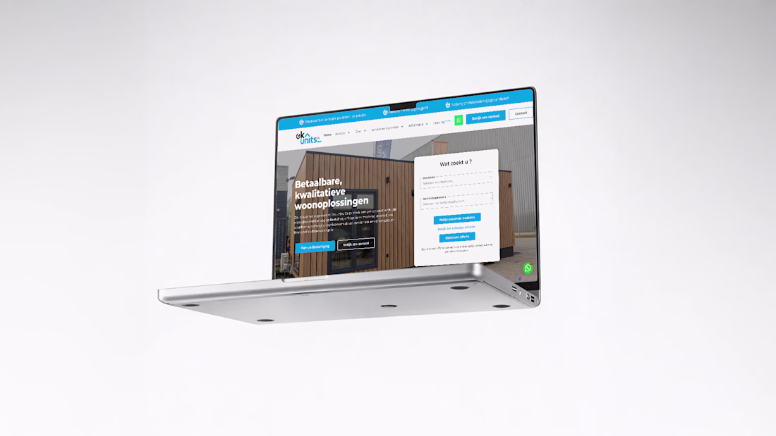


Figma design and Webflow development.🚀
Same industry 2 different websites. Which one would you choose?
7 voted
100%
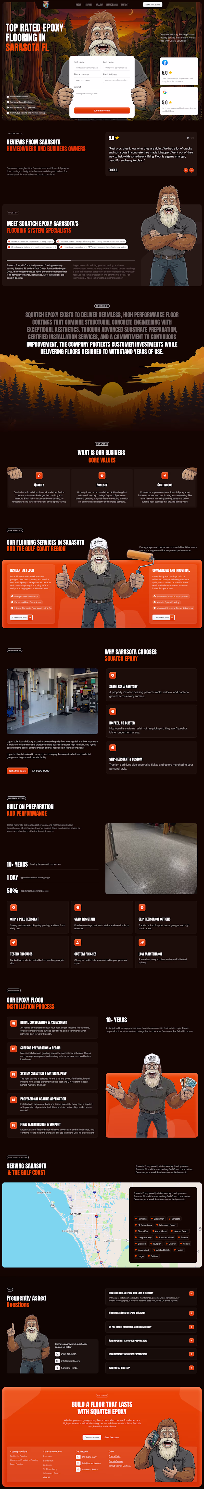
0 voted
0%
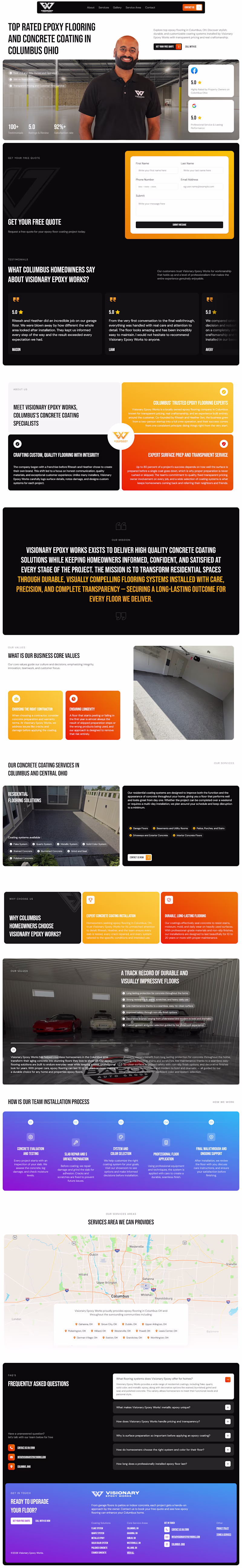
7 votes
Closed