
Jacob Samson
Video Editor, Graphic Designer Architect & 3D Artist
Ready for work
Jacob is ready for their next project!
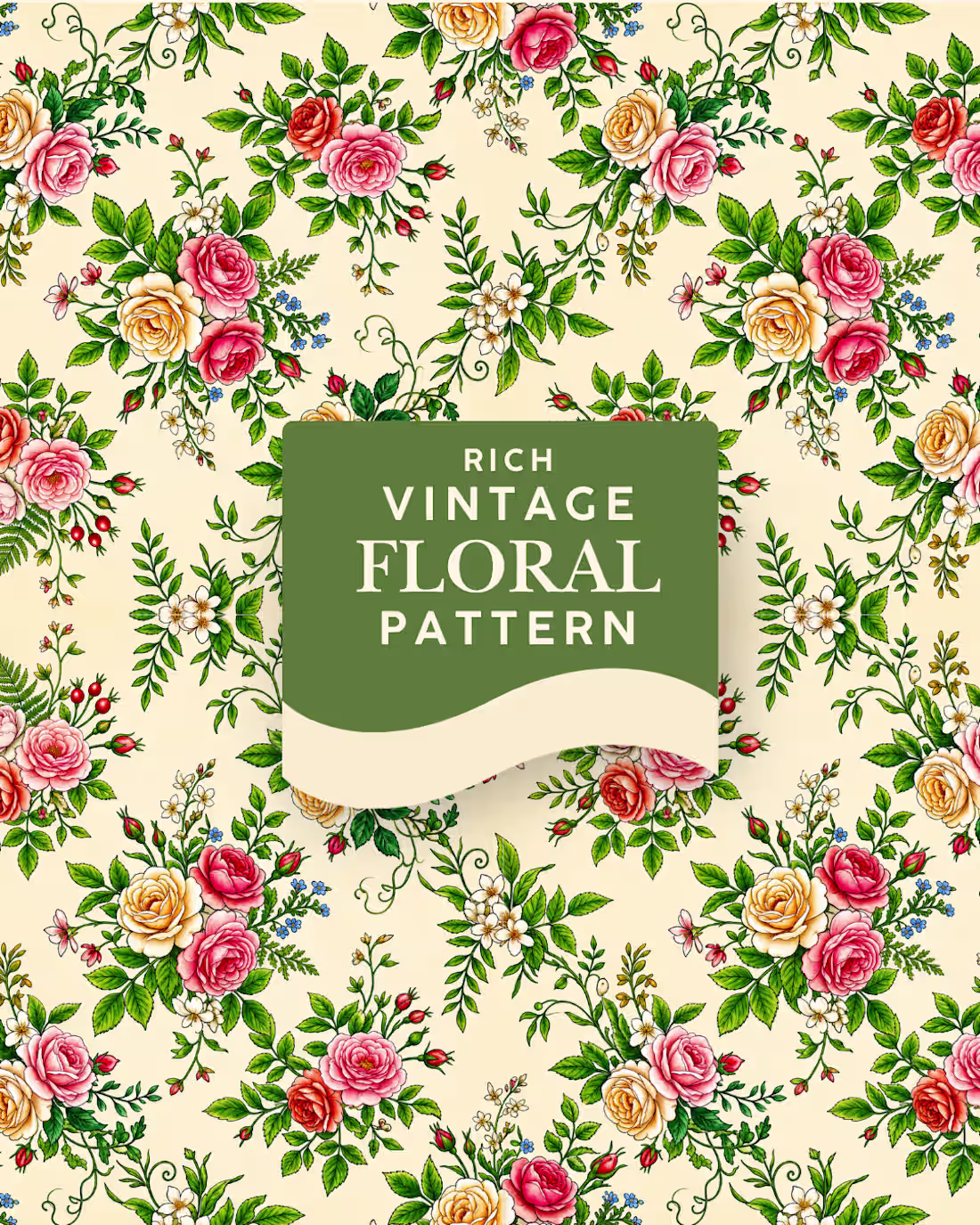
What makes seamless patterns work well is simple structure and balance.
The shapes, lines, or flowers are arranged so they repeat neatly in all directions.
Good spacing and flow helps your eyes move smoothly, so everything looks natural and clean.
1
1
39
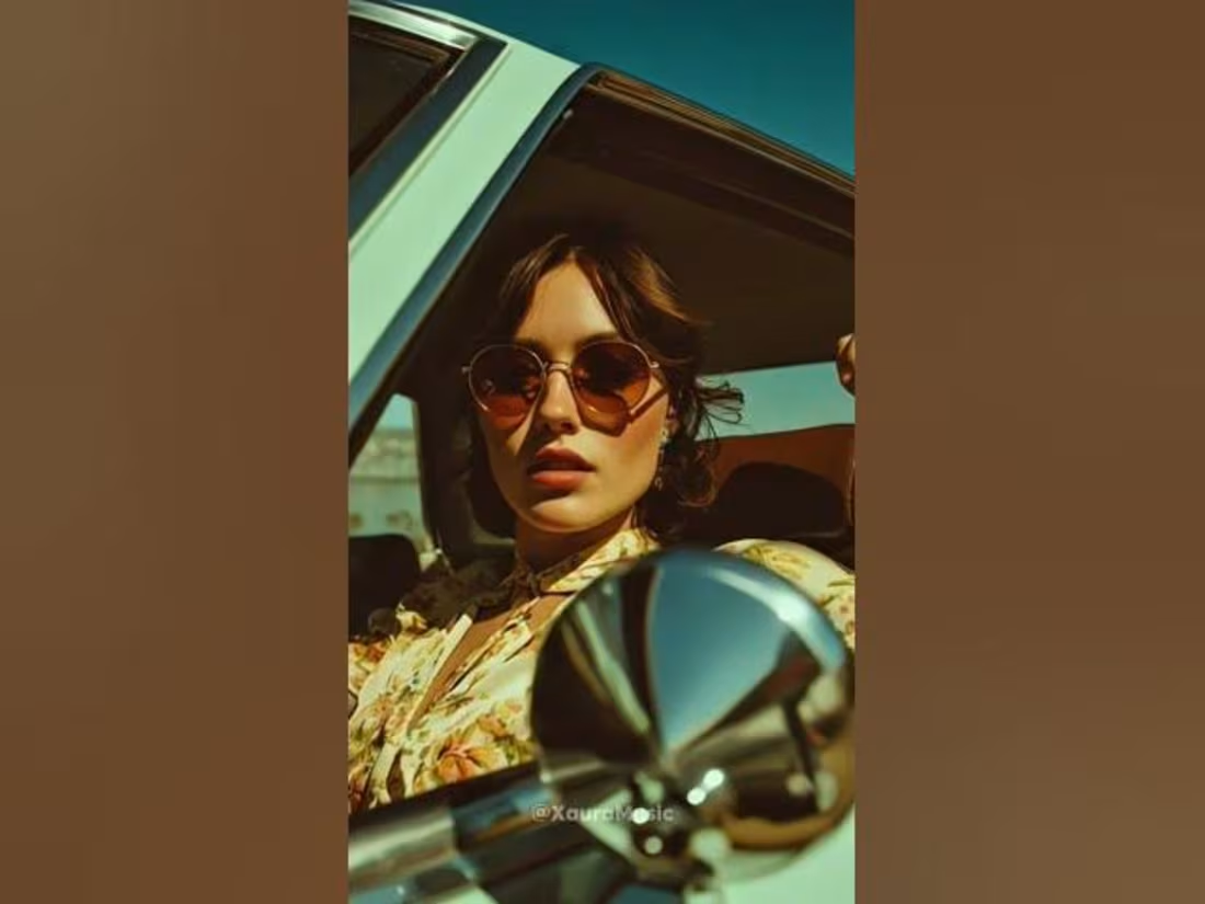
How I made the AI CapCut templates in 30 secs or less. I used a lot of simple editing techniques to get it done in line with the brief.
2
99
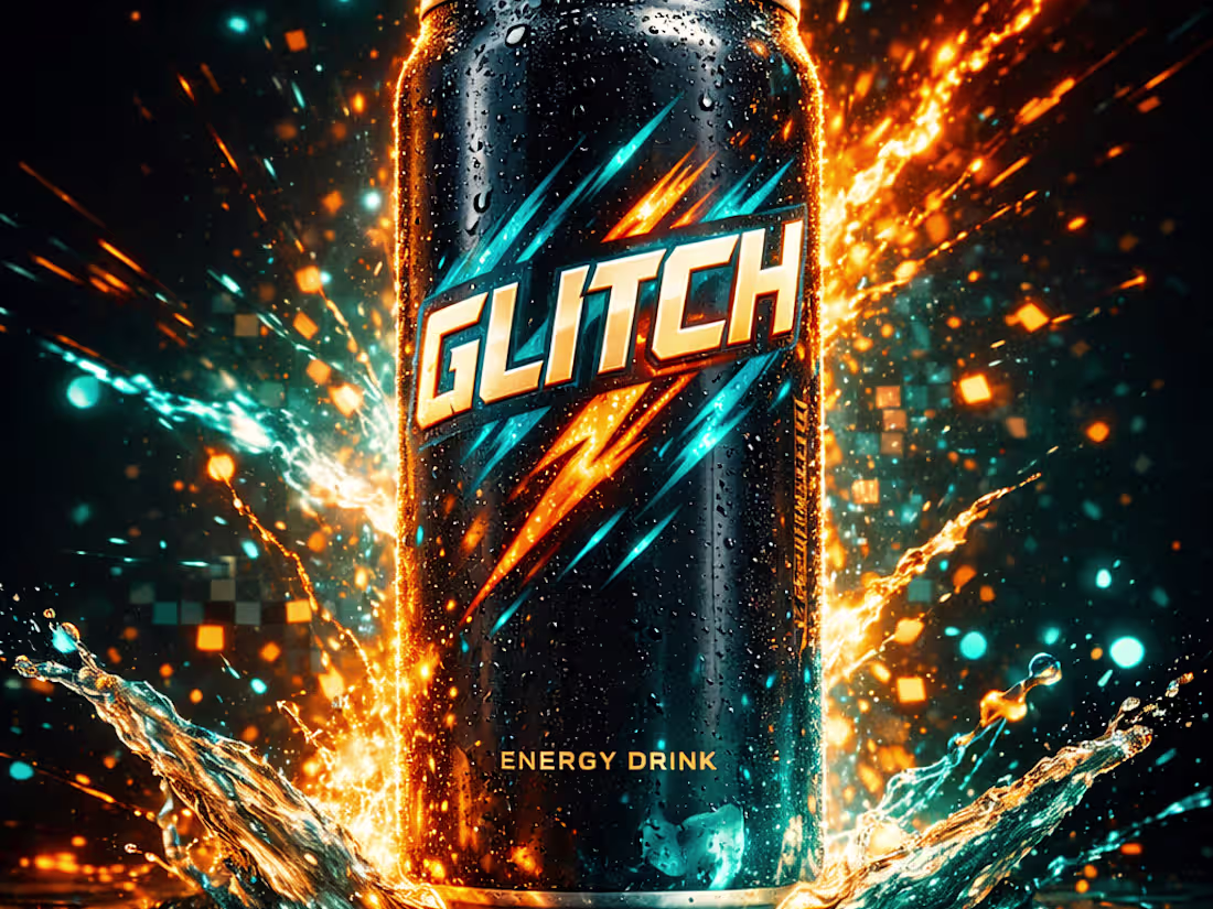
Creative Video Ad for Energy Drink
0
2
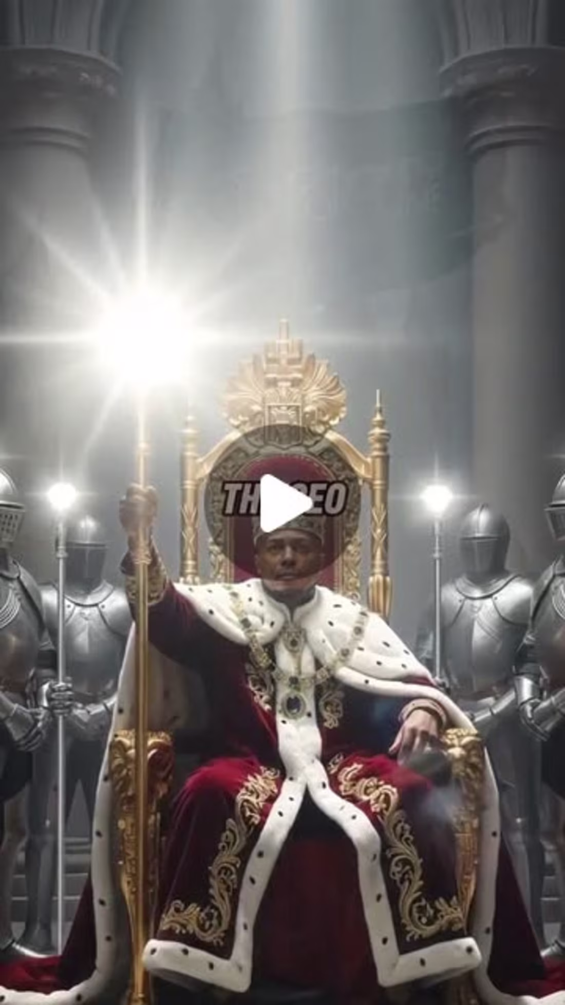
Short form video content for social media
0
3
Music Video Edit
0
2
Fast paced Music Video Edit
0
1
Short-form Music Video Editing
0
4
Short-form Video Editing for Reels and Short
0
1

Short-form Video - Corporate Catfishing Scams
0
2
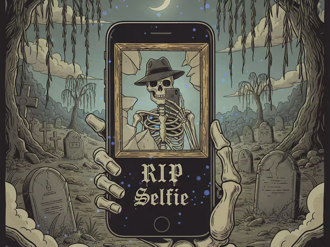
Short-form Video Editing - RIP selfie
0
3
I created this calendar design 1 year ago for a client all the way in Jamaica. Such an amazing experience.
1
0
23
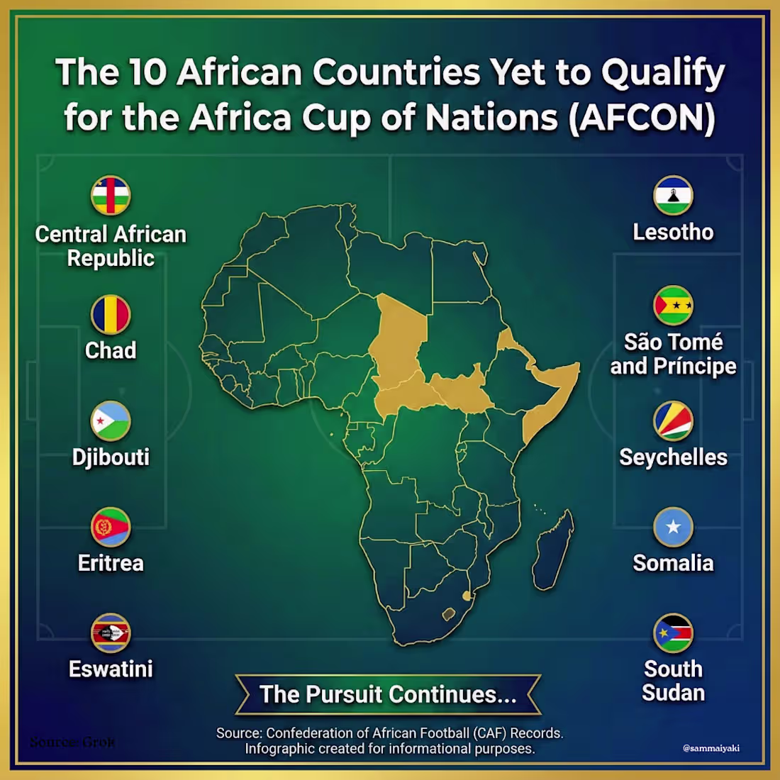
Gemini Nano Banana Prompt:
"A professional square infographic (1024x1024) titled "The 10 African Countries Yet to Qualify for the African Cup of Nations (AFCON)." The design features a stylized map of Africa in the center, highlighting the following countries in Gold: Central African Republic, Chad, Djibouti, Eritrea, Eswatini, Lesotho, São Tomé and Príncipe, Seychelles, Somalia, and South Sudan. Surrounding the map is a clean, modern list of these 10 country names, each paired with their small national flag. The background is a deep emerald green with a subtle football pitch texture and faint African geometric patterns. The typography is bold and white, resembling sports statistics graphics. High resolution, vector art style."
1
43
Creating infographics takes a lot of creative power to achieve.
You have to get all the data, graphic elements and layout accurately.
A slight misrepresentation can change the message.
0
21
Happy Thanksgiving 🦃
1
22
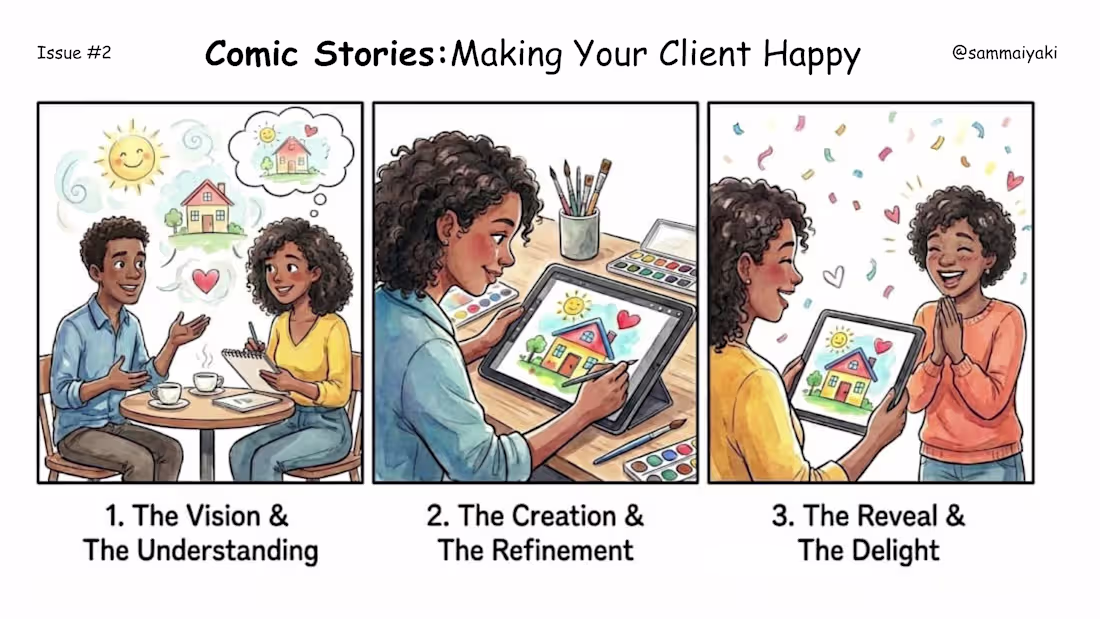
Making your client Happy can be so easy.
1
28
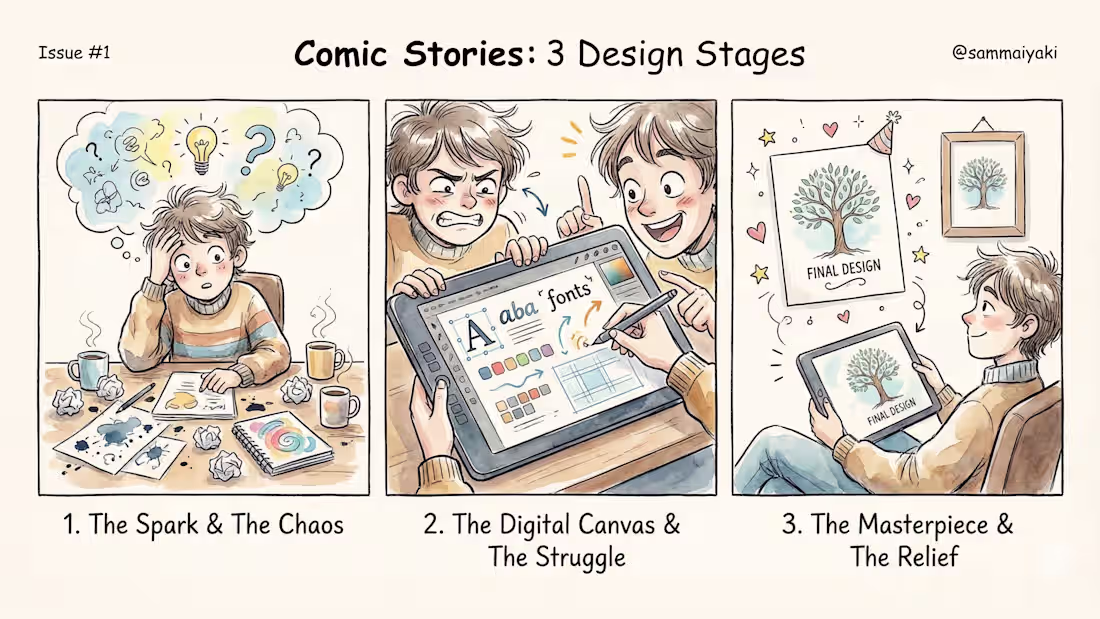
After designing for years you tend to forget these faces. Why? It intuitively forms your workflow.
I still get stuck in Stage 1 sometimes. Lol.
1
28
Made with simple and easy to follow steps, this logo animation expresses the true essence of the brand - Apeiron Ascent Podcast.
1
16
Straight out of production in your domain. Motion brings every thing alive.
1
1
20
Yet another refined and expressive packaging design for FlorAura, a full, thoughtfully curated skincare collection brought together with a clean, modern aesthetic.
This concept covers the entire lineup: a hydrating moisturizer, a protective sunscreen, a silky body lotion, a targeted serum, and more.
Each product carries the same soft, premium visual language that makes the brand feel fresh, elegant, and naturally elevated.
It’s a cohesive look that brings the whole range to life while reinforcing the calm, skin-loving vibe FlorAura stands for.
0
24
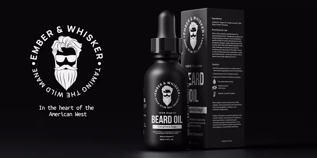
As a bearded person, I put in so much love and care in designing this label for Ember & Whisker.
0
32
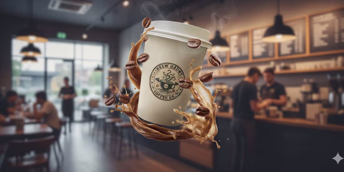
This design is a masterpiece of commercial fantasy, instantly elevating the Brew Haunt Coffee Co. brand by giving it an enchanting visual narrative.
The composition brilliantly uses shallow depth-of-field, keeping the witch and the product, the magical, floating coffee cup in tack-sharp focus against the busy, blurred background of a coffee shop.
0
22
As a professional Graphic Designer with special expertise in Packaging Design, one of the main tenets to never miss is the design context.
In this design, for Cuvée Royale a new wine brand out of Paris, France with focus on selling vintage wines across the world, I paid particular focus on the local context as well as the location.
For the logo, I designed an ornate crest that will also serve as a stamp for official purposes.
Furthermore, the wines come from the early 1900s so the label has to look both grand and timeless.
3
6
45
It's Spooky Season.
0
29
Designing the Sudsy billboards was all about capturing that fresh, feel-good moment, the sparkle after the rinse, the scent that lingers, the warmth of home.
I wanted every glance at the billboard to feel clean, bright, and full of life, just like Sudsy itself.
Bold colors, soft bubbles, and a touch of joy to remind you: even chores can shine.
1
1
47
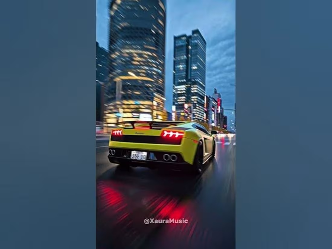
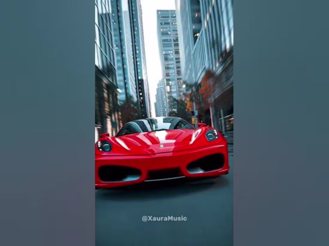
Few months back, I tried making a full music video using Google VEO 3 + Producer AI + CapCut. Here's the outcome.
https://youtu.be/CeuQR-JZj1c?si=H_7mZYhgaepnuYlt
1
0
54
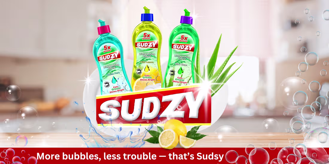
I wanted Sudsy to feel like more than just another dish soap, something that brings warmth and freshness to everyday life. Each fragrance tells a story: Aloe Clean soothes, Ocean Pure refreshes, and Wild Lemon energizes. I designed it to look as clean and uplifting as it feels, bright, simple, and made for real homes. Because even the smallest moments, like washing dishes, deserve a little spark of joy.
0
55
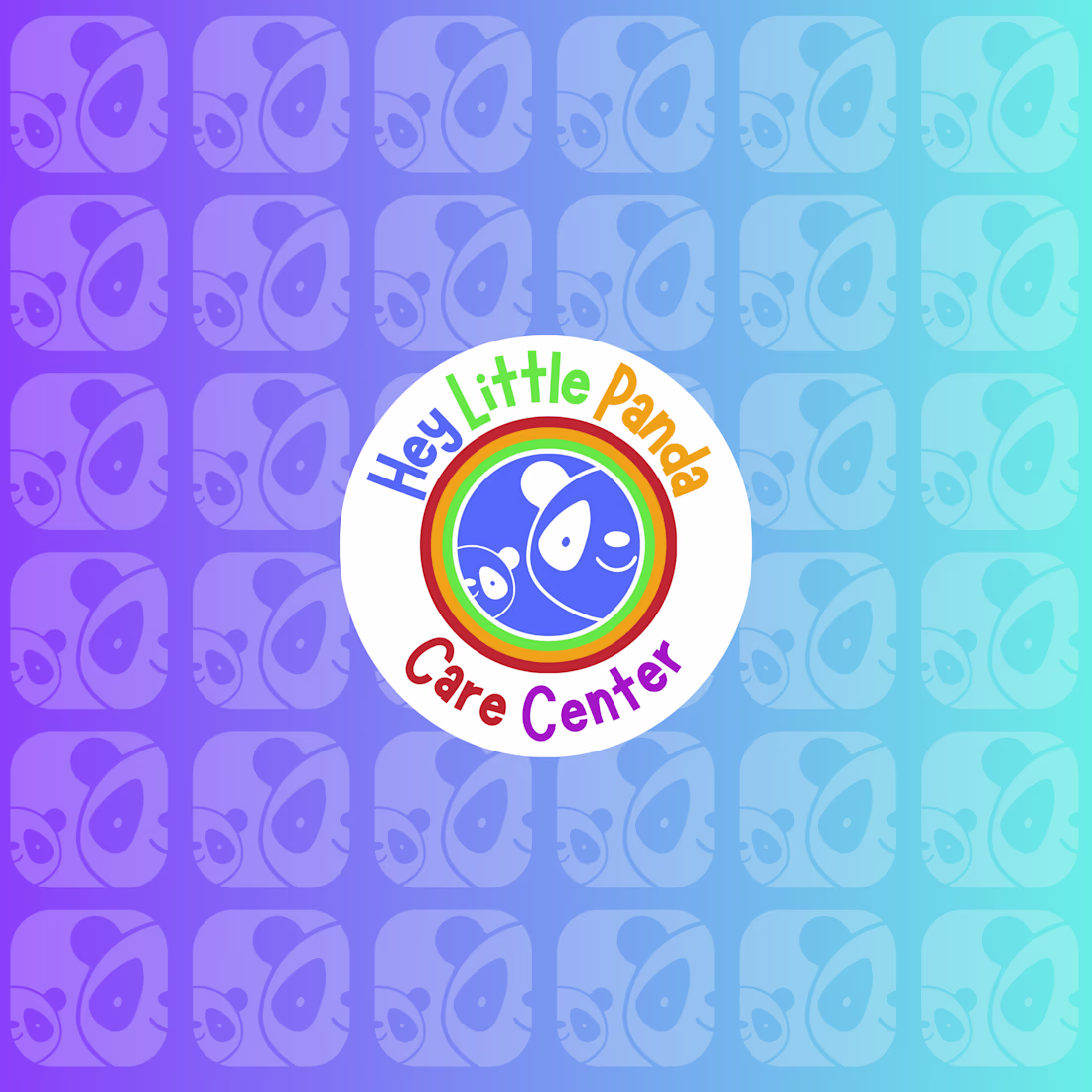
Just wrapped up the logo and brand design for Hey Little Panda Child Care Center, a project that instantly made me smile. I wanted it to feel as warm and joyful as the kids it represents, full of color, care, and happy little moments that say “home.”
0
47
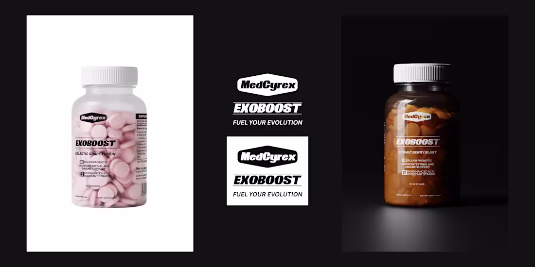
Creative Package Design for MedCyrex Supplement
1
1
Creative Package Design for MedCyrex Supplement
0
2
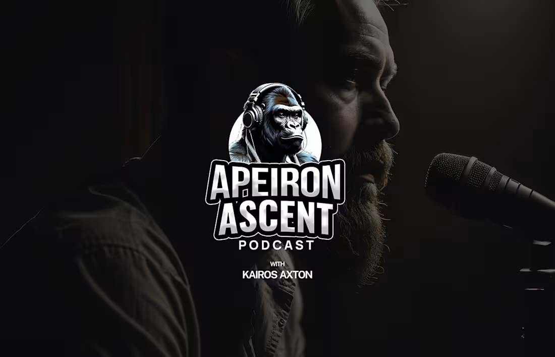
Full Podcast Brand Identity Design For Apeiron Ascent
0
4
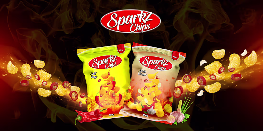
Brand Identity Design for Sparkz Chips
0
1

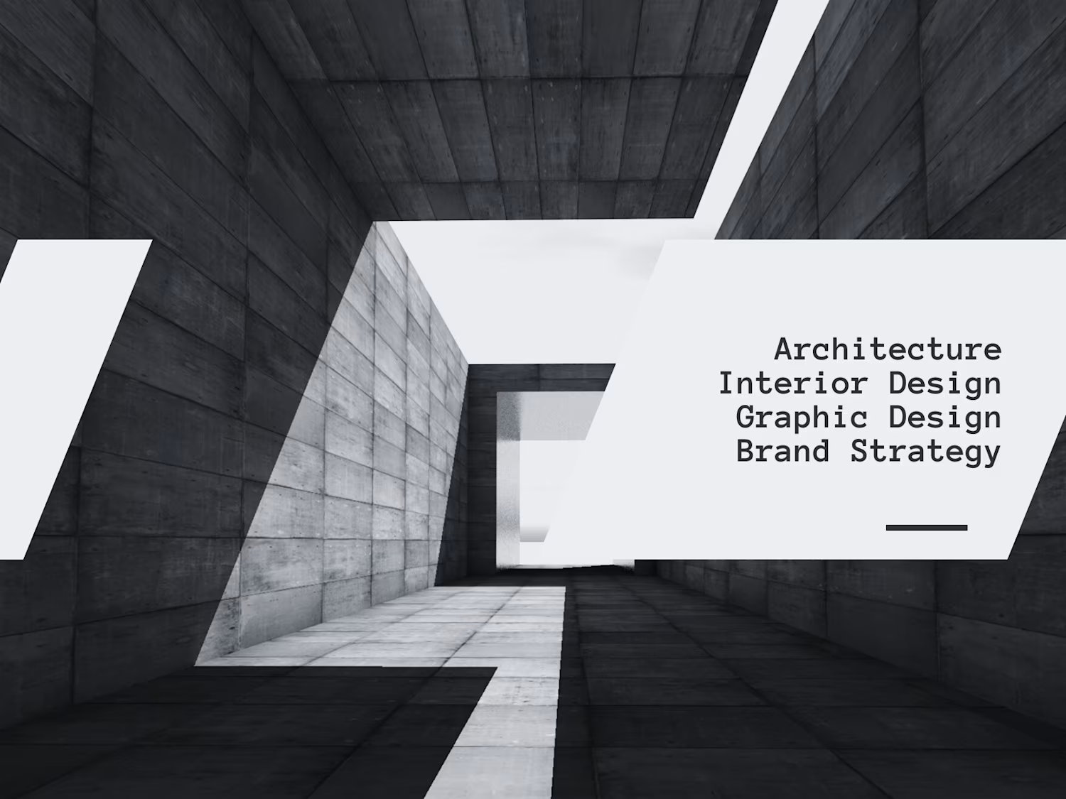
Creative Brand Identity Design for Academic University
1
3