Jacob Samson
Video Editor, Graphic Designer Architect & 3D Artist
Ready for work
Jacob is ready for their next project!
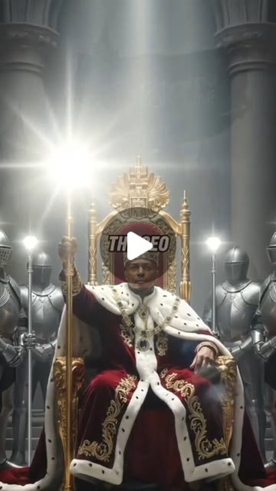
How I made the AI CapCut templates in 30 secs or less. I used a lot of simple editing techniques to get it done in line with the brief.
2
71
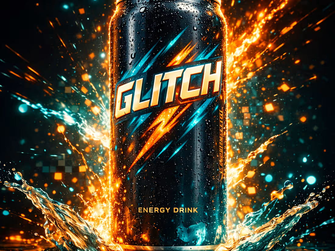
Creative Video Ad for Energy Drink
0
0
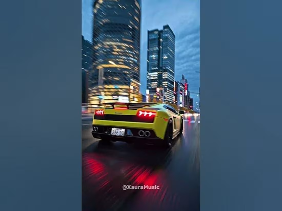
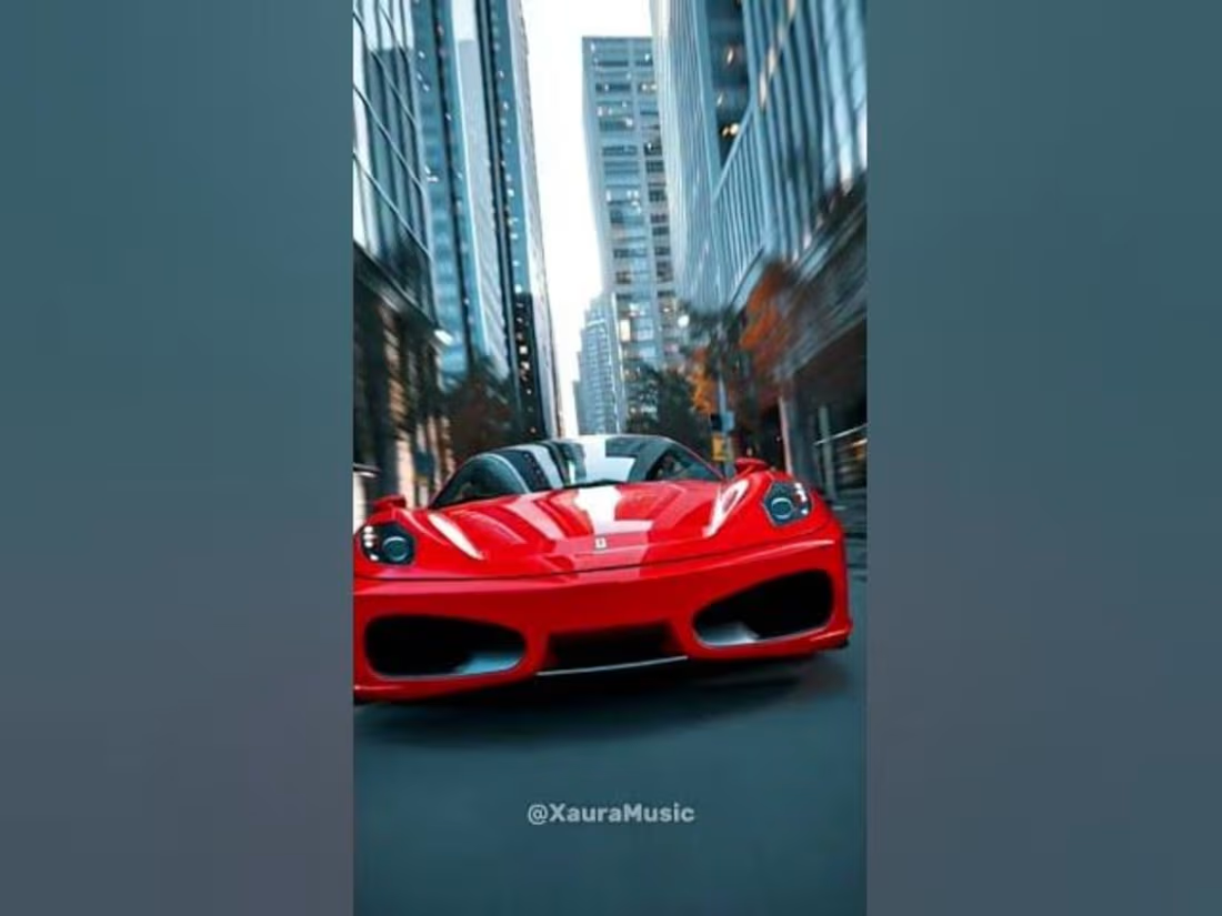
Short form video content for social media
0
1
Music Video Edit
0
0
Fast paced Music Video Edit
0
0
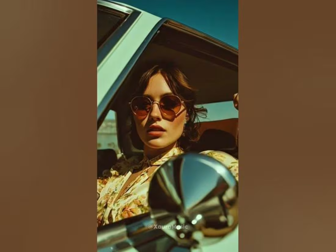
Short-form Music Video Editing
0
0
Short-form Video Editing for Reels and Short
0
0
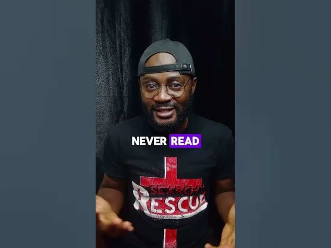
Short-form Video - Corporate Catfishing Scams
0
0
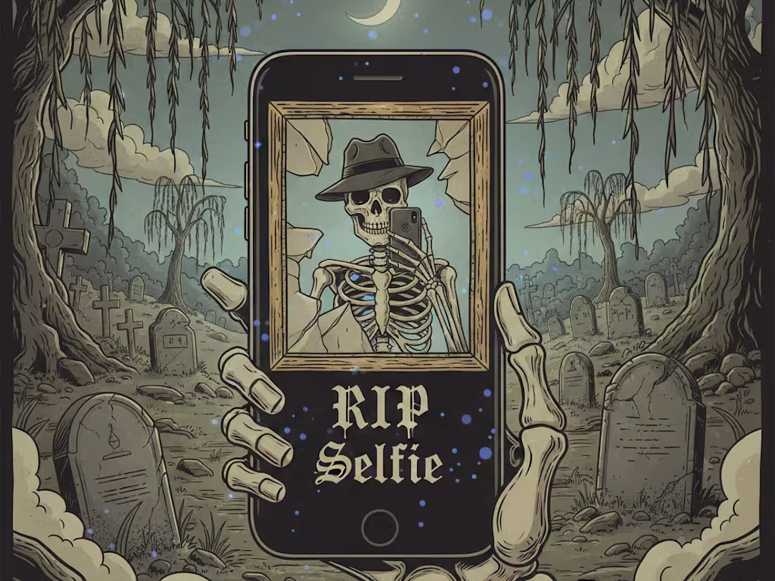
Short-form Video Editing - RIP selfie
0
0
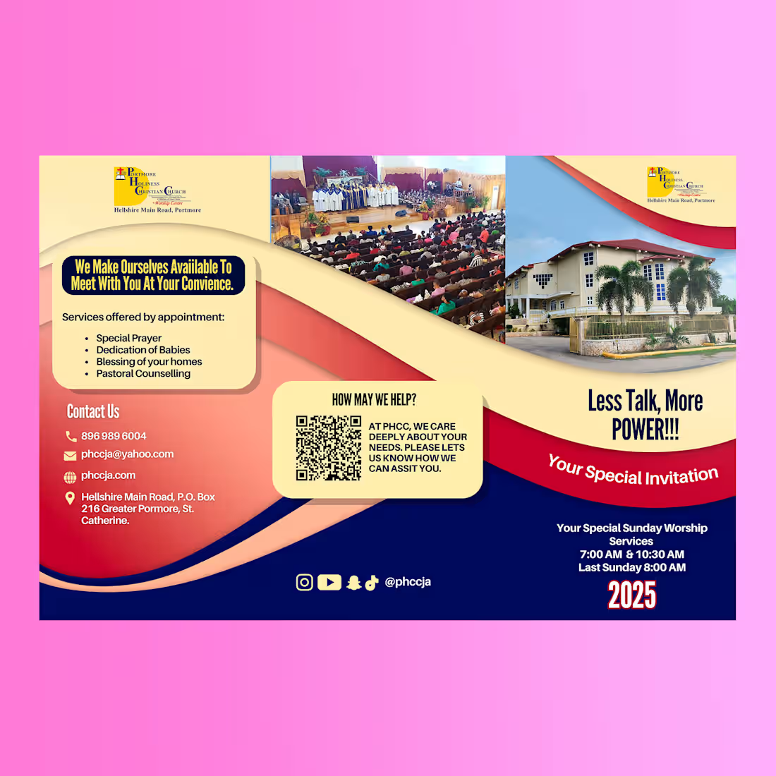
I created this calendar design 1 year ago for a client all the way in Jamaica. Such an amazing experience.
1
0
19
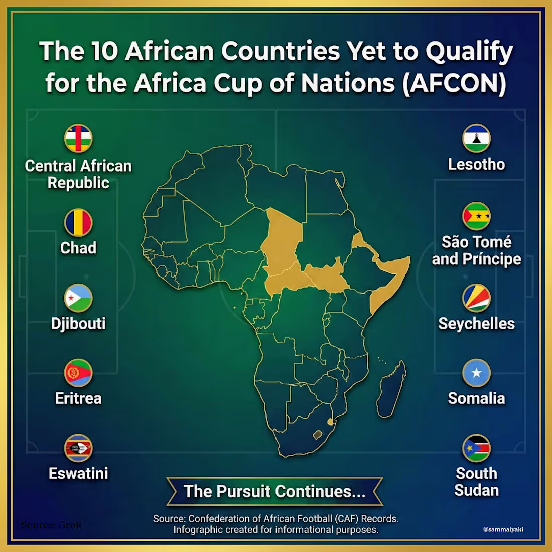
Gemini Nano Banana Prompt:
"A professional square infographic (1024x1024) titled "The 10 African Countries Yet to Qualify for the African Cup of Nations (AFCON)." The design features a stylized map of Africa in the center, highlighting the following countries in Gold: Central African Republic, Chad, Djibouti, Eritrea, Eswatini, Lesotho, São Tomé and Príncipe, Seychelles, Somalia, and South Sudan. Surrounding the map is a clean, modern list of these 10 country names, each paired with their small national flag. The background is a deep emerald green with a subtle football pitch texture and faint African geometric patterns. The typography is bold and white, resembling sports statistics graphics. High resolution, vector art style."
1
34
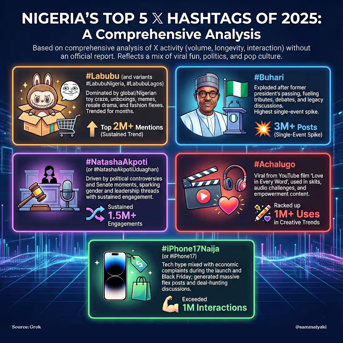
Creating infographics takes a lot of creative power to achieve.
You have to get all the data, graphic elements and layout accurately.
A slight misrepresentation can change the message.
0
18
Happy Thanksgiving 🦃
1
20
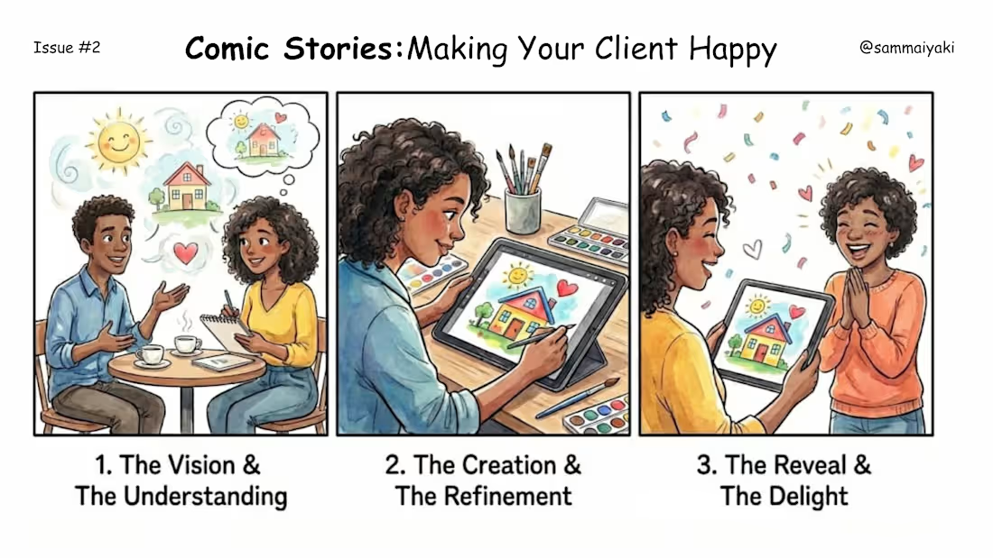
Making your client Happy can be so easy.
1
26
After designing for years you tend to forget these faces. Why? It intuitively forms your workflow.
I still get stuck in Stage 1 sometimes. Lol.
1
18
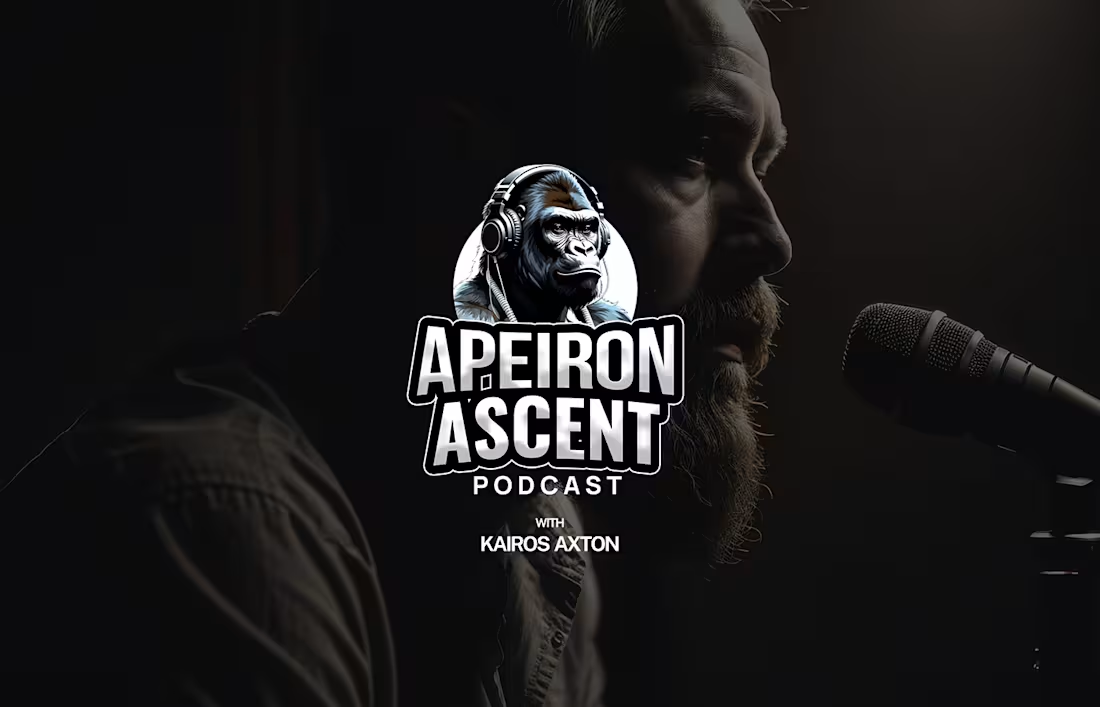
Made with simple and easy to follow steps, this logo animation expresses the true essence of the brand - Apeiron Ascent Podcast.
1
14
Straight out of production in your domain. Motion brings every thing alive.
1
1
17
Yet another refined and expressive packaging design for FlorAura, a full, thoughtfully curated skincare collection brought together with a clean, modern aesthetic.
This concept covers the entire lineup: a hydrating moisturizer, a protective sunscreen, a silky body lotion, a targeted serum, and more.
Each product carries the same soft, premium visual language that makes the brand feel fresh, elegant, and naturally elevated.
It’s a cohesive look that brings the whole range to life while reinforcing the calm, skin-loving vibe FlorAura stands for.
0
23
As a bearded person, I put in so much love and care in designing this label for Ember & Whisker.
0
26
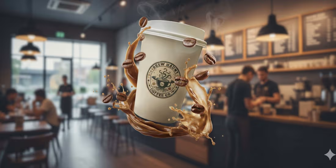
This design is a masterpiece of commercial fantasy, instantly elevating the Brew Haunt Coffee Co. brand by giving it an enchanting visual narrative.
The composition brilliantly uses shallow depth-of-field, keeping the witch and the product, the magical, floating coffee cup in tack-sharp focus against the busy, blurred background of a coffee shop.
0
20
As a professional Graphic Designer with special expertise in Packaging Design, one of the main tenets to never miss is the design context.
In this design, for Cuvée Royale a new wine brand out of Paris, France with focus on selling vintage wines across the world, I paid particular focus on the local context as well as the location.
For the logo, I designed an ornate crest that will also serve as a stamp for official purposes.
Furthermore, the wines come from the early 1900s so the label has to look both grand and timeless.
3
6
37
It's Spooky Season.
0
26
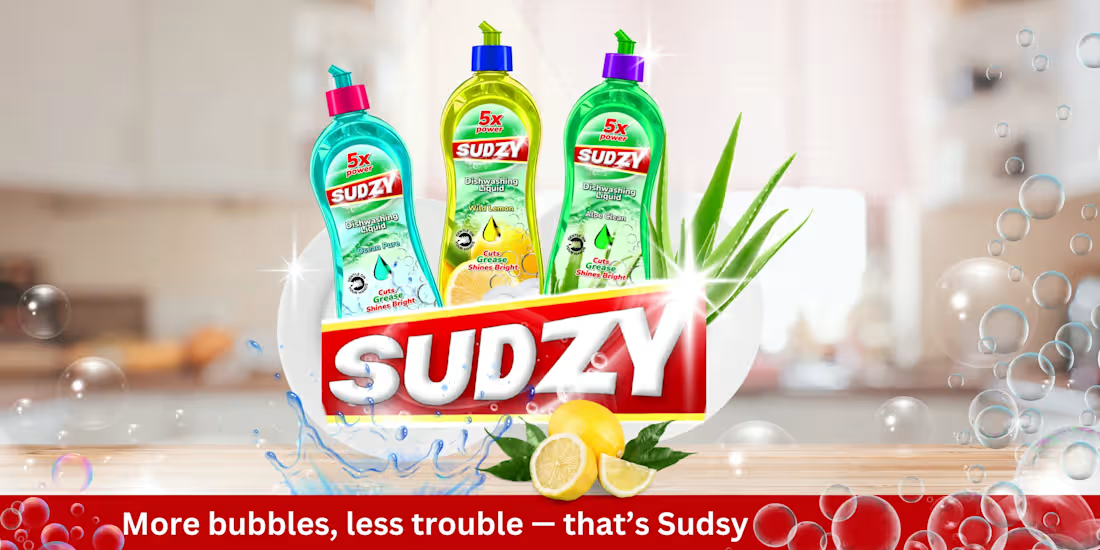
Designing the Sudsy billboards was all about capturing that fresh, feel-good moment, the sparkle after the rinse, the scent that lingers, the warmth of home.
I wanted every glance at the billboard to feel clean, bright, and full of life, just like Sudsy itself.
Bold colors, soft bubbles, and a touch of joy to remind you: even chores can shine.
1
1
43
Few months back, I tried making a full music video using Google VEO 3 + Producer AI + CapCut. Here's the outcome.
https://youtu.be/CeuQR-JZj1c?si=H_7mZYhgaepnuYlt
1
0
52
I wanted Sudsy to feel like more than just another dish soap, something that brings warmth and freshness to everyday life. Each fragrance tells a story: Aloe Clean soothes, Ocean Pure refreshes, and Wild Lemon energizes. I designed it to look as clean and uplifting as it feels, bright, simple, and made for real homes. Because even the smallest moments, like washing dishes, deserve a little spark of joy.
0
49
Just wrapped up the logo and brand design for Hey Little Panda Child Care Center, a project that instantly made me smile. I wanted it to feel as warm and joyful as the kids it represents, full of color, care, and happy little moments that say “home.”
0
45
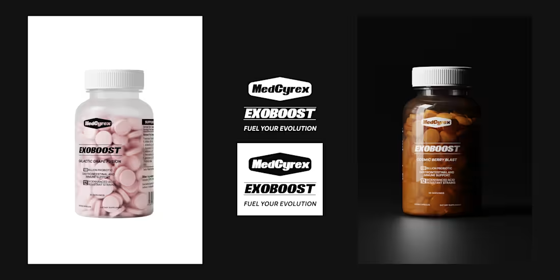
Creative Package Design for MedCyrex Supplement
1
0
Creative Package Design for MedCyrex Supplement
0
0
Full Podcast Brand Identity Design For Apeiron Ascent
0
0
Brand Identity Design for Sparkz Chips
0
0
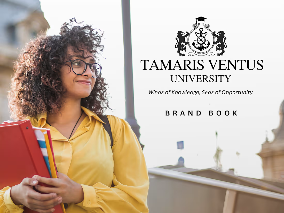
Creative Brand Identity Design for Academic University
1
0
