
pro
Kevin Voisin
Business automation ninja for smooth, scalable growth



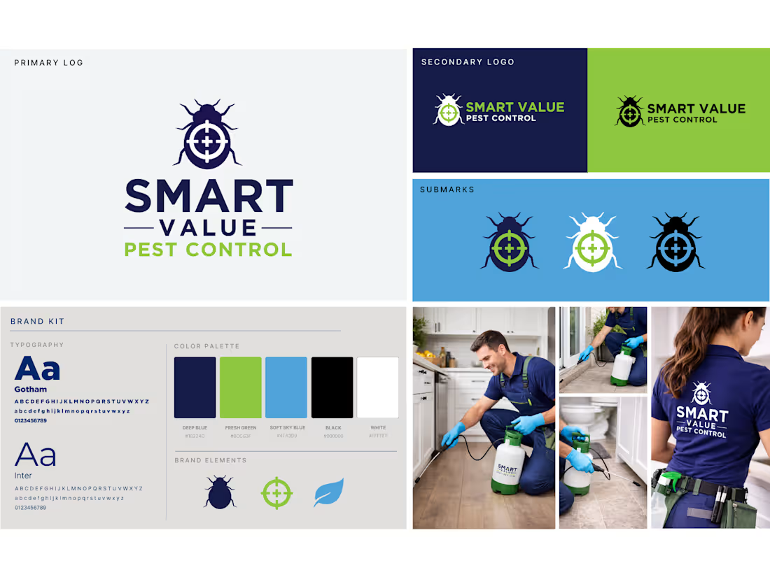
Home service businesses don't need pretty branding. They need branding that survives the field.
A logo that holds up on a service van going 60mph. Submarks that don't pixelate on a uniform patch. Colors that look the same on a yard sign at noon and an estimate PDF at midnight. Most brand kits collapse the second they leave the designer's screen.
Built the full identity for Smart Value Pest Control, engineered for the field first, digital second:
→ Bold primary logo built to read clearly on vehicles, signage, and uniforms at distance
→ Secondary lockups + submarks sized for every real-world application (truck doors, polo embroidery, app icons, invoices)
→ Typography: Gotham for field signage and equipment, Inter for digital and documents
→ Deep blue / fresh green / soft sky palette, professional, approachable, holds up in print and on screen
→ Full brand kit organized so techs, dispatchers, and marketing pull the right asset without asking
A consistent brand in the field is the first system. The backend systems, booking, dispatch, follow-up, review capture, get built on top of it.
If you run a home service business and your brand looks different on every truck and every email, that's fixable in a week.
0
59
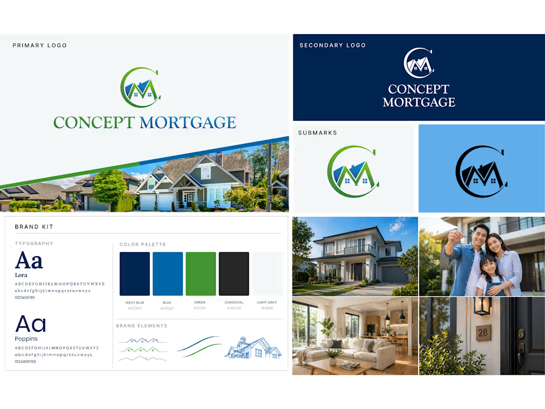
In financial services, trust isn't a feeling. It's an infrastructure decision.
Every touchpoint a prospect sees, the logo on the loan doc, the color on the email, the type on the website, either compounds trust or quietly leaks it. Most lenders lose deals not because of rates but because the brand feels inconsistent enough to plant doubt.
Built the full brand identity for Concept Mortgage to lock that trust in at the foundation:
→ Primary lockup engineered for high-stakes financial documents
→ Monogram submarks for app icons, favicons, and tight digital placements
→ Typography system: Lora for editorial weight, Poppins for digital clarity
→ Navy / green / charcoal palette - modern, reliable, built to age well
→ Full brand kit with lifestyle imagery direction for warmth on a foundation of structure
When the brand system is consistent, every downstream system, funnels, email sequences, client portals, inherits that trust automatically.
If you're building in a trust-sensitive industry and your brand isn't pulling its weight, that's a fixable problem.
0
55
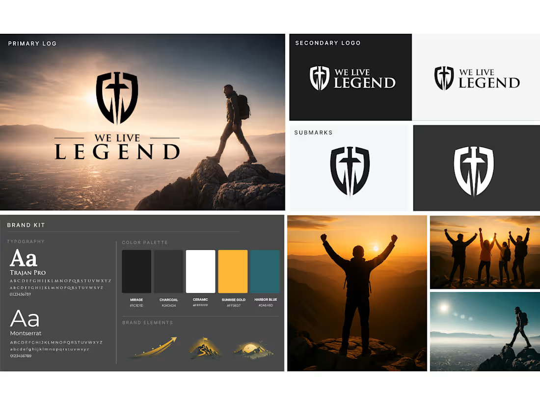
Built the full brand identity for We Live Legend, my own coaching program and accountability app built to push people toward purpose-led living.
The brief I gave myself: cinematic, mission-driven, built to carry weight across every touchpoint: app, funnel, content, community.
What I built:
→ Shield-and-cross monogram anchoring the visual system
→ Classical serif paired for editorial weight and timeless feel
→ Dynamic, high-contrast color palette engineered for digital and app use
→ Full brand kit: primary logo, secondary lockups, submark variations, typography rules, color hierarchy
When you build a brand for your own program, you stop designing for "nice." You design for what has to perform across every system it touches.
See it live: livelegendapp.com (https://livelegendapp.com)
0
79
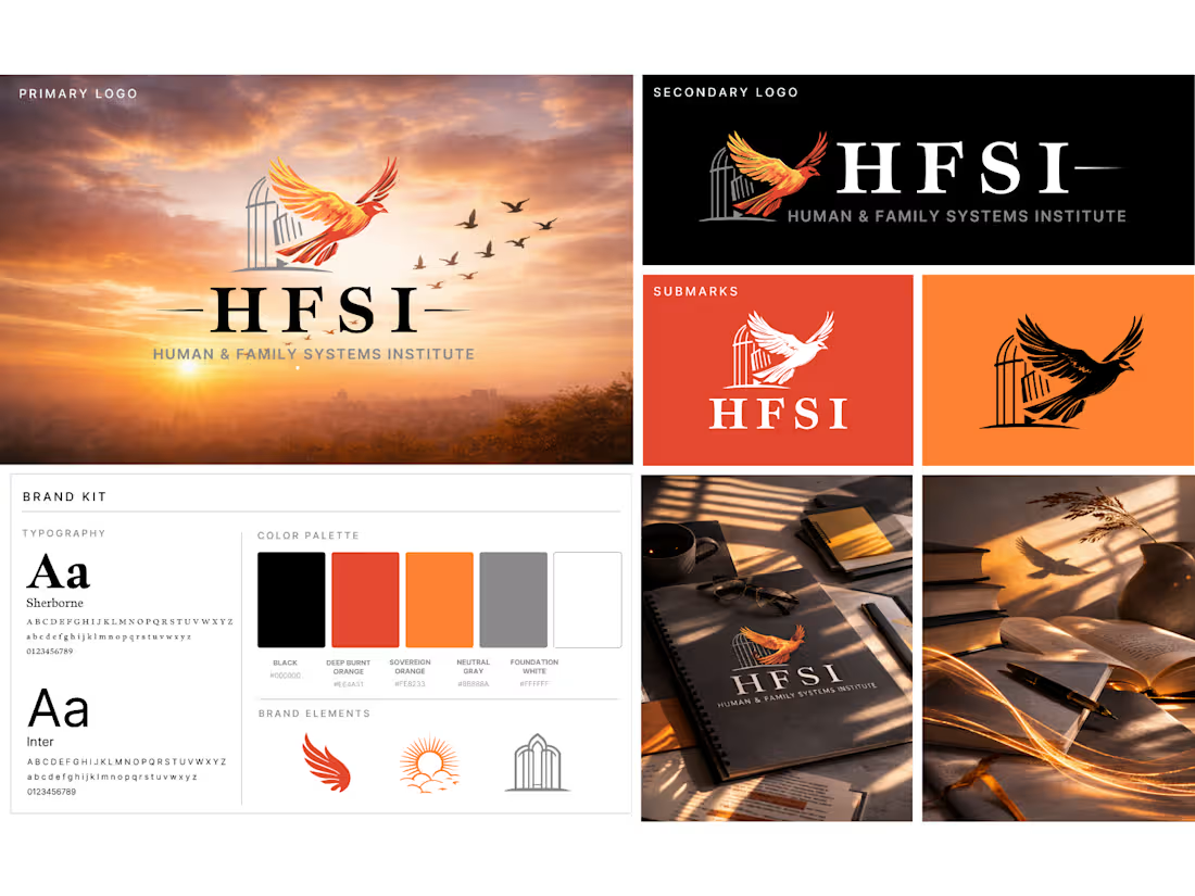
Most growing organizations don't have a branding problem. They have a consistency problem.
Different fonts on the website vs. the deck. Three versions of the logo floating in team folders. New hires guessing at colors. Every touchpoint feeling slightly off-brand because there's no single source of truth.
We built the full brand system for the Human & Family Systems Institute (HFSI) to kill that chaos before it started:
→ Primary logo + secondary lockups + submark variations (one for every use case, so nobody improvises)
→ Typography system: Sherborne for editorial weight, Inter for digital clarity
→ 5-tone editorial color palette with defined hierarchy
→ Full brand kit with digital + print applications, organized so any team member can pull the right asset in 10 seconds
The deliverable wasn't "a logo." It was a brand operating system, the kind of backend infrastructure that lets a growing institute scale its communications without scaling the chaos.
If your team is recreating the same assets every week or your brand looks different in every deck, you don't need a redesign. You need a system.
DM "brand system" and I'll send our intake.
0
88