Iosua Gavril
Brand identity for founders who care about details.
New to Contra
Iosua is ready for their next project!


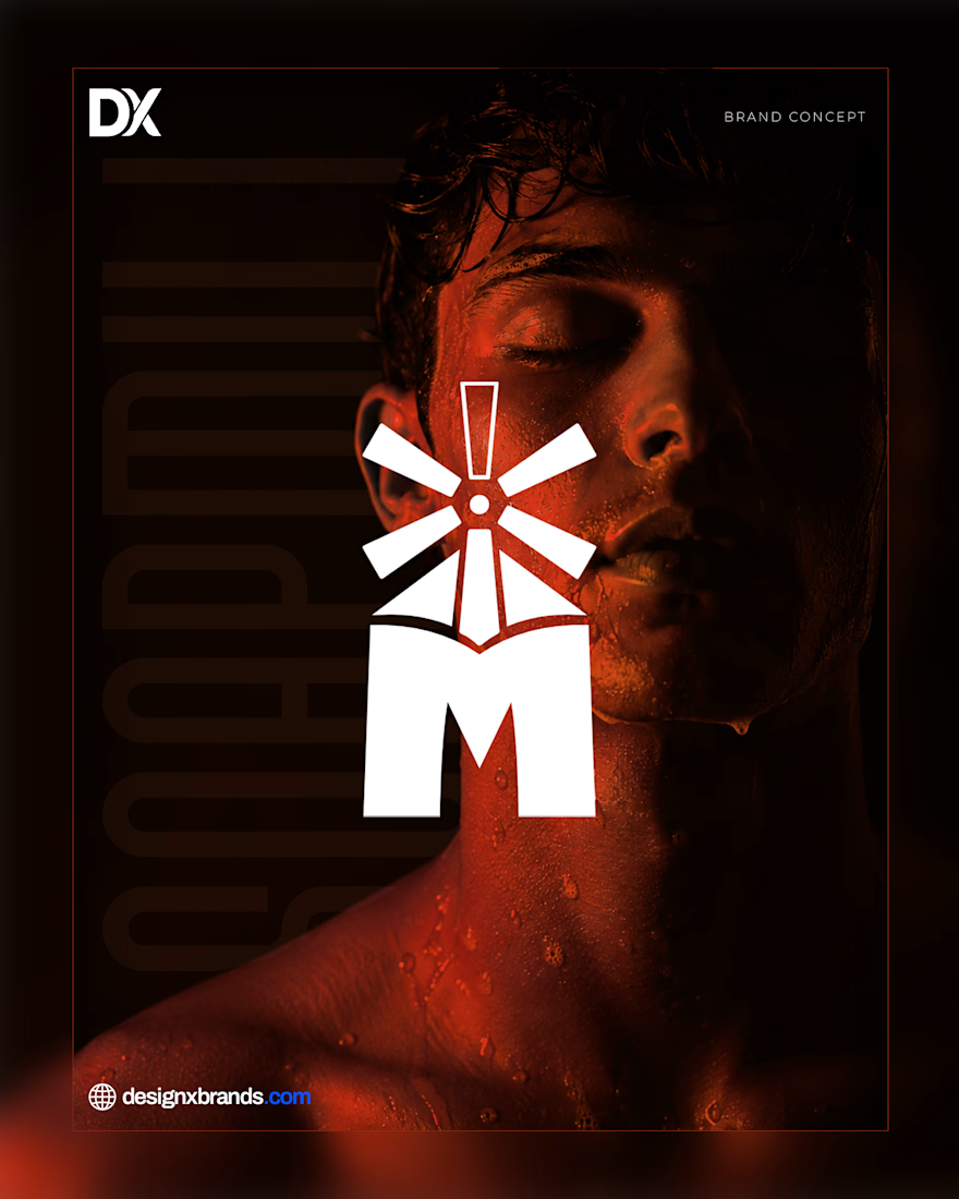
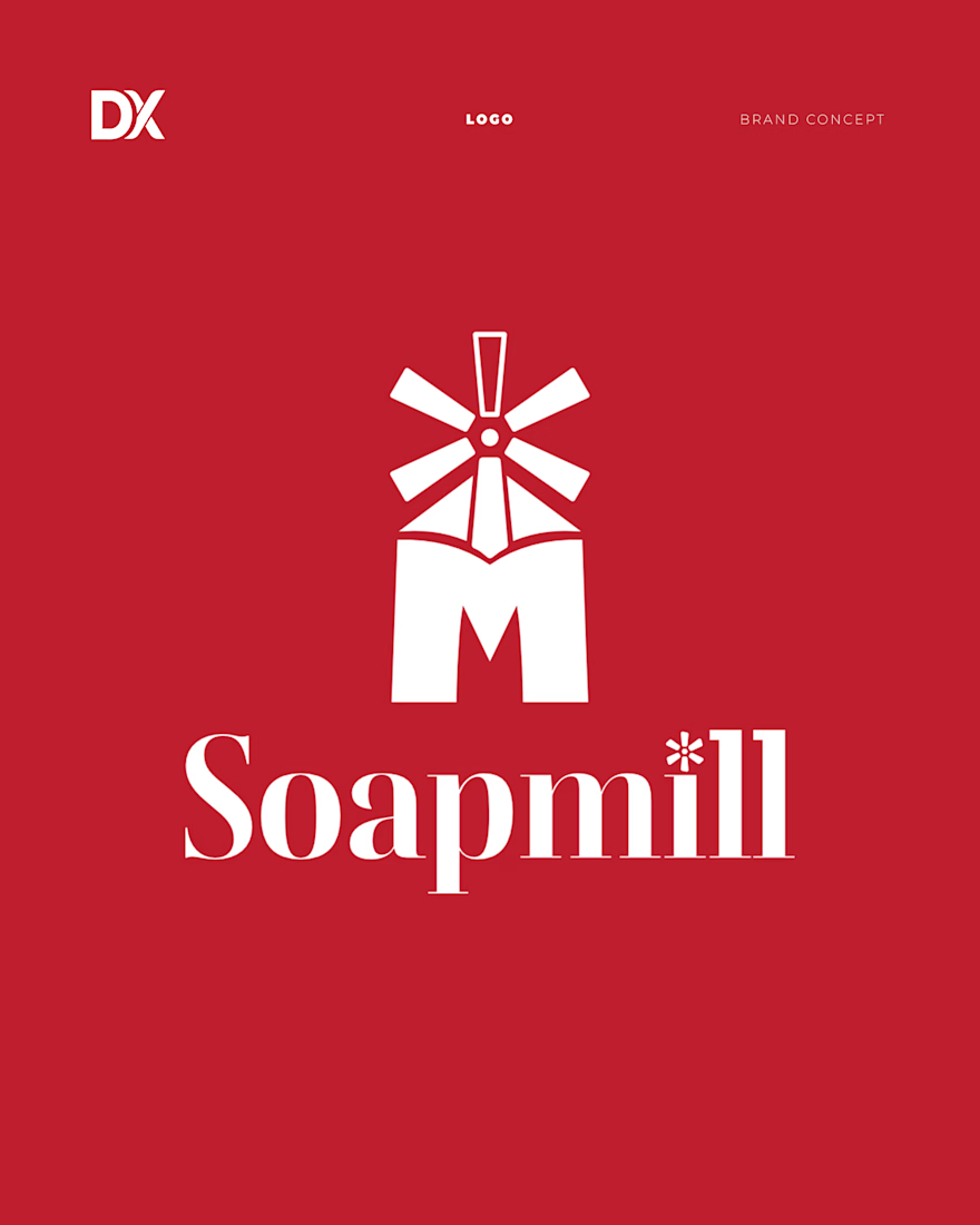
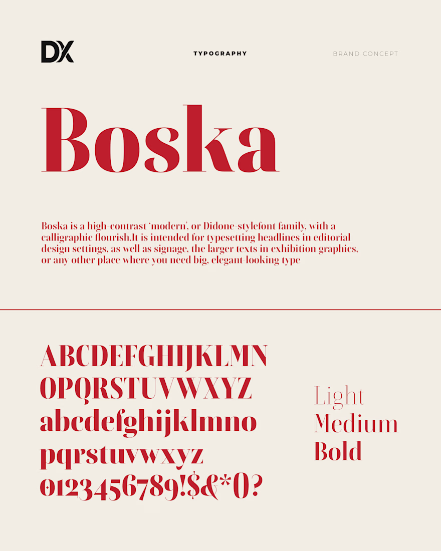
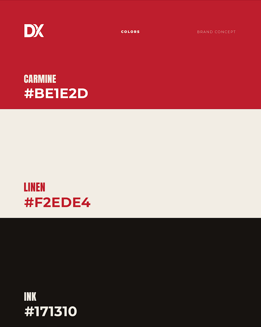
Soapmill — Brand Identity Concept
A Bucharest bio soap maker needed a system, not a logo. Built a windmill out of the letter M, carmine red as the through-line, six unified labels for the ritual product line.
designxbrands.com
Built to Impress.
Nobody climbs a mountain to see a hill.
A brand built properly does not need to explain itself. It is recognised from a distance and it stays with people after they leave.
First piece in an ongoing series exploring what "built to impress" actually looks like.
Brand identity and web design. Open for new projects.
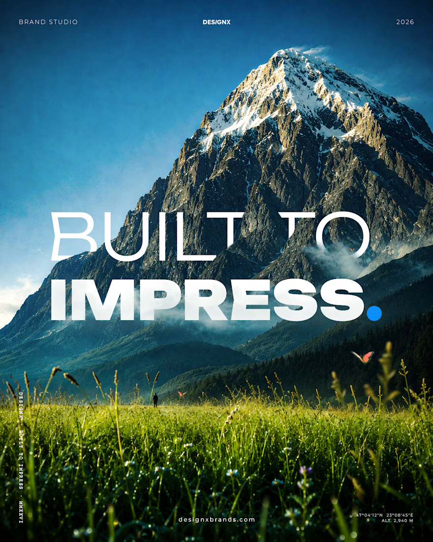
Built to impress.
I run Designx — a brand & web studio for companies that refuse to blend in. I build identities and websites made to be remembered, not overlooked.
Not to fit in. Not to play it safe. To be remembered.
A forgettable brand isn't an option.
Brand identity from €290 ·...



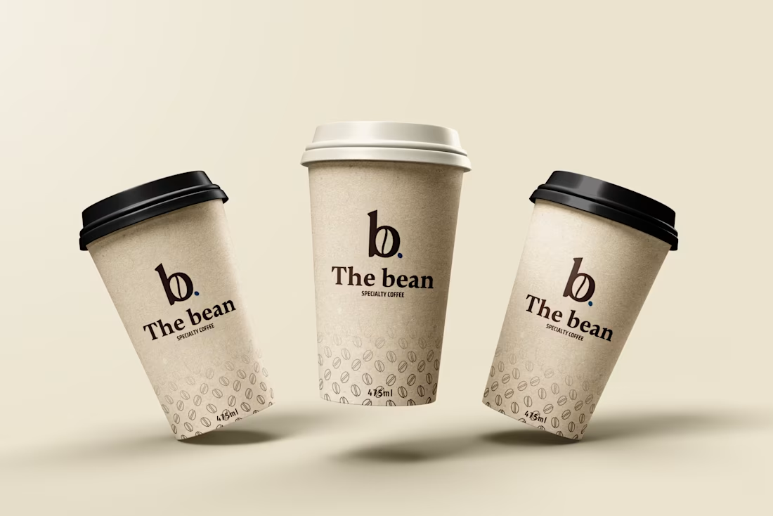
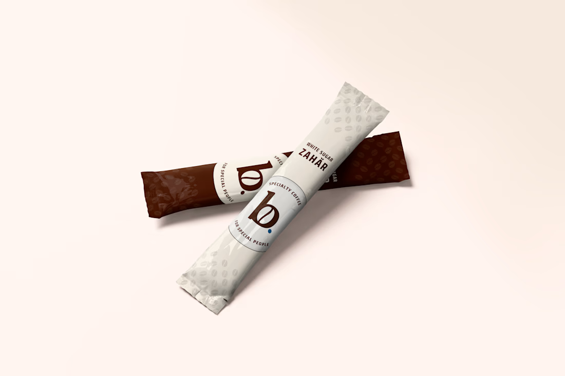
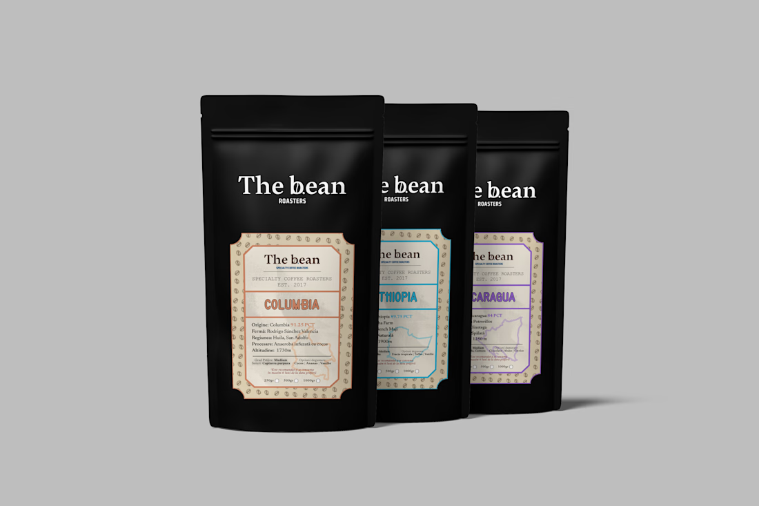
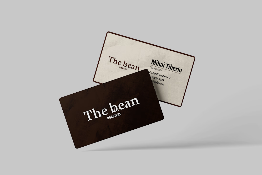
Brand Concept | The Bean
Specialty coffee is craft, the brand had to feel handmade, not like
another cold, minimal café logo.
The whole identity turns on one detail: a coffee bean tucked into the "b"
of the wordmark, with a single deep-roast crease down its center. It's
the kind...