The network for creativity
Join 1.25M professional creatives like you
Connect with clients, get discovered, and run your business 100% commission-free
Creatives on Contra have earned over $150M and we are just getting started
Back to feedPost

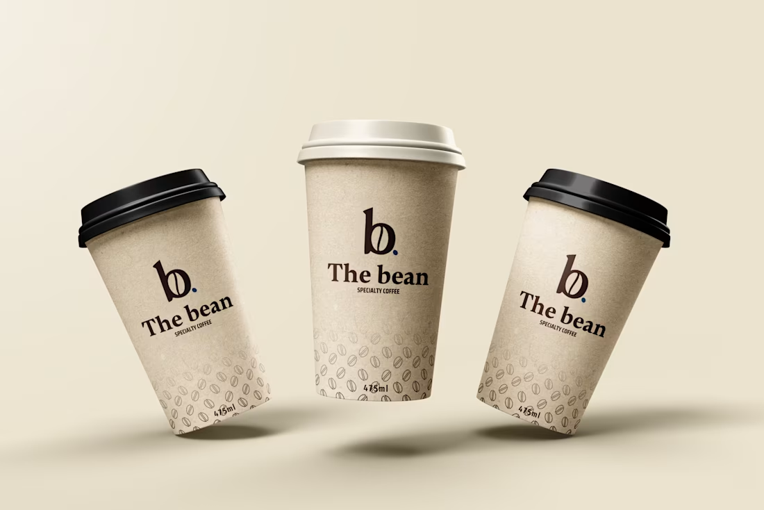
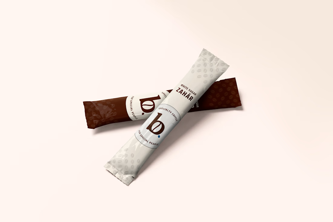
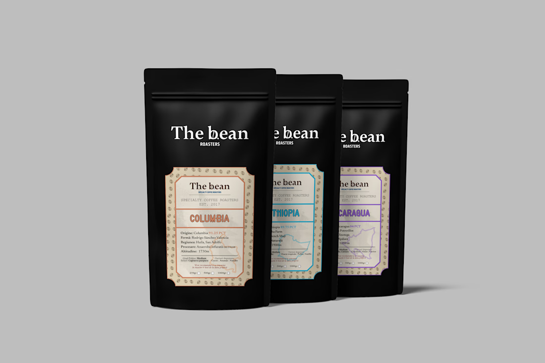
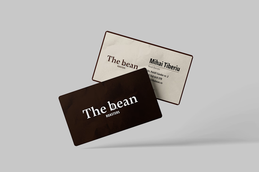
Brand Concept | The Bean
Specialty coffee is craft, the brand had to feel handmade, not like
another cold, minimal café logo.
The whole identity turns on one detail: a coffee bean tucked into the "b"
of the wordmark, with a single deep-roast crease down its center. It's
the kind of thing you notice on the second look and don't forget. Warm
serif type, a dark-roast palette, and one unexpected cool accent keep it
premium without going corporate.
A mark with a secret, the way the best specialty brands earn a second
glance.


The network for creativity
Join 1.25M professional creatives like you
Connect with clients, get discovered, and run your business 100% commission-free
Creatives on Contra have earned over $150M and we are just getting started






Related posts

Had some fun with this one.
Exploring how typography, colour, and a few unexpected details can give a brand its own personality.
Meet Flankman. Full case study is live! ↓







clean


I like the font!

Four luxury black-and-gold skincare packaging and gift box concepts with label design, brand styling, and product mockups.

Nice mockup!