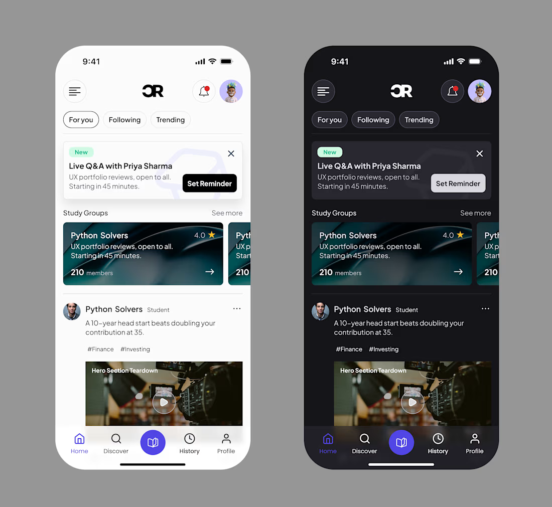
Ibukunoluwafemi Adejolu
Product Designer: Website & Mobile App Design Expert
Ready for work
Ibukunoluwafemi is ready for their next project!




Designing for the little details that make a product feel more human.
Exploring visual direction, storytelling, and interaction to make financial products feel simpler, more approachable, and more engaging for kids. ✨

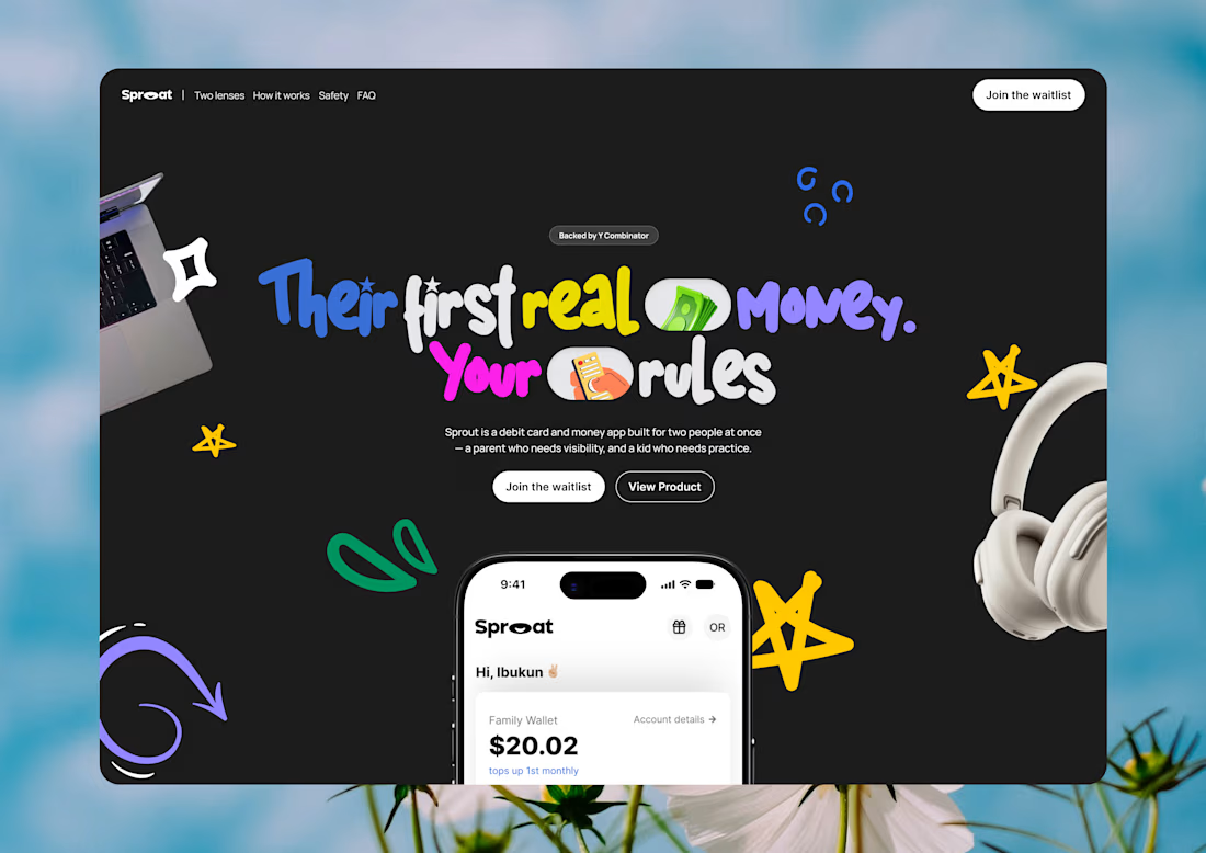
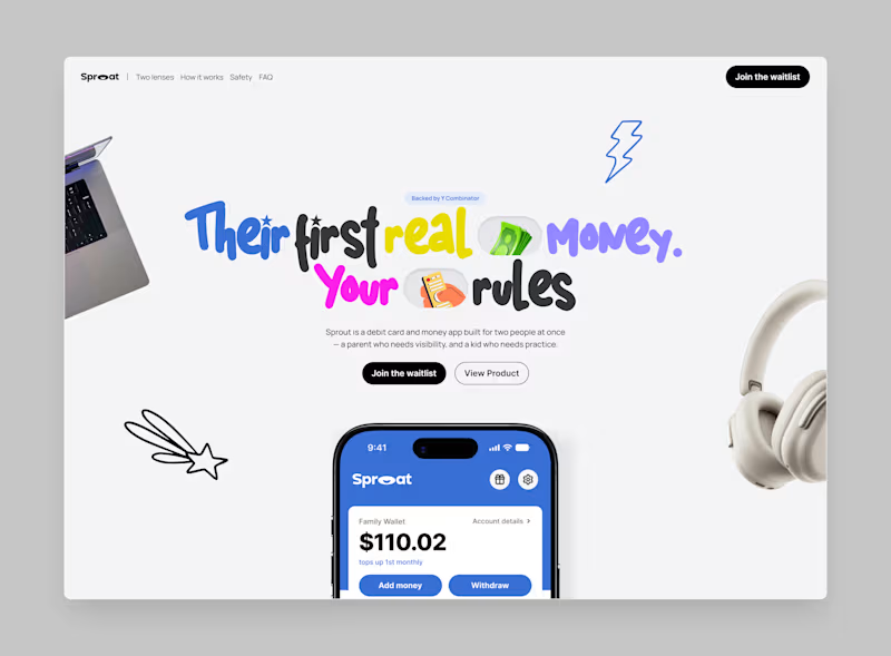
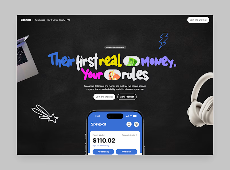
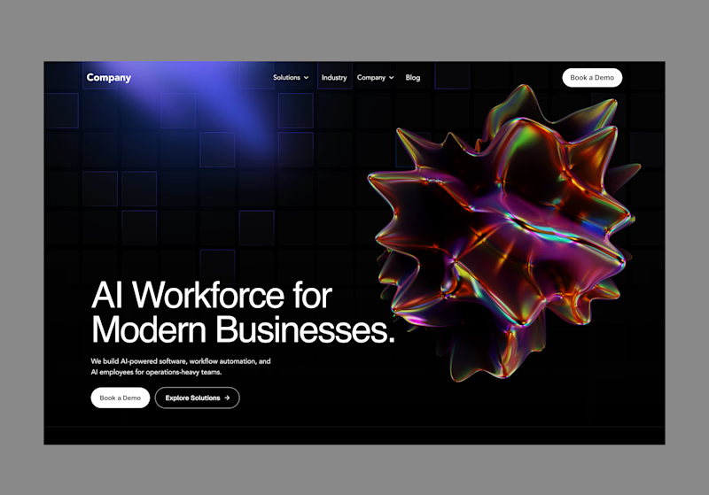
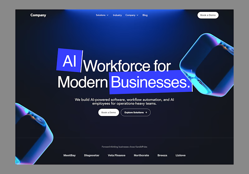
Two hero concepts. One kids finance app. Exploring how to make financial tools feel fun and approachable for kids, while keeping parents in control.
which you would prefer, A OR B
3 voted
38%
5 voted
62%
8 votes
Closed
A hero section is more than just the first thing users see. It’s where a product introduces itself, communicates its value, and sets the direction for the experience.
Here, I explored two approaches: Option A puts the product and visual asset at the forefront, creating a more...
0 voted
0%
7 voted
100%
7 votes
Closed
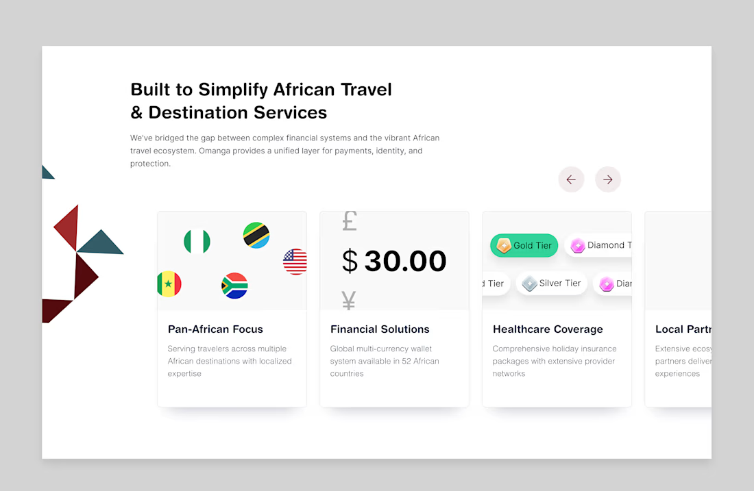
Design is problem-solving with pixels.
Every screen, every interaction, every micro-decision serves the user first. This one was about stripping complexity down to something that feels effortless (the kind of "simple" that takes the most iterations to get right).
Clean layout....