The network for creativity
Join 1.25M professional creatives like you
Connect with clients, get discovered, and run your business 100% commission-free
Creatives on Contra have earned over $150M and we are just getting started
Back to feedPost
Taste Test
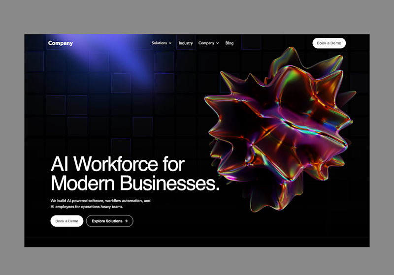
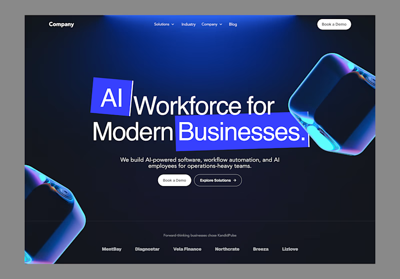
A hero section is more than just the first thing users see. It’s where a product introduces itself, communicates its value, and sets the direction for the experience.
Here, I explored two approaches: Option A puts the product and visual asset at the forefront, creating a more immersive and visual-first experience. Option B takes a more typographic approach, using the headline and supporting elements to communicate the value proposition more directly.
Two directions, same goal: making the first impression count.

0 voted
0%
7 voted
100%
7 votes
Closed

Both are amazing

Thank you, glad you like both.

You’re right, B feels more aligned with the topic, and the colours work better too.. thank you for the feedback

both are good. just purely off looks, i'd go for B
Thanks Godwin! Appreciate the feedback. I was leaning towards B too

Wow great work🔥
thank you so much
The network for creativity
Join 1.25M professional creatives like you
Connect with clients, get discovered, and run your business 100% commission-free
Creatives on Contra have earned over $150M and we are just getting started





Related posts

Hero Section Review
Which would you pick if I was designing for you ?
3 voted
38%
5 voted
62%
8 votes
Closed


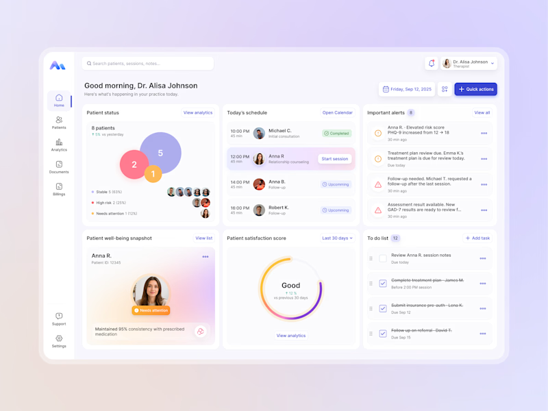
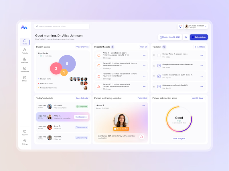
Designing for therapists means prioritizing what matters in the next few minutes, not just what looks good on a dashboard.
I explored two layout directions for a mental health practice management web app that helps psychologists manage sessions, patients, documentation, tasks, and follow-ups.
Both concepts use the same core widgets, but with different positioning and visual hierarchy. The goal was to make daily priorities easier to scan and act on.
Which option feels more intuitive - A or B? 🤔
17 voted
68%
8 voted
32%
25 votes
Closed

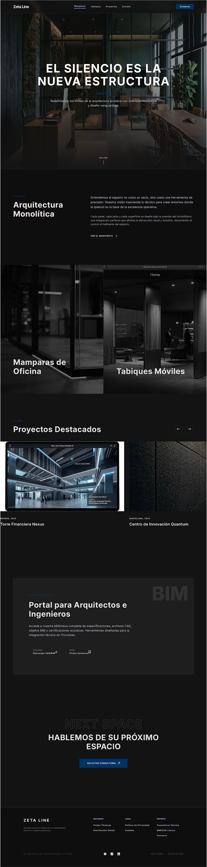
Recently, I created two designs for my client. One is in dark mode, and the other is in light mode. I love both of them. Which one do you like more?
5 voted
56%
4 voted
44%

9 votes
Closed

fresh light