pro
Margo Syniakova
Brand Designer & Art Director
- 5.00
- Rating
- 11
- Followers


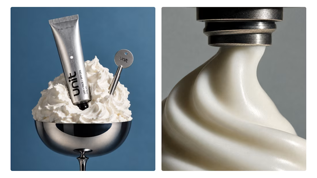
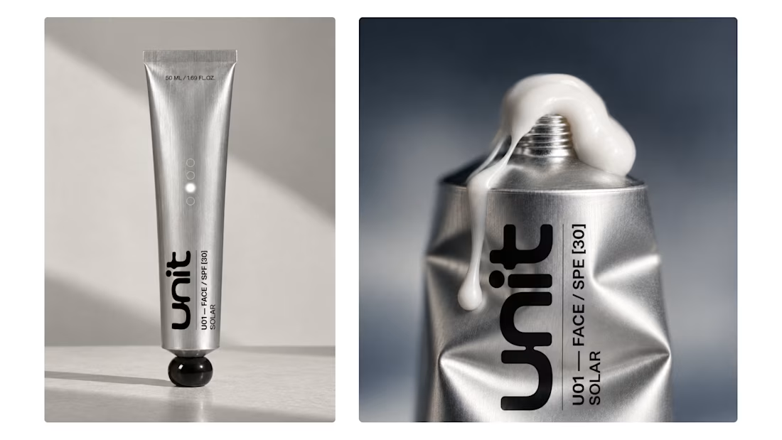
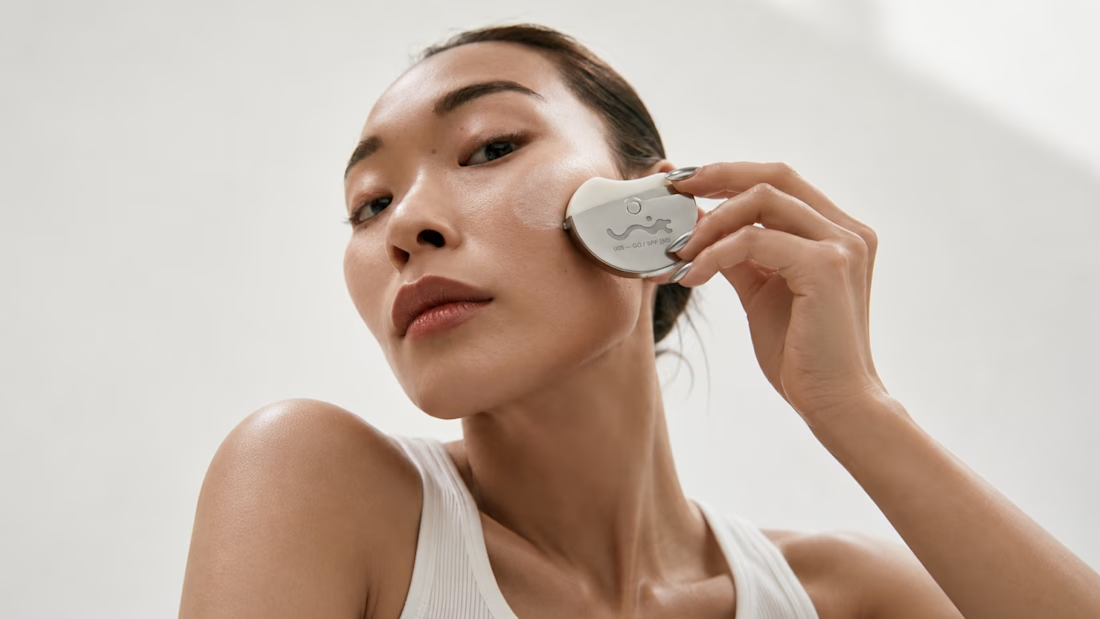
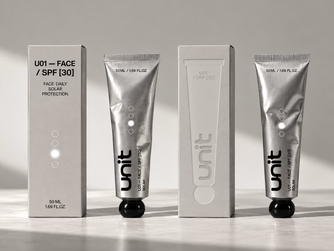
New project - UNIT ☀️
A sunscreen brand built around UV exposure, protection and touch.
We turned SPF levels into a simple graphic system, let the logo melt as UV intensity rises, and used cold aluminium packaging as a contrast to the heat of the sun.
For the outer packs, embossed...


Years of After Effects later… here we are 👀Officially a Jitter Expert!
Turns out motion can be powerful and actually fun to make.
Excited to keep bringing more brands to life with Jitter!

Jitter expert
Margo Syniakova


$9.8M in Jitter opportunities
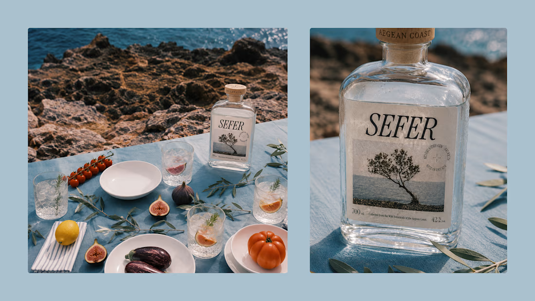
We were supposed to brand a gin.
Somehow, we ended up branding a feeling.
Sefer started with the Aegean coast, windswept trees, faded postcards, salty air, and that strange feeling of missing a place while you’re still there.
So instead of making another bottle that screams...