
Hellen Kardenas
Graphic Designer & teacher in love with writing & communication. Proud mom. Fan of brownies, gamification, grids, color, photography & street art.
Profile in progress
Hellen is building their profile!
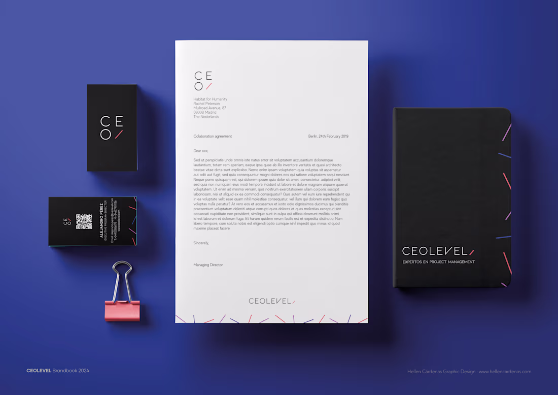
It’s time to introduce the rebranding of CEOLEVEL, a well-known Project Management and Agile School with a long-standing reputation.
They reached out to me to craft a new visual identity that truly reflects their capabilities, values, and unique personality.
The concept behind this rebrand is all about the balance between chaos and order. In project management, when things aren’t well-organized, chaos takes over—and that’s exactly where CEOLEVEL shines. Their training transforms disorganization into structure, helping businesses achieve clarity and efficiency.
This duality is captured in their new identity: bold, colorful graphics symbolize the challenges and complexities of project management, while a clean, geometric logo embodies professionalism, focus, and structure.
18
124
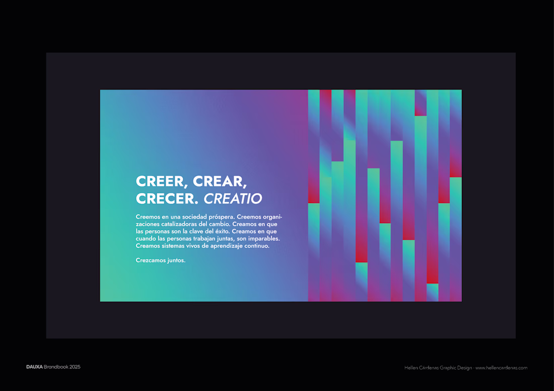
DAUXA isn’t just a consultancy or training company — it’s a team that blends expertise, humanity, & humor in everything they do.
The challenge was to create a brand identity that reflected their analytical mind, approachable attitude, and genuine warmth. The concept of equalization became the foundation — a metaphor for how DAUXA fine-tunes every element to bring out the best in people and organizations.
From there, I built a visual system that balances structure with emotion, and precision with personality.
DAUXA helps companies create healthy, inspiring work environments where people feel motivated to grow. My goal was to translate that spirit into a visual identity that feels authentic & memorable.
15
109
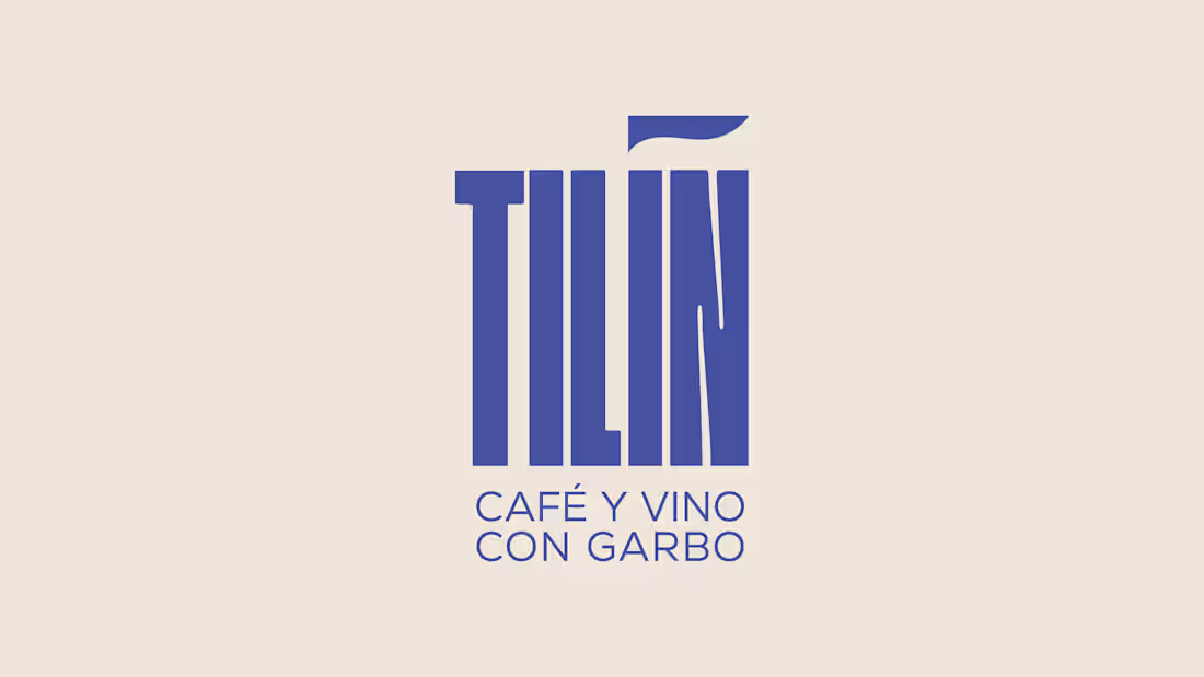
Located within Espacio Márgenes, a vibrant cultural hub in Granada, Tilín needed a visual identity that reflected its soul — warm, creative, and full of life.
I didn’t want to just design a logo; I wanted to understand the story behind it. Listening to their team's energy and vision allowed me to build an identity with meaning — one that communicates, connects, & feels alive.
From the start, we knew Tilín needed that something that resonates. That’s how the accent was born: a horizontal wave that flows, transmits good vibes, & symbolizes those moments of connection. It’s the accent that makes tilín.
Tilín is a celebration of culture, community, and gastronomy — a brand that speaks, connects, and stays with you.
#BrandDesign #VisualIdentity #BrandingProject #CreativeDirection #LogoDesign #CulturalBranding #GastronomicBranding
2
19
134