
hassan Saied
“Helping businesses grow with curated content, research, and


"Success is a science. If you have the premises, you will get the results." – Oscar Wilde
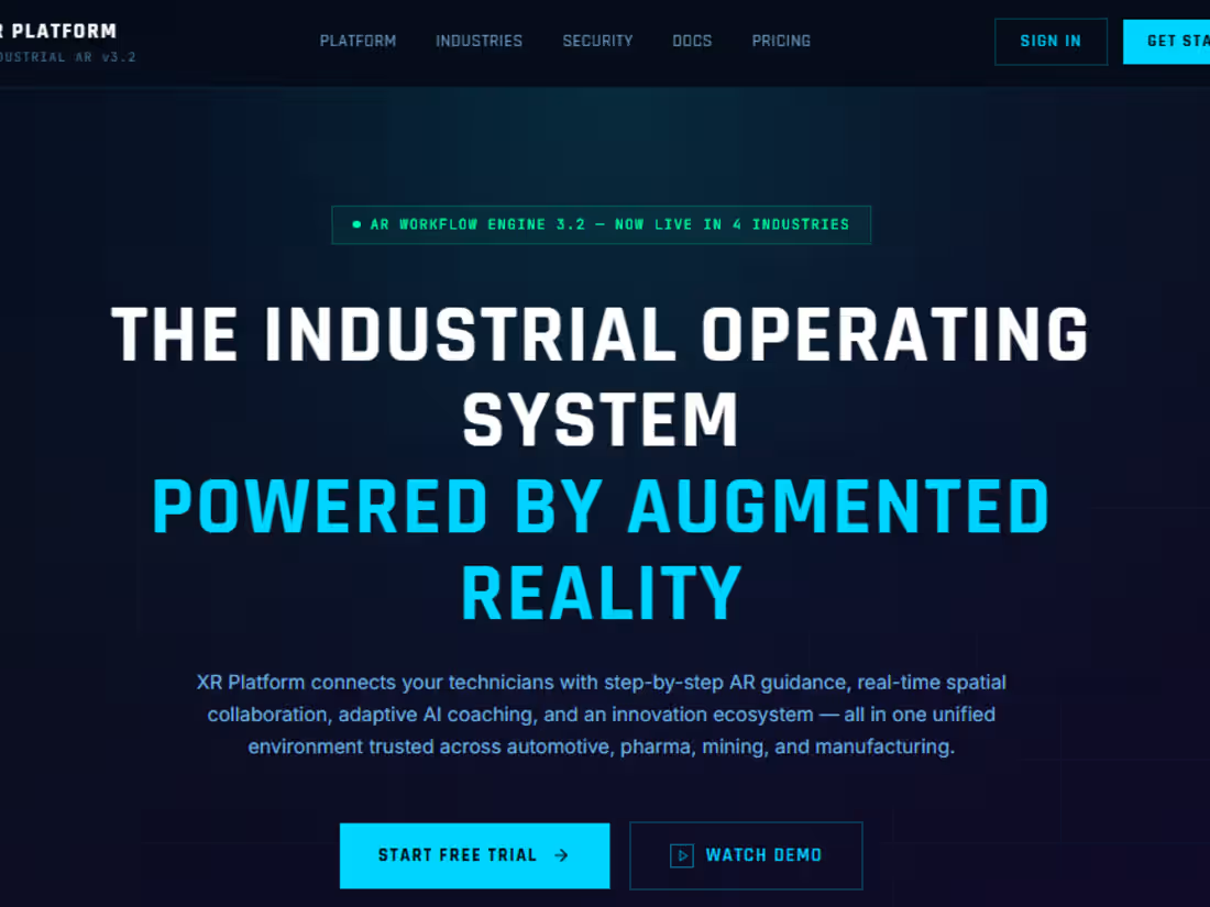
This quote was the cornerstone of the XR Platform project, because great projects are not built on luck or chance, but rather on understanding the problem, analyzing its causes, and then developing appropriate solutions in a scientific and systematic way. Therefore, the goal from the outset was to transform complex industrial challenges into a smart work experience based on Extended Reality (XR) and artificial intelligence technologies, enabling workers and technicians to perform their tasks faster, more accurately, and with fewer errors.
When studying the client's needs, we found that the fundamental problem was not a lack of technology, but rather how to deliver the right information to the right person at the right time. In factories, mining environments, the automotive industry, and the pharmaceutical industry, a small delay or error can lead to significant financial losses or production line shutdowns for extended periods. Therefore, it was essential to find a way to make instructions, guidelines, and vital data readily available to the worker during task execution, without the need to refer to lengthy operating manuals or complex systems.
And from here began the scientific phase of the project. We analyzed user behavior within industrial environments, studying the thought processes of technicians and engineers as they performed daily tasks. We also focused on understanding the cognitive load users experience while navigating different steps, as information overload or poor organization can lead to costly operational errors. These studies were not merely preliminary; they formed the foundation for all subsequent design decisions.
Following this, an integrated information architecture was developed, connecting all parts of the platform, from login and progress dashboards to collaboration, task execution, and performance analysis. The goal was to create a logical and sequential user journey that allows users to move from one step to the next without losing context or feeling overwhelmed.
During the design process, several significant scientific challenges emerged. One of the most prominent was the issue of visual contrast within industrial environments, where unstable lighting and dark backgrounds can make reading information more difficult and increase eye strain. To address this, a visual system was developed that utilizes intelligent and variable gradients adapted to the nature of the task and the industrial environment, resulting in improved clarity of text and elements and reduced visual fatigue.
We also faced another challenge related to the cognitive coherence between work steps. Technicians need to move between multiple stages without losing their understanding of the core task. Therefore, a system was designed based on holographic layers and intelligent visual flows that connect each step to the next naturally and seamlessly, maintaining focus and reducing the likelihood of errors.
At the global collaboration level, the challenge was to display hundreds of teams, projects, and challenges within a single dashboard without creating visual or informational clutter. To address this, a global collaboration dashboard was designed that allows information to be categorized by industry sector, such as mining, pharmaceuticals, or automotive, while providing sorting and organization tools that make accessing information easier and more efficient.
Another crucial element of the project was linking the design to real-time data. Instead of displaying static information, the platform was able to directly display performance indicators, accuracy, and estimated execution times, giving users a clear view of the current situation and increasing their confidence in the system during operation.
Since the human element remains fundamental to the success of any technological system, we considered how to enhance user motivation. The challenge lay in adding motivational elements without compromising the professionalism of the industrial environment. Therefore, a separate incentive layer was designed, incorporating experience points, global rankings, and achievements, to encourage continuous improvement without distracting users from their core tasks.
Figma played a pivotal role in transforming these ideas into reality. By creating an integrated Design System, all visual components and elements were unified, ensuring complete consistency between design and development. Figma's real-time collaboration capabilities also accelerated communication between designers and developers, making all modifications and updates available instantly. This contributed to improved final product quality and reduced implementation time.
The project's impact extended beyond improving industrial processes, reaching into everyday life. The core principle of presenting the right information at the right time can be applied across numerous fields. In factories, the platform helps workers perform tasks with greater precision; in hospitals, doctors can monitor patient data in real time; and in education, students can learn through realistic, interactive experiences that simulate real-world work environments.
The platform also contributes to reducing human error by providing information and guidance during implementation, accelerating training processes through interactive simulations, and enhancing collaboration between different teams worldwide through a unified work environment that allows for more efficient knowledge and experience sharing.
Looking at the project as a whole, we find that it represents a practical and direct application of Oscar Wilde's maxim. The results achieved were not accidental, but rather the product of a series of sound premises: user research, problem analysis, understanding the industrial environment, building an integrated design system, leveraging artificial intelligence, linking live data with visual experience, and continuously testing the solutions.
Therefore, the XR Platform project is not merely a design model or a digital interface, but a living example that success can be achieved when scientific knowledge is combined with professional execution and a clear vision. And when the premises are built on With proper research, analysis, and planning, the results become a natural extension of the process. This embodies the true meaning of the saying: "Success is a science; if you have the premises, you will get the results."
[Link to the blog explaining the project in detail: https://hassanonlineprojects.blogspot.com/2026/06/the-humanmachine-harmony-how-figma-and.html]
[Link to the project: https://admin-scene-57807586.figma.site]
[Link to the project: https://www.figma.com/community/file/1648277395328344334]
1
1
136
I want to clarify that this project wasn't directly assigned to me; rather, I discovered it on an independent platform and proposed a comprehensive solution to the client. The client has the full right to accept, reject, or cancel the project. My goal was to present a creative initiative that reflects my capabilities, not to impose a commitment on the client. All projects are the same.
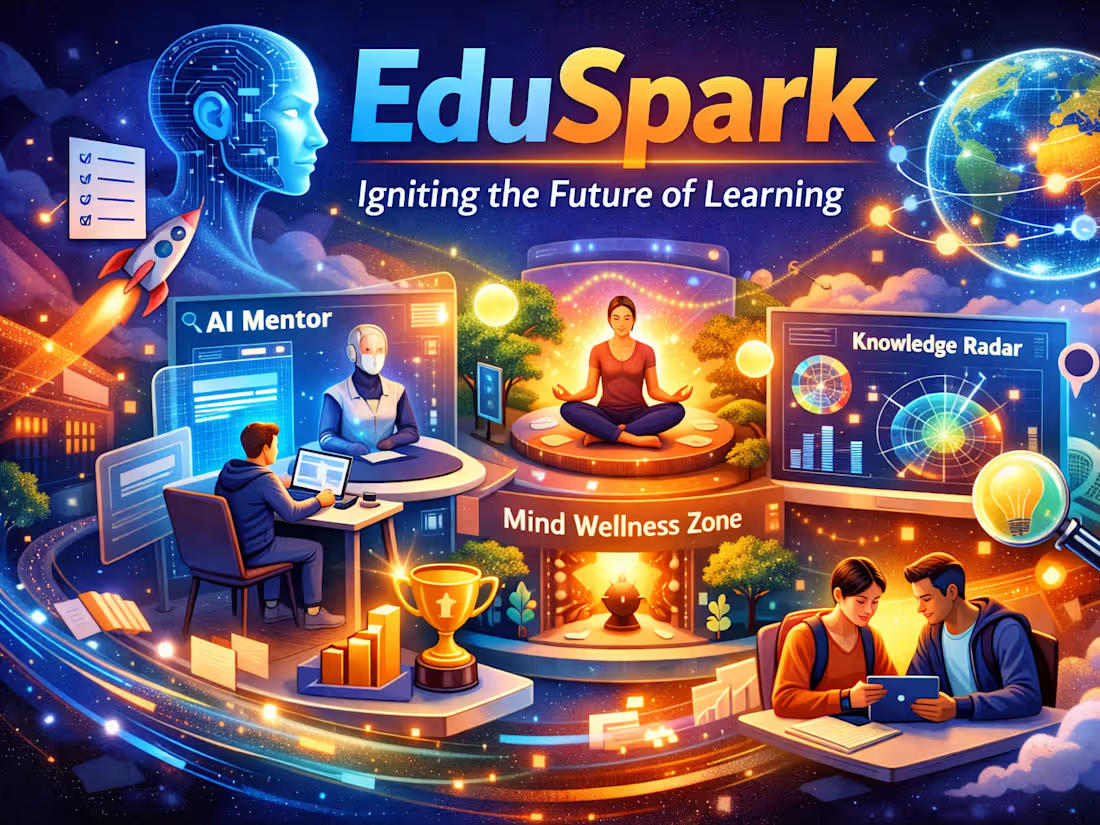
EduSpark: Re-engineering the Future of Digital Education**
Success is a Science. "If you have the premises, you'll get the results." — Oscar Wilde*
This quote wasn't just a slogan. It was the guiding principle behind the development of EduSpark. The project started with a set of clear principles: analyzing user needs, building prototypes, designing a unified system, creating pilot models, and applying AI enhancements. From these beginnings, EduSpark has evolved into a next-generation educational technology platform, transforming traditional learning into a dynamic and interactive environment.
🎯 Project Overview
EduSpark addresses the fundamental shortcomings of current educational platforms: disjointed user journeys, poor interaction, and slow navigation. By integrating user experience design, AI technologies, and behavioral psychology, the platform provides a seamless student experience—from an intelligent registration process that identifies their majors to personalized dashboards and interactive navigation.
🛠️ Solution Architecture
User Needs Analysis ➔ Prototyping ➔ Unified System Design ➔ Pilot Models ➔ AI Enhancements
User Journey Seamless: Smart registration with customizable dashboards.
Dynamic Navigation: Interactive sidebar elements for an instant experience.
AI-Powered Design: Smart course cards and automated design optimizations.
Design System: Unified colors and components to support future PHP/Laravel development.
✨ Revolutionary Features
AI-Powered Mentoring Center: A dedicated study assistant to guide students step-by-step.
Future Career Path Map: An interactive GPS for career paths linked to courses.
Mental Wellbeing Zone: Integrated mental wellbeing tools (Pomodoro Technique, breathing exercises).
Innovation Lab & Global Collaboration Hub: A digital workshop for group projects and instant feedback.
Knowledge Radar: An intelligent tool that predicts trending skills before they peak.
Interactive Learning: Realistic badges that measure creativity, teamwork, and innovation.
🌍 Results
For Investors: A high-quality, prototyping-ready, and monetizable prototype.
For Institutions: Increased student retention through the integration of interactive learning methods and programs. Mental health.
For developers: A fully organized Figma file ensures fast performance and easy updates.
📌 For a detailed explanation, visuals, and complete project details, please visit my blog:
👉 EduSpark: Igniting the Future of Learning
(https://hassanonlineprojects.blogspot.com/2026/06/eduspark-igniting-future-of-learning.html)The project link is:
https://puzzle-tweak-01976593.figma.site
https://www.figma.com/community/file/1647555007774987439
2
2
239
This project, undertaken by a client through a freelance platform, was successfully completed. The GreenChoice project aimed to design a user experience (UX) and user interface (UI) for an app and website that would help people make healthy and sustainable food choices.
The platform displays accurate and reliable nutritional data for over one million food products and provides personalized recommendations to consumers, making their daily lives easier and healthier.
🎯 Challenges Faced by the Project
Complexity of Nutritional Information
Problem: The average consumer finds it difficult to understand ingredients and nutritional values.
Solution: Transform complex data into easy-to-read charts and icons.
Poor User Experience in Traditional Food Apps
Problem: Registration is complicated, search is unclear, and results are unappealing.
Solution: A simple registration process with smart search and multiple filters (such as low-sugar or eco-friendly products).
Lack of Engagement and Trust
Problem: Users abandon the app if they don't feel it is useful or trustworthy.
Solution: Add interactive product pages with attractive images, personalized recommendations, and clear health ratings.
🌍 How the challenges were overcome:
Using Figma to create a unified design system that ensures consistency across all pages.
Conducting user research to understand their needs, then translating the results into practical improvements.
Testing usability using tools like Maze to ensure search and filtering work correctly.
The environmentally conscious consumer ← chooses eco-friendly products thanks to smart filtering.
The link is:
https://fire-chant-55834281.figma.site
0
88
I apologize for including the previous link in the project, so I'm including it again.
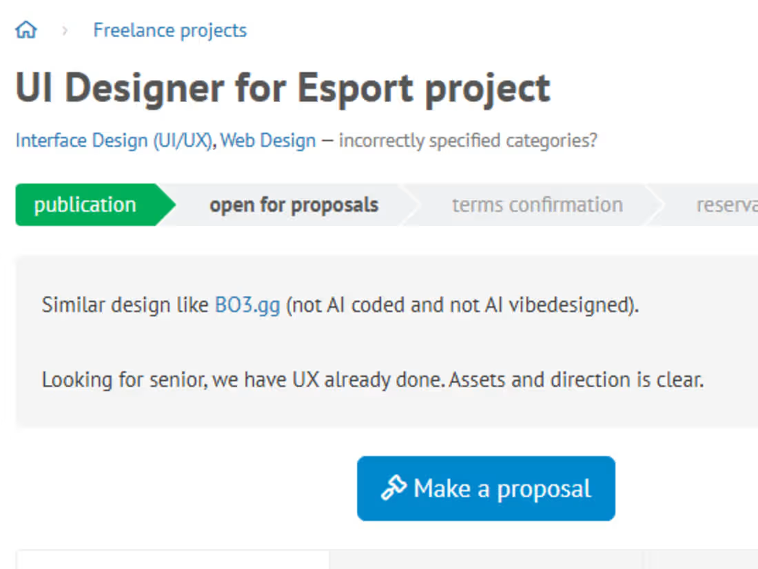
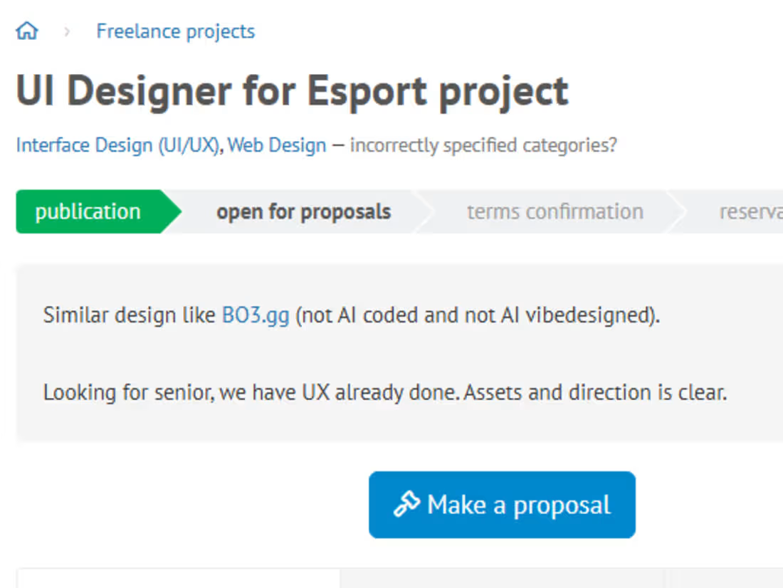
While searching for a job, no matter how challenging, on a freelance platform, I came across a client who said, "Similar design like BO3.gg (http://BO3.gg) (not AI coded and not AI vibe designed)."
"Looking for senior staff; we already have UX done. Assets and direction are clear."
The project aims to design a modern digital platform similar to BO3.gg (http://BO3.gg), but with a professional, manual approach, free from artificial intelligence. The platform should be interconnected, highly engaging, and error-free. It will display game data clearly and provide a seamless and integrated user experience.
🎯 Client Objectives
Seamless Registration Experience: Facilitating new user login and building trust from the very first step.
Smart Dashboard: Transforming complex data into easy-to-understand graphs and icons.
Complete Page Linking: Ensuring that every page links correctly without errors or broken links.
Attractive and Modern Images: Using high-quality images and modern colors to attract users.
Increased Engagement and Trust: Through personalized recommendations, intelligent search, and interactive content. ⚠️ Issues the client wanted resolved:
Complex registration: Users leave the platform if they encounter difficulties registering.
Unintelligible data: Complex information causes users to lose interest.
Low trust and engagement: Similar platforms don't offer engaging or personalized content.
🛠️ Challenges and how they were overcome:
Data complexity:
Challenge: Presenting a lot of information in an understandable way.
Solution: Design a visual dashboard using Figma with simplified icons and graphs.
Poor registration experience:
Challenge: Long and complicated registration process.
Solution: Build a smooth signup flow with clear and quick steps.
Low engagement and trust:
Challenge: Users leave quickly.
Solution: Add interactive pages, personalized recommendations, and attractive images to build trust.
🌍 Practical benefits:
For gamers: Quick access to team and tournament statistics.
For businesses: Building a reliable platform that increases user loyalty.
For the average user: A seamless, uncomplicated experience with engaging and useful content. Practical example: A player enters the platform → finds a simple registration, then a dashboard displaying their team's results clearly and attractively.
These issues were successfully overcome, and this challenge was met. The link to the project proves this:
https://slice-trio-88059604.figma.site
1
1
233