
pro
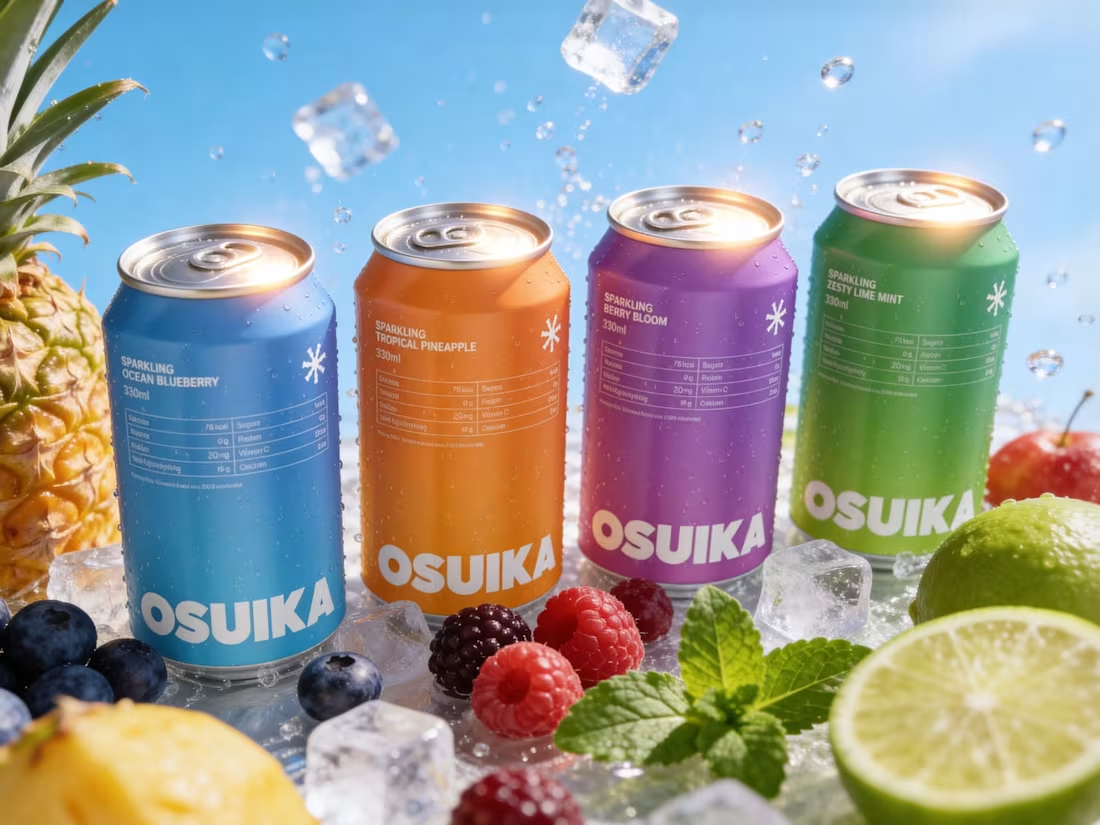
Osuika Beverage - Packaging Redesign
1
2
Visual Identity Design for Tustee
2
7
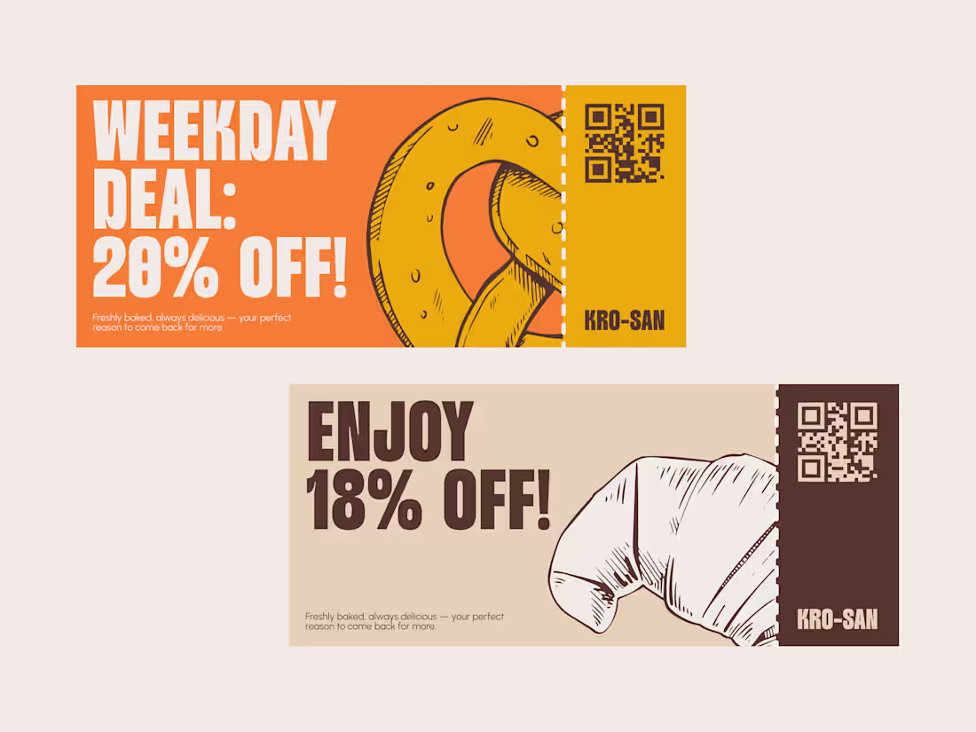
The latest visual exploration for Croissant Bakery, I tried using Pop color, Raw style illustration and minimalist layout.
What do you think? Full visual case study on my contra profile 👀
Maybe you have same exploration just drop on reply!
1
2
204
1
6
5
383