
Gideon Phillip
Building premium brands with strategy at the core.™
- 5.00
- Rating
- 17
- Followers
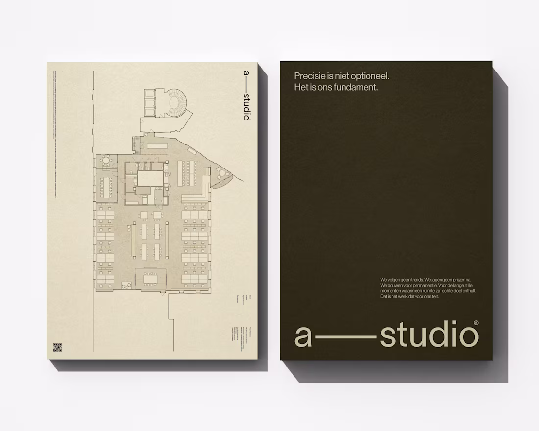
Chen Architecture is a Singapore-based architecture firm specializing in high-density design for the rapidly evolving cities of Southeast and East Asia. Founded by Eleanor Chen in 2019, the studio operates at the intersection of Asian spatial intelligence and contemporary architectural practice—rejecting both Western mimicry and nostalgic traditionalism.
0
76
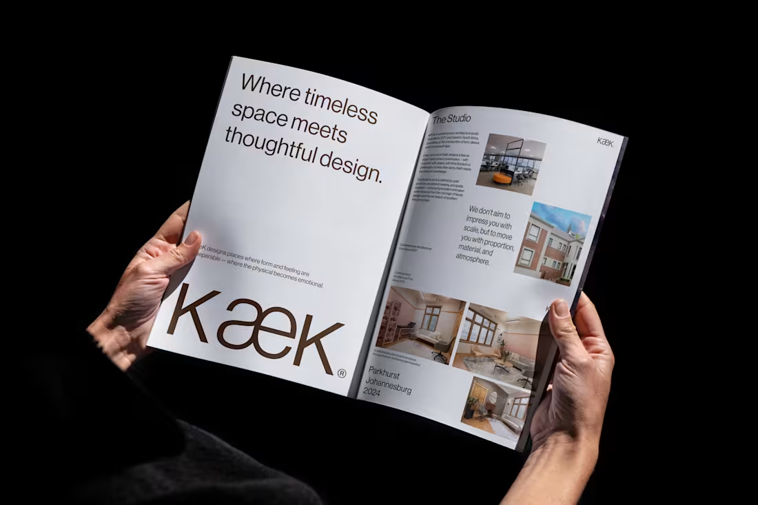
KæK / Brand Identity
1
4
YOEN® is a luxury textile house dedicated to the art of considered making. Founded on the belief that the objects closest to our bodies deserve the same rigour applied to architecture — every thread chosen, every weight calibrated, every texture a dialogue between material and maker.
We work in cashmere, merino, alpaca and their rarest blends. Our throws, towels and textiles are not decorative objects — they are tactile experiences, designed to hold warmth, absorb light and endure. YOEN® pieces belong to rooms that breathe: minimalist interiors, thoughtful homes, places where stillness is a form of luxury.
Yoen's mission remains the same:
To create textiles of genuine permanence — pieces that are felt before they are seen, that outlast trends, and that reward daily use with deepening softness and quiet beauty.
Such a wonderful experience to finally see this work done!
0
89
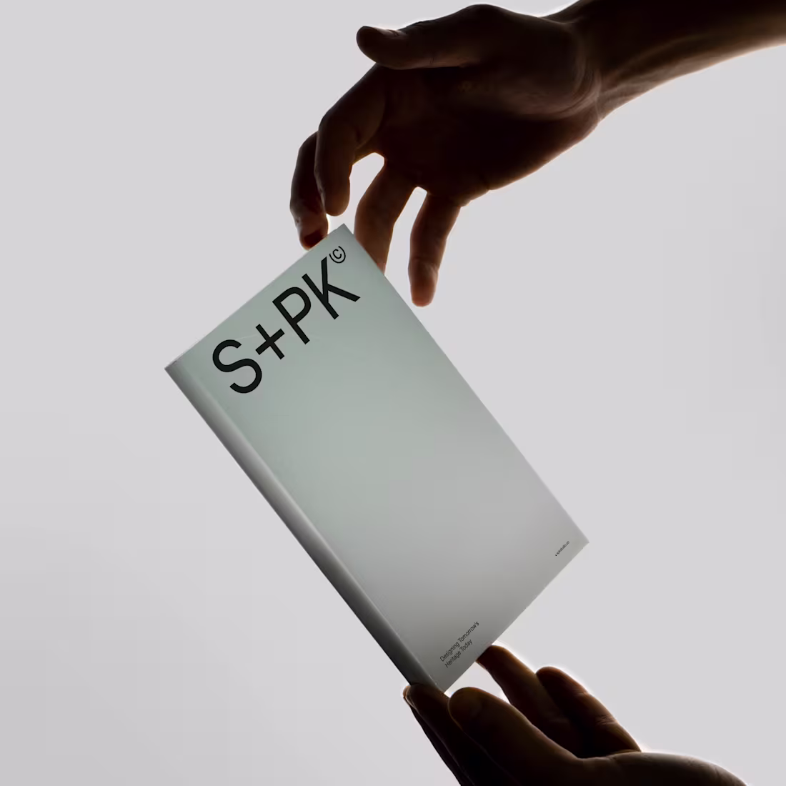
S+PK / Brand Identity
0
1
Excited to join the challenge with this work.😍
Hauke Architecture & Interior Design — a premium firm from Mikołów, Poland that's challenging the rigid, corporate approach to architecture.
The challenge?
→ Most architecture logos feel cold and impersonal. Hauke needed something that reflected their philosophy: bold in form, simple in essence, deeply human in spirit.
The solution?
→ An icon inspired by the top view of a round house (humanity and openness) merged with vertical lines (architectural perspective). Abstract yet meaningful. Premium yet approachable.
Architecture should invite people in, not keep them at a distance.
:
2
5
242
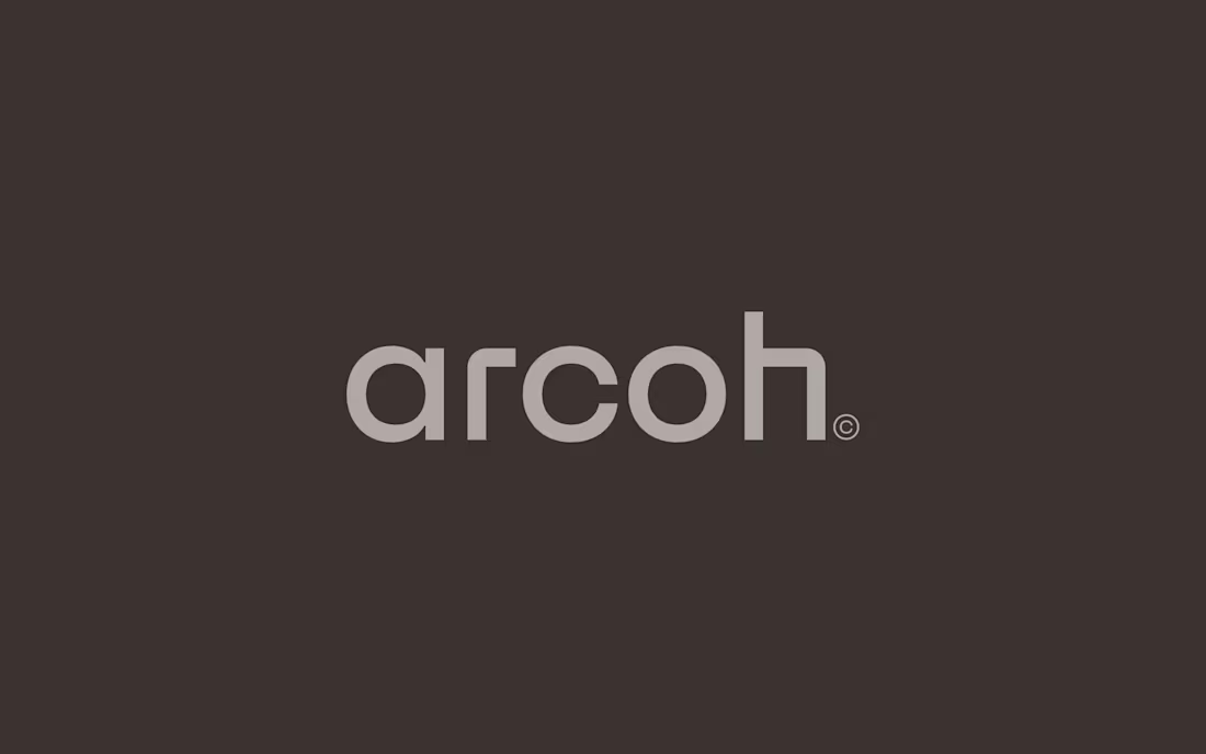
ARCOH
0
2
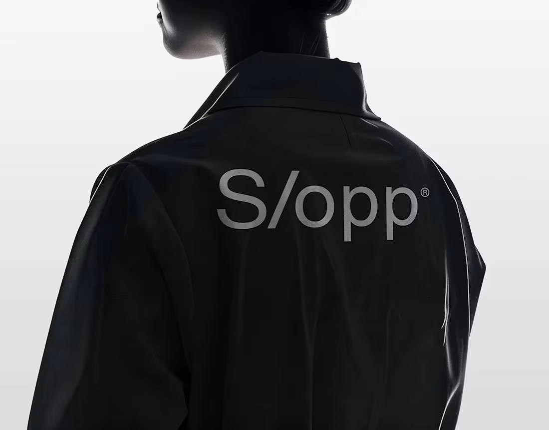
S/opp® / Brand Identity
1
3
Alima Studio® / Brand Identity
0
3
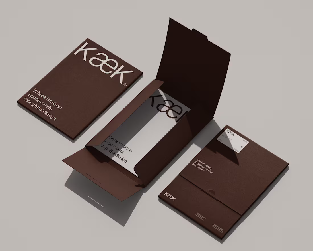
KæK / Brand Identity
0
6
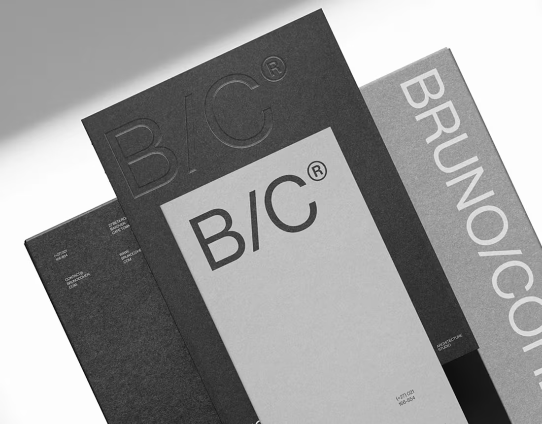
Bruno Cohen® / Brand Identity
1
4