
Franklyn Michael
Brand Identity Designer
Ready for work
Franklyn is ready for their next project!
Perissos’ brand identity is a premium, trust-driven visual system designed for a modern cryptocurrency education platform.
Logo Mark: A custom “P” symbol that integrates a location pin and upward motion, representing guidance, growth, and direction.
Typography: Clean, modern sans-serif pairing that balances professionalism with accessibility.
Color Palette:
Bold orange for energy and action
Deep brown/black tones for stability and trust
Gold accents to signify value and premium positioning
Visual System: Repetitive logo patterns and high-contrast layouts create strong brand recognition across touchpoints.
Applications: Scales seamlessly across digital platforms, merchandise, and large-format advertising.
Overall, the identity positions Perissos as a credible, forward-thinking, and premium academy in the crypto space—focused on clarity, trust, and long-term growth.
0
15
BACCAF is a visual bridge between the structured elegance of British tailoring and the vibrant energy of African heritage. My goal was to create a brand architecture that feels both "Establishment" and "Urban" without the cultural clash.
The identity is anchored by a custom logotype where the sharp, fluid stroke beneath the "f" serves as a strategic nod to the path of a tailor’s needle, grounding the brand in its made-to-measure roots. I balanced this craftsmanship with a high-contrast palette: deep regal tones represent British sophistication, while heritage oranges and golds inject the warmth of the continent. The result is a cohesive, premium identity designed for the global citizen who values artisanal quality over mass production.
0
31
Aivon’s brand identity is a modern, tech-forward visual system built around clarity, growth, and innovation.
Logo Mark: A geometric, upward-structured “A” symbol representing progress, precision, and scalability.
Typography: Clean, minimal sans-serif that reinforces clarity and professionalism.
Color Palette:
Deep black for strength and stability
Vibrant cyan for energy and innovation
Soft neutral tones for balance and approachability
Visual Language: Pattern-driven extensions of the logo create consistency across digital and physical applications.
Applications: Seamlessly adaptable across apparel, mobile interfaces, and large-scale outdoor branding.
Overall, the identity communicates a brand that is forward-thinking, reliable, and confidently modern.
0
40

Created this amazing vector artworks for BTGR Project
2
67

Created simplified Social media posters for YGX
It was a splendid experience
The goal was to create realistic, eye-catching designs that are generic to the brand
2
56
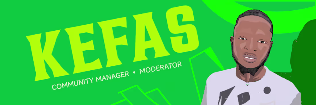
Created this digital artworks for KEFAS
0
40

Worked on this poster and motion design for SHAW Community upcoming Webinar
Software - Photoshop, Aftereffects
0
32