
Aivon’s brand identity is a modern, tech-forward visual system built around clarity, growth, and innovation.
Logo Mark: A geometric, upward-structured “A” symbol representing progress, precision, and scalability.
Typography: Clean, minimal sans-serif that reinforces clarity and professionalism.
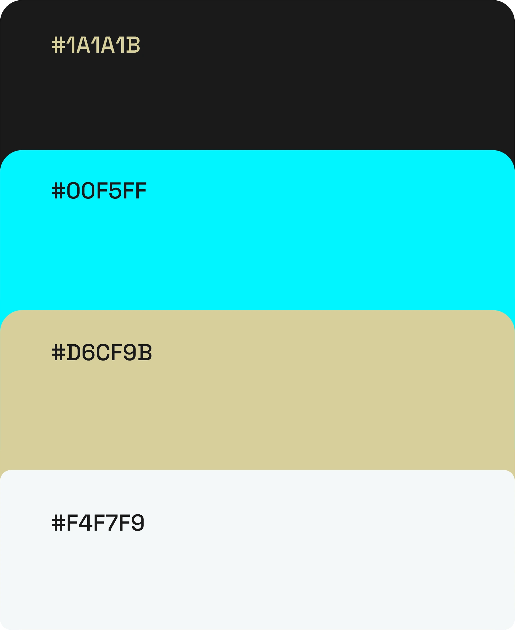
Color Palette:
Deep black for strength and stability
Vibrant cyan for energy and innovation
Soft neutral tones for balance and approachability
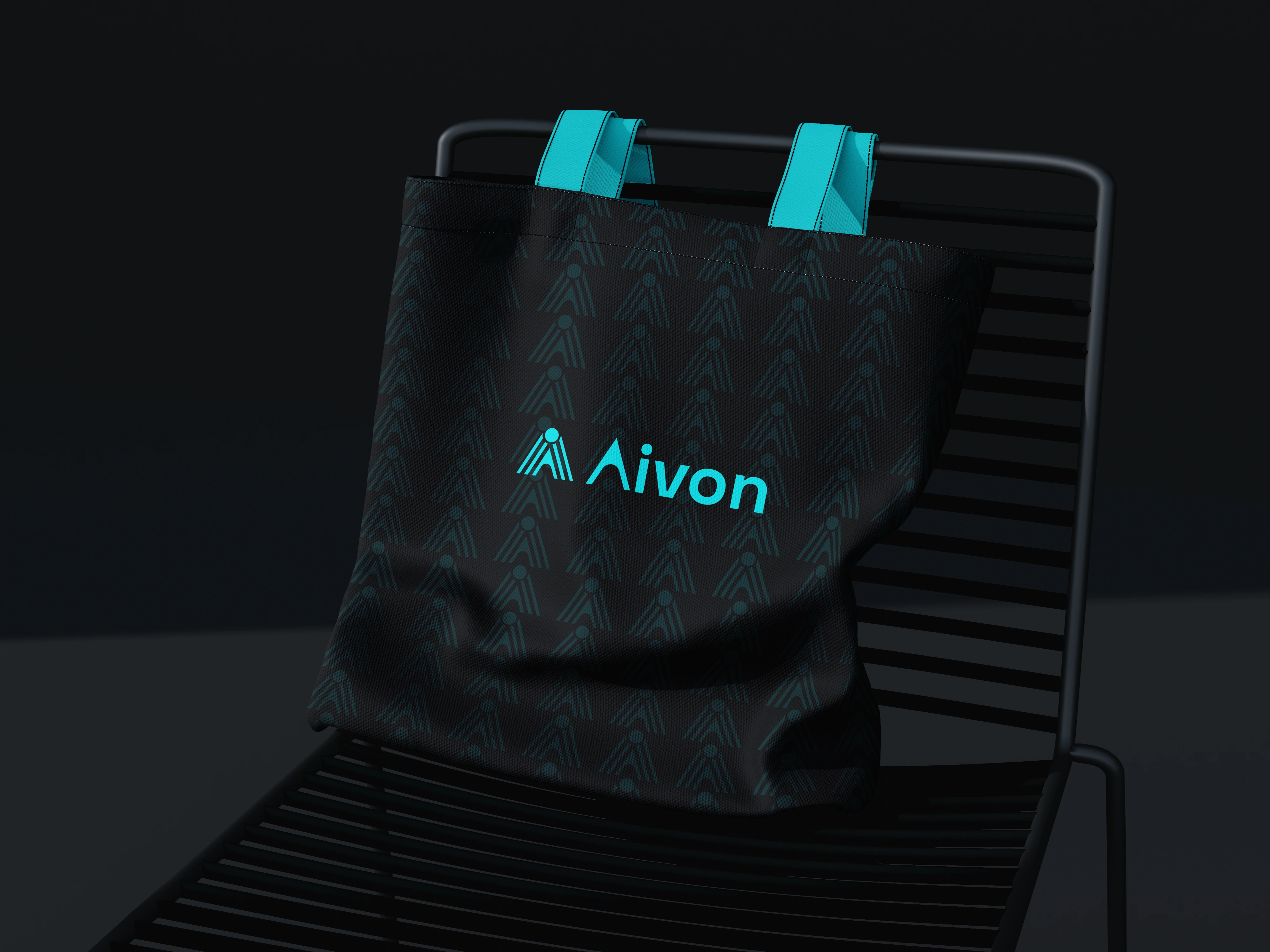
Visual Language: Pattern-driven extensions of the logo create consistency across digital and physical applications.
Applications: Seamlessly adaptable across apparel, mobile interfaces, and large-scale outdoor branding.
Overall, the identity communicates a brand that is forward-thinking, reliable, and confidently modern.
0 likes · 0 views · Apr 25, 2026
Aivon’s brand identity is a modern, tech-forward visual system built around clarity, growth, and innovation. Logo Mark: A geometric, upward-structured “A” sy...


