
Fardin Omor Afnan
Next.js landing pages with interactive product heroes.
- 9
- Followers


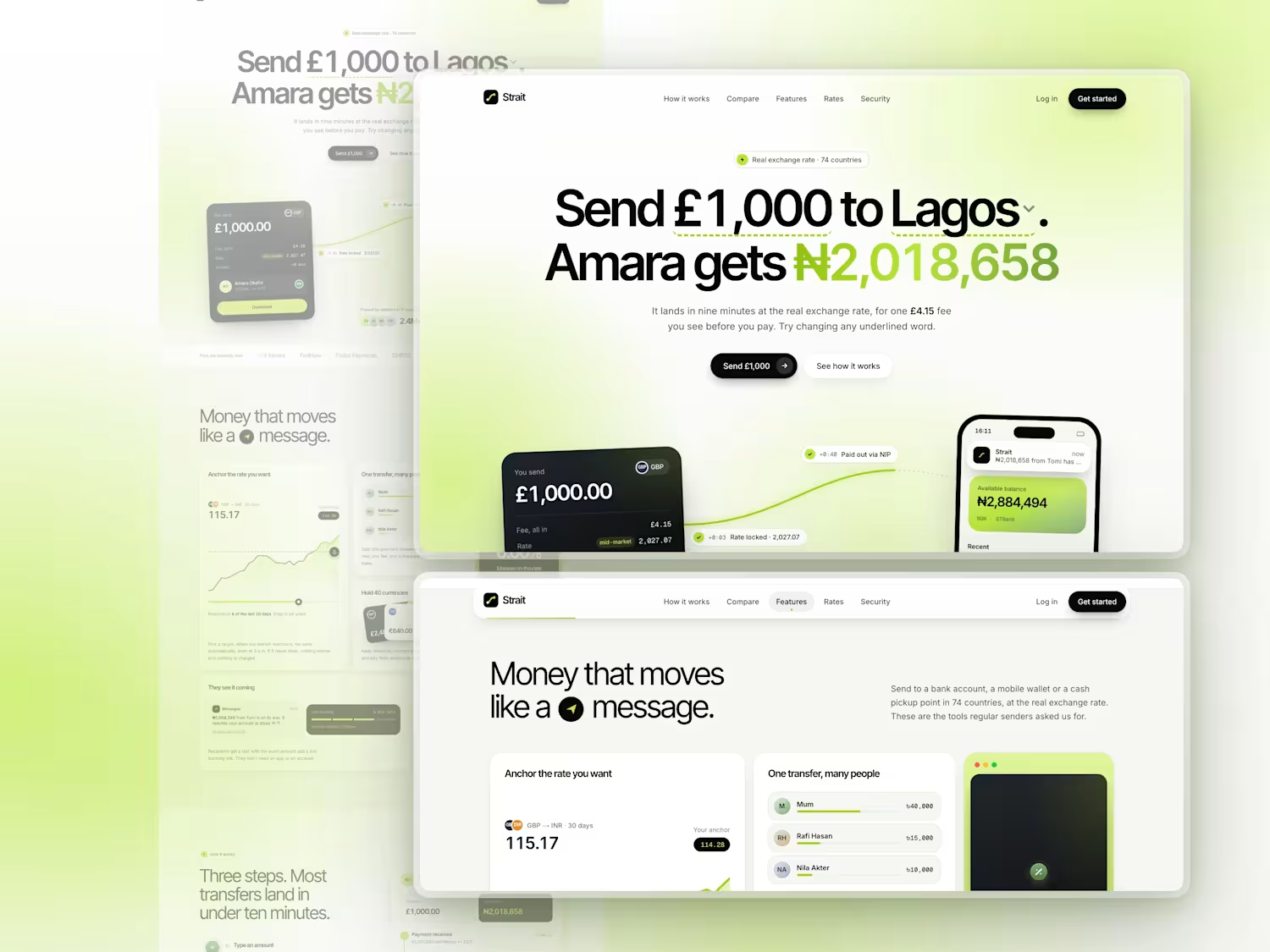
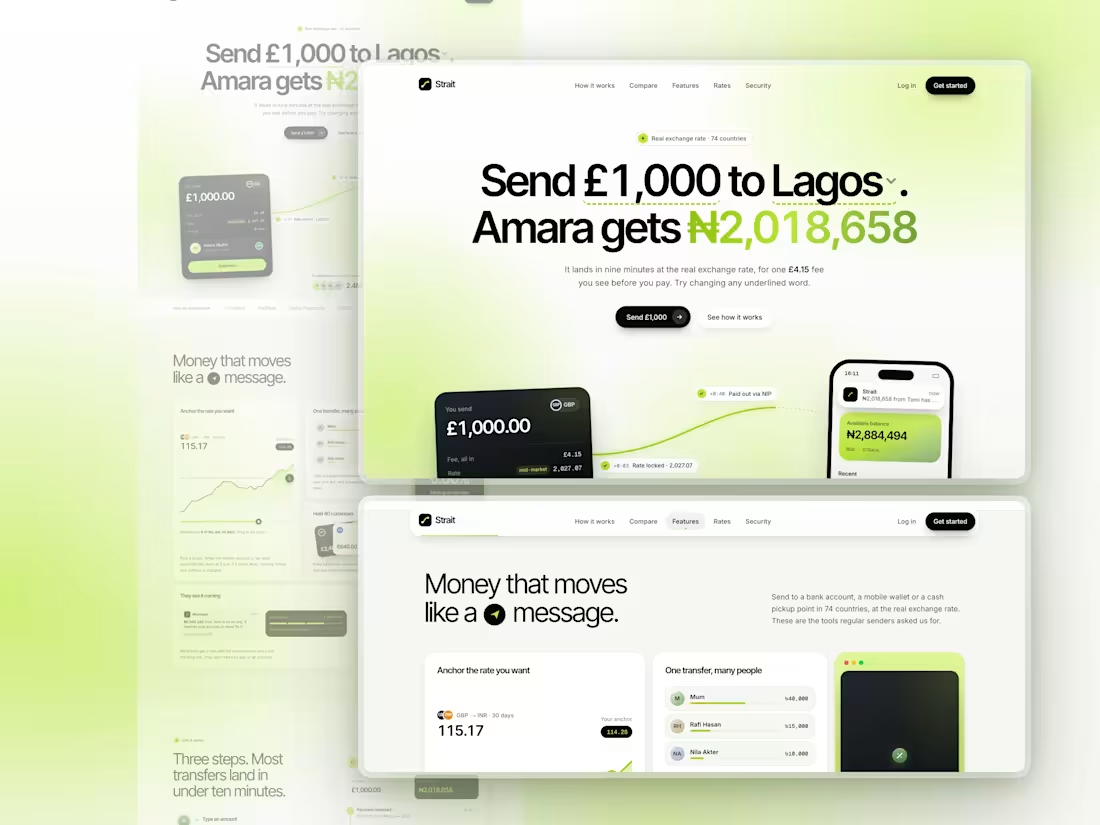
🔥 Strait is a Next.js landing page for a money transfer app, crafted entirely with Claude on high settings. The headline is a working calculator: change the amount, currency or city, and the payout updates. Below it, the money travels from a send card into the recipient's banking app.
It's lime, white and black, smooth on mobile, and built with Next.js 16, Tailwind CSS v4 and TypeScript. There are no image files.
https://strait-tau.vercel.app/
2
172
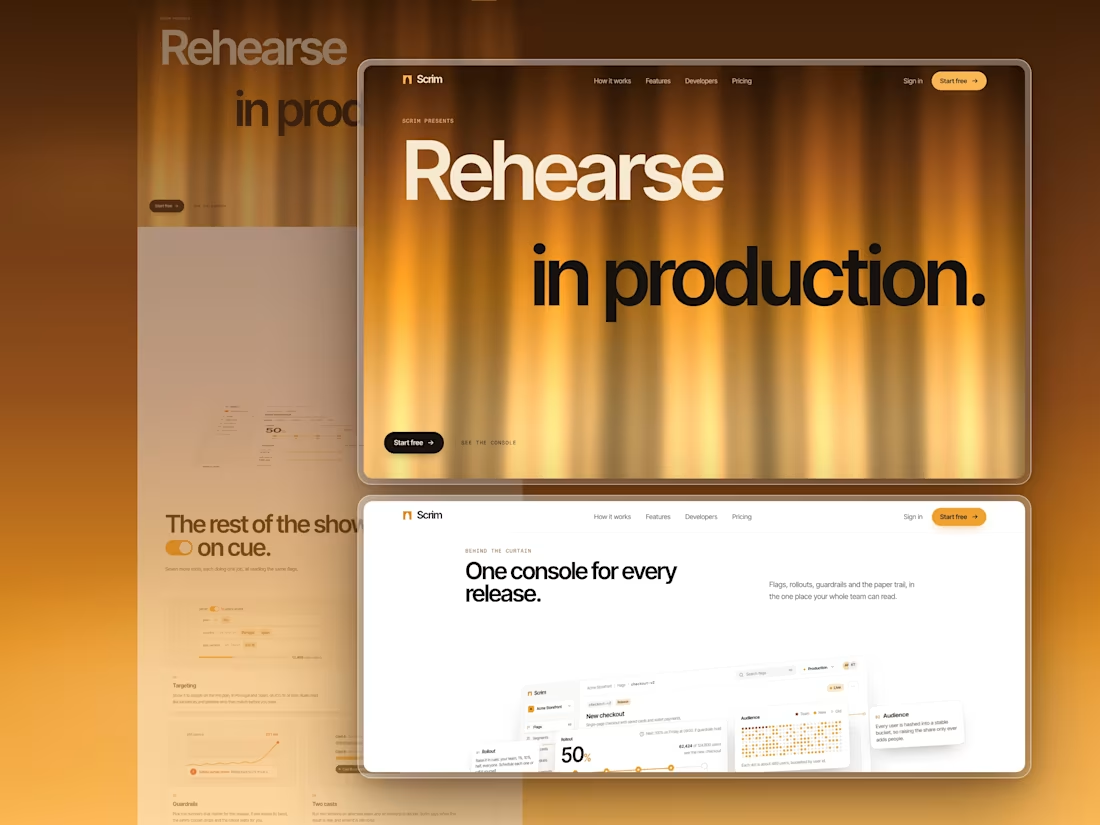
Scrim is a landing page I designed and built for a feature-flag and staged-rollout product.
A scrim is the theatre gauze that hides a set until it's lit from behind. Feature flags do the same with code, so I staged the whole page as a show: a silk curtain opens it and falls closed again at the end.
Some of the moments:
- The curtain is live WebGL silk, backlit from deep umber to pale gold. Its folds part toward your pointer.
- The product console arrives lying flat on the stage floor and hinges up to face you. Keep scrolling and it comes apart into its four cards, at different depths, and stays that way as the section leaves.
- "40 ms" counts down to "0.04 ms" as you scroll, next to a code window in four languages.
- Pricing is a theatre ticket. Drag to your number of users and it reprints itself for the plan that fits.
- Every FAQ answer sits behind its own feature flag. Switch one on and it rolls out to you.
- At the end the same curtain falls closed, with "Break a leg." printed across it.
The product UI is all HTML, CSS and SVG, with no image files. Built with Next.js 16, Tailwind CSS v4 and Lenis.
Live link: https://scrim-seven.vercel.app (https://scrim-seven.vercel.app/)
0
64
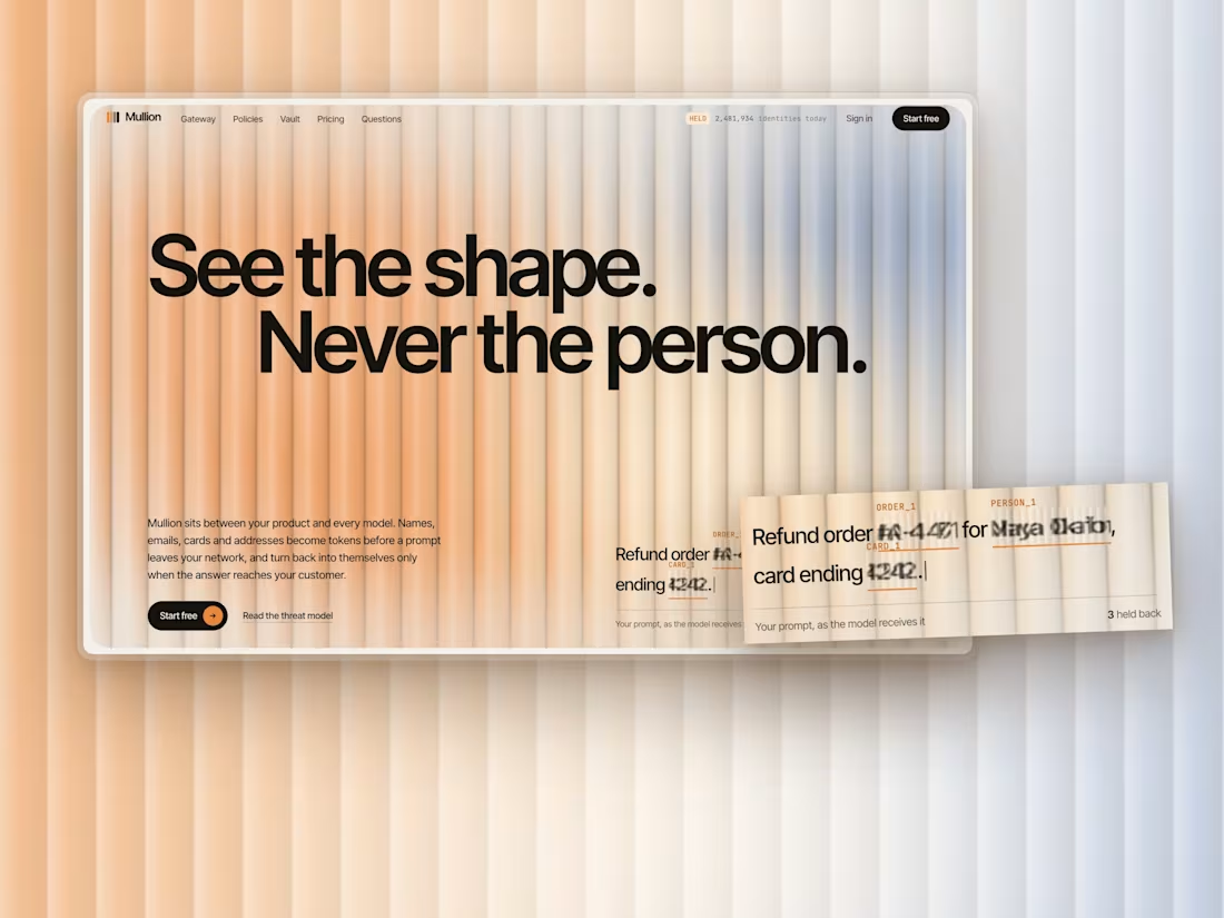
Mullion is a landing page I designed and built for an AI privacy product: a gateway that swaps names, emails and card numbers for tokens before a prompt reaches a model, and puts them back when the answer comes home.
Reeded glass lets the light through and keeps the detail back. You can see someone's shape behind it, never who they are. That's exactly what the product does to a prompt, so the hero is a live pane of reeded glass in daylight, and everything personal on the page sits behind the same ribs.
Live: https://mullion-phi.vercel.app (https://mullion-phi.vercel.app/)
1
5
292
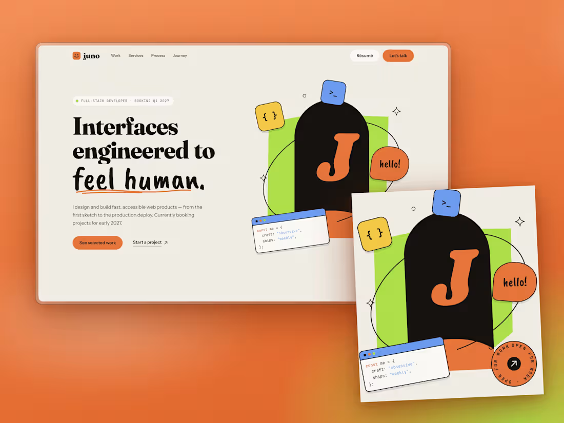
Designing a developer portfolio that doesn't look like a template
The brief
Build a developer portfolio in Next.js and Tailwind. No generic AI-looking hero. Dribbble-level polish.
The starting point
I took a reference site with a warm cream background, a chunky serif, a handwritten accent and a photo cutout over a lime shape. The rule was to take inspiration, not copy: borrow the mood, the type pairing and how elements are placed, then make it a different page.
Decision 1: replace the photo with a composition
A portfolio template can't ship someone's face, so I built the hero from code instead. A lime slab, an ink arch holding your initial, an orbit line that passes behind the arch and in front of it, and floating stickers: a code window, a "hello!" bubble, a spinning "open for work" badge. They sit on separate depth layers and shift with the cursor. If you drop a transparent PNG into public/, the hero swaps your photo in automatically.
Decision 2: type that does the talking
Fraunces at heavy weight for headlines, a brush script for one phrase per section, Instrument Sans for reading, JetBrains Mono for labels. The script is kept rare on purpose. Overuse makes it a gimmick.
Decision 3: contrast before aesthetics
The reference uses white text on orange. At body size, white on that orange fails WCAG AA, so my buttons use ink text instead. It also reads more editorial.
Decision 4: single-column storytelling
My first journey section used two columns and felt sparse on the right. I moved it to one column with a vertical timeline, full-width roles and stack tags.
A mistake worth sharing
My first testimonials section was a horizontal scroller. On a wide monitor the cards sat flush against the left edge, because I'd written an invalid calc() for the padding and the browser silently dropped it. The staggered offsets made it look worse. I replaced it with one featured quote at a time: arrows, dots and a panel that changes colour per person. Simpler, and it reads better.
What I'd do next
Real project screenshots instead of CSS mock-ups, and a case-study page template for each project.
Built with Next.js 16, React 19, Tailwind v4 and TypeScript. No image files, all SVG and CSS.
https://juno-calloway.vercel.app/
7
11
408