
Designing a developer portfolio that doesn't look like a template
The brief
Build a developer portfolio in Next.js and Tailwind. No generic AI-looking hero. Dribbble-level polish.
The starting point
I took a reference site with a warm cream background, a chunky serif, a handwritten accent and a photo cutout over a lime shape. The rule was to take inspiration, not copy: borrow the mood, the type pairing and how elements are placed, then make it a different page.
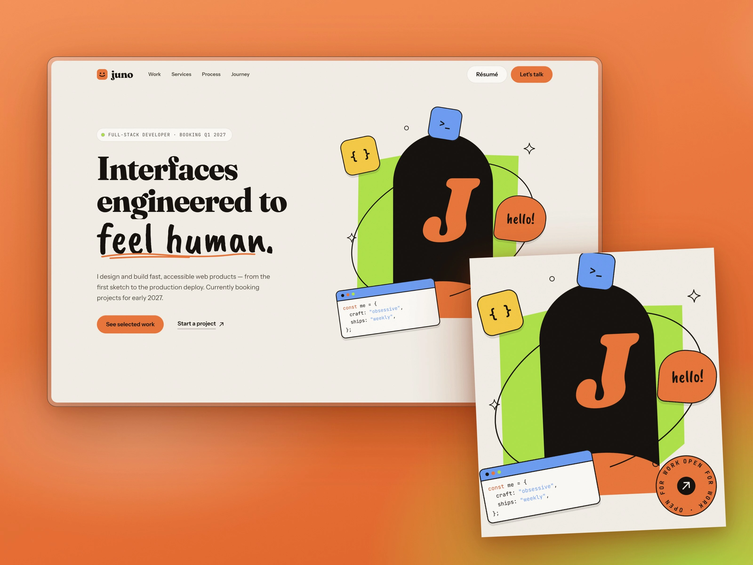
Decision 1: replace the photo with a composition
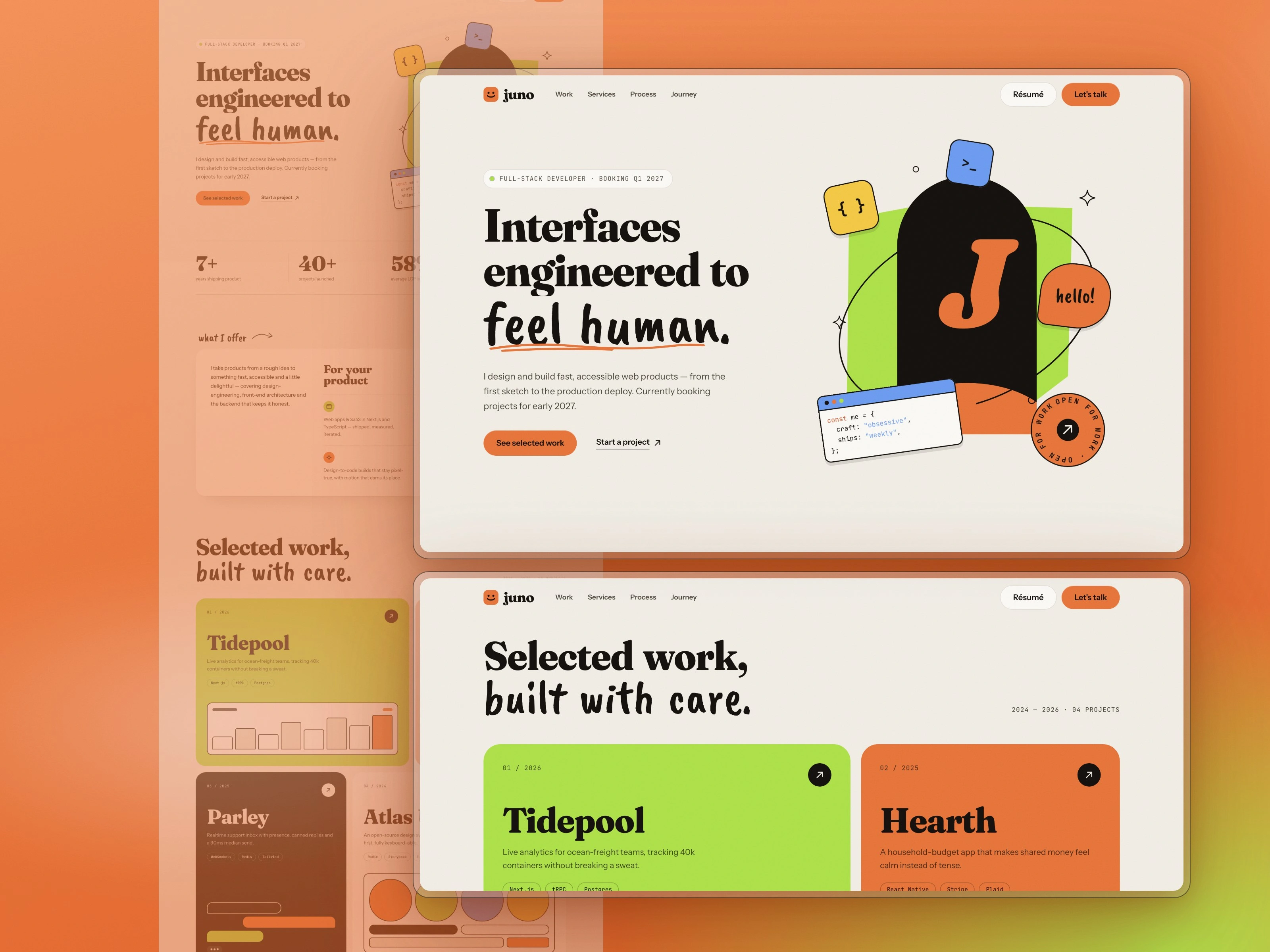
A portfolio template can't ship someone's face, so I built the hero from code instead. A lime slab, an ink arch holding your initial, an orbit line that passes behind the arch and in front of it, and floating stickers: a code window, a "hello!" bubble, a spinning "open for work" badge. They sit on separate depth layers and shift with the cursor. If you drop a transparent PNG into public/, the hero swaps your photo in automatically.
Decision 2: type that does the talking
Fraunces at heavy weight for headlines, a brush script for one phrase per section, Instrument Sans for reading, JetBrains Mono for labels. The script is kept rare on purpose. Overuse makes it a gimmick.
Decision 3: contrast before aesthetics
The reference uses white text on orange. At body size, white on that orange fails WCAG AA, so my buttons use ink text instead. It also reads more editorial.
Decision 4: single-column storytelling
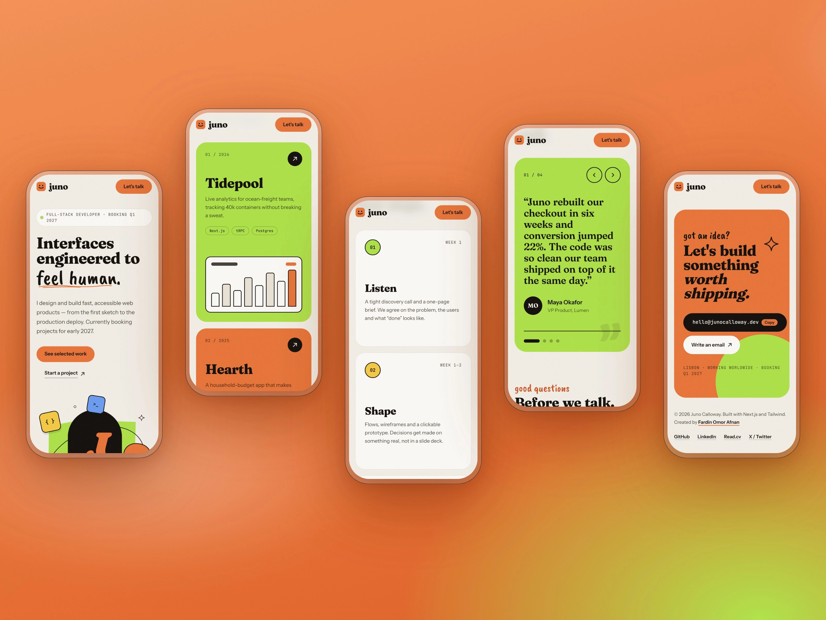
My first journey section used two columns and felt sparse on the right. I moved it to one column with a vertical timeline, full-width roles and stack tags.
A mistake worth sharing
My first testimonials section was a horizontal scroller. On a wide monitor the cards sat flush against the left edge, because I'd written an invalid calc() for the padding and the browser silently dropped it. The staggered offsets made it look worse. I replaced it with one featured quote at a time: arrows, dots and a panel that changes colour per person. Simpler, and it reads better.
What I'd do next
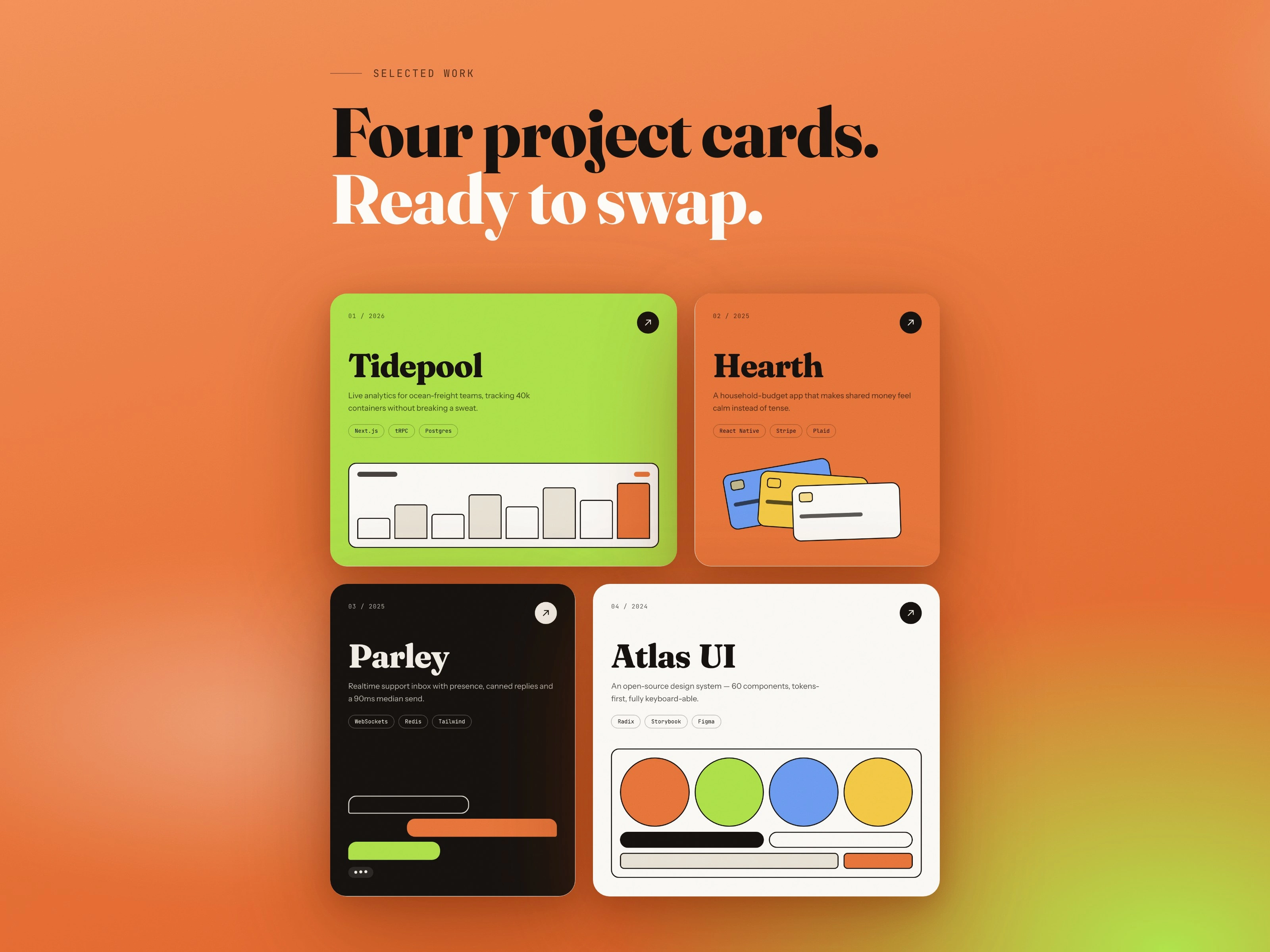
Real project screenshots instead of CSS mock-ups, and a case-study page template for each project.
Built with Next.js 16, React 19, Tailwind v4 and TypeScript. No image files, all SVG and CSS.
0 likes · 2 views · Oct 21, 2026
Designing a developer portfolio that doesn't look like a template The brief Build a developer portfolio in Next.js and Tailwind. No generic AI-looking hero. ...


