


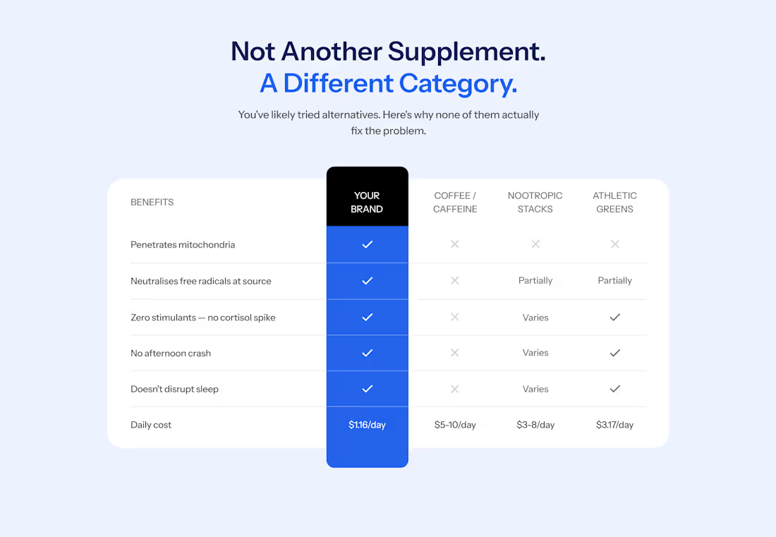
Most websites get comparison tables wrong. You see a colorful grid of green ticks for their brand and red crosses for everyone else.
Shoppers have seen these kind of tables so many times that they skim straight past it. If your product is winning on every row, it reads like an ad. And people hate ads.
On a supplement store I worked on this year, the comparison table gives one of the competitors three ticks out of five. When a rival gets credit where it's earned, the rows where your product wins looks more believable.
The design here also helps reduce cognitive. Instead of a disorienting grid of ticks and crosses, the brand's column is a solid color and runs past the top and bottom of the table, so it's the first thing you see. Every other column stays plain white with grey marks, so nothing competes with it.
This layout works well on mobile too, a breakpoint most websites treat as an afterthought.
Follow me, I'll soon be sharing how to design your comparison tables for mobile.
0
5
Micro-animations for a discount nudge
0
24
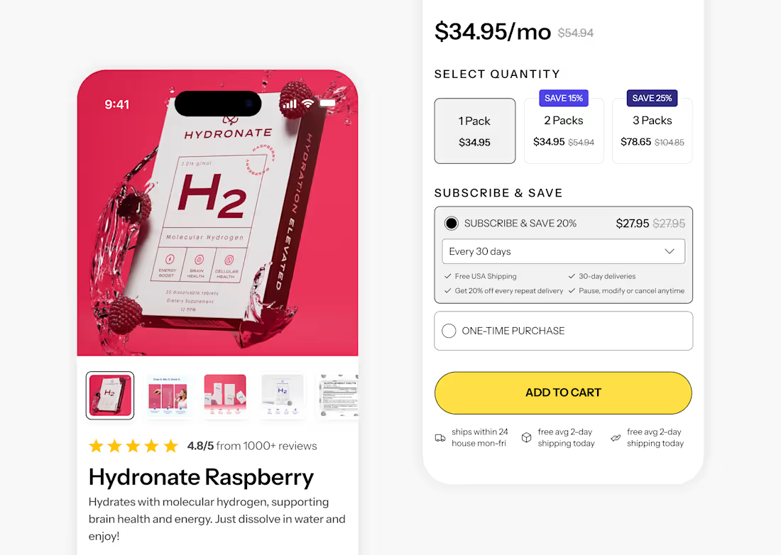
I love customization on product pages. 😍
0
22
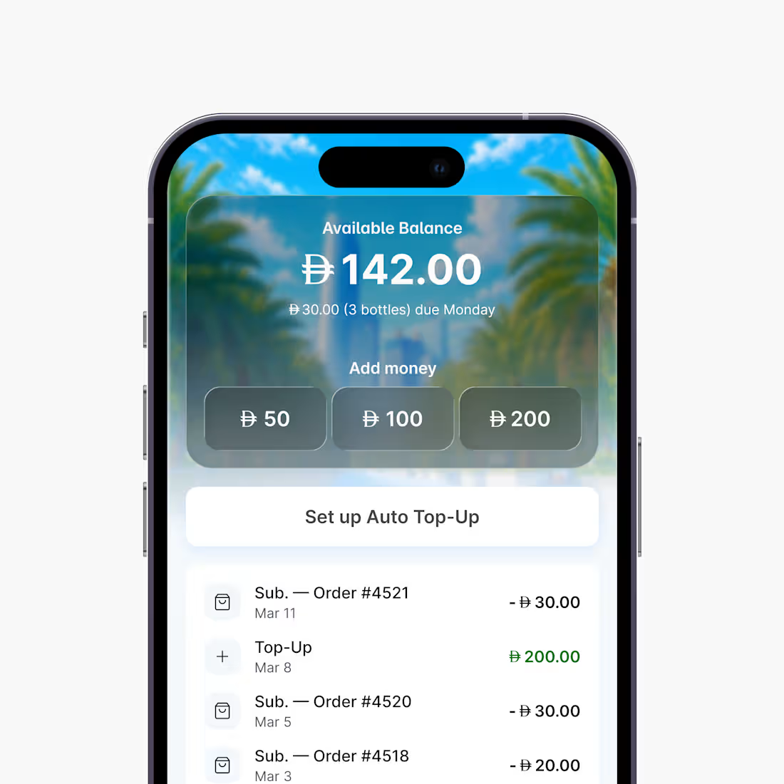
Wallet versions for a delivery app 🇦🇪
0
21