
Tasawar Hayat
Building bold, strategic brands that make an impact 🤎
- 1
- Followers

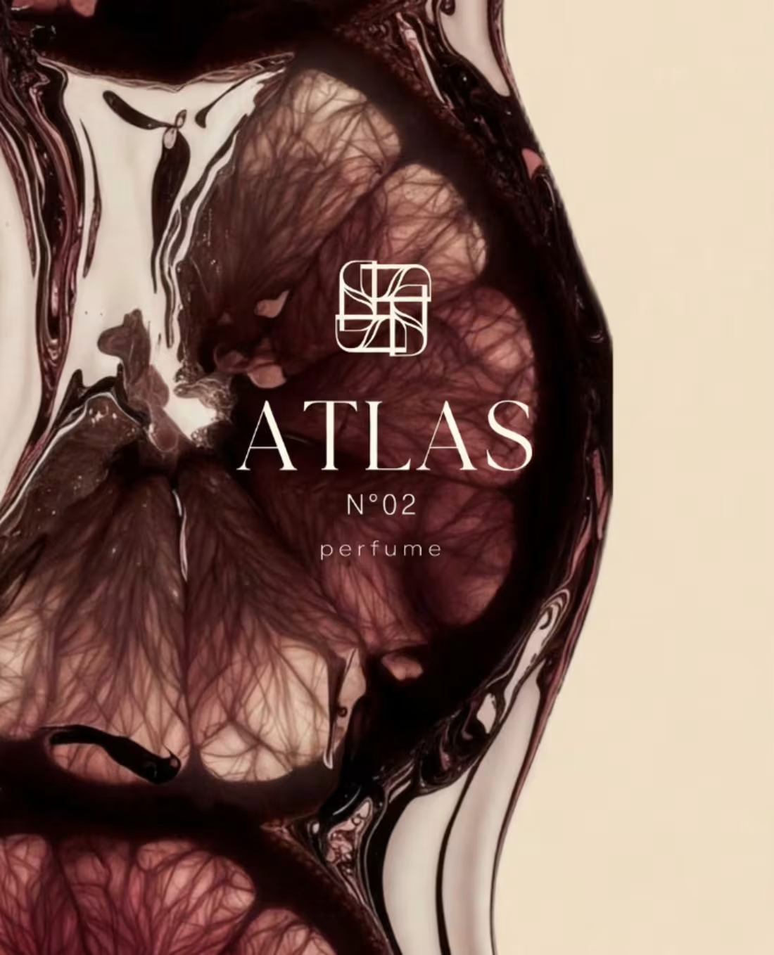
ATLAS N°02 - Luxury Perfume Brand Identity & Campaign. Luxury perfume brand identity & ad campaign for ATLAS N°02 - The Essence of Mystery. A complete premium branding from bottle to packaging.
HOOK: Every great perfume starts with a feeling, not a fragrance.
THE BRIEF: Client came to me with a simple burgundy bottle and said, "Make it feel like it costs $500." No logo. No story. No identity. Just a bottle.
INSPIRATION: I researched oud, old libraries and mysterious nights. ATLAS is not sweet. It's deep, woody, warm and dark. Like a secret you don't tell everyone.
THE IDEA: That golden smoke you see? That's not smoke. That's the memory of someone who left the room, but their scent stayed. That's "The Essence of Mystery".
COLORS & LOGOS: I chose Burgundy #3C0D0D for passion and Real Gold Foil for royalty. The fan icon is inspired by ancient Arabian luxury.
PROCESS DAY BY DAY:
Day 1: Abstract ink art - the soul of the perfume, where burgundy meets gold in water.
Day 2: The Oud Wood poster - where the scent is born, golden smoke rising from old wood.
Day 3: Packaging Design - heavy, soft, debossed box and bag that feels expensive before you even open it.
Day 4: Human Touch - boy spraying ATLAS N°02 on his neck, because perfume is not about bottle, it's about the person who wears it.
RESULT: ATLAS N°02 is no longer just a bottle. It's a luxury house now. People don't buy perfume, they buy confidence. This branding can now stand next to Tom Ford and Dior.
THANK YOU: for checking my work on ATLAS N°02. If you are looking for someone who can turn your simple product into a premium luxury brand story, let's talk. I would love to build your next bestseller. - ATLAS N°02 Project.
1
24
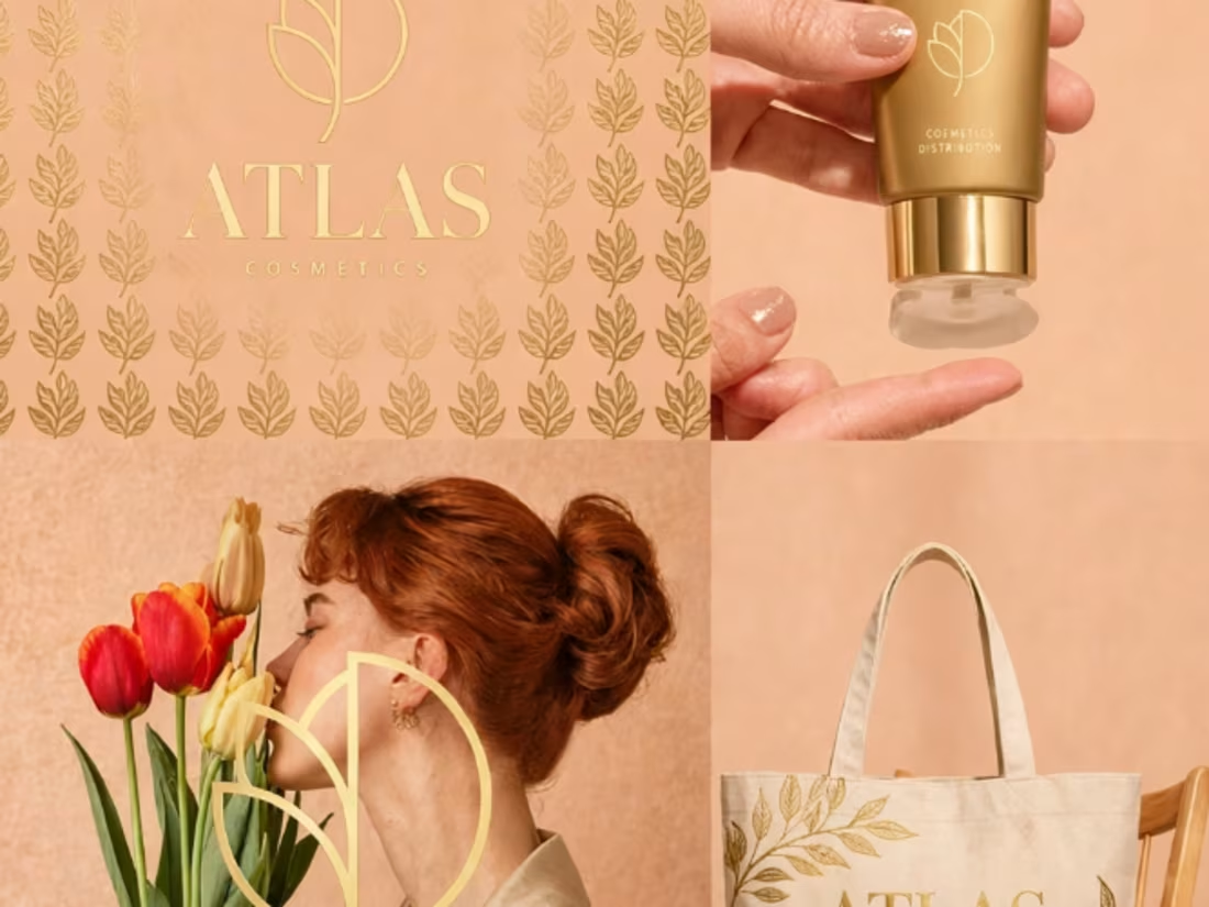
Project Overview: ATLAS is a luxury cosmetics distribution brand rooted in natural beauty. The goal was to create a timeless, minimal, premium identity that feels organic yet high-end. This full brand compilation showcases the complete brand ecosystem from logo to products to packaging.
Concept & Inspiration: Inspired by peach blossom softness, natural stone textures, and golden hour warmth. The brand symbolizes growth, beauty, and strength - combining organic nature with refined luxury.
Logo Design: Logo Mark: Elegant custom serif "ATLAS" with B-style monogram + Peach Blossom
Construction: Peach Blossom + B Monogram = ATLAS Logo. Monochrome version for versatile application. Embossed gold foil effect for premium feel.
Color Palette (Golden + Light Orange): Cream #F7F2EB - Soft & nurturing base. Brushed Gold Foil #C9A66B - Luxury highlight. Matte Gold #B8915A - Premium solid. Peach Gold #F4B08A - Warmth & radiance.
Typography:
Primary: Luxe Serif - ATLAS Headlines - Used for logo, headlines, product names.
Secondary: Inter / Montserrat Clean Modern - Used for body text, details, info.
Brand Pattern & Essence: Custom Tulip Branch Pattern - Minimal line art peach floral.
Brand Essence: Luxurious, Golden Elegance, Warmth, Premium Minimal, Timeless.
Deliverables in this Portfolio:
1. Logo on Peach - Organic fruit mockup.
2. Business Card on Stone Rock - Letterpress on textured cream.
3. Product Trio - Hydrating Cream 50ML, Vitamin C Serum 30ML, Body Oil 350ML.
4. Cream Swatch - Radiant Hydrating Cream lifestyle.
5. Tote Bag with Orange Tulips - Sustainable merch.
6. Face Mist Spray - Lifestyle application.
7. Complete Brand Identity Sheet.
Mission: Llevamos la belleza más lejos - We take beauty further. Designed to be luxury, natural, minimal, timeless, premium - EST. 2020. #ATLAS #Cosmetics #LuxuryBrand #BrandIdentity.
0
26
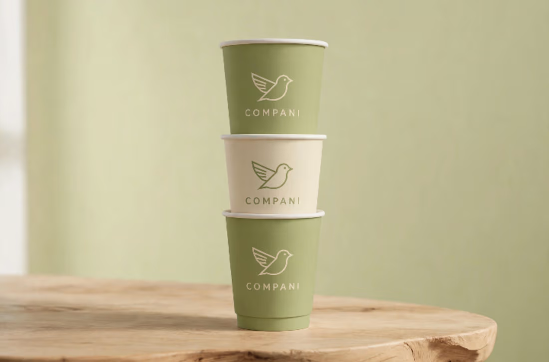
Compani — Cozy Cafe Brand Identity + Collaterals Compani is a cozy all-day cafe brand designed to feel warm, calm, and familiar. Made for slow mornings, honest coffee and easy conversations. Soft minimal identity with warm neutral tones and a simple bird mark. Every touch point from cup to bag feels calm, consistent and human.
Scope: Logo design, typography, color palette, packaging and menu
The Challenge: Most modern cafes are either too aesthetic or too plain. The challenge was to build a brand that feels beautiful online but even warmer in real life — something people want to come back to.
The Concept: The concept is built around togetherness. A neighbourhood cafe where every coffee, every conversation, and every small moment feels like home. A place to pause, connect and belong.
The Identity: We kept the identity soft, minimal and human. Warm beige tones, clean rounded type, and a simple bird mark that stands for community. From cups to bags to menus — every touch point feels calm, consistent and inviting.
Outcome: A warm, memorable brand that feels like a neighbourhood favourite from day one.
Thank you for viewing Compani. Like what you see? Let's build your cozy brand next. Available for branding projects — DM me
0
26
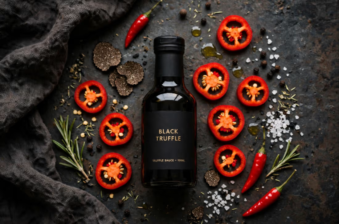
BLACK TRUFFLE Brand Identity & Packaging Design
0
0