Ella Shteier
Design & Development for Startups | Certified Framer Expert
- 5.0
- Rating
- 33
- Followers


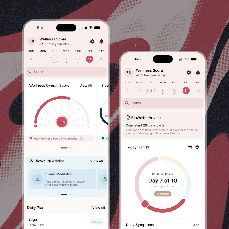
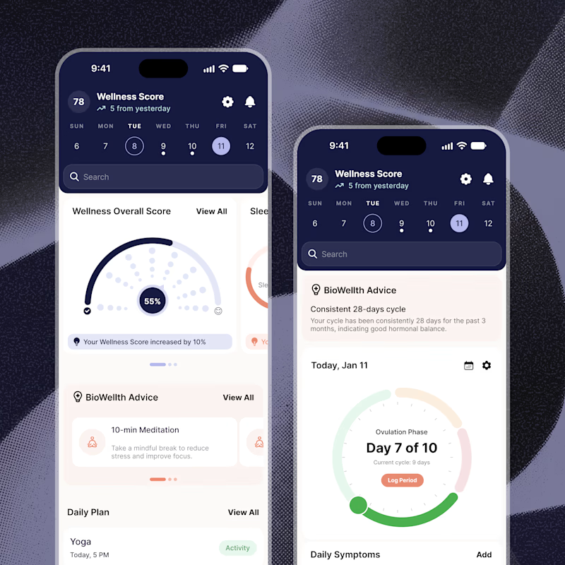
Exploring two color palette directions for a women’s health app. Which one feels right to you? 👀
32 voted
56%
25 voted
44%
57 votes
Closed
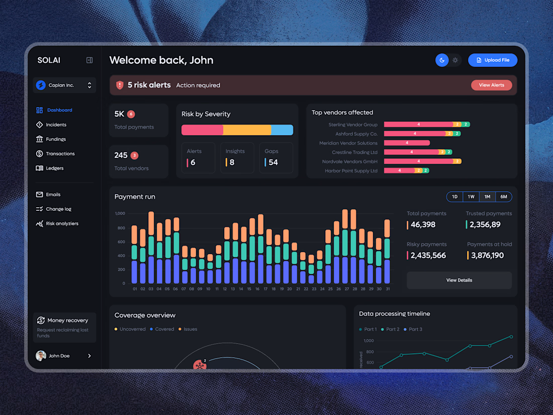
A dashboard with a lot of data doesn’t have to feel overwhelming.
The focus here was on clear hierarchy, easy-to-scan risk alerts, and making complex payment data feel simple and intuitive. Dark UI, structured analytics, and just enough color to guide attention where it matters.
What do you think of this direction?
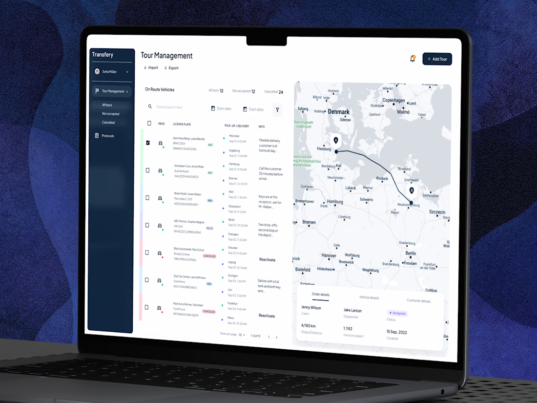
Designing for logistics means working with a lot of data without making the interface feel overwhelming.
For this platform, the focus was on creating a clear and intuitive experience where routes, vehicles, and key details are easy to manage at a glance.
Clean, practical, and...
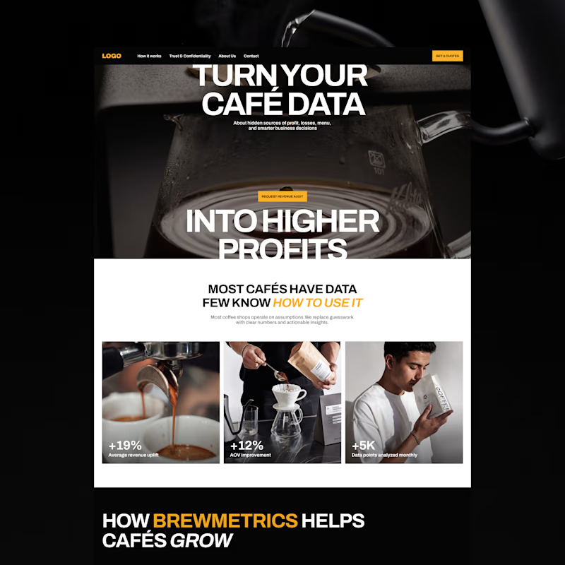
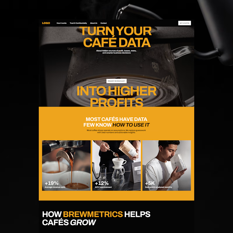
Exploring two color palette directions. Which one are you going for? 👀

13 voted
57%
10 voted
43%
23 votes
Closed
Health is probably one of my favorite areas to design for.
Over the years, I’ve worked on projects across mental health, elderly care, accessibility, VR-based treatment, wellness, and other health-focused products.
What I value most about these projects is the purpose behind them....