

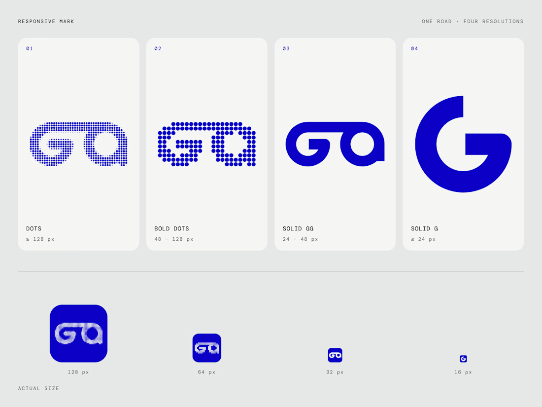
One road. Four resolutions.
The Gg mark is drawn as a single continuous road.
At large sizes it's dots. As it gets smaller, the dots grow bolder,
then the road turns solid, and at 16px only the G remains.
Same path, every size.
#responsivelogo #logodesign #brandidentity #dotmatrix


distric.gg — rebrand.
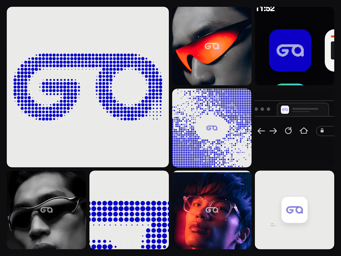
One road. Two letters. No breaks.
The new Gg is drawn as a single continuous line of dots,
built to move as well as it stands still.
Vision: identities that last.
Mission: make every brand feel like a place.

New mark, same district.
Gg is now one unbroken road,
dot by dot, from the first letter to the last.
Made for screens, signs, and motion.
#rebranding #brandidentity #logodesign
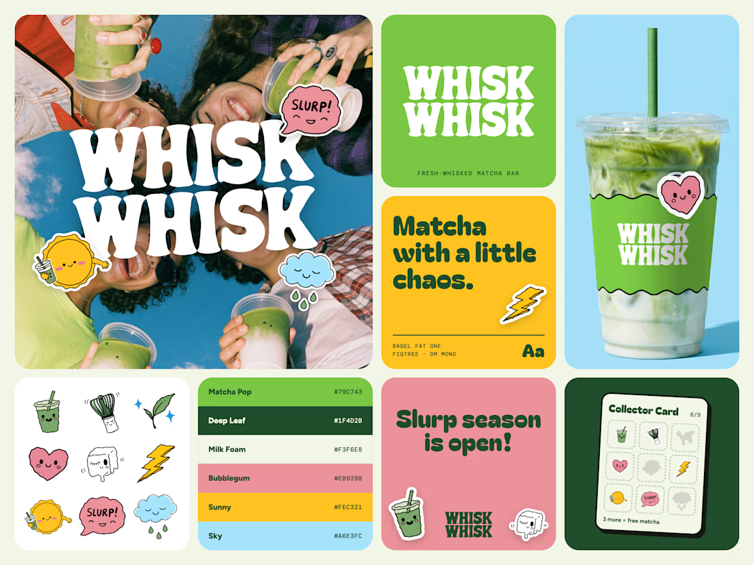
WHISK WHISK 🍵 Matcha with a little chaos.
A concept brand where every cup comes with a random collectible sticker. 9 doodle characters, a custom wordmark, cup packaging, and a palette pulled from the stickers.
Made with Recraft + Claude. Which one are you collecting first? 👇