The network for creativity
Join 1.25M professional creatives like you
Connect with clients, get discovered, and run your business 100% commission-free
Creatives on Contra have earned over $150M and we are just getting started
Back to feedPost
distric.gg — rebrand.
One road. Two letters. No breaks.
The new Gg is drawn as a single continuous line of dots,
built to move as well as it stands still.
Vision: identities that last.
Mission: make every brand feel like a place.


A single continuous line of dots is a neat constraint for a Gg, since the rhythm can carry the motion too. How does it hold up at favicon size, where the dots start to merge? Does the mark switch to a simplified version there?

Good catch. Below ~32px the dots do merge, so the mark is responsive:
the same road is drawn as dots at large sizes, fewer dots for app icons,
a solid Gg in the mid range, and a solid G at 16px. One road, four resolutions.
Thanks for the detail. Dropping to a solid G at 16px is the part I'd have fought over, so it's good to see the system keeps one skeleton across all four sizes.
The network for creativity
Join 1.25M professional creatives like you
Connect with clients, get discovered, and run your business 100% commission-free
Creatives on Contra have earned over $150M and we are just getting started
Related posts


A great website should do more than look good, it should make choosing a business feel easy.
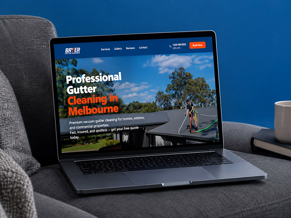
I recently completed a website project for Bryer, a Melbourne-based gutter and solar panel cleaning business.
The goal was to create a clean, professional online presence that communicates their services clearly, builds trust, and makes it easier for potential customers to request a quote.
Now, I’m curious:
When you visit a service-based business website, what matters most to you, the design, the information, or how easy it is to get in touch?
Let’s hear your thoughts! 👇
#WebDesign #Webflow #UXDesign #WebDevelopment #WebsiteDesign #Contra


this is amazing work

A complete brand identity system that brings visual direction, social media, and web design into one clear, consistent brand experience across every touchpoint.


From craving to system. 🌭🔴
A look behind the identity of Bocaditos—a playful blend of retro diner culture and classic cartoon character design.
Meet Bocadito: part chef, part cowboy, always full of attitude. Built around a signature red zigzag, the mascot moves through different poses and costumes while keeping a consistent identity.
This brandbook brings the thinking together: references, character rules, and a visual system designed to keep things recognizable as the brand grows.
Good food. Good mood.
#BrandIdentity #CharacterDesign #BrandGuidelines #RestaurantBranding #GraphicDesign

Part chef, part cowboy what a fun mascot concept! The typography system is top-notch 👏


