Freelancers using Dash Plotly
Sign Up
Post a job
Sign Up
Log In
Filters
1
Projects
People
Ari Harrison
pro
San Francisco, USA
AI & ML Engineer
$1k+
Earned
7x
Hired
23
Followers
Follow
Message
AI & ML Engineer
1
Luxury Furniture 3D Visualization App
1
14
1
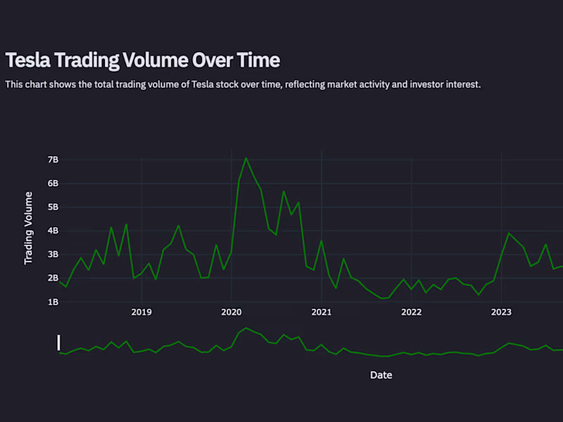
Tesla Stock Price Dashboard
1
43
0
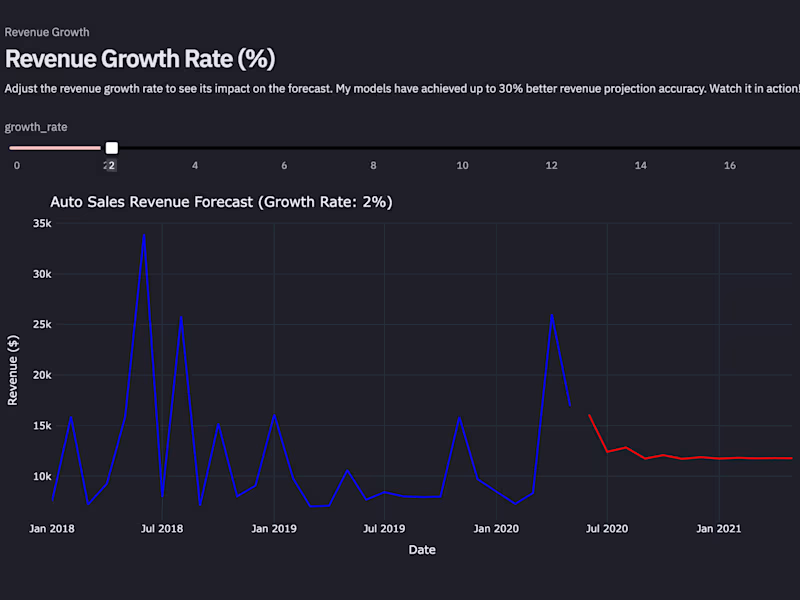
Auto Sales Revenue Forecast Dashboard
0
41
1
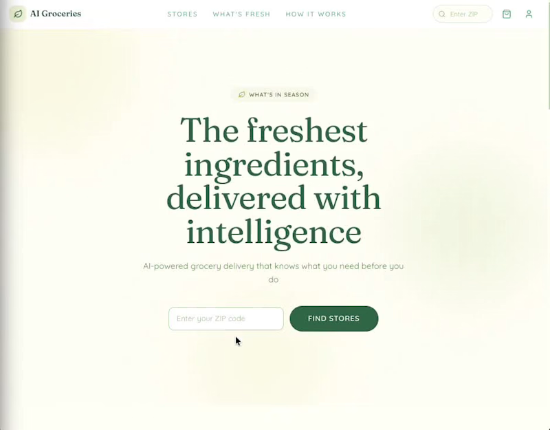
AI Groceries An AI-powered online grocery delivery platform built with Next.js 15, React 19, Supabase, Claude API, and Stripe. Designed around "The Harvest Table" philosophy -- abundant, warm, and grounded in real food provenance.
1
175
Dash Plotly
(3)
Follow
Message
Anurag Nagare
Mumbai, India
I’m an AI & Machine Learning engineer with expertise in deve
Follow
Message
I’m an AI & Machine Learning engineer with expertise in deve
0
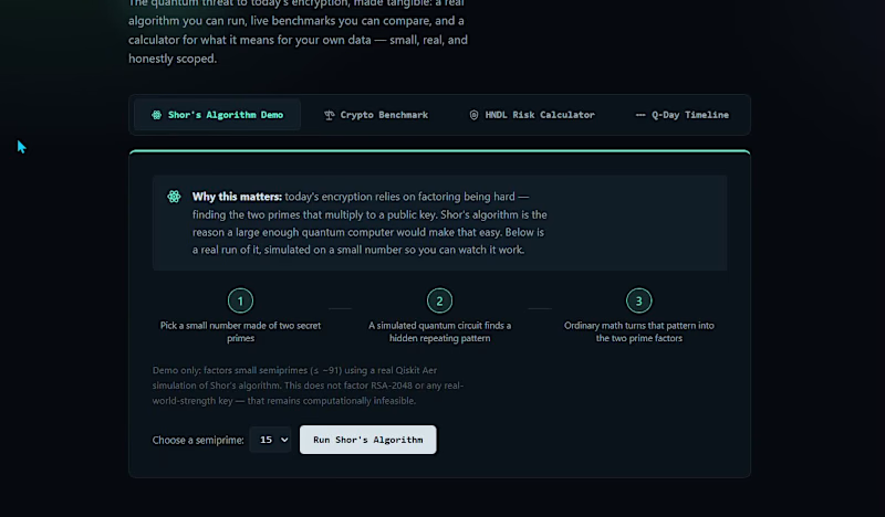
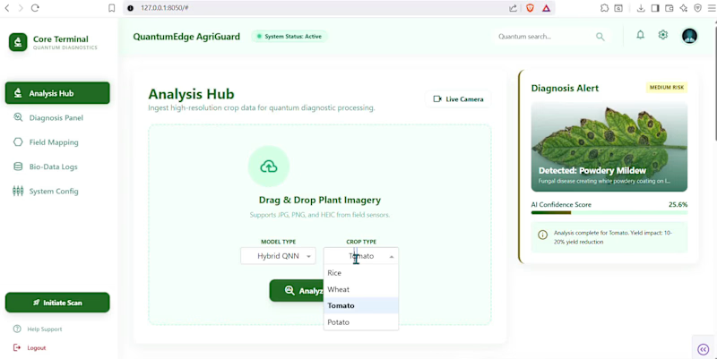
Everyone's talking about quantum computing. Nobody's using it to feed farmers. India loses 20–30% of its crop yield every year to diseases and pests. Not because farmers don't care — but because early detection is hard, expensive, and inaccessible to the people who need it most. The existing solutions? Either a basic image classifier trained on lab-perfect photos that fail in real field conditions, or an agronomist visit that costs time and money most small farmers don't have. So I built QuantumEdge AgriGuard — a hybrid Quantum Neural Network app where a farmer can photograph a diseased leaf on their phone and get an instant diagnosis in under 5 seconds. Here's what makes it different from just another plant disease detector: Instead of a pure classical CNN, I built a hybrid architecture — a ResNet/EfficientNet backbone extracts visual features, then passes them into a Variational Quantum Circuit (VQC) for the final classification. The quantum layer uses angle embedding + StronglyEntanglingLayers, which gives it a measurable edge on small, noisy datasets — exactly the kind of data you get from Indian field conditions. The app doesn't just tell you what disease it is. It gives you: → Confidence score → Organic + chemical remedies (India-specific) → Yield impact estimate → A live classical vs quantum accuracy comparison so you can see the difference yourself I tested the quantum advantage claim honestly — ran both models on the same downsampled PlantVillage dataset and tracked accuracy, F1-score, and inference time side by side. The results are on the dashboard. No hand-waving. Built with PennyLane + PyTorch + Plotly Dash. Designed to run on simulators today and on QpiAI-Indus 25-qubit hardware tomorrow.
1
0
19
0
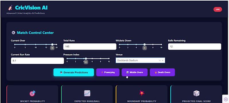
CricVision AI - Advanced Cricket Analytics Dashboard! CricVision AI is an intelligent cricket analytics platform that leverages machine learning to provide real-time match predictions and comprehensive player insights. The dashboard predicts wicket probability, expected runs per ball, and boundary likelihood using three trained ML models with StandardScaler normalization. It features interactive match scenarios (Powerplay, Middle, and Death overs), over-by-over projections, win probability calculations, and economy rate forecasts. Users can compare players head-to-head, analyze form trends over recent innings, visualize run distribution through wagon wheels, and get AI confidence scores for all predictions - making it a complete solution for cricket enthusiasts and analysts.
0
77
0
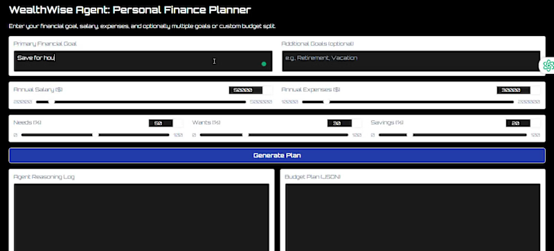
I created WealthWise Agent, a smart personal finance planner designed to craft personalized budget plans and investment strategies. This app takes into account user inputs like salary, expenses, and financial goals, and then uses a Large Language Model (Gemini) to analyze these factors based on the 50/30/20 budgeting rule. It offers a clear step-by-step reasoning log, a detailed JSON-structured financial plan, and an interactive visualization of budget allocation, empowering users to make informed choices to reach their financial goals. 💻 Tech Stack Used: Frontend/UI: Gradio (custom themed with CSS, Orbitron font) AI/Logic: Google Gemini (gemini-1.5-flash) with LangChain agents Data: yFinance API for real-time stock/ETF data, Pandas & NumPy for calculations Visualization: Plotly Express for interactive charts
0
48
1
Most AI research tools are just a chatbot with a search button. I built something different. Every time you ask an AI to research something, you're getting one model, one pass, no quality check. It writes confidently, cites poorly, and you have no idea if what it produced is actually accurate. For anyone making real decisions from AI-generated research, that's a silent risk most people ignore. The problem gets worse at scale the longer and more complex the question, the more a single model hallucinates, misses sources, and loses structure. There's no one checking its work. So I built ResearchOS a 5-agent pipeline where each agent has one job. A Supervisor breaks down your question. A Researcher runs parallel searches across 22+ sources. An Analyst extracts data and auto-generates charts. A Writer synthesises a cited report. A Critic fact-checks it and sends it back for revision if anything is wrong. The loop runs up to 3 times before the report is approved. One question in. A full cited report with charts and PDF export in under 10 minutes. I tested it live by watching the Critic catch a missing citation mid-run and send the Writer back to fix it before approval. That's the part that makes this actually usable for real work. Built on LangGraph, Groq, Tavily, ChromaDB and runs entirely on free tiers.
1
72
Dash Plotly
(3)
Follow
Message
Mohsen M
Italy
AI Chatbot Developer | Data Scientist | ML Engineer
Follow
Message
AI Chatbot Developer | Data Scientist | ML Engineer
0
Incident Response Fairness Analysis
0
16
0
Machine Learning for Bone Tumor Diagnostics
0
10
0
Electricity Consumption Prediction for Malmi Office Building
0
9
View more →
Dash Plotly
(3)
Follow
Message
Istiak Ahmed Khan
Dhaka, Bangladesh
Power BI Data Analyst + ML AI Automation Expert
5.0
Rating
99
Followers
Follow
Message
Power BI Data Analyst + ML AI Automation Expert
3
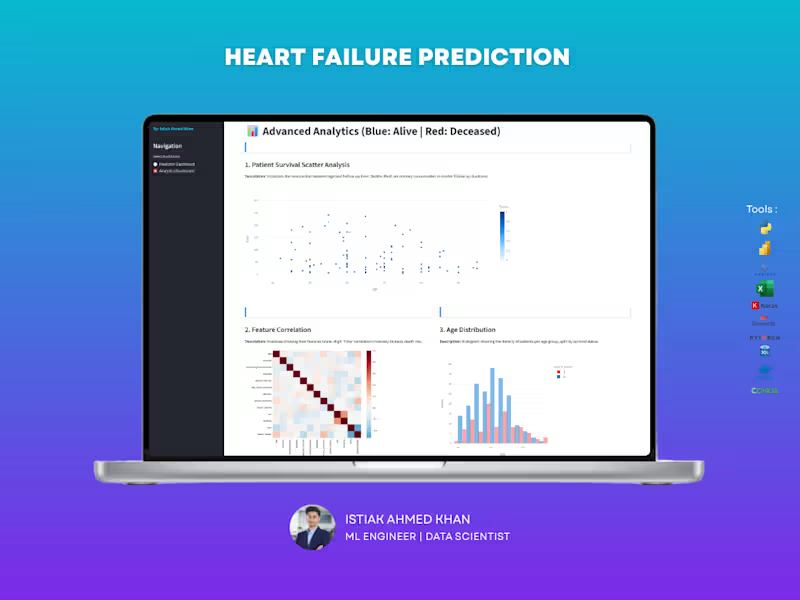
Saving Lives through Early Clinical Risk Detection Application is live at: https://495a-35-237-151-197.ngrok-free.app The Problem: Heart failure is a leading cause of global mortality; the difference between survival and fatality often depends on how early a high-risk patient is identified. The Solution: I developed a clinical diagnostic tool that analyzes patient health markers to forecast mortality risk, assisting medical professionals in prioritizing life-saving care. Key Impacts: Early Intervention: The model identified that follow-up time is the single most critical factor in reducing fatalities, emphasizing the need for early diagnosis and consistent monitoring. Precision Diagnostics: By analyzing heart efficiency (ejection fraction) and chemical markers like serum creatinine, the tool provides a high-accuracy (84.49%) risk score for every patient. Clinical Support: The system helps doctors look past "statistical flukes" by accounting for outliers in medical data, ensuring that extreme clinical cases are caught rather than ignored. Actionable Health Insights: Demonstrated a clear link between age, heart efficiency, and chemical abundance, giving providers a data-driven framework to improve long-term patient outcomes
1
3
772
10
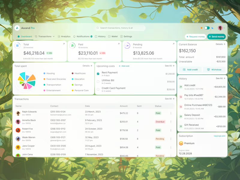
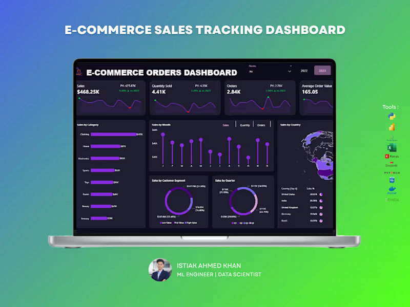
The E-Commerce Orders Dashboard provides a comprehensive overview of order performance, revenue trends, and customer purchasing behavior. Designed for online businesses, this dashboard transforms transactional order data into actionable insights that support growth, operational efficiency, and strategic decision-making.
2
10
1.2K
18
Email Marketing Analytics Dashboard – UI/UX Design Struggling to track campaign performance across multiple channels? This dashboard is designed to give you a complete, real-time view of your marketing efforts in one clean and intuitive interface. A powerful, easy-to-use dashboard that helps you monitor email, SMS, social media, and push campaigns without the confusion of scattered data. Every key metric is presented clearly so you can make faster, smarter decisions. Key Capabilities: Track open rates, click rates, conversions, and revenue in real time, Compare performance across multiple marketing channels, Identify your top-performing campaigns instantly, Understand audience engagement with clear visual breakdowns, Spot trends and optimize campaigns quickly. Most businesses run campaigns but struggle to understand what’s actually working. This dashboard eliminates guesswork by turning your data into clear, actionable insights — helping you improve ROI and scale winning strategies. Perfect For: Digital marketers, E-commerce brands, Agencies managing multiple campaigns, Startups looking to optimize growth. If you want a high-converting, professional dashboard that not only looks great but drives real business decisions — I can help you build it.
8
18
1K
6
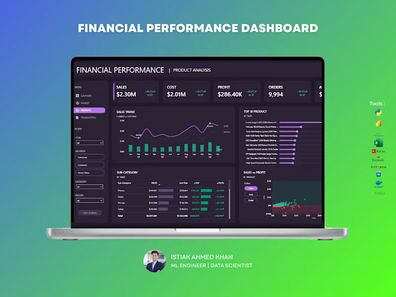
The Financial Performance Dashboard provides a comprehensive overview of an organization’s financial health by tracking revenue, expenses, profitability, and key financial indicators. Built using Power BI, this dashboard enables finance teams and decision-makers to monitor performance, identify trends, and make data-driven strategic decisions.
6
931
Dash Plotly
(1)
Follow
Message
Imaad Mahmood
Bahawalpur, Pakistan
Data Scientist | Data Analyst | Machine Learning
Follow
Message
Data Scientist | Data Analyst | Machine Learning
1
FinCast Pro Development
1
2
1
How do you turn $15.9K in ad spend into $49.2K in revenue? You stop guessing and start tracking Running paid social campaigns without granular visibility is essentially burning budget. For this Q1 2025 performance tracker, the goal wasn't just to make pretty charts—it was to build an automated, actionable intelligence tool that immediately identifies where marketing dollars are generating the highest return. The Data-Driven Insights: By analyzing over 2.7 million impressions and 1.8 million unique reach, this dashboard uncovered the exact levers driving profitability: 🚀 The ROI Engine: The overarching strategy yielded a highly profitable 3.1 Return on Ad Spend (ROAS). 🏆 Winning Formats: Carousel ads heavily dominated the space, capturing 21.9% of the share, proving that interactive, multi-image formats win the algorithm. 📅 Timing is Everything: Engagement rates spiked massively on Saturdays, reaching near 20%, indicating the optimal window for scaling ad spend. 🎯 Campaign Economics: While "Seasonal Promos" drove the highest total top-line revenue , the "Community" campaigns actually delivered the most efficient ROAS.
1
39
3
Built a full YouTube analytics dashboard in Google Looker Studio using real channel data from Dark Psychology Archive. The dashboard tracks 6 KPIs — Views (18,582), Watch Time (51.2 hrs), CTR (4.32%), Likes (1,302), Subscribers Gained (105), and Engagement Rate (10.31%). A monthly trend line reveals the growth curve peaking at 4,266 views in November. Content-type breakdown shows Shorts drive 71% of total views. Top performer: Hoovering at 1,232 views with 8.2% CTR. Built to help content creators make data-driven decisions on what to post, when, and in what format — without exporting CSVs manually.
3
134
1
HR teams spend hours every week pulling salary, performance, and turnover data from separate spreadsheets. This dashboard puts all of it in one place — live. Built this HR Analytics Dashboard in Google Looker Studio with 5 KPI cards, department salary breakdown, geo distribution map, and a ranked leaderboard sorted by total compensation. Engineering leads at $1.05M total salary. Finance close behind. Decision-makers can see that in 3 seconds instead of 3 hours.
1
125
Dash Plotly
(1)
Follow
Message
Abu Aasif Ansari
Kagal, India
I help businesses fix messy data and build dashboards
New to Contra
Follow
Message
I help businesses fix messy data and build dashboards
0
Smart Data Analyst — AI-Powered Data Analysis App Built a fully working AI-powered data analysis app from scratch using Streamlit and Gemini API. The problem: Most business owners have data in Excel or CSV files but no easy way to analyze it without hiring a full-time analyst or learning Python. So I built a tool where you just upload your file — and the app does the rest. → Auto-detects KPIs from any dataset → Generates charts automatically → Ask questions in plain English — get instant answers with tables and charts → Downloads full PDF report with KPIs and charts → RAG memory — remembers past questions Tech: Streamlit · Gemini API · Python · Pandas · Plotly 🔗 Live: https://smart-data-analyst-ahkz32vjd6dzvhmexkrhdm.streamlit.app/ (https://smart-data-analyst-ahkz32vjd6dzvhmexkrhdm.streamlit.app/)⭐ GitHub: https://github.com/AbuAsifAnsari/smart-data-analyst (https://github.com/AbuAsifAnsari/smart-data-analyst)
0
42
1
Freelance IQ — AI-powered analytics dashboard for freelancers, built entirely with Google Stitch. 5 screens: Income tracking, Client insights, Project pipeline, AI earnings forecast, and Goal tracker — all in a premium dark UI. Used Stitch's Gemini 3.1 Pro mode with streaming generations and in-place AI edits to go from idea to interactive prototype in one session. https://stitch.withgoogle.com/preview/9455851854863077407?node-id=494f0bc78d54431bbb199e7793602920
1
151
1
Sales, Customer & Marketing Analytics Dashboard Project
1
2
0
I’m a Data Analyst specializing in cleaning, structuring, and analyzing marketing and sales data using Python, Excel, SQL, and Power BI. I help businesses fix broken data pipelines, resolve formatting issues, and turn raw data into accurate dashboards that support decision-making. My work focuses on clarity, reliability, and scalability—ensuring reports remain consistent as data grows. If you’re struggling with inconsistent data or dashboards that don’t reflect reality, I can help streamline the process end-to-end.
0
154
Dash Plotly
(1)
Follow
Message
Eduardo Sierra
Tegucigalpa, Honduras
UI/UX Designer & Researcher | Market Research Background
18
Followers
Follow
Message
UI/UX Designer & Researcher | Market Research Background
0
Data Analysis and Data Visualization
0
8
3
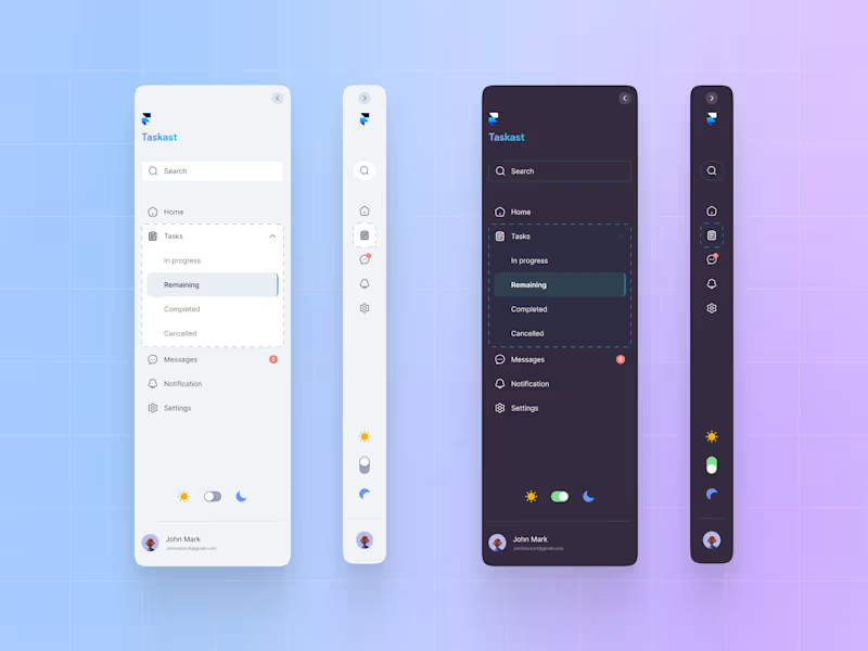
This week, I had the opportunity to create UI components for a project management startup
2
3
92
2
This is a running app concept that I've been designing on Figma
2
119
1
I designed a tiered pricing for a survey management platform. As well as the CTA buttons
1
147
Dash Plotly
(1)
Follow
Message
IRENE MAINA
Nairobi, Kenya
Data Analyst provided data driven decisions to stakeholders.
24
Followers
Follow
Message
Data Analyst provided data driven decisions to stakeholders.
0
House Price Analysis for Value Improvement
0
2
1
Tanzanian Water Well Data Analysis Project
1
3
0
https://github.com/Brene-m/AWS_Restatrt
0
38
1
Call Volume Prediction Model for Mtoto News
1
1
Dash Plotly
(2)
Follow
Message
Explore people