


I’ve always felt that love is less about softness and more about the balance of tension.
For the most recent Order & Chaos drop, I wanted to explore that through design rather than hearts and flowers. Because honestly? Great design and great relationships both require a mix of boundaries and total abandon.
I played with some heavy contrasts this time around—think precision alignment versus expressive scale, and sharp typography against grainy, intimate photos.
Order is the grid. Chaos is the kiss mid-laugh.
If you have too much order, the work feels dead. If you have too much chaos, it all collapses.
I'm curious for the founders and creatives following along: where is your brand sitting right now? Are you playing it too safe, or are things getting a little too scattered?
2
6
199

Multi-Asset Video Campaign
Delivered a comprehensive motion design strategy spanning 8-minute long-form content and diverse short-form assets. Demonstrated mastery of pre-production planning, brand alignment, and audience engagement through strategic motion principles.
What Was Delivered
Pre-Production Strategy
Comprehensive conceptualization and planning that aligned creative direction with client objectives and brand narrative architecture.
Multi-Format Production
Optimized content delivery across long-form (8 min primary) and short-form formats, each tailored for specific distribution channels and audience behaviors.
Motion Design Excellence
Advanced motion graphics and kinetic typography that enhanced narrative clarity, visual hierarchy, and measurable audience engagement.
Brand Consistency at Scale
Unified visual language across 20+ distinct pieces, maintaining cohesive design principles while adapting to diverse content types.
3
243




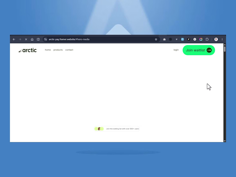
Arctic: Fintech SaaS Website (Brand + Framer Build)
Description
Arctic is a concept fintech platform I designed and built end-to-end in Framer, a full brand-to-launch website for a cross-border payments company.
This project covers the complete process, not just the visuals:
1. Brand identity, name, logo concept, color system, and typography built from scratch
2. 17-page architecture: product pages (send money, global accounts, cards, invoices, U.S. stocks), a working waitlist capture flow in place of live auth, and full navigation across personal and business use cases
3. Content & copywriting: every page written from the ground up to match the brand voice
4. SEO: metadata, titles, and descriptions configured page-by-page before launch
5. Fully responsive Framer build, published and live
I led every part of this project myself: brand strategy, UX writing, page layout, and the Framer build to show what a complete fintech website engagement looks like, from first concept to a launch-ready site.
🔗 Live site: arctic-pay.framer.website (http://arctic-pay.framer.website)
3
3
207

AcePoint is a digital platform designed to streamline and elevate the way tennis clubs, academies, coaches, and players operate within a unified ecosystem.
Rather than simply digitizing existing workflows, the project was approached as a complete rethinking of the sports management experience eliminating fragmentation, reducing operational friction, and creating a seamless, end-to-end journey across all touchpoints.
The platform centralizes key functionalities including court reservations, subscription management, payments, coaching operations, and performance tracking into a single, cohesive interface. This consolidation removes the need for external tools and enables a fluid, uninterrupted user experience from onboarding to booking and beyond.
One of the core challenges was designing for a multi-role environment, where users can simultaneously act as players, coaches, parents, or administrators. To address this, the experience was built around adaptive UX principles allowing dynamic role switching, contextual interfaces, and personalized user flows without increasing cognitive load.
From a UX/UI perspective, the work focused on balancing system complexity with clarity and usability. The platform integrates advanced logic such as recurring bookings, scheduling dependencies, financial tracking, and role-based permissions, all structured within a modular and scalable design system.
Key design principles included:
-End-to-end journey orchestration, ensuring a frictionless experience from registration to payment
-Role-based personalization with adaptive dashboards and contextual actions
-Automation of repetitive processes such as confirmations, reminders, and reporting
-Scalable and modular architecture adaptable to different club and academy structures
A mobile-first approach ensured accessibility across all devices, supported by clear information hierarchy, intuitive navigation, and reduced cognitive load. Accessibility standards were also integrated to ensure inclusivity across user profiles.
Beyond usability, AcePoint was designed as a strategic growth tool increasing subscription conversion, improving user retention, and strengthening engagement between clubs, coaches, and their communities.
This project demonstrates a holistic approach to UX/UI where product strategy, system thinking, and user-centered design converge to deliver a scalable, high-impact digital platform.
0
95


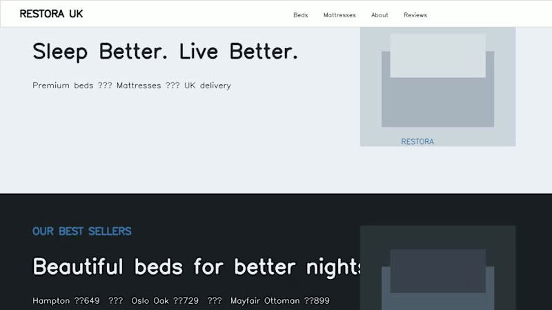
Welcome to Restora UK — premium beds and mattresses designed for better sleep. Explore our beautiful collection of upholstered, oak and storage beds, created to bring comfort and style into every bedroom. Discover our premium mattresses, compare prices, and find the perfect level of support for a better night’s sleep. With UK delivery, a 100-night comfort promise and a five-year guarantee, Restora makes choosing your perfect bed simple. Designed with a clean, modern and responsive experience for every device. Designed and developed by Saqib.”
#️⃣ Hashtags
#WebDesign #WebDevelopment #BedWebsite #FurnitureWebsite #MattressWebsite #EcommerceWebsite #ResponsiveWebDesign #UIDesign #UXDesign #WebsiteDevelopment #Contra #FreelanceWebDeveloper #UKBusiness #FurnitureStore #BedroomDesign
0
73
