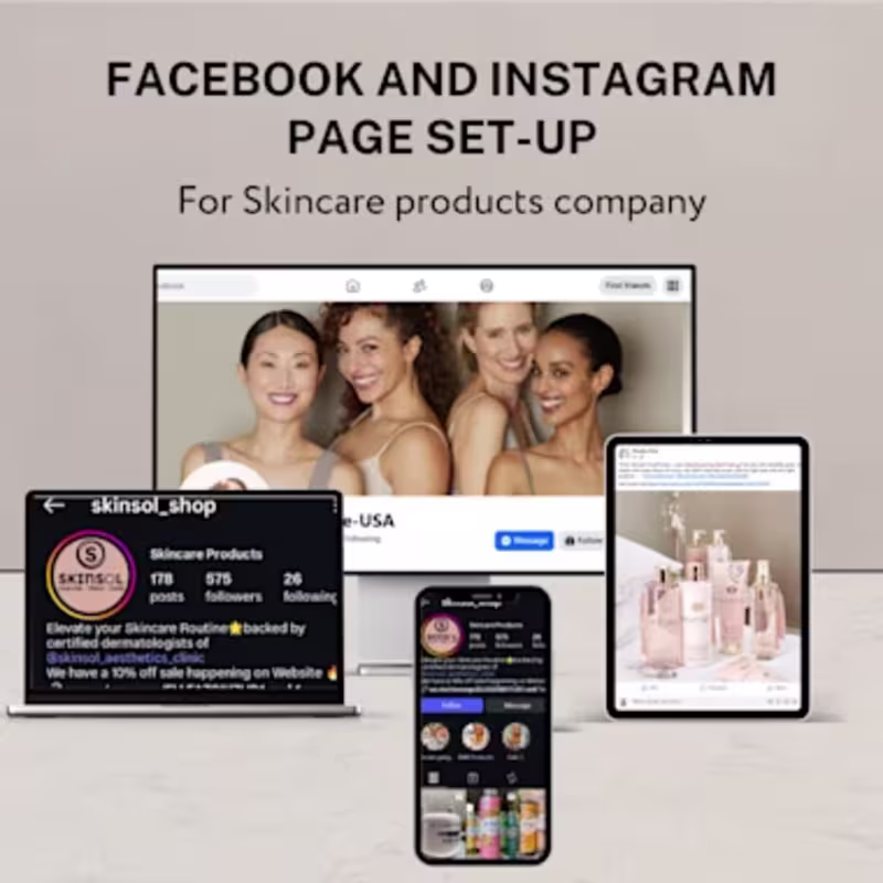
Opt-in Page Design Projects
Sign Up
Post a job
Sign Up
Log In
Filters
1
Projects
People
Message
0
Liezl Swan
Monica Yates Email Migration from Flodesk to Kit
0
21
Message
0
Melissa Compton
pro
ClickFunnels Landing Page Design
0
2
Message
0
Scott DS Young
pro
Social Storytelling & Franchise Marketing Design for Zaxby’s
0
4
Message
6
Flora | EMAIL & QUIZ
pro
Page deck Landing Page
6
10
Message
1
Onifade Ifeoluwa
Do the footer or FAQ really matter in a landing page design ???? Most people think headers and hero sections do the heavy lifting on a landing page. But here’s the truth 👇 Footers and FAQs quietly close the deal. The FAQ answers the objections users won’t ask out loud: Is this for me? Is it safe? Is it worth the money? The footer builds trust when attention is fading: credibility, links, social proof, and contact points. They don’t grab attention. They remove friction. A landing page without a strong FAQ or footer doesn’t feel broken It just converts less. Design isn’t only about what people notice. It’s about what makes them feel confident enough to act.
1
234
Message
0
Sierra Janisse
pro
Kajabi Site Revamp for Malibu Medium
0
3
Message
1
Min Bui
pro
Turning Traffic Into Bookings
1
8
Message
0
Abby Smith
pro
Premium Website, Sales Funnel, Lead Generation Funnel
0
8
Message
0
Rebecca Chandler
pro
Custom Kajabi Webinar Sales Funnel for Drum School
0
7
Message
4
Abdullah Noman
Another shot for CornerStone. Just wrapped up a modern SaaS landing experience focused on one core idea: complex tools should feel simple. Instead of adding visual noise, the goal was to create structure, rhythm, and clear decision paths — helping users understand value within seconds. What this project focused on: • Conversion-focused layout hierarchy • Clear product storytelling • Scalable design system foundations • AI-product visual language • Balanced aesthetics + usability Great SaaS design isn’t decoration — it’s communication. If you’re building a SaaS product and need design that supports growth, scalability, and clarity, let’s collaborate. Available for: SaaS Landing Pages, Product UI, Brand + Web Design
2
4
360
Message
1
Shahid Iqbal
pro
Kit Landing Page for Notion Template
1
3
Message
2
Stephen Kolawole
pro
🚀 Built more than just a landing page… I built a patient acquisition system. Here’s what makes it work: 🦷 Clear, Irresistible Offer “Complete Dental Checkup for $159” — simple, direct, and hard to ignore. 📱 Conversion-Focused Design Clean layout, trust signals (reviews, stats, doctor profile), and a form placed exactly where it converts best. ⚙️ Automation That Does the Follow-Up Instantly Once a visitor fills the form: → They’re captured as a lead → They instantly receive an SMS → The clinic can follow up faster (while interest is still hot 🔥) 📩 A2P 10DLC SMS Setup (Fully Compliant) No random texting. Proper setup to ensure deliverability, trust, and scalability. 💡 Most businesses focus only on getting traffic… But the real money is in what happens after the click. No follow-up = lost leads Smart automation = booked appointments Imagine getting notified + reaching out to every lead instantly without lifting a finger. That’s the difference between a page that “looks nice” and one that actually prints results. What do you think matters more for conversions: 👉 Design 👉 Offer 👉 Follow-up system Drop your answer below 👇 let’s talk. #GoHighLevel #LeadGeneration #SalesFunnels #SMSAutomation #ConversionDesign #MarketingSystems
2
2
109
Message
0
Neda Filiposka
pro
Landing page
0
12
Message
1
vladimir dimitrov
pro
200+ Waitlist Signups Before Launch Day — Webflow Landing Page
1
57
Message
0
Sachin Kumar
pro
AI Speaker & Business Innovation Website Design
0
0
Message
1
NOMAN IJAZ
Designing for AI tools means earning trust fast — users arrive skeptical and leave either converted or gone. For this AI voice SaaS project, I focused the entire design strategy on immediate value communication: bold headline typography, real product UI embedded directly into the hero, and social proof signals positioned exactly where doubt appears. The light, minimal layout with organic line-work backgrounds keeps the interface feeling human despite the technical subject matter. Every section was wireframed, UX-tested, and refined in Figma before final visual execution.
1
1
235
Explore projects