Freelance Brand Strategists in Zwolle
Freelance Brand Strategists in Zwolle
Sign Up
Post a job
Sign Up
Log In
Filters
2
Projects
People
Roos van Gestel
pro
Zwolle, Netherlands
I shape brand identities through design & strategy
1x
Hired
4.9
Rating
99
Followers
Top
Follow
Message
I shape brand identities through design & strategy
0
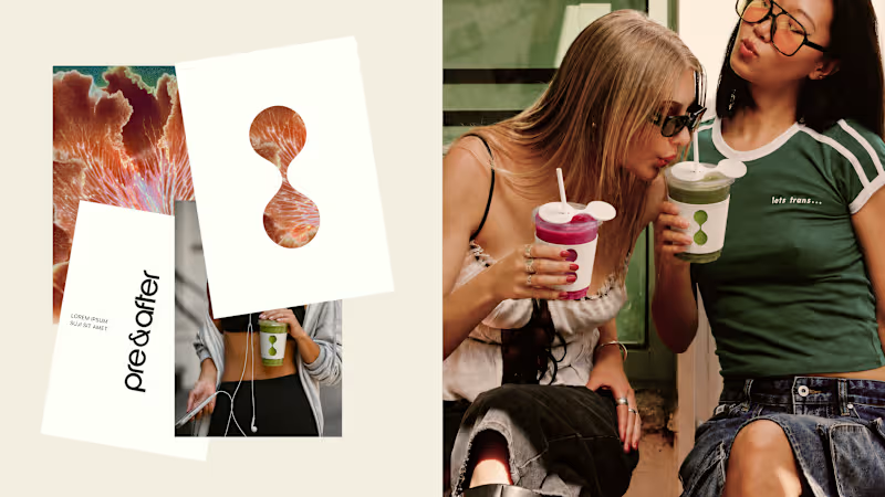
Brand Identity for Pre & After
0
2
1
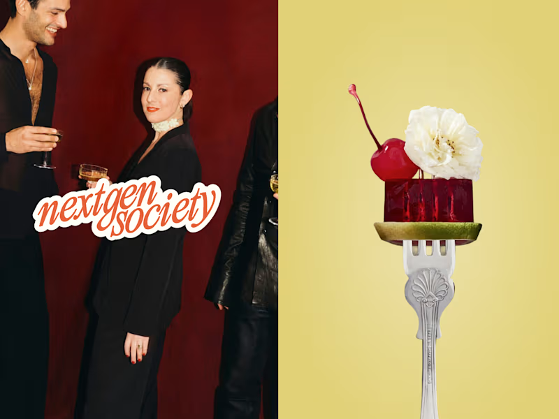
NextGenSociety Brand Identity Development
1
22
3
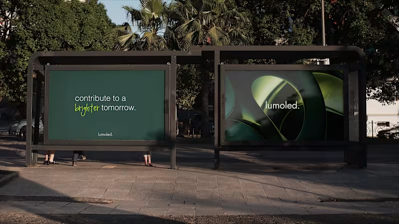
LumoLED Sustainable Lighting
3
41
22
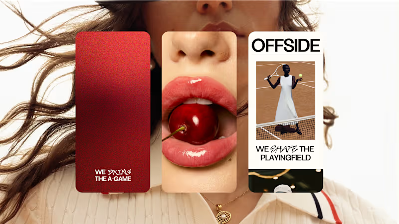
OFFSIDE Marketing Agency
22
132
Brand Strategist
(8)
Follow
Message
Aron Koehoorn
Zwolle, Netherlands
Strategic Brand & UI/UX Designer | Building high-end designs
New to Contra
Follow
Message
Strategic Brand & UI/UX Designer | Building high-end designs
0
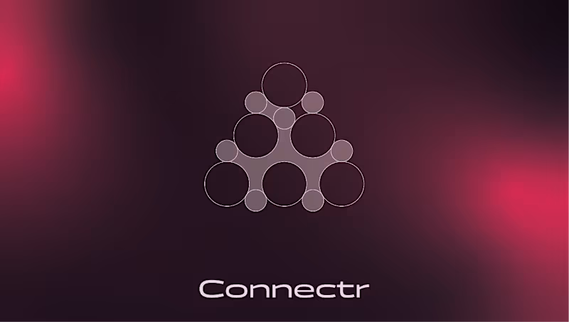
Connectr – Brand Identity & Digital Experience for Human-Centric Tech Services: Brand Identity, Logo Design, UI/UX Web Design, Copywriting Strategy, OOH (Out of Home) Design About the Project Connectr is a forward-thinking consultancy and recruitment agency operating at the intersection of IT and human behavior. Their core philosophy is simple but powerful: implementing technology is the easy part; getting people to adopt and embrace it is the real challenge. They needed a visual identity that clearly communicates their mission to bridge the gap between hard tech and human connection. The Challenge The IT consultancy space is heavily saturated with cold, hyper-corporate, and strictly digital aesthetics (often relying on standard "tech blue" color palettes). The challenge was to design an identity that feels instantly credible in the tech space, but radiates warmth, empathy, and human energy to attract both top-tier consultants and progressive clients. The Solution & Design Choices Logo & Geometric Grid: The core of the identity is the custom "node" icon. Built on a strict geometric grid of intersecting circles, the mark symbolizes a network of individuals connecting to form a cohesive, stronger entity. It visually represents the brand's core offering: bringing the right people together. Color Palette & Gradients: To break away from traditional tech branding, I introduced a striking, energetic magenta-to-red gradient. Set against deep, dark backgrounds (almost a rich plum/black), this gradient creates a glowing effect that feels vibrant, human, and modern. Crisp white is used for typography to maintain high legibility and contrast. Typography & Messaging: The brand's voice is bold and direct. The visual identity gives center stage to strong copy like "Tech snappen. Mensen begrijpen." (Understand tech. Understand people) and the core tagline "Meer mens. Meer impact." (More human. More impact). The clean, modern sans-serif typography ensures this messaging hits home instantly. Digital Experience: I designed a seamless digital experience across desktop and mobile. The website uses generous whitespace paired with the brand's signature soft gradients to create an interface that feels intuitive, clean, and welcoming—crucial for a platform focused on recruitment and human connection. OOH Campaign: The brand comes to life in the physical world through impactful billboard designs. Using dark backgrounds with the glowing gradient and relatable photography, the posters act as powerful recruitment tools and brand-awareness drivers in urban environments. Deliverables Brand Strategy & Core Messaging Geometric Logo Design & Identity System Responsive Website UI/UX Design Mobile Interface Design OOH Campaign Assets (Billboards & Posters)
0
54
0
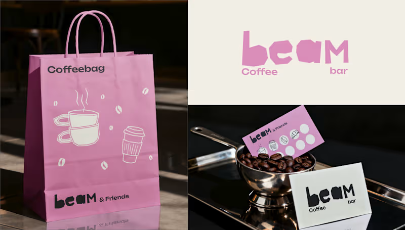
Beam Coffee Bar – Brand Identity & Storefront Design Services: Brand Identity, Packaging Design, Custom Iconography, Storefront Design, Merchandise About the Project Beam Coffee Bar is a modern, neighborhood coffee spot that doesn't take itself too seriously, but takes its coffee very seriously. The goal was to create an approachable, highly recognizable, and uplifting brand identity that brings a pop of color and personality to the daily coffee routine. The Challenge The third-wave coffee scene is often dominated by ultra-minimalist, moody, or hyper-industrial aesthetics. The challenge for Beam was to break the mold by designing a visual identity that feels incredibly fresh, playful, and inviting, while still communicating the high quality of their espresso and baked goods. The Solution & Design Choices Logo & Typography: The custom "beam" wordmark features chunky, irregular, "cut-out" style lettering. This organic, slightly imperfect typography gives the brand a human touch and a playful, laid-back energy. Color Palette: I moved away from traditional coffee tones and introduced a signature, vibrant pastel pink paired with off-white and a deep, dark roast brown. This high-contrast palette makes the brand instantly recognizable and highly "Instagrammable." Custom Iconography: To add charm across all touchpoints, I developed a set of quirky, hand-drawn line art icons featuring a croissant, a muffin, stacked coffee cups, a moka pot, and a stylized character enjoying a brew. Packaging & Merchandise: The playful aesthetic was rolled out across various physical items, including pink "Snackbags" for pastries, custom coffee cups with personalized name spaces ("This is your Cappuccino, Laura"), branded receipts, and "beam & Friends" punch cards for community loyalty. Storefront Design: The brand comes to life on the street level with a striking pink-and-white striped awning, crisp window decals featuring the custom iconography, and a clean, brightly lit shop sign that makes the café an unmissable local landmark. Deliverables Primary Logo & Typography System Custom Illustration & Iconography Library Packaging Design (Cups, Snack bags, Receipts) Merchandise & Loyalty Cards ("beam & Friends") Physical Storefront Branding (Awning, Signage, Window Decals) Looking for a brand identity that stands out in a crowded market? Let's collaborate and bring your vision to life.
0
64
3
Neuralis – Brand Identity & UI/UX Design for an Urban Run Club Services: Brand Identity, UI/UX Design, Art Direction, App Design, OOH (Out of Home) Design About the Project For Neuralis, I had the opportunity to design the complete brand identity and app interface. Neuralis isn't just another running app; it's a premium, community-driven platform that connects and motivates athletes in cities like London, Amsterdam, and Berlin. The brand's mission is clear: elevate performance through the power of the pack. The Challenge The challenge was to create a visual language that feels high-end and minimalist, yet exudes the raw, athletic energy of urban street running. The brand needed to breathe a performance-oriented mindset while remaining deeply connected to a tight-knit community. The Solution & Design Choices The Logo & Mark: The core of the identity is the stylized, geometric golden hare. This symbolizes speed, agility, and relentless forward momentum. The logo is designed on a strict grid, ensuring perfect balance and scalability across all formats. Color & Typography: I opted for a bold, high-contrast palette. The base consists of deep dark gray and black, creating a 'stealthy' and premium feel. The gold adds a touch of exclusivity, while the bright action red is used for interface elements and key typography to instantly grab attention. The sleek, sans-serif typography gives the overall design a modern, urban aesthetic. UI/UX App Design: The iOS app interface is designed with a strict focus on clarity during workouts. By using striking, floating widgets (like the red 'Outdoor group run' card), users can check their route, fellow runners, distance, time, and calories burned at a single glance. Copywriting & Campaign: To reinforce the community's mindset, powerful slogans were integrated into the brand identity: "Forward is the only way", "PACE DICTATES THE PACK", and "WE RUN TOGETHER". These elements come to life across striking billboards, urban posters, and merchandise like tote bags. Deliverables Concept & Art Direction Logo & Brand Guidelines Mobile App Design (iOS Interface) Merchandise (Tote Bags) OOH Campaign Assets (Billboards & Posters)
2
3
81
0
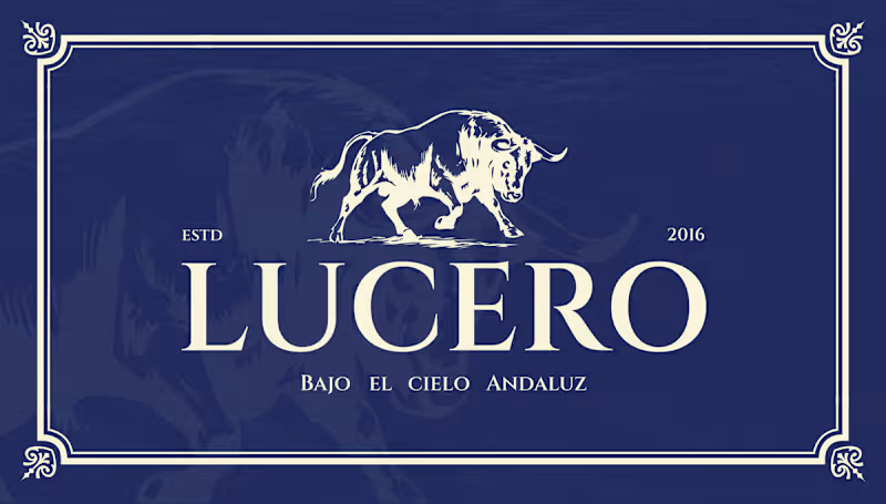
Lucero – Brand Identity & Web Design for an Authentic Andalusian Restaurant Services: Brand Identity, Logo Design, Web/UI Design, Custom Illustration, Exterior Signage About the Project Lucero is an authentic Spanish restaurant established in 2016, dedicated to bringing the rich, passionate culinary heritage of Andalusia to its guests. The objective of this project was to elevate their visual identity to match the premium, atmospheric, and romantic dining experience they provide—true to their tagline, "Bajo el Cielo Andaluz" (Under the Andalusian Sky). The Challenge Designing for traditional cuisines often comes with the risk of falling into touristy clichés. The challenge was to capture the authentic spirit of Southern Spain in a way that feels highly sophisticated, established, and elegant. The visual identity needed to communicate quality and tradition while appealing to a modern, discerning clientele seeking a high-end gastronomic experience. The Solution & Design Choices Logo & Iconography: The centerpiece of the brand is a majestic, hand-drawn illustration of a Spanish bull—a powerful symbol of strength and heritage. This is paired with a highly refined, classic serif typeface. The logo is designed to work beautifully across a flexible grid, easily adapting to light and dark backgrounds. Color Palette: I moved away from the expected bright reds and yellows of typical Spanish branding. Instead, the primary palette relies on a rich, deep midnight blue—representing the Andalusian night sky—perfectly contrasted with a warm, elegant cream tone. Custom Pattern Design: To add rustic charm and texture to the brand, I illustrated a bespoke, hand-drawn pattern. Featuring staple ingredients and culinary elements like garlic, vine tomatoes, pomegranates, and tapas, this pattern adds a playful yet artisanal touch to menus and packaging. Digital Experience: I designed a premium, responsive website interface that immediately invites users to "Dine under the Andalusian sky." The dark UI mirrors the intimate, warmly lit atmosphere of the physical restaurant, utilizing rich photography and elegant typography to drive reservations. Physical Branding & Storefront: The identity translates seamlessly into the physical environment. From the elegant window decals welcoming guests at the bistro-style storefront, to the classic, round projecting outdoor sign, the brand establishes a strong, sophisticated presence on the street. Deliverables Primary Logo & Responsive Brand Marks Color Palette & Typography System Custom Hand-Drawn Brand Pattern Responsive Website Design (Desktop & Mobile) Exterior Signage & Window Graphics
0
46
Brand Strategist
(3)
Follow
Message
Explore people