Fractional Founding Designer — Brand, App UI & Landing pages
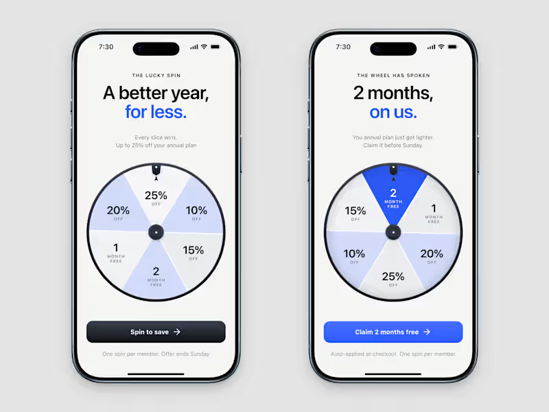
The first time your onboarding asks for money, it should feel like a thank you.
I designed this concept for a subscription app's onboarding.
I wanted the offer to feel like a member perk.
Six slices, every one a real prize.
No "try again" filler.
The win screen gets the same care as the invitation.
The winning slice turns cobalt and the button changes to the prize.
The copy says what the user won.
I gave the wheel a physical rim and a neutral hub, so it feels like an object you can touch.
You can read every prize before you spin, and the terms sit below the button.
The user will forget the discount.
They'll remember how the ask felt.
1
50
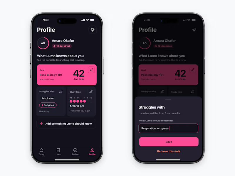
Most profile screens bury everything in a settings menu.
I designed this one differently.
A pencil on every card.
Tap it & a bottom sheet opens.
The background stays visible.
You can still see what you're editing.
One field.
One save.
Most apps make you leave the page to fix a typo.
I didn't want you to.
1
34
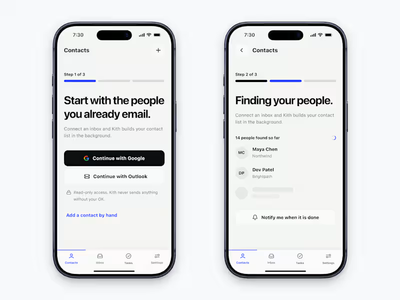
Zero data.
Zero context.
The empty state is the only screen where your app has nothing to show & everything to prove.
I designed the first 3 screens of an AI CRM app around one idea.
Good onboarding doesn't just show off features.
It anticipates anxiety and eliminates it, step by step.
Each screen answers the one question the user is asking at that very moment.
4
91
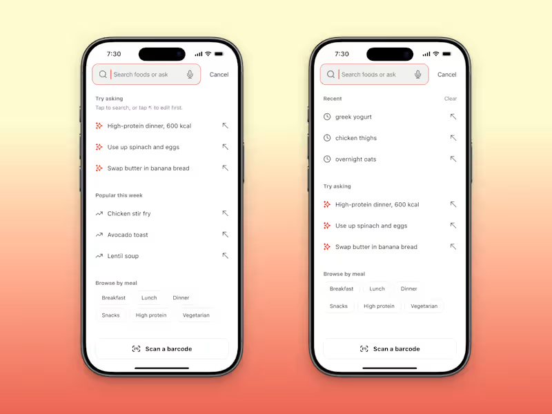
You know exactly what to type into your own search box.
A new user doesn't.
They open it and see a blinking cursor.
Then they have to guess what your app can do.
I designed an empty search screen for an AI food tracker concept here's what I put in it (if you want to steal it).
Example questions at the top, like "High-protein dinner, 600 kcal".
Those 4 words tell a new user more than a blinking cursor does.
Recent searches, but only once there's history.
A new user has none.
A few big buttons for people who'd rather tap than type, like Breakfast and Dinner.
Barcode scan pinned to the bottom, where a thumb can reach it.
Clear your history, log out of your own app & open search.
If you wouldn't know what to type, neither will they.
6
6
159

I build brand systems for SaaS and Tech startups
- $1k+
- Earned
- 2x
- Hired
- 5.0
- Rating
- 27
- Followers
I build brand systems for SaaS and Tech startups


Full-stack engineer for mobile, AI & backend systems


Dedicated HR Services Tailored for You


View more →

SEO Writer | Blogs That Rank & Convert

Frontend Developer & Figma UI/UX Designer


AI receptionists & booking systems for clinics and spas
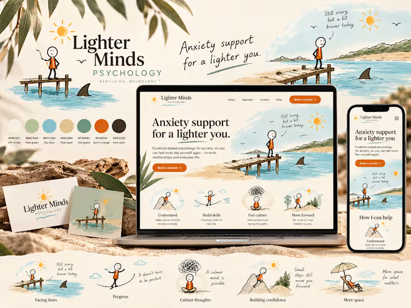
Coastal Calm — Anxiety & Wellness Brand Concept
A self-initiated visual identity and landing-page concept exploring how an anxiety-treatment brand could feel calm, distinctly Australian and gently humorous without relying on clinical wellness clichés.
The Concept: This speculative brand study explores a warmer visual language for anxiety and mental-health services, balancing clinical trust with personality and gentle humour.
Creative Direction: The identity draws from Australian coastal environments through sun-bleached neutrals, paperbark greens, water blues, sand tones and tactile illustrated textures.
A recurring hand-drawn character navigates small moments of uncertainty, from standing near a suspicious shark fin to balancing across a tightrope. The intention is not to make anxiety itself humorous, but to bring lightness to the sometimes disproportionate situations our minds create around it.
Visual System: The concept combines editorial typography, loose line illustration, natural textures and generous whitespace. Burnt orange provides moments of energy against the otherwise quiet coastal palette.
The landing-page exploration demonstrates how the system could extend from brand identity into a responsive digital experience.
Scope explored: Brand direction · Logo system · Colour palette · Typography · Character illustration · Landing-page UI · Mobile responsive direction
Self-initiated speculative concept created for portfolio demonstration. Not commissioned by or affiliated with the businesses depicted.
6
5
387
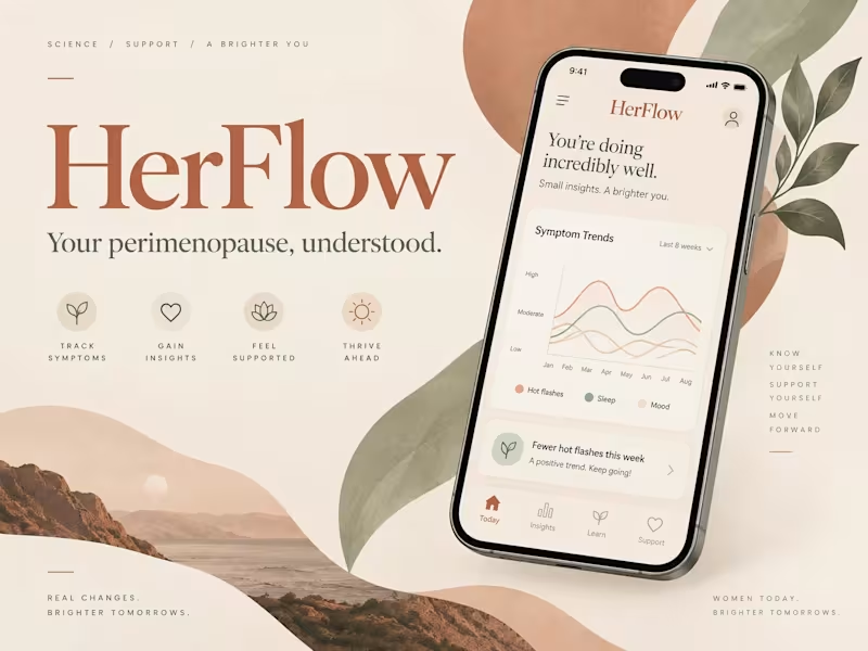
HerFlow — Perimenopause Copilot: A patient-owned web app that helps women in perimenopause track symptoms, spot real patterns, and walk into doctor visits with clear, honest data.
The problem: Perimenopause can last for years and bring dozens of shifting symptoms like sleep loss, hot flashes, mood swings and brain fog. Women often feel dismissed at appointments because they can't show what has been happening over time. Most trackers focus only on periods.
The solution: HerFlow tracks the whole transition. A 30-second daily check-in turns into trends, symptom clusters and evidence on whether treatments work. It also produces doctor-ready reports and visit briefs. The data belongs to the patient.
Key features
Quick daily check-ins for symptoms, sleep, mood, cycle and energy
Trends and symptom clusters: shows which symptoms tend to show up together, using lift-based analysis
Pattern confidence layer: honest labels that separate how much data there is from how strong the evidence is
Intervention evidence tracker: before/after comparisons for treatments like HRT, supplements or lifestyle changes
Visit Prep: a printable pre-appointment brief with data-driven questions for the clinician
Doctor-ready reports and secure sharing
Personalized voice: preferred name and a chosen tone (warm, plain or clinical)
Installable app (PWA) with branded emails and a public beta landing page
0
79
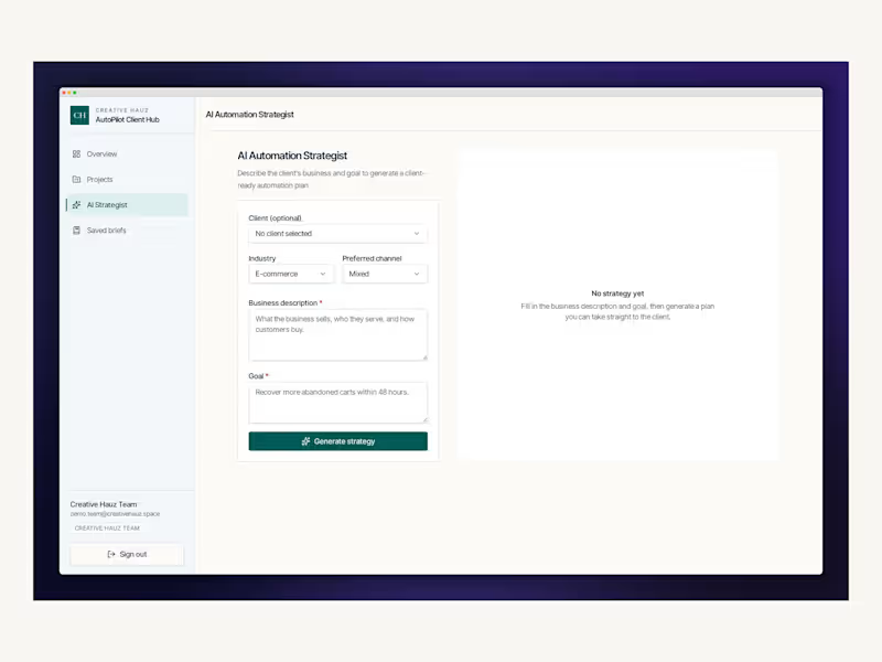
AutoPilot Client Hub is a role-aware operations platform built for Creative Hauz, an AI automation agency. It replaces scattered spreadsheets, chats and docs with a single workspace where the internal team manages every automation project, and clients sign in to follow progress and request new automations
The problem: Agencies delivering automations (cart recovery, appointment reminders, lead nurture, review requests) juggle many clients at once. Status lives in people's heads, client updates are manual, and scoping new work takes hours.
What I built: Team dashboard — live KPIs (active, in progress, new requests, completed), priority projects and items needing attention.
Projects workspace — searchable, filterable project list with create/edit flows, impact metrics and a notes timeline with a "visible to client" toggle.
Client portal — clients see only their own projects, updates and requests, and can submit new automation requests.
AI Automation Strategist — turns a client's goal and description into a client-ready plan: workflow steps, message sequence, expected impact and next steps. Plans are saved to a searchable Briefs library with one-click copy.
Secure by design — email/password auth, role-based routing (team vs client) and database-level row security so clients can never see another client's data.
0
61
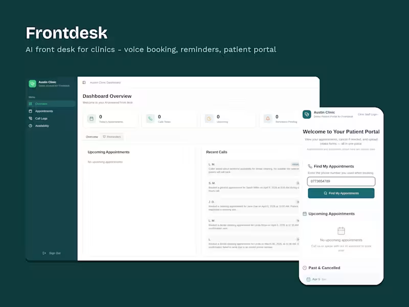
Frontdesk is an AI receptionist for small clinics. It answers calls, books and reschedules appointments in plain language, sends SMS reminders, and gives patients a self-service portal.
I designed and built the product end to end, including the voice agent, scheduling system, patient portal, staff dashboard, call summaries, privacy-first interface, and deploymen
0
92

Full-stack engineer building custom software, apps and AI
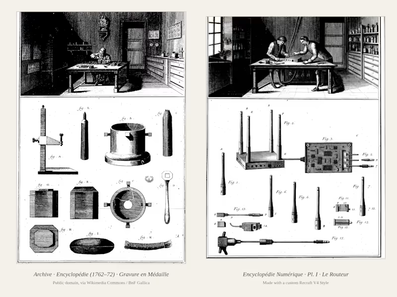
Encyclopédie Numérique: Plates of the Connected Age. I'm a software engineer in Zimbabwe, and I spend my days configuring routers and servers that nobody ever sees. While digging through the plates of Diderot and d'Alembert's Encyclopédie (1762–1772) on Wikimedia Commons, I noticed it did exactly what I wished someone would do for my work: it opened up the machines of its time and showed every part with care. So I built a Recraft Style from eight of its engravings and used it to make a "lost volume" covering the machines of our connected age, from home routers to the language models we now talk to. Every plate follows the original layout, with the workshop scene above and the numbered parts below, so it reads as if the 18th century had documented the 21st.
2
3
221
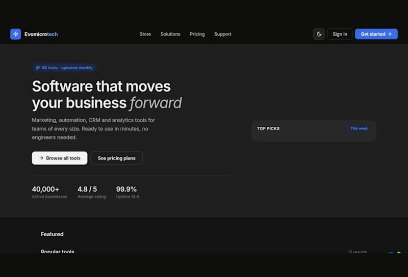
Evomicrotech Store: a software storefront for marketing, automation, CRM and analytics tools for teams of every size. Built with Go, Vue 3, TypeScript, MedusaJS, PostgreSQL and Docker. https://apps.evomicrotech.com/
0
34