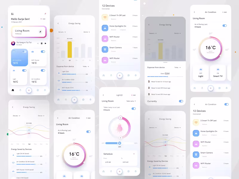
Icon Designer Projects in White PlainsIcon Designer Projects in White PlainsSmart Home App UI - IoT Control Dashboard
The Smart Home Eco concept is a high-fidelity mobile dashboard designed to simplify the complexity of IoT ecosystems. It focuses on the intersection of sustainability and lifestyle, providing users with a visual narrative of their energy consumption alongside seamless hardware control. The design uses a "Soft-Glass" aesthetic to ensure the interface feels lightweight and premium.
What Makes This Design Special:
Intuitive Device Hub — Quick-access tiles let users toggle devices instantly without digging through menus.
Smart Energy Analytics — Visual charts, bar graphs, and wave lines make energy tracking engaging rather than technical.
Premium Visual Hierarchy — Gentle gradients, soft shadows, and clean typography guide the eye naturally.
Gesture-Ready Controls — Circular temperature dials and slider-based light controls feel tactile and real.
Conversion-Focused UX — Every action (Add device, Set schedule, Toggle On/Off) is one tap away.
Unified Design Language — Consistent iconography, color palette, and spacing across 10+ screens.
Problem Solved & Solution:
Problem: Most smart home apps are either too technical for average users or too simplistic to offer real utility, often burying energy data deep in sub-menus.
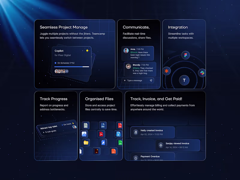
Solution: This UI brings transparency to the forefront. By integrating energy-saving metrics directly into the control screens, users are nudged toward eco-friendly behavior without sacrificing the convenience of a centralized smart hub. A set of elegant and versatile feature cards designed specifically for SaaS platforms and modern web applications. These cards showcase key product features with clean layouts, subtle depth, meaningful icons, and engaging micro-interactions. Built for dashboards, marketing pages, and pricing sections, they deliver a premium, trustworthy feel while making complex SaaS offerings instantly scannable and appealing.
These feature cards stand out through their refined balance of minimalism and visual hierarchy. Thoughtful use of whitespace, soft shadows, and smooth hover animations creates delightful user engagement without overwhelming the interface. The design feels premium yet approachable, helping SaaS products communicate value quickly and effectively while maintaining consistency across the entire product ecosystem.
Problem Solved & Solution: Many SaaS feature sections suffer from cluttered, boring, or inconsistent card designs that fail to capture attention or clearly communicate benefits, resulting in lower engagement and conversion rates. This solution provides a polished, conversion-focused card system that improves scannability, boosts visual appeal, and guides users toward key actions — ultimately helping SaaS platforms increase user understanding, interest, and sign-ups.