Freelance UI Designers in Warsaw
Sign Up
Post a job
Sign Up
Log In
Filters
2
Projects
People
Adrian Kuleszo
pro
Warsaw, Poland
Premium design to grow your business - DesignMe
$10k+
Earned
5x
Hired
5.0
Rating
228
Followers
Top
expert
+2
Follow
Message
Premium design to grow your business - DesignMe
10
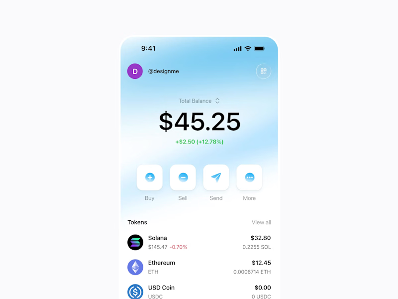
Crypto Wallet App - concept exploration
10
931
7
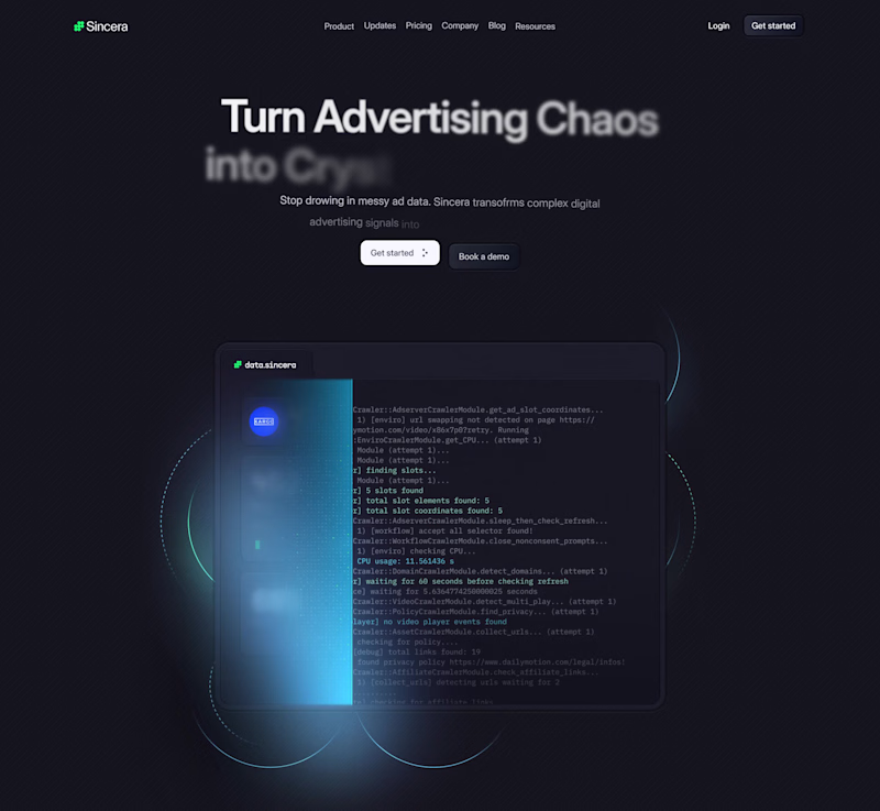
Landing page design for Sincera.ai
7
336
19
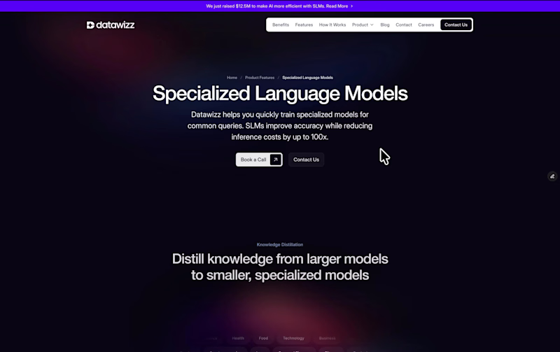
Feature page for Datawizz.ai
4
19
810
10
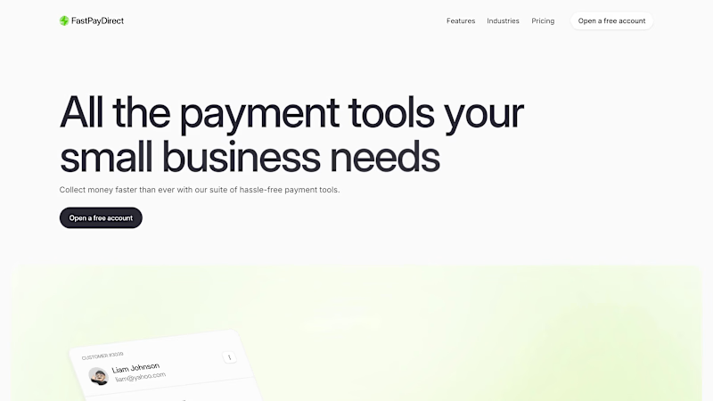
Website for FastPay Direct
10
324
UI Designer
(7)
Follow
Message
Daniella
pro
Warsaw, Poland
crafting engaging designs that speak human 🇺🇦
$10k+
Earned
3x
Hired
5.0
Rating
544
Followers
Top
expert
+1
Follow
Message
crafting engaging designs that speak human 🇺🇦
40
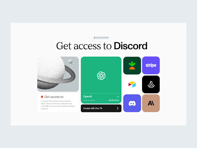
This project didn’t see the light of day, but I think it turned out really great 🥹
1
40
2.6K
38
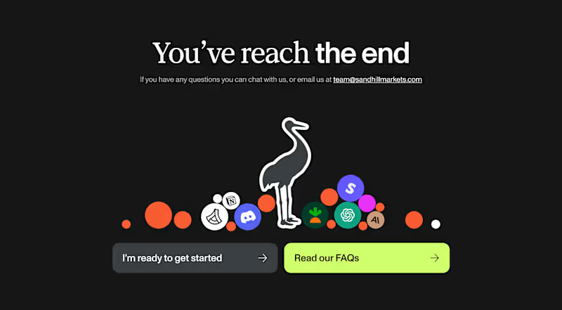
Next piece from this project: Sandhill, CTA section, an archive some of you liked
38
2.5K
47
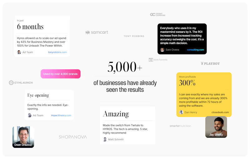
Testimonials section, ui design.
1
47
2.7K
1
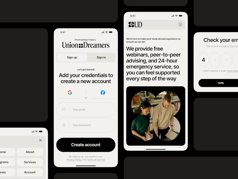
Union Dreamers: mobile page, brand identity
1
55
UI Designer
(14)
Follow
Message
Yunis Mikayilov
pro
Warsaw, Poland
Premium Design Partner | Launch Videos & Branding
$50k+
Earned
10x
Hired
5.0
Rating
210
Followers
expert
Hired
Follow
Message
Premium Design Partner | Launch Videos & Branding
4
Vibecoder — Branding & Launch Video
4
90
2
FishAudio — S2.1 Pro Launch Video
2
14
25
Atomic — Branding
25
272
14
Cooderz is a full-stack token engineering studio building smart contracts and launch infrastructure for Web3 teams. Most Web3 brands lean too corporate or too noisy. Cooderz needed something sharper - an identity that builds trust with serious founders, while still feeling bold enough for crypto. We built a system around a tilted square that reads as a code block, a chain unit, and a piece of modular infrastructure. Paired with a geometric wordmark, gradients, and dark interfaces - technical, confident, launch ready. ▶ Full case study: https://foxxy.studio/cases/cooderz
3
14
518
UI Designer
(1)
Follow
Message
Anastasiia Barbashyna
pro
Warsaw, Poland
Designer for your SaaS, app, deck and brand.
$5k+
Earned
2x
Hired
5.0
Rating
54
Followers
Expert
Follow
Message
Designer for your SaaS, app, deck and brand.
2
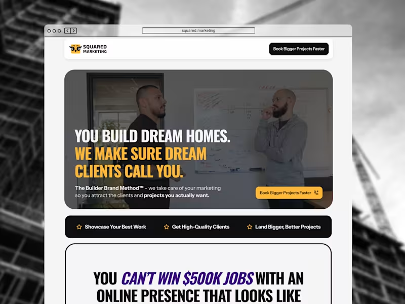
Squared Marketing Website Design and Launch
2
15
2
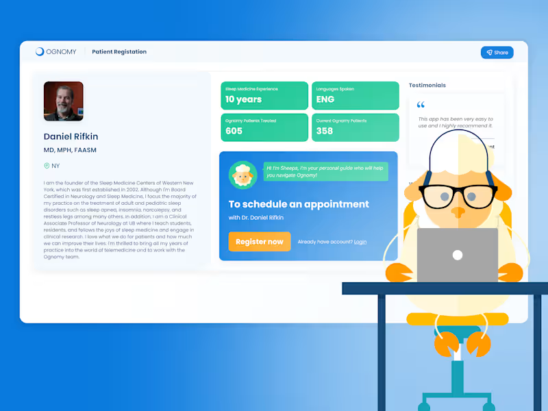
Simplifying Patient Registration for Ognomy
2
12
2
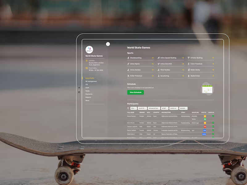
Digital Transformation for Roller Sports: WorldSkate Infinity
2
16
4
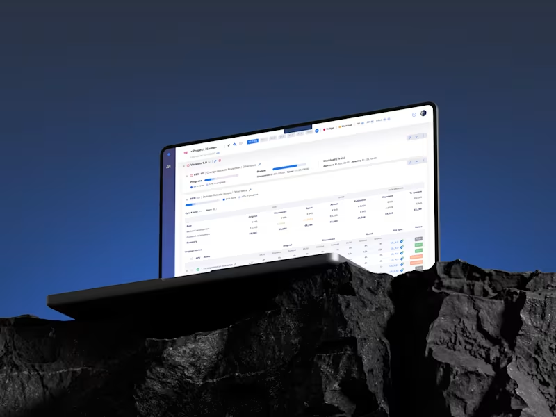
Scalable SaaS Management Solution from ground up
4
65
UI Designer
(5)
Follow
Message
Klym Yevtushenko
pro
Warsaw, Poland
SaaS Product Designer | UI/UX, Webflow & B2B Websites
$1k+
Earned
3x
Hired
5.0
Rating
127
Followers
Follow
Message
SaaS Product Designer | UI/UX, Webflow & B2B Websites
40
AURIX — Premium Audio Product Landing Page 🎧✨ AURIX is a bold landing page concept created for a premium audio brand focused on high-end sound, refined design, and an immersive listening experience. The goal was to make the product feel aspirational from the first screen while keeping the interface clear, modern, and easy to explore. The visual direction combines rich red tones, editorial typography, premium lifestyle imagery, and interactive music elements to create a digital experience that feels both luxurious and emotionally engaging. Special attention was given to: • a cinematic hero section that places the headphones and listening experience at the center; • premium product positioning supported by elegant typography and a refined color system; • responsive desktop and mobile layouts designed for smooth product discovery 📱; • music player components that add interaction and reinforce the audio-focused concept; • suggested tracks and collection navigation that make the experience feel more dynamic; • strong calls to action guiding users toward exploring the product collection; • a scalable visual system suitable for product launches, campaigns, and future e-commerce pages. The result is a memorable digital experience that helps AURIX feel premium, modern, and emotionally connected to music — combining product storytelling with a clear path toward discovery and purchase 🎶 Looking to create a bold landing page for your audio, lifestyle, technology, or consumer product brand? Let’s build something people can feel ⚡
18
40
719
6
R1 Padel — High-Performance Sports Equipment Landing Page 🎾 Performance starts long before the first match. This landing page concept for R1 Padel was designed to capture the energy, precision, and premium quality behind a high-performance padel racket. The goal was to create a bold digital experience that immediately communicates speed, power, and confidence while keeping the product at the center of attention. The design combines dramatic visuals, strong typography, and a clean interface to deliver an immersive shopping experience for athletes and sports enthusiasts. Key design highlights: • a cinematic hero section focused entirely on the product; • dynamic visual composition inspired by movement, impact, and performance; • premium product presentation with detailed specifications and feature highlights; • responsive desktop and mobile layouts for a seamless shopping experience 📱; • bold call-to-action elements that naturally guide users toward purchase; • clean navigation and intuitive content hierarchy for effortless browsing; • a modern visual language that reinforces a premium sports brand identity. The result is a conversion-focused landing page that blends impactful storytelling with ecommerce usability, helping transform visitors into customers while strengthening the brand's premium positioning. Looking to create a modern ecommerce experience or product landing page for your sports brand? Let's build something that performs as well as your product. 🚀
2
6
125
178
FreshLock — Food Packaging Landing Page Design 🍎📦 FreshLock is a modern landing page concept created for a food packaging brand focused on preserving freshness, reducing waste, and presenting innovative packaging solutions through a clean digital experience. The goal was to communicate product benefits instantly while making the website feel fresh, premium, and trustworthy. The visual direction combines bold typography, minimal layouts, realistic product imagery, and vibrant red accents to create a strong first impression while keeping the focus on the product. Special attention was given to: • a product-first hero section that immediately highlights freshness and packaging quality; • clean visual hierarchy that makes key messages easy to scan; • responsive desktop and mobile layouts optimized for every device 📱; • trust-building elements showcasing product quality, freshness, and customer confidence; • bold CTAs that encourage users to explore the product and learn more; • a minimal interface that lets the packaging and product visuals become the center of attention; • a scalable landing page design suitable for future product launches and marketing campaigns. The result is a modern, conversion-focused landing page that helps communicate product value, strengthens brand credibility, and creates an engaging experience from the very first screen ✨ Looking to create a modern landing page for your food, packaging, FMCG, or consumer product brand? Let's build something fresh together 🚀
64
178
3.6K
12
VISION — Luxury Eyewear Landing Page for a Fashion Brand 🕶️✨ VISION is a bold fashion landing page concept created for a premium eyewear brand focused on sharp silhouettes, strong identity, and modern luxury. The challenge was to make the product feel exclusive and editorial while keeping the shopping experience clear and conversion-focused. The visual direction combines oversized typography, dramatic black-and-white imagery, deep red tones, and clean product presentation to create a strong first impression. Special attention was given to: • a high-impact hero section that immediately communicates the brand’s premium positioning; • editorial layouts inspired by luxury fashion campaigns and magazine design; • responsive desktop and mobile experiences optimized for product discovery 📱; • featured product cards with clear pricing and collection-focused actions; • trust-building details such as UV protection, premium materials, easy returns, and shipping benefits; • strong CTAs that guide users toward exploring and shopping the collection; • a distinctive visual system built around contrast, bold typography, and selective color accents. The result is a memorable e-commerce experience that helps the eyewear brand feel premium, confident, and easy to shop — blending fashion storytelling with clear product navigation ❤️🔥 Looking to create a bold digital experience for your fashion, beauty, luxury, or e-commerce brand? Let’s build something that stands out together ✨
3
12
341
UI Designer
(28)
Follow
Message
Kris Anfalova
pro
Warsaw, Poland
Premium UI/UX & Web Design for Fintech, SaaS & Web3 | Framer
$10k+
Earned
1x
Hired
5.0
Rating
199
Followers
expert
expert
+1
Follow
Message
Premium UI/UX & Web Design for Fintech, SaaS & Web3 | Framer
44
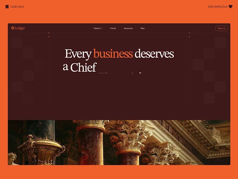
Finally get to share this one — been sitting on it for a while and couldn't post until now 🎉 Designed the full landing page (and a bunch of product screens) for XRS, a prop trading platform. The idea: traders pass a funded-account challenge, trade the firm's capital, and keep up to 80% of the profits. Prop trading is a pretty saturated space and most platforms look the same — dark UI, generic trading stock imagery, nothing that actually sticks. So instead of the usual playbook, I leaned into a black-and-gold identity — including custom, hand-crafted illustrations built specifically for this project (the glowing spheres, gradient icons, all of it) instead of stock assets or generic 3D packs. Some of what's in there: — Custom illustrated icons for the 3-rule system and "trader to fund manager" journey — Floating reward/payout cards as social proof right in the hero — A plan selector so people can pick account size, currency, challenge type — Trustpilot ratings + a testimonial section for trust — Support + FAQ blocks, because people are putting real money on the line Genuinely proud of how this one came together — every visual element built from scratch for the brand, full case + more screens are up now, finally 👀
18
44
611
42
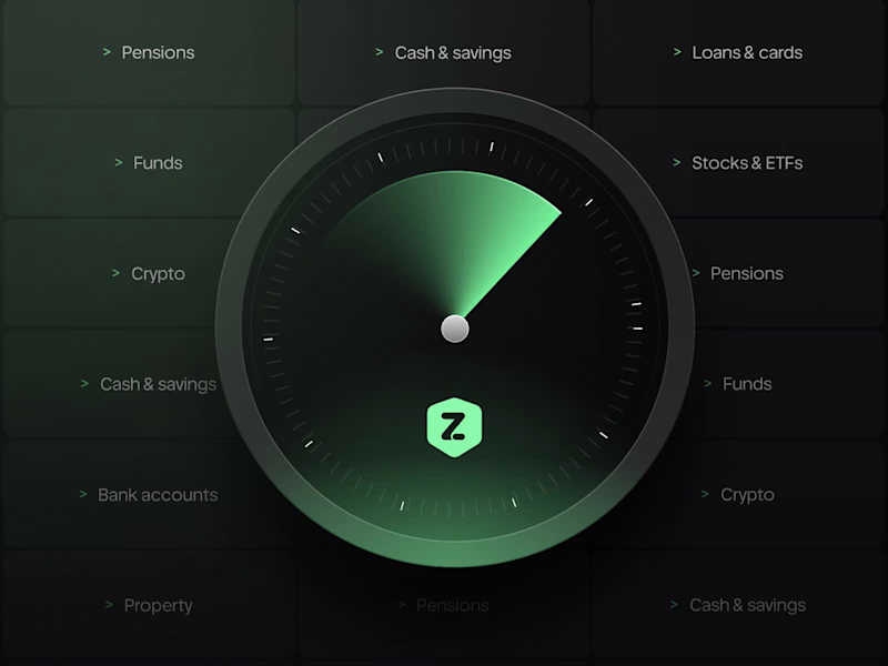
Meridial — Wealth Management Platform For Meridial, I designed a system where the one thing that matters — portfolio drift — always surfaces first, no matter how many clients an advisor is tracking. Signal over noise, even at 200+ portfolios. ⚪ The challenge: Advisors managing dozens of portfolios need to instantly spot what's drifted from target — without digging through spreadsheets or noisy dashboards that bury the signal in data. A dark, grain-textured UI gives Meridial a private-banking feel instead of typical fintech blue. The landing page proves the product directly in the hero with live allocation and drift cards, while the dashboard extends the same card system into radar charts, composition breakdowns, and a weekly digest — built so advisors can scan hundreds of portfolios at a glance. A case in making complex portfolio data resolve into one clear signal.
16
42
919
83
Terra — AI Environmental Risk Platform Designed the landing page and product UI for Terra — a platform that helps land developers and engineering teams see environmental risk (soil stability, tree canopy loss, water table depth) before breaking ground. The challenge: Development decisions are usually based on estimates, not real ground data — and by the time issues show up, it’s often too late to reverse them. The interface needed to make complex sensor/AI data feel immediate and trustworthy, without losing emotional weight. The solution: Raw, organic photography (wildflowers, grass, natural terrain) paired with clean glass-panel data cards — creating a visual tension between “nature” and “precision engineering.” Bold editorial typography carries the emotional message, while translucent metric cards surface real numbers: soil stability, canopy loss %, water table depth. A strong example of turning dense environmental data into something a non-technical stakeholder can understand in seconds.
30
83
3.5K
28
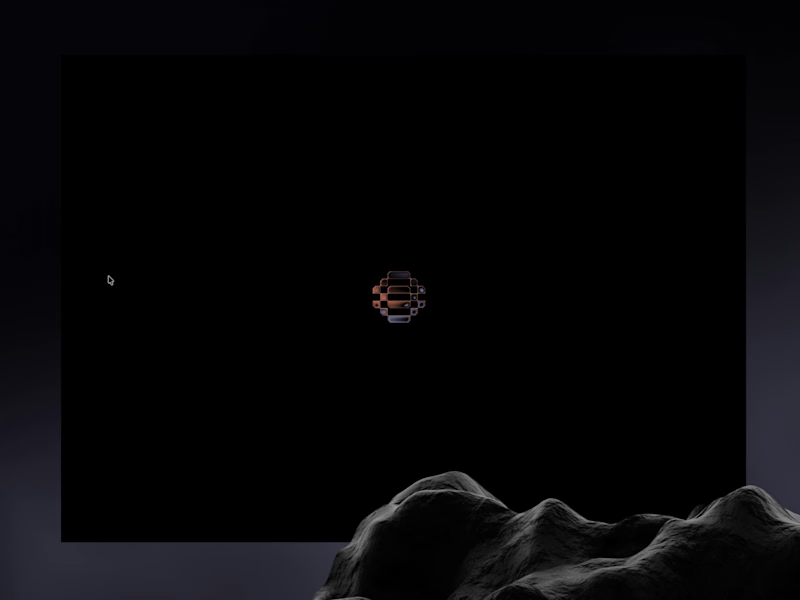
Architect of Chaos: Branding Cobalt Analytics for the Envato Challenge AI has completely changed the creative landscape, but it hasn’t changed what makes a digital product functional. For the Envato Challenge, I set out to design the brand identity and UI concept for a B2B SaaS platform, Cobalt Analytics. The goal was to show the crucial difference between machine generation and human curation. The Insight: The Azulejo Metaphor Data analytics is often visually represented by clichéd glowing nodes and neon webs. I wanted a metaphor with history. I turned to Azulejo — traditional Portuguese ceramic tiles. Historically, the art of Azulejo was about taking thousands of fragmented, independent tiles and assembling them into one grand, coherent narrative. This is exactly what a predictive data platform does: it turns chaotic metrics into a clear system. The Process: AI as the Miner, Human as the Filter I started by feeding AI historical references of Azulejo tiles. The result? Absolutely stunning, yet completely unusable visual noise. AI generated beautiful chaos, but as a designer, I know that algorithms don't understand scalability, negative space, or modular grids. The Extraction: I rejected 95% of the AI generations, extracting just one perfect geometric silhouette hidden in the noise. The Clean-Up: I moved to Envato Elements to source mathematically perfect vector shapes and rebuilt the AI's concept into a clean, scalable brand mark. The System (Figma): I established a strict modular Bento-grid, paired the complex geometry with a brutalist sans-serif typography, and built out the core UI dashboard widgets in Figma. The Execution (Zero Photoshop): To bring the brand into the real world, I utilized Envato’s native mockup generator. I applied my designs directly to premium physical and digital mockups right inside Envato's browser tool—no Photoshop required. A completely streamlined, modern workflow. The Result: Cobalt Analytics. A brand identity that is mathematically precise, highly scalable, and ready for development. AI generated the noise, but human judgment built the system. And for the brave souls, here is the link to the full Figma file. Fair warning: it’s a typical creative mess inside, you know how it is 😅 https://www.figma.com/design/5Du5Sjr7jCCZYNgH5Y9QtB/Envato-Challenge?node-id=17-2181&t=vap8tOu6fACNieNW-1
12
28
7K
UI Designer
(33)
Follow
Message
Vova Kondriianenko
pro
Warsaw, Poland
Staff Product Designer. I design, build and improve software
$25k+
Earned
4x
Hired
5.0
Rating
260
Followers
expert
Expert
Follow
Message
Staff Product Designer. I design, build and improve software
4
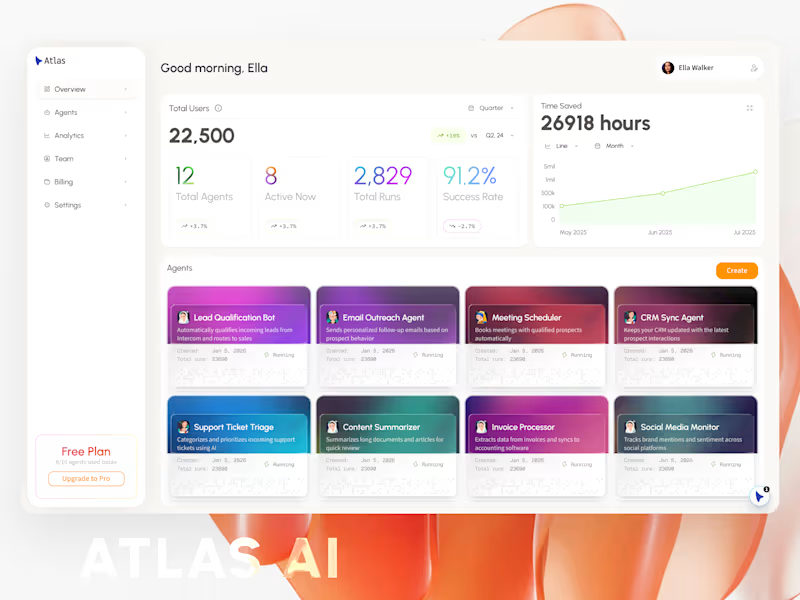
AI Agent UI Design
4
131
0
Mobile Apps Design Ideas
0
64
1
Entropy Synapse
1
103
4
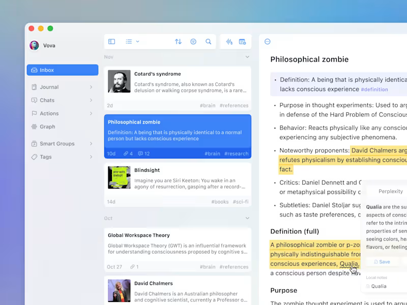
Hey, Contra! Check my first digital product: Freelance Core - your client pipeline in a box. Built this for myself, now sharing it with you! Freelance Core is a pre-built web app for managing your freelance business. Run it locally or deploy to Vercel. SQLite database included - no setup headaches. 🍱 What's inside: - Client pipeline with project tracking and a Kanban board - Weekly schedule for all your calls - AI-powered call prep (never walk into a meeting blind) - Project notes that actually stay organized - Reports dashboard to see where your time goes - Pipeline value tracking so you know your business health at a glance 🛠️ More is coming! https://contra.com/products/YWzMLUC9-freelance-core-your-clients-pipeline-in-a-box
4
913
UI Designer
(3)
Follow
Message
Mateusz Nieckarz
Warsaw, Poland
Product Designer, Framer & Jitter Expert
$10k+
Earned
2x
Hired
5.0
Rating
54
Followers
expert
expert
+1
Follow
Message
Product Designer, Framer & Jitter Expert
3
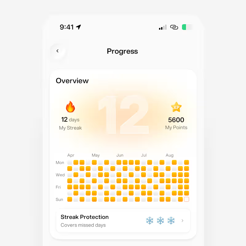
Habits Mobile App UI
1
3
216
7
Vendy — CRM Platform UI Design System
7
60
3
Segment - SaaS Dashboard & Landing Page
3
78
3
Fox Protocol
3
85
UI Designer
(9)
Follow
Message
Explore people