The network for creativity
Join 1.25M professional creatives like you
Connect with clients, get discovered, and run your business 100% commission-free
Creatives on Contra have earned over $150M and we are just getting started
Back to feedPost

Undertow reads the emotional signals you don't consciously track — tension, calm, overwhelm and turns them into something you can actually see and understand.


Both are amazing


reading tension and overwhelm is an ambitious thing to design for

Wow the interaction is so beautiful! And I love the way you showed it's loading with the lights through the text, very nice

Turning something as vague as "overwhelm" into an actual visible signal is a hard design problem. What was the trickiest emotional state to translate into something you could actually show on screen?

Nice Design

That's Creative.😍

amazing work

This is Dope 🔥


Looks amazingg

nice work


Creative work !

Visualizing emotional state as this shifting particle orb is a much better metaphor than a dashboard with numbers on it. Does the pattern respond in real time or is it more of a periodic snapshot?

Amazing work

This feels both modern and timeless!


Really cool way to make emotional patterns visible.

Wow, how did you created this framer effect? Thats really nice!

Translating chaotic emotional states into an organic, shifting particle orb is brilliant. Did you use Unicorn Studio to generate and control the interactive shader effects?

Smooooth...


Nice work

Loving the design tokens structure in this Figma file. Makes web handoff an absolute breeze.

love it

looks very premium, well done man


Awesome

You did a great job, Mariusz. Kuddos to you, man.


What's actually driving the visual shifts, real input data or generative randomness?


Love it
The network for creativity
Join 1.25M professional creatives like you
Connect with clients, get discovered, and run your business 100% commission-free
Creatives on Contra have earned over $150M and we are just getting started



Related posts

What if sending money felt a little more like giving a gift?
For Nova, I explored a banking app that brings payments, cards, and a bit of personality together. You can check your balance, browse recent transactions, send or request money, top up, and pay bills.
My favorite part is the digital postcard feature. Before sending a transfer, you can add a little illustrated card—a heart, a birthday greeting, or a playful character. A simple way to make birthday money or a thank-you feel more personal.
I carried that same 3D character into onboarding, pairing it with bold red gradients and large, clear payment details. There’s room for play, while the recipient and amount stay easy to check.
Would you add a postcard to a transfer? I’d love to know what occasion you’d use it for.






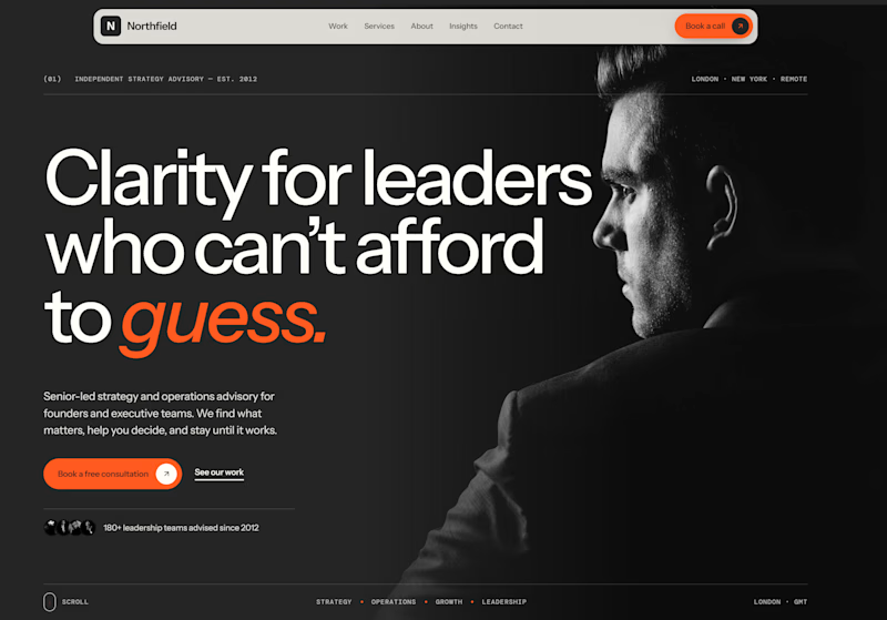
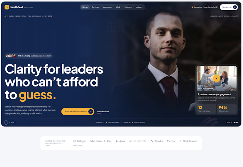
Exploring two different hero directions for a new project.
Same message, two completely different visual approaches.
Which one makes a stronger first impression?
A or B? Curious to hear your thoughts!
36 voted
90%
4 voted
10%
40 votes
Closed

Both are strong. I lean towards the dark version, because the orange accent on the italic "guess." pops and the profile portrait gives it a more editorial, confident feel. The navy one reads a bit more corporate, which could suit a more conservative audience. Nice exploration!

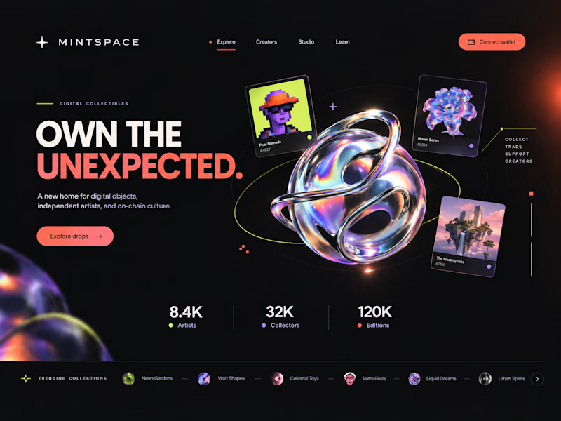
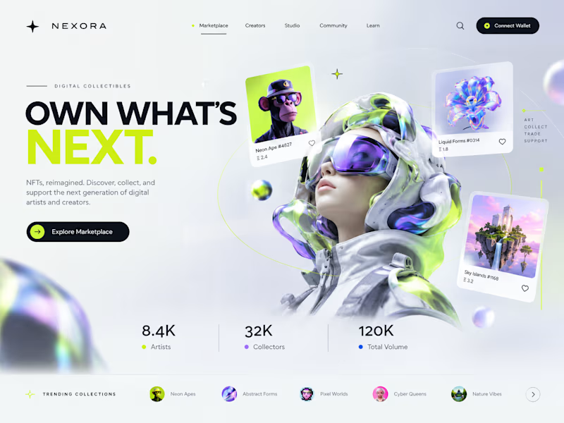
Two directions. One NFT marketplace.
Which visual direction would you choose?
🖤 A — Dark & Futuristic
🤍 B — Bright & Minimal
Both explore the future of Web3, but with completely different visual identities.
Drop your vote in the comments: A or B?
#UIUXDesign #WebDesign #NFT #Web3 #ProductDesign
10 voted
29%
25 voted
71%
35 votes
Closed

Strong design, well done