The network for creativity
Join 1.25M professional creatives like you
Connect with clients, get discovered, and run your business 100% commission-free
Creatives on Contra have earned over $150M and we are just getting started
Back to feedPost
Real-time interactive orb built for a smart home landing page concept. Cursor-based movement, hover-triggered status panel, tuned lighting to match warm golden-hour ambient scene. No baked animation everything driven by live interaction.


So cool man. Love the animation

Thanks Girum !

brilliant execution, that animation is epic.


the warm room looks so good. nice orb

Cursor-based hover instead of a baked loop is the right call here, it makes the whole thing feel alive rather than looping on repeat. How long did it take to get the lighting to read as golden hour without looking washed out?

The warm interior gives the orb a believable setting, and tying it to a status panel gives the interaction a purpose. How are you adapting the hover interaction for touch screens — tap to reveal the controls?

Everything being driven live instead of baked must make performance nerve-wracking across devices. Did you build in a fallback for lower-end hardware, or just bet most visitors would have the horsepower for it?

The design looks awesome. Great project!


no baked animation?? wild

Nice work!

This is pure creativity man

The network for creativity
Join 1.25M professional creatives like you
Connect with clients, get discovered, and run your business 100% commission-free
Creatives on Contra have earned over $150M and we are just getting started











Related posts

The team is cooking
Motion design for the logo we are making for Nation e-commerce


Wou

FinPulse — Premium Cross-Border Remittance App
Designed a trustworthy FinTech mobile app for global money transfers.
Process: Started with user flow & wireframes for 3-tap transfer, then built a scalable design system in Figma with 100+ components.
Outcome: Final UI focuses on clarity and trust — from onboarding to Home Dashboard ($12,450 balance), Send Money, and Money Sent success state. Built for conversion and speed.
Tools: Figma, iOS Design System, SF Pro
Tags: Mobile App, FinTech, UI/UX, Product Design


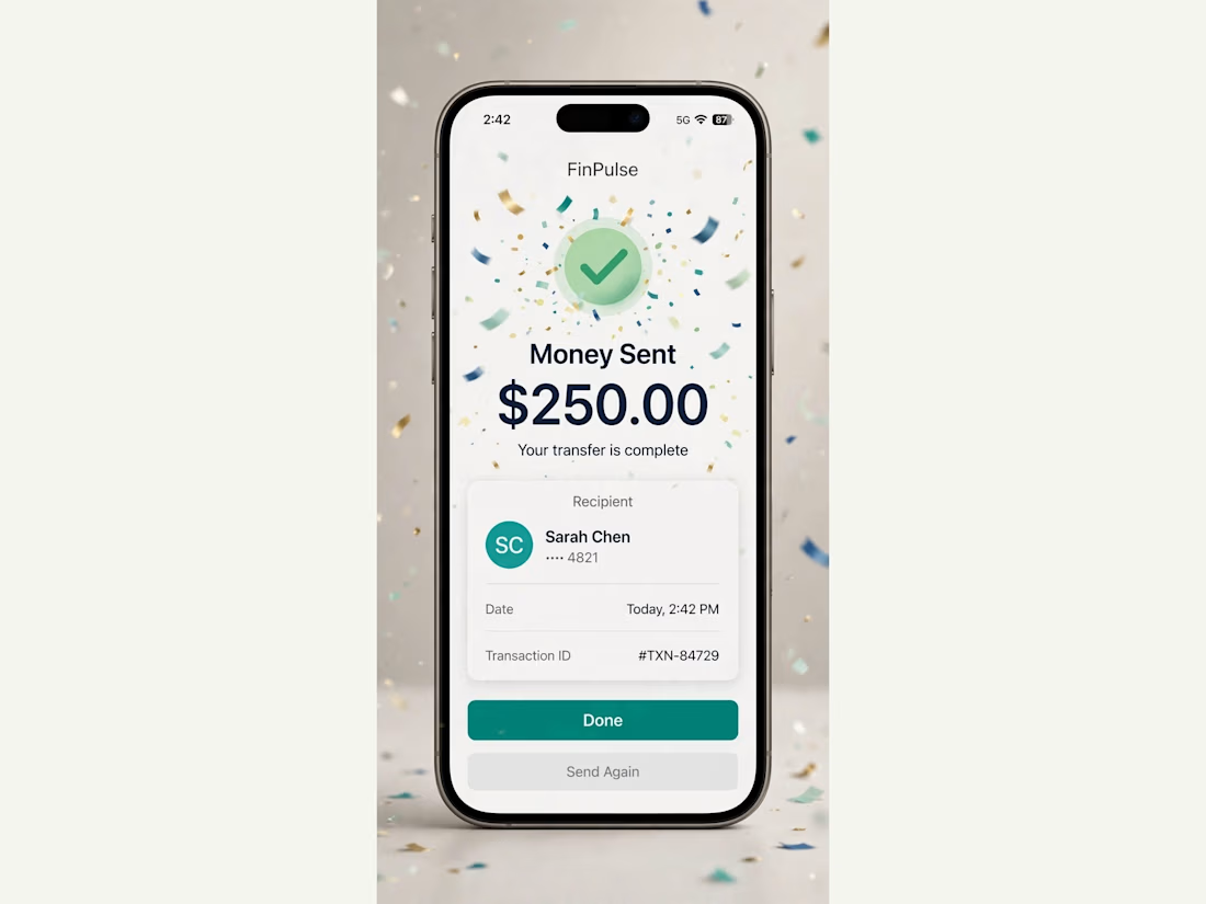
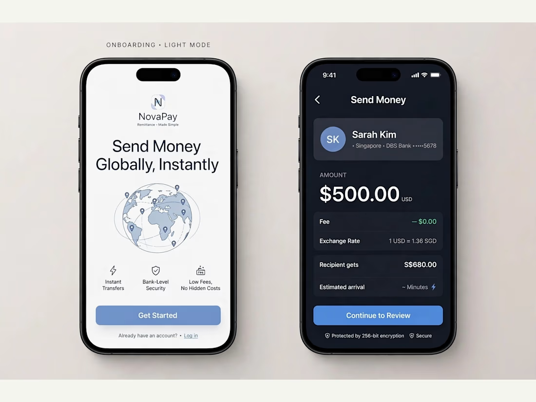
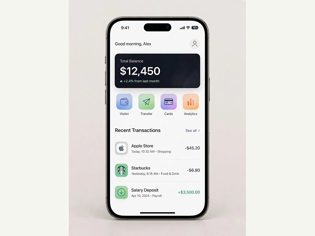
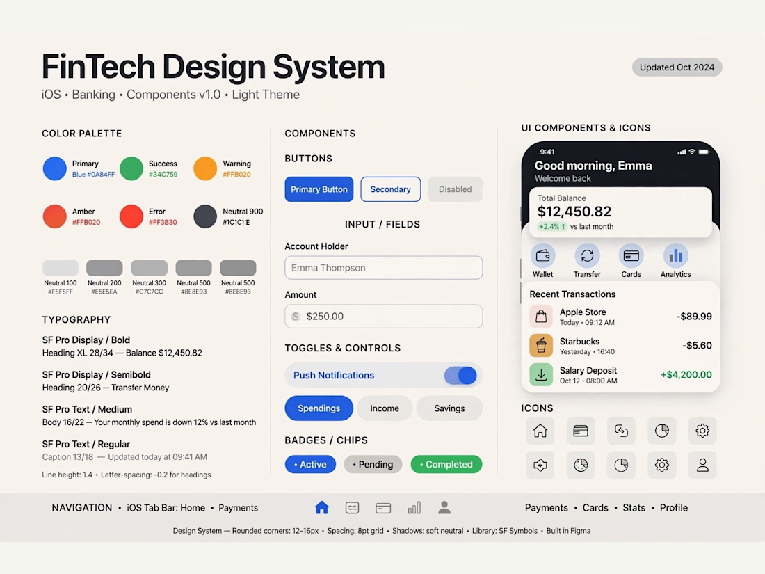

Really solid FinTech mobile design. Clean, trustworthy, and the user flow sounds well thought out. Great outcome on the final UI!

Poster Club turns a simple event template into your own print. I built two working Flutter versions and recorded the same editing flow in each.
Print Room: calm, editorial, with a mounted canvas and bottom tools.
Cutout Playground: bold, playful, with loose prints and tools at the edge.
Which one would you rather use?
What made the difference?
Grab it for free:
https://contra.com/products/cUHBysMu-poster-club-free-flutter-ab-ui-kit


37 voted
60%
25 voted
40%
62 votes
Closed

Print Room looks great!!