
Product designer / AI-First / Full Stack Developer

Product designer / AI-First / Full Stack Developer


Designer and Framer developer
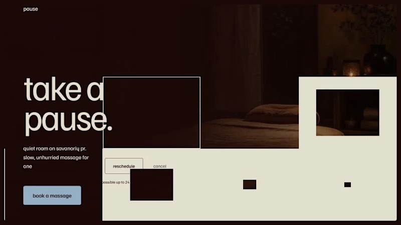
pause massage studio is a fictional solo therapist in vilnius. one person doing everything: massages, scheduling, reminders, chasing no-shows over instagram dms.
for #lovablechallenge i rebuilt the front door: pick a massage, pick a real open time, confirm, done. no back and forth. reschedule or cancel yourself, no need to message her.
built entirely in @Lovable. link +:: demo video below.
1
1
176
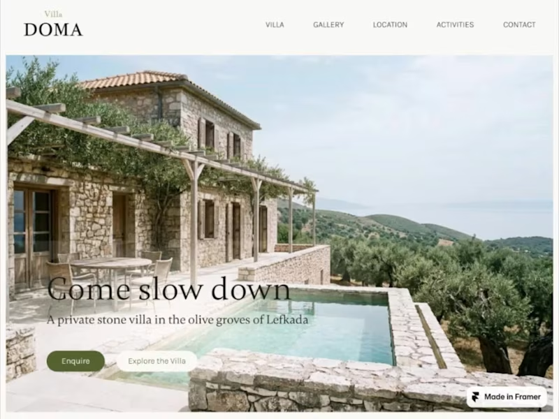
My first Framer template is live! This was a huge learning milestone for me. Since wrapping it, I’ve finished another project and can already see a million things I’d do differently - onward and upward! 😄
Villa Doma - a private villa website template built for boutique stays, vacation rentals, and small hospitality businesses.
I was going for warm, editorial, and grounded in place: stone, olive, and natural light.
5 pages, 2 CMS connected sections, dynamic gallery layout and fully responsive.
🔎Find on Framer marketplace
(https://www.framer.com/marketplace/templates/villa-doma/)👀Preview live (https://villa-doma-template.framer.website/)
4
5
322

Custom Web Solutions with Architectural Insight
- 5.0
- Rating
- 4
- Followers
Custom Web Solutions with Architectural Insight


Senior Agentic AI Specialist

This project is a modern Webflow-based educational platform designed for creative learning, mentorship, and digital course management. The goal was to create a visually engaging and scalable online academy experience focused on art education and community-driven learning.
The platform features a high-converting landing page with immersive visual storytelling, guiding users into workshops, mentorship programs, and specialized creative courses through optimized enrollment flows and strategic call-to-action sections.
The website architecture was built using a structured CMS system in Webflow, allowing dynamic management of courses, instructors, categories, and educational content. The platform supports multiple creative disciplines including painting, sculpture, photography, printmaking, and graphic design.
1
141

This project focuses on building a complete Kajabi-based knowledge business platform that combines online courses, community engagement, video learning, and automated marketing funnels into a scalable digital ecosystem.
At the center of the platform is a creator analytics dashboard that provides real-time business insights such as revenue tracking, active members, and audience growth. The system is designed to help creators manage and scale their digital products efficiently.
The platform also includes a full lead-generation and sales funnel workflow, starting from opt-in landing pages and automated email capture to high-converting sales pages and optimized checkout experiences with upsells.
On the content side, the project includes community portals, podcast integrations, and structured course management systems with drag-and-drop lesson organization. The learning experience is enhanced through a modern video delivery interface optimized for online education and member engagement.
Additionally, the platform integrates automated email marketing workflows based on user behavior, enabling personalized campaigns, engagement tracking, and customer retention automation.
The overall goal of this project is to create a professional all-in-one creator platform that supports content monetization, audience growth, automation, and scalable digital education delivery.
1
136

This workflow is designed as an AI-powered customer support and order automation system that combines real-time data processing, sentiment analysis, AI interpretation, and automated communication.
The automation starts when a customer submits a request through a webhook or Typeform. The workflow then splits and processes the incoming data in parallel to improve speed and efficiency.
1
147


Solving Problems Visually

Got the opportunity to completely change the look of SolarShare. Their old branding was dated and wasn't working for their solar panel blockchain vision.
Before and after below. What do you think?
2
158


Two seasons, one brand. Here's how that works.
So Ustukių Malūnas came to me twice: once for spring, once for the holidays. Two completely different vibes. Spring is all lightness and fresh starts. Holiday is cozy, warm, gingerbread-scented everything.
The fun part? Making both feel like them while telling two very different stories.
Here's what I leaned on:
The brand's bones stayed the same (layout, type, core elements)
Color and illustration carried the seasonal mood
I love this kind of problem. How do you keep a brand recognizable when the energy shifts completely? That tension between consistency and surprise is where the good stuff happens.
Which packaging do you like more?
12
52
545

web solutions for real estate developers


White space isn’t empty—it’s breathing room
White space isn’t empty—it’s breathing room


View more →

UX/UI Designer with an entrepreneurial mindset.
UX/UI Designer with an entrepreneurial mindset.


View more →