


Framer Engineer

Turned the iPod from my portfolio into a fully customizable component and just submitted it to the marketplace. 🎵
You can customize both the screen and the outer frame, so it’s easy to make it fit different styles and projects.
Now just waiting for approval
https://framer.link/QWbVAl1
3
97

Last week, a traditional business owner reached out to us with a common challenge spending too much time visiting each organization in person just to introduce their completed work and services.
To solve this, they decided to build a professional website that represents their business digitally, strengthens their brand presence, and delivers information to clients faster and more efficiently.
We collaborated closely and successfully delivered the project within just 7 days.
All services were completed as a full digital foundation for their business growth.
A big thank you to Powercore for trusting us with their project.
🌐 www.powercorellc.mn (http://www.powercorellc.mn)
1
3
342


Expert Product Designer
Expert Product Designer


UI/UX Designer
UI/UX Designer

🌍 iTrader Global — Landing Page Design
This project was one of the most challenging design experiences I’ve worked on.
Unlike my previous projects, this one required a unique dark green color palette and 3D-style visuals, which demanded a lot of experimentation and precision in both design and rendering.
It was a time-intensive project that pushed my creativity and technical skills to a new level — but the result was absolutely worth it.
💻 You can check it out here:
👉 www.itrader.global (http://www.itrader.global)
1
122

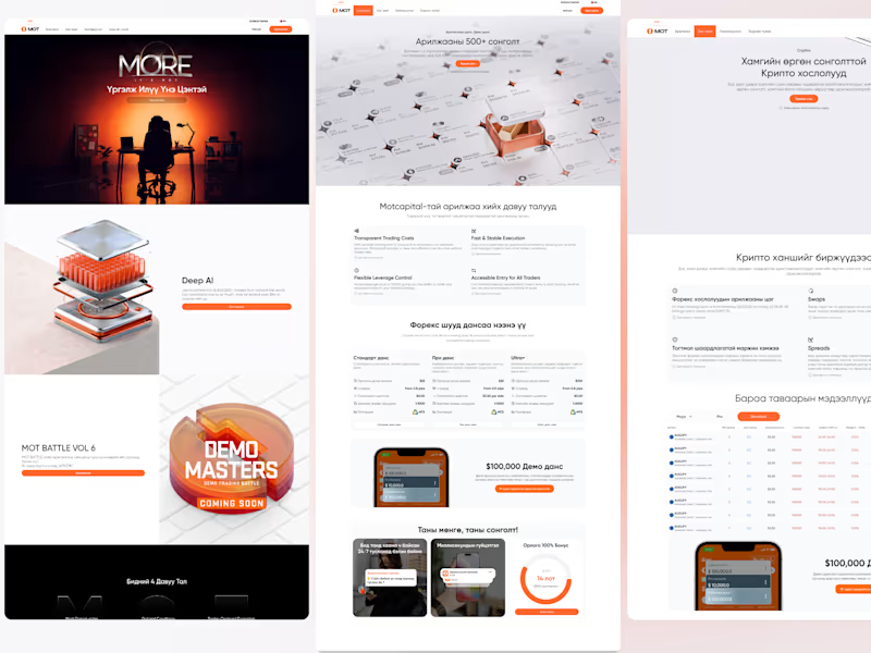
🇲🇳 Mongolian Stock Exchange System Project
This project is a comprehensive trading platform built across Web, User Dashboard, and Mobile systems.
It’s based on previous successful cases and focuses on a minimal, clean design that allows users to trade, withdraw funds, and copy trades quickly and seamlessly.
📈 Key Features
Fast and simple transaction process
Fund withdrawal and deposit
Copy trading and live trading participation
Reward and promotion system with a modern user experience
I’m developing this entire project solo, handling everything from UX/UI design to full system implementation.
It’s a continuously evolving project where I challenge myself with new design and technical solutions every day.
💻 Check out the project here:
👉www.motcapital.com (http://www.motcapital.com)
👉 my.motcapital.com
0
119


Experienced full-stack product engineer
Experienced full-stack product engineer


Brand Identity Designer — Logo Systems, Visual Direction
Brand Identity Designer — Logo Systems, Visual Direction
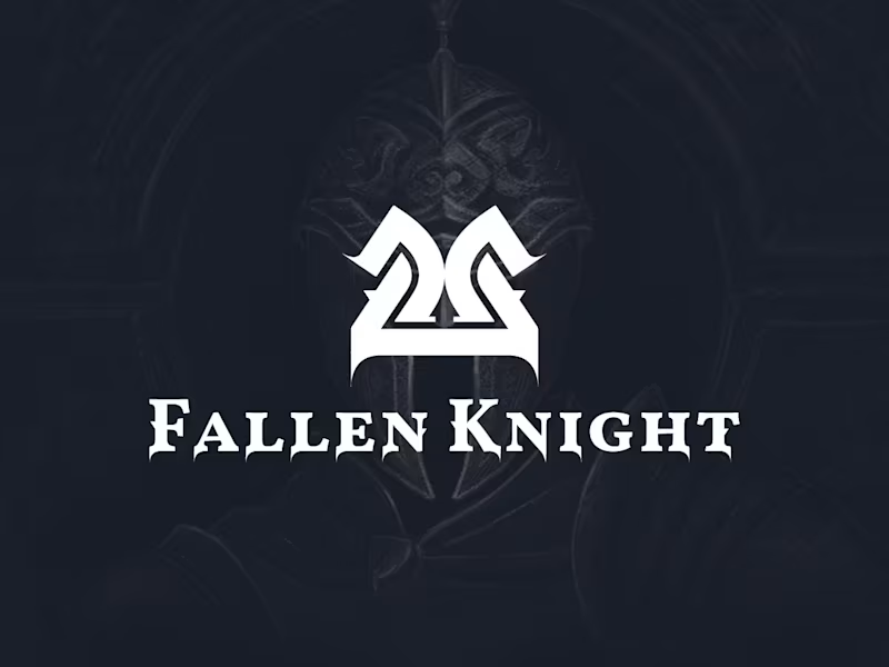
Fallen Knight — Building a Dark Fantasy Board Game World
A complete visual identity, illustration, card system, and packaging design for a medieval fantasy board game.
Fallen Knight is a medieval fantasy board game project designed to transport players into a dark world of knights, conflict, and fallen kingdoms.
The goal was to create more than a standalone logo or a collection of illustrated cards. The project needed a recognizable visual world that could remain consistent across every part of the game—from its identity and packaging to its characters, cards, icons, and supporting graphics.
I developed the complete creative direction and visual system for the project. My work included the logo and heraldic brand mark, character illustrations, card layouts, typography, color palette, iconography, supporting graphic elements, and packaging design.
The visual direction combines medieval heraldry with dramatic fantasy storytelling. The shield-based symbol gives the game a strong and recognizable central mark, while the darker palette, detailed illustrations, and structured card system create atmosphere without sacrificing clarity or usability.
Each component was designed as part of the same world. Repeated shapes, borders, colors, symbols, and typographic rules connect the individual game assets and help the identity remain cohesive across different formats.
I was responsible for the complete visual development and execution of the project. A collaborating designer supported the project by preparing social media marketing posts.
Full Project : https://www.behance.net/gallery/117645673/Fallen-Knight-Board-game-design
0
64
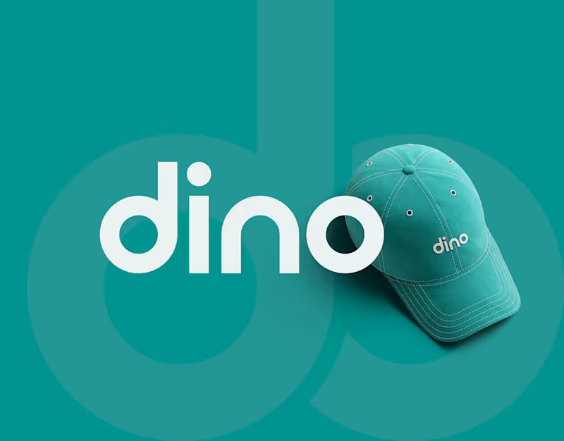
Dino — Visual Identity & Brand System
A bold and approachable visual identity built around a distinctive wordmark and a flexible graphic system. The identity was designed to remain clear, recognizable, and consistent across both digital and physical brand applications.
My role: Brand Identity, Logo Design, Visual Direction
1
0
84
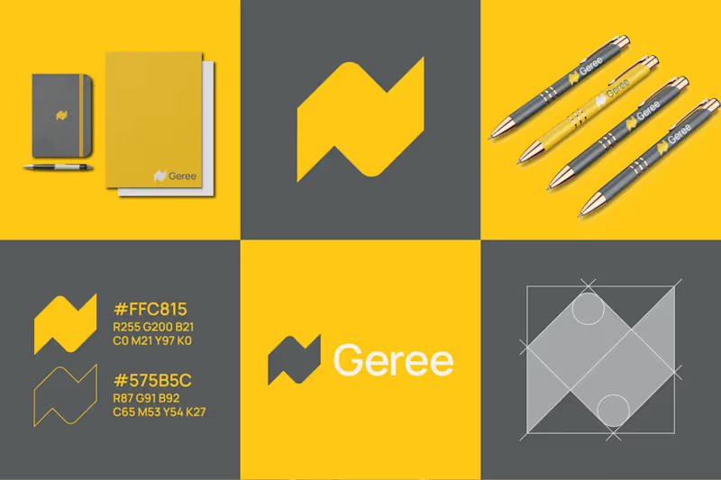
N Geree - Logo & Visual Identity
Developed the complete brand identity and logo system for N Geree, focusing on clarity, balance, and adaptability.
The design combines modern minimalism with strategic visual storytelling — creating a cohesive identity that works seamlessly across digital and print platforms.
Every element, from typography to color palette, was crafted to communicate the brand’s values and personality through a timeless, professional visual language.
1
78
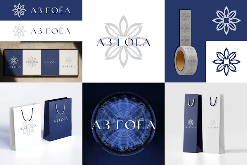
Аз Гоёл - Logo & Visual Identity
Developed the complete brand identity and logo system for Аз Гоёл, focusing on clarity, balance, and adaptability.
The design combines modern minimalism with strategic visual storytelling — creating a cohesive identity that works seamlessly across digital and print platforms.
Every element, from typography to color palette, was crafted to communicate the brand’s values and personality through a timeless, professional visual language.
1
83

Independent artist creating illustrations and animations.
Independent artist creating illustrations and animations.


Professional Web Developer with 6+ Years Experience
Professional Web Developer with 6+ Years Experience


View more →

Turning ideas into bold, brand-aligned visual stories.
Turning ideas into bold, brand-aligned visual stories.


View more →