





I’ve always said: great design is nothing without user connection. When you're building an app like HOLLY, understanding what truly motivates your users is key. You can have stunning UI/UX, but if it doesn’t speak to your users’ needs, you’ve missed the mark.
HOLLY is a prime example. We didn’t just create a visually appealing app; we created one that resonated with users on an emotional level. How? By focusing on the core challenge - procrastination and motivation. Users don’t just interact with the app; they connect with it. And that connection is what drives engagement.
✅ After analyzing drop-off points, we made crucial design adjustments. The result? A 25% boost in user retention. The numbers speak but the real story is design that builds trust.
Check out more about HOLLY: https://league-design.com/holly-heath-ui-ux/
3
369


Is the classic swipe outdated? 🤔
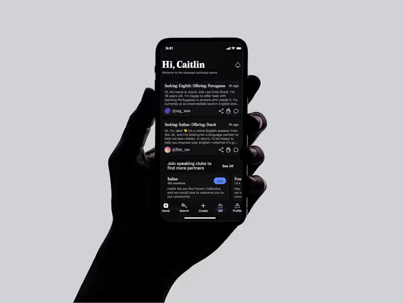
I wanted to experiment with a different discovery experience, so I designed this interactive "scan flow" for a dating app concept. It's built to feel more dynamic and less repetitive than traditional swiping.
Let’s debate: swipe vs. scan
Which one creates a better user experience?
Share your thoughts below, and don't forget to leave a like if you enjoyed the preview! 🚀
1
5
286

I've recently worked on the Web3 & Blockchain CrossPlatform project, where I've created 100+ screens within 4 weeks.
This platform's tokens replicate whole markets; no need to gamble on individual assets, user can easily gain exposure to blue chip NFTs or the top 10 cryptos with one transaction 🚀
3
4
417
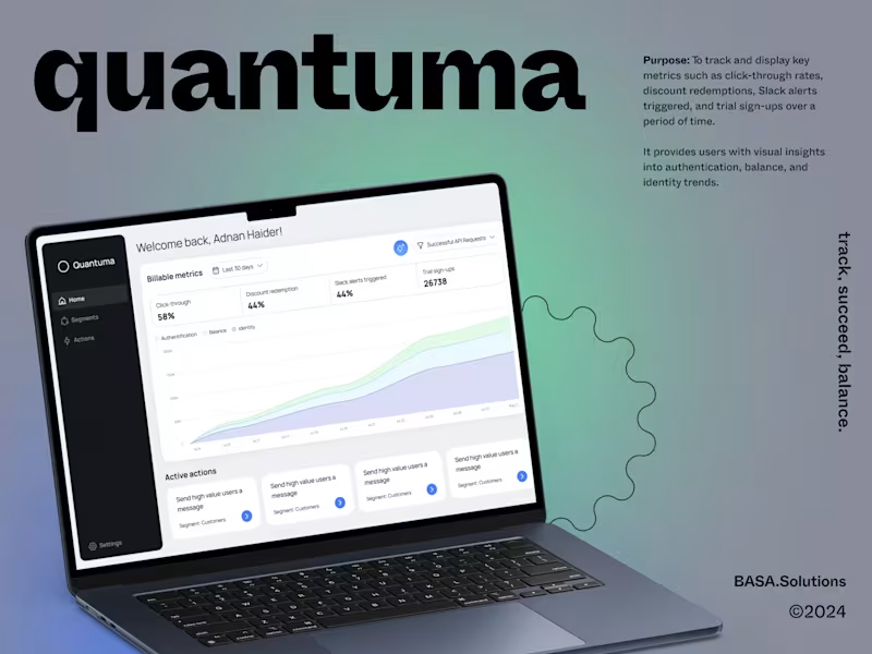

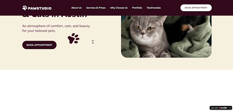
Hi! I’d like to share my work. This is my first time creating a project on the Lovable platform!
About the Project: PawStudio is a small grooming salon for dogs and cats in Austin, Texas.
Target Audience: Cat and dog owners who deeply care about their pets.
Problem: Although the business is small, it already has its loyal clients. They often text or call to inquire about pricing and check available time slots. The salon owner cannot always answer immediately (as they are busy grooming animals), causing potential clients to leave for competitors.
Solution:
To relieve the owner’s workload, an easy-to-use booking modal with date and time selection was built.
An admin dashboard was created so the owner can easily view client appointments and scheduled time slots.
To effectively attract new clients and turn them into confirmed bookings, a conversion-focused landing page funnel was carefully crafted — leading visitors seamlessly from service discovery to a quick appointment in just 2 clicks.
Workflow & Design Process:
UX Research: Before starting the design, I conducted a UX research analysis of competing businesses in similar niches.
Figma UI Layout: Next, I crafted the initial UI/UX layout and visual hierarchy in Figma.
Lovable Development: The final step was bringing the layout to life on the Lovable platform, where I used clear engineering prompts to build, style, optimize, and publish the fully functional web application.Typography & Color Palette:
Typography: I chose the Alan Sans font family because its friendly, playful character perfectly aligns with the positive mood of the brand.
Color Palette: Special attention was given to the color scheme (#360F1E, #FDFBF7, #53182E) — combining deep burgundy tones with warm cream backgrounds to highlight the cozy, high-end atmosphere of the grooming salon.
1
238
