Freelance Presentation Designers in Ukraine
Sign Up
Post a job
Sign Up
Log In
Filters
2
Projects
People
Heed Collective
pro
Ukraine
Building cultures through Brand Systems
$50k+
Earned
14x
Hired
5.0
Rating
679
Followers
Top
Follow
Message
Building cultures through Brand Systems
32
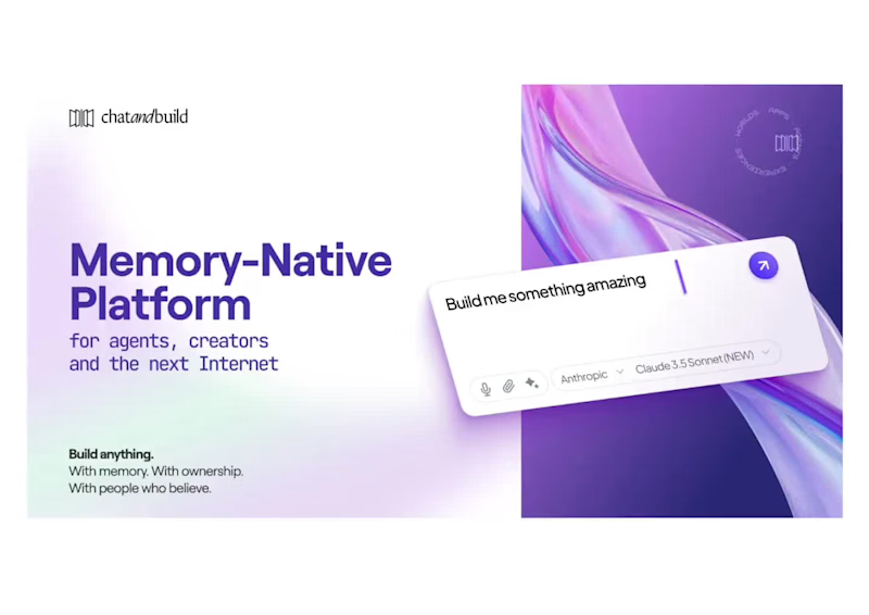
Sharing a deck design for ChatAndBuild. AI solutions were in the spotlight this year — and at Heed Collective, we’ve been working with teams building in this space. Good data visualization always starts with understanding the data first — only then can the visuals truly support the story.
7
32
2.3K
24
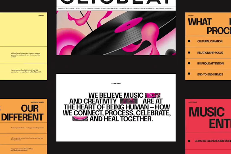
ClicBeat Pitch Deck Redesign
24
538
8
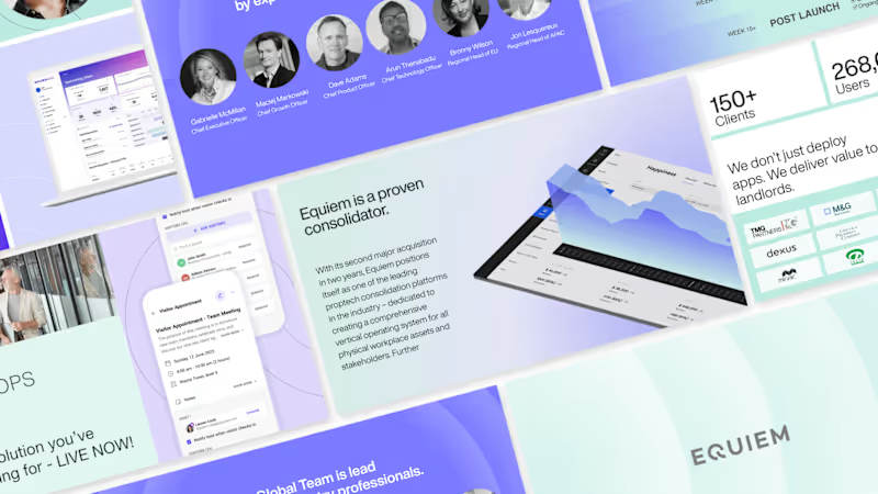
Presentation design for Equiem SaaS
8
104
82
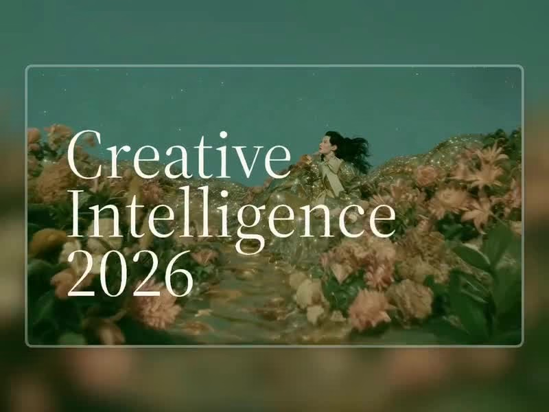
So excited to see Creative Intelligence 2026 by @Contra Labs (https://contra.com/company/contra_labs_a39b77) out in the world! At @Heed Collective , we had the pleasure of designing both the website and the report. We’re incredibly grateful for this collaboration! Our creative exploration started with a question: What does Creative Intelligence mean today? We believe it lives at the intersection of creativity and analysis, imagination and insight. We translated this into a visual story that begins in space — vast, dreamy, full of possibility — and gradually moves closer to Earth, grounding imagination in something tangible and human. Huge congrats to the whole team, @Erin Horner (https://contra.com/erin), @Ben Huffman (https://contra.com/ben), @Mark Vassilevskiy (https://contra.com/mark_vassilevskiy), @Alex Karpodinis (https://contra.com/alexk), @Stacy · Heed Collective (https://contra.com/existacial), @Heed Collective (https://contra.com/anna_heedcollective), and the entire @Contra Labs (https://contra.com/company/contra_labs_a39b77) team 👏 Check it out (https://contra.com/p/rRkvBLOE-creative-intelligence-2026-report-site-development)
2
22
82
3.3K
Presentation Designer
(3)
Follow
Message
Oleksii K.
pro
Ukraine
I help build trust in your product [through digital design]
$1k+
Earned
6x
Hired
5.0
Rating
110
Followers
expert
expert
+2
Follow
Message
I help build trust in your product [through digital design]
24
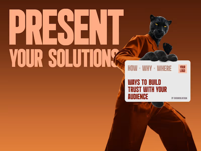
😩we're all tired of empty phrases we all want to be heard 🤝so, how do you build true loyalty? 🙌start a one-to-one conversation and personalised presentations can help with this these are not boring slides; they are a short, human way of saying, 'I hear your pain. here's (https://www.figma.com/proto/Wuxc3YrHrrTIdK7D40Oc6U/prz---okaiukov?page-id=465%3A10&node-id=465-14&viewport=217%2C451%2C0.04&t=PlnBh19vNl9kW9uk-1&scaling=contain&content-scaling=fixed)the solution for you.' 🏃♂️➡️and yes, it takes effort but in a world where everyone is chasing automation, genuine attention is the most valuable currency it builds trust, turning one-time buyers into loyal customers. 🙌I've put together a short guide on how it works → book a call (https://cal.link/okay)I'll be happy to help you find a voice for your brand, company or startup
5
24
1K
1
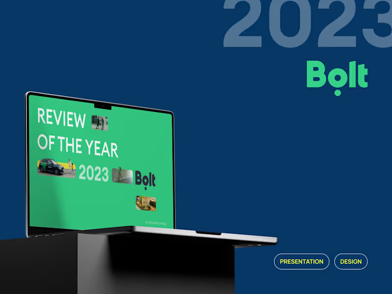
Bolt's Presentation: Review of the year 2023
1
193
1
Animations for Talkpush Homepage
1
21
2
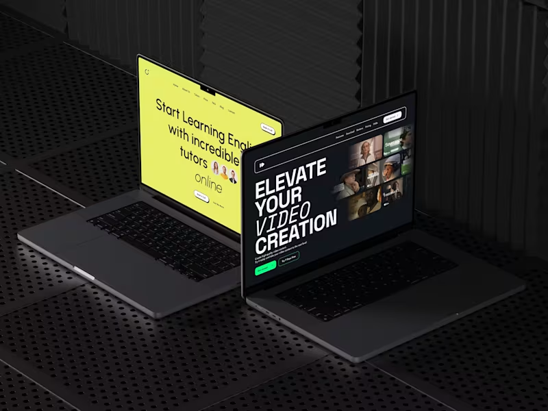
Framer's Websites
2
329
Presentation Designer
(2)
Follow
Message
Vladyslav Stadnyk
pro
Ukraine
Presentation Design | Investor Pitch Decks & PowerPoint
New to Contra
Follow
Message
Presentation Design | Investor Pitch Decks & PowerPoint
2
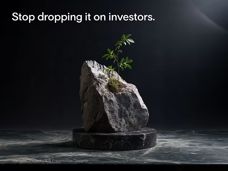
Burying your traction on slide 28 is the fastest way to lose a venture partner. Most founders assume volume equals expertise. They drop a massive rock of information onto venture partners, hoping the investor will dig through it to find a reason to write a check. But reality works differently. Venture partners review materials on their phones in the back of a cab or between meetings. If your core growth metric is hidden under a solid wall of text, nobody is going to see it. You lose their attention before they even understand your business model. Your presentation should be a scalpel, not a sledgehammer. Cut your deck in half. Leave empty space so your most critical numbers can actually breathe. One clean layout proving your unit economics closes rounds much faster than ten pages of technical documentation and product features. Open your current pitch deck. How many slides can you delete today without losing the core narrative?
2
2
204
1
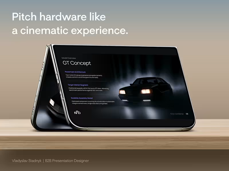
Most hardware founders pitch their premium products on a standard white background. They assume clean design always means bright design. But for a high-ticket physical product, a white canvas actively cheapens your perceived value. I recently designed the investor pitch deck for a European automotive startup building something completely contrarian. A lightweight, purely analog mechanical car for driving enthusiasts. No complex touchscreens. No heavy electronics. Just raw, purposeful engineering. To raise capital from European investors, we abandoned the standard corporate aesthetic. We built all 22 slides in a deep, cinematic dark mode. This is why the dark aesthetic works perfectly for high-value hardware: 📍 The Spotlight Effect A dark canvas swallows visual noise. It acts like a spotlight in an empty room, forcing the investor's eye directly onto the curves of the car and your specific manufacturing metrics. 📍 Subconscious Exclusivity Premium brands rarely use blinding white in their showrooms. Darker tones instantly signal a high-end, exclusive experience before you even speak. 📍 Contrast Power When we mapped out the detailed cost breakdown, the bright accent numbers against the dark background made the unit economics impossible to ignore. Your presentation design is not just a container for your business plan. It is the first real test of your brand positioning. Open your current deck. Does your visual aesthetic actually justify the valuation you are asking for?
2
1
215
1
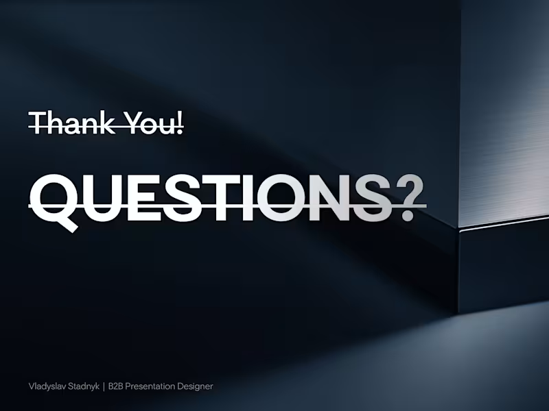
📣 You just pitched a multi-million dollar business. But your final slide is actively killing your momentum. Founders treat the last layout as a polite goodbye. You paste a generic question mark icon, type your email, and leave it on the screen for the entire Q&A session. That means your final slide sits on the display for 20 minutes. It gets more screen time than your financial model. And it tells the room you have nothing left to sell. I watched a founder make this mistake recently. His core presentation was incredibly sharp. Then the deck ended on a giant "Thank You!" and the energy in the room completely flatlined. We scrapped his goodbye slide that same afternoon. We replaced it with a silent closer. Instead of an email address, we put his $1.5M round size right in the center of the layout. We anchored the left side with his massive MRR growth metric. We added a clean QR code on the right for instant follow-up. When investors started grilling him about customer acquisition the next day, that new slide sat on the screen behind him. It projected traction in absolute silence. Every time the investors looked up, they were forced to stare at his momentum. Your last slide is a billboard. Stop leaving it blank. Open your pitch deck today and delete the "Questions?" slide. Put your strongest numbers back on the screen.
1
262
1
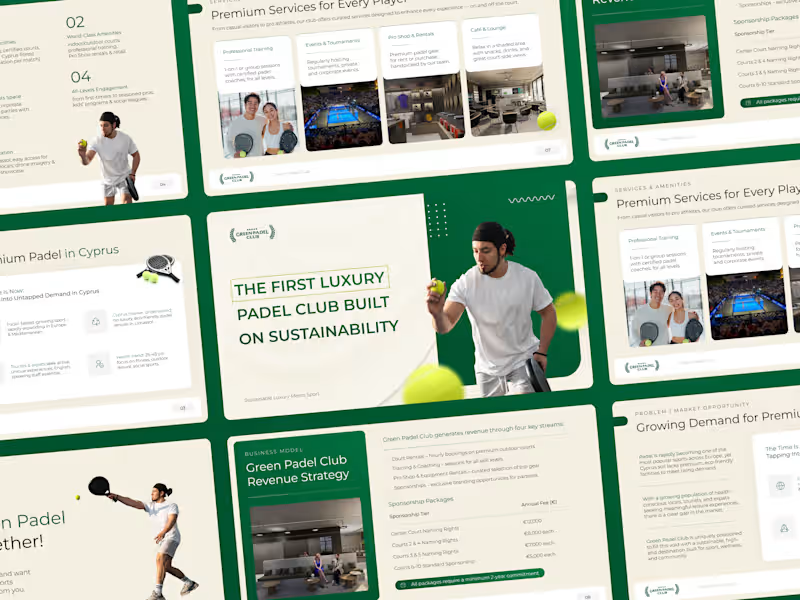
🏓 Luxury Sports & Sustainability Pitch Deck | Investor Presentation 🚀 Challenge: Green Padel Club, Cyprus's first sustainable luxury padel venue, needed an investor deck to attract high-net-worth backers by communicating premium positioning and a rigorous ESG thesis. 🎨 Solution: I designed a sophisticated PowerPoint combining editorial layouts, lifestyle imagery, and structured storytelling to cover market demand, revenue strategy, and sustainable design. 📈 Impact: An investor-ready deck balancing aspirational branding with clear financial logic, enabling the club to confidently pursue European capital partnerships.
1
196
Presentation Designer
(15)
Follow
Message
Olena Ulianytska
Lviv, 79000
Presentation Creator: Design, Structure, Content
5.0
Rating
2
Followers
Follow
Message
Presentation Creator: Design, Structure, Content

0
Business Presentation | Pet care | Wowpet
0
19
0
Cooperation Presentation | Real Estate | Inshi Hotels Group
0
22
0
Corporate Presentation | Hospitality Business | Robert Hotel
0
25
0
Corporate Presentation | Hospitality Business | Gremi Hotel
0
12
Presentation Designer
(4)
Follow
Message
Dmytro Messer
Odesa, 65000
Founder MDevise Agency & Senior Graphic Designer
Follow
Message
Founder MDevise Agency & Senior Graphic Designer
1
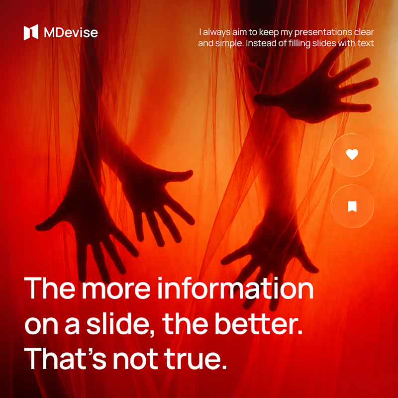
Using less text doesn’t mean leaving out important information. For me, the key is deciding what actually deserves space. Whether it’s a sentence, an image or a chart, every part should have a clear purpose and support the overall message. I pay close attention to visual hierarchy. I want the audience to move through the presentation naturally, starting with the most important point and then noticing the supporting details. Font size, formatting and placement all help create this structure. I also try to be careful with the amount of text. If there is too much, people are less likely to read it. When content doesn’t fit, reducing the font size only makes the slide harder to scan.
1
105
0
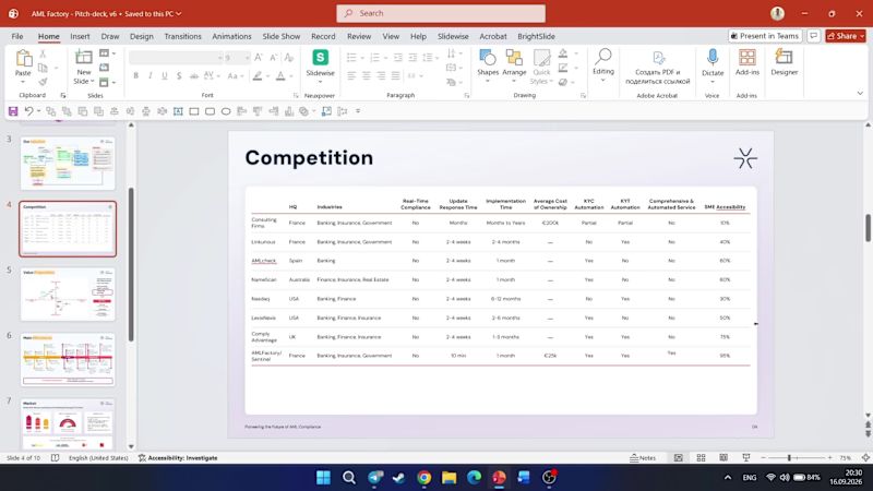
PowerPoint just made working with tables a little easier One of the small updates I really like is the ability to work with tables more easily directly from the interface, without having to jump into additional settings every time you want to make a simple adjustment. It may seem like a small thing, but when you work with presentations every day, these little improvements can save quite a lot of time. Have you already tried this update in practice?
0
93
0
Most people think presentation design is about opening PowerPoint, choosing a nice font, some colors and images, and making the slides look “wow.” But I actually start somewhere else. Before I design anything, I want to understand the presentation first. Who is it for? What is it meant to achieve? What is the main message? What should people remember after seeing it? Then I organize the content. I decide what belongs on each slide, what order makes the most sense, where the important points should stand out, and what can be removed. For me, good presentation design is about finding the right balance between the message and the visuals. The design should make the content more interesting without taking attention away from the main idea.
0
75
3
Even strong content can be difficult to understand when it’s presented without a clear flow. The audience may lose track of what really matters or simply stop paying attention. Before creating the slides, I would first define the key message. Then I would decide which ideas are essential and which ones can be left out. I would organize the content so each part naturally leads to the next. This makes the presentation easier to follow and keeps the story clear. Another thing I would focus on is the amount of information on each slide. Too much text, too many charts, or too many visuals can make the content overwhelming and distract from the message. A strong ending is just as important. I would leave the audience with a clear takeaway and a simple understanding of what they were meant to remember. For me, good structure is about making ideas clear, keeping people engaged, and making the message easy to remember.
1
3
224
Presentation Designer
(14)
Follow
Message
Karina K
Ukraine
Graphic + Motion design
1x
Hired
6
Followers
Follow
Message
Graphic + Motion design
0
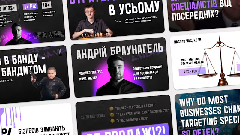
Braunagel | Conference Presentation
0
6
0
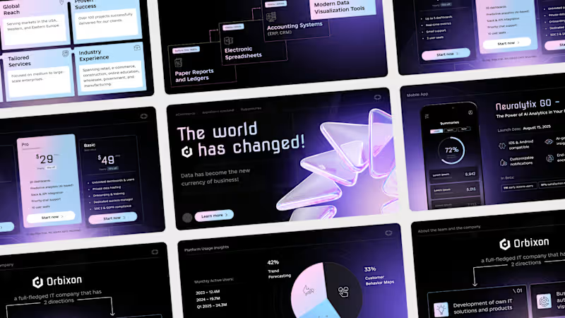
Orbixon | Pitch Deck
0
37
0
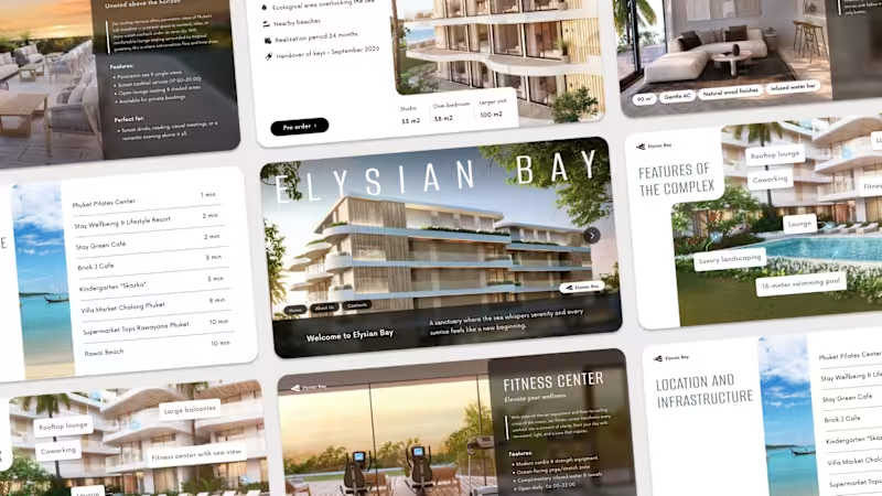
Elysiym Bay | Hotel Presentation
0
63
5
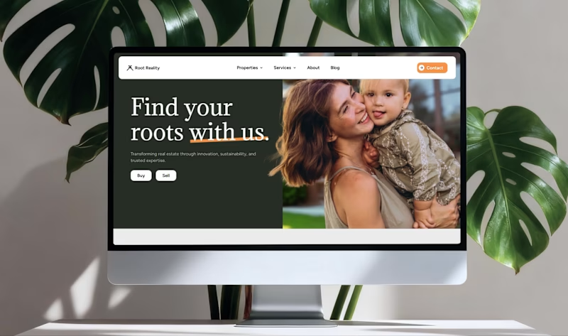
Root Reality | Branding + Website design
5
74
Presentation Designer
(3)
Follow
Message
Emiliya Smuzhanytsia
Mukachevo, 89611
Pitch deck design expert
Follow
Message
Pitch deck design expert
0
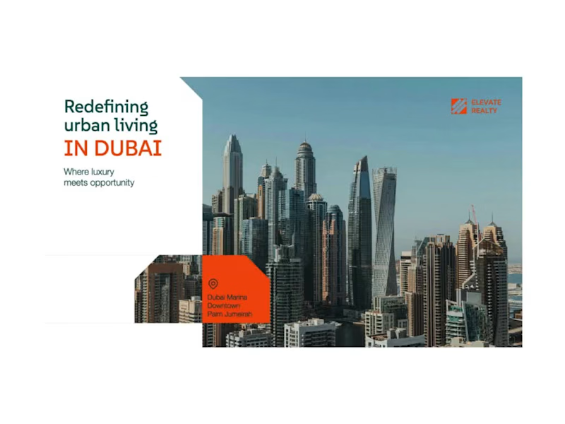
Real Estate Pitch Deck - PowerPoint Presentation Design
0
11
0
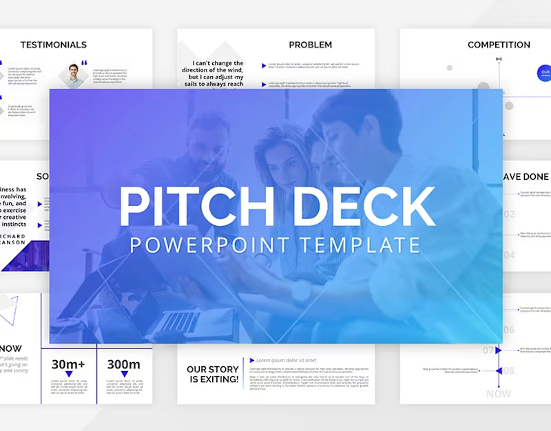
Pitch Deck Powerpoint Presentation Template
0
11
0
PowerPoint Presentation Design for Marketing Agency
0
4
1
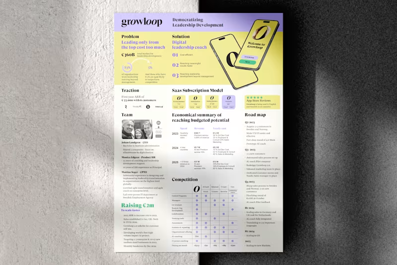
I will design one pager, executive summary, or investment teaser
1
50
Presentation Designer
(6)
Follow
Message
Vitalii Nadkernychnyi
Kyiv, 02000
Graphic Designer | Smart & Modern Visuals
Follow
Message
Graphic Designer | Smart & Modern Visuals
0
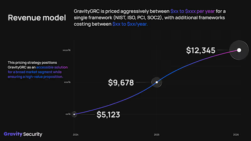
Gravity Security / Presentation Design
0
13
0
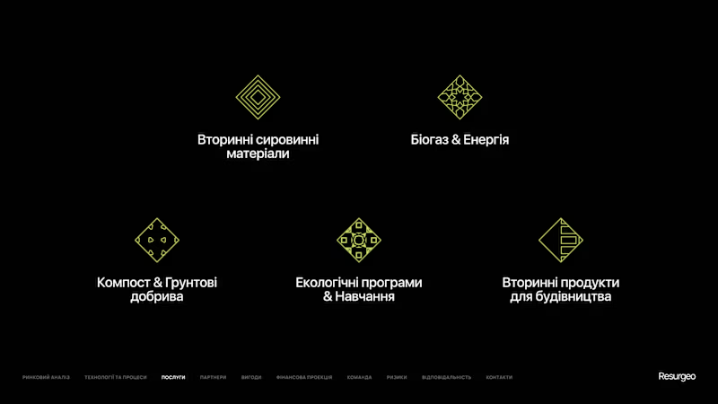
Resurgeo / Presentation Design
0
2
0
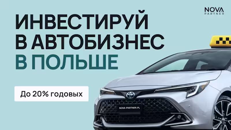
Nova Partner / Presentation Design
0
4
0
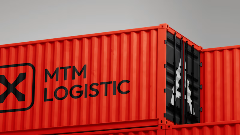
MTM Logistic / Brand Identity
0
9
Presentation Designer
(3)
Follow
Message
Explore people